

Design
10 Engaging Birthday Email Examples + Strategies

When it comes to making your customers feel special, nothing says "We're glad you're here" like a personalized birthday email. Not only that, but they are great sources for driving up engagement and strengthening brand loyalty.After all, who doesn't love a freebie or a discount to spoil themselves with?Whether you're currently sending birthday emails or want to start, below you'll find some of our best strategies for crafting and optimizing birthday messages that delight your recipients.
What is a Birthday Email?
Birthday emails are powerful automated email campaigns brands use to provide a more personalized customer experience. While on the surface, they might seem like a simple gesture to brighten your customer's day. These emails are strategically crafted and inserted into every big e-commerce brand’s email marketing efforts.
What is the Purpose of a Birthday Email?
Birthday emails have multi-purposes. While they are created to help celebrate a subscriber's special day, they also drive up email engagement and brand loyalty. Here’s how:
- Deepen Subscriber Connection: A personalized birthday wish can strengthen the bond between a brand and its subscribers. A simple message can make your subscribers feel important, keeping you at the top of their minds the next time they purchase.
- Drive Sales: Exclusive birthday discounts or offers can incentivize subscribers to purchase.
- Boost Engagement: Birthday emails often see higher open and click-through rates than regular promotional emails.
Do Birthday Emails Work?
Absolutely! When it comes to engagement metrics, birthday emails are the party animals of the email marketing world. In fact, according to Experian, birthday emails generate “179% more clicks, 481% more transactions, and 342% more revenue per email.”Our educated hypothesis is that everyone loves a little extra attention on their birthday, and when brands deliver that in the form of tailored offers and heartfelt messages, subscribers are more likely to engage (and buy)!
10 Happy Birthday Email Examples (and their strategies)
Birthday emails are a unique blend of celebration and strategy; finding the right balance is important. We've scoured the email universe and handpicked 12 of the best birthday emails. Each example showcases a different approach, from heartwarming messages to irresistible offers.As we unwrap each one, you'll discover what makes them stand out and drive results. By the end of this list, you'll be brimming with ideas and ready to craft birthday emails that resonate and convert.
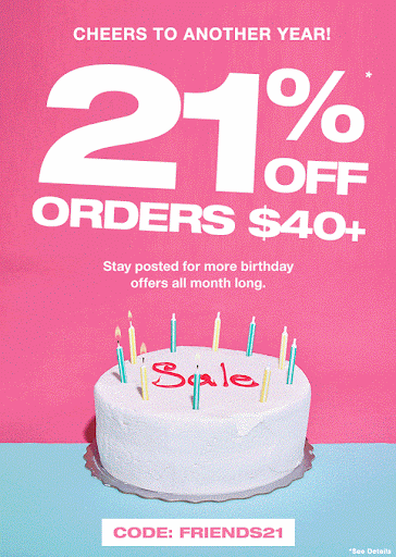
Make your offer stand out
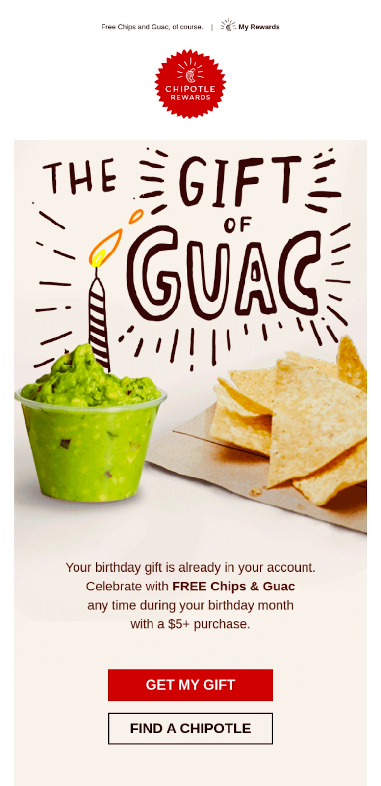
This birthday email example from Chipotle showcases a brilliant marketing strategy. The "Gift of Guac" is not only quirky and engaging but also entices the receiver with a tempting offer on one of Chipotle's delicacies. Not only that, but the offer is applicable anytime during their birthday month, which promotes return visits.In addition, the call-to-action button attracts the reader's eye and offers clear instructions for the next steps.
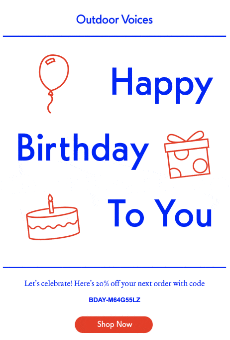
Keep it Simple and Stay on Brand
When it comes to birthday emails, Outdoor Voices nails it by embracing the beauty of simplicity.A common mistake with birthday emails is that it is really easy to go overboard. Outdoor Voices does a great job of embracing the “less is more” approach to design and copywriting, which aligns with their overall brand identity.Another differentiating factor, when compared to Chipotle’s approach above, is that the offer is not the star of the email. Instead, the customer is. This strategy is great for strengthening connections with readers as they often feel less “sales-y. ”Regardless, they do a great job of ensuring the offer is still noticed by adding an on-brand CTA that stands out.
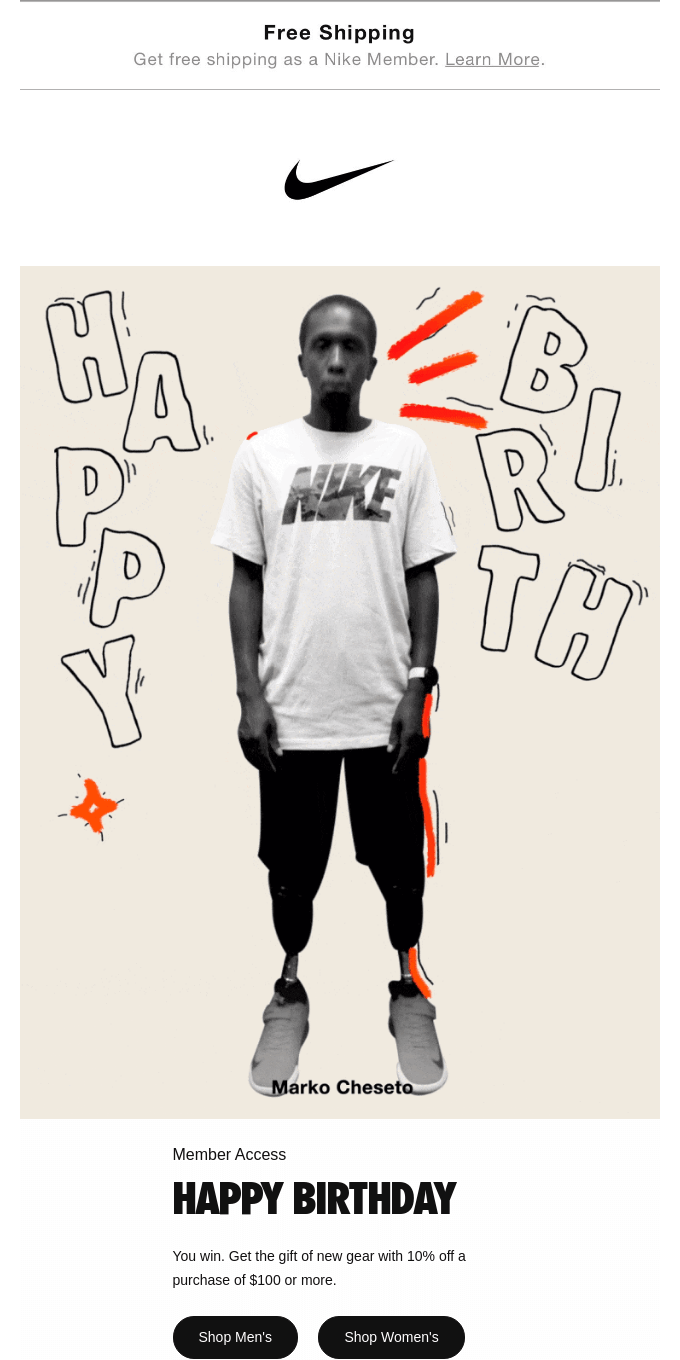
Nike's birthday email also beautifully embodies its athletic and dynamic brand essence. Featuring an athlete surrounded by playful hand-drawn elements, the email captures attention and reinforces Nike's iconic image. The straightforward offer of a 10% discount on a $100 purchase, combined with the exclusive feel of 'Member Access,' effectively incentivizes the recipient to shop.
Use a Humorous Approach
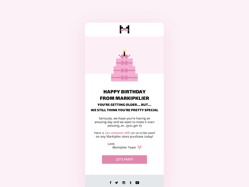
The following birthday email from Markiplier incorporates humor to create a memorable and light-hearted message. The message feels personable as it makes a joke about aging that a friend would make, yet emphasizes genuine appreciation.The offer for a discount on Markiplier store items adds an incentive to the comedic touch. If there's a lesson here, it's this: a good laugh can reel 'em in, but pairing it with a genuine offer? That's the cherry on top!
Exclusivity For The Win
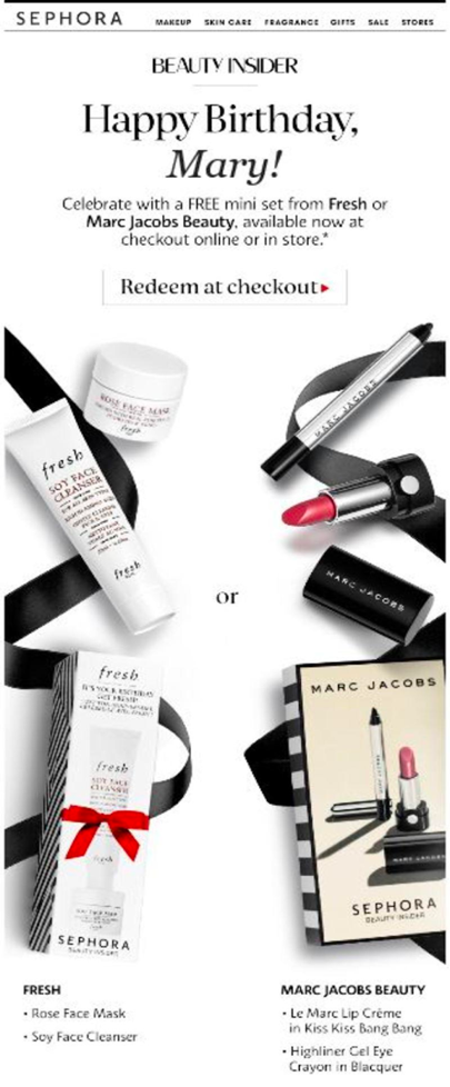
If you're an avid Sephora shopper, you'll know their birthday mini sets are (unfortunately) not curated for the individual; however, this email makes you feel like it is.While using your reader's name is a great example of personalization, in this case, it isn't the star of the show.Sephora's unique layout, design, and use of high-quality images exude the feeling of "these were hand-picked just for you." The use of supersized imageslaid out was intentional to make these "minis" feel larger (and, in turn, more exclusive) than they are, which likely makes "Mary" feel special.They also subtly hint with a subtitle that "Mary" is receiving this exclusive offer because they are part of their "beauty insider" program, further promoting the feeling of exclusivity and encouraging customer loyalty.
Time Is Of The Essence? or Not?
The following two emails offer a different approach to birthday offer expiration dates.PixelBoosts offers a 30% discount to be redeemed within three days. Crafted for those looking to renew their subscriptions, this birthday email does a good job of blending the personal touch of a birthday email with a gentle nudge toward "stick around with us!"
On the other hand, the email below extends the festivities and gives the reader the entirety of their month to redeem their discount. The phrase "pick your own present" offers a sense of autonomy and personalization.
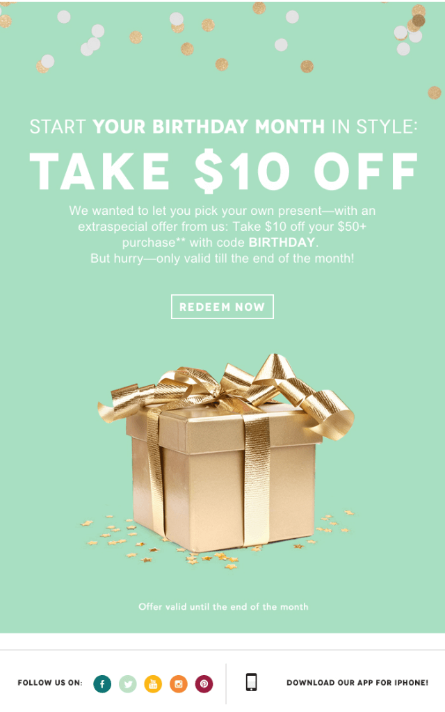
There are pros and cons for both strategies.While offering limited-time offers such as PixelBoost can be a great way to encourage urgency and conversion, finding the right time to send this email is important. According to Campaign Monitor, 55% of birthday emails are sent on the recipient's birth date. For limited offers such as 3 days, the challenge comes with not knowing whether the recipient will open the email in time as they might be taking some much-needed R&R.For birthday emails with a much longer deadline, while they offer recipients ample time to open and purchase, you risk them forgetting about your offer. In this case, reminder emails will be essential, turning birthday emails into birthday campaigns.As always, we recommend testing and monitoring what works best for you and your organization.
Personalized Product Recommendations
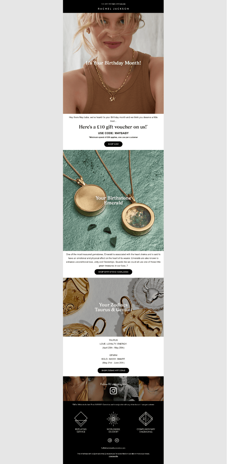
According to Epsilon, "80% of consumers say they're more willing to purchase when provided with a personalized experience." While, a birthday email alone is a strong example of this, Rachel Jackson's birthday email takes it one (or ten) steps further.
While we usually see product recommendations being personalized with the power of dynamic content and consumer behavior, Rachael Jackson takes a unique, maybe simpler, but still impactful approach using the recipient's birthstones.
The use of high-quality images and meaningful descriptions engages the recipient to learn more about their birthstone, which only further helps promote the feeling that "this was made for me."
Use Interactive Elements
When done right, videos, gifs, and polls are great ways to catch your readers' attention and guide them toward the desired action.While the email below is simple, the animated birthday cake and candle GIF catches the reader's eye and embodies the essence of celebration, warmth, and festivity. Again, while simple, the GIF enhancesthe user experience, making the offer more enticing and the email more interactive.
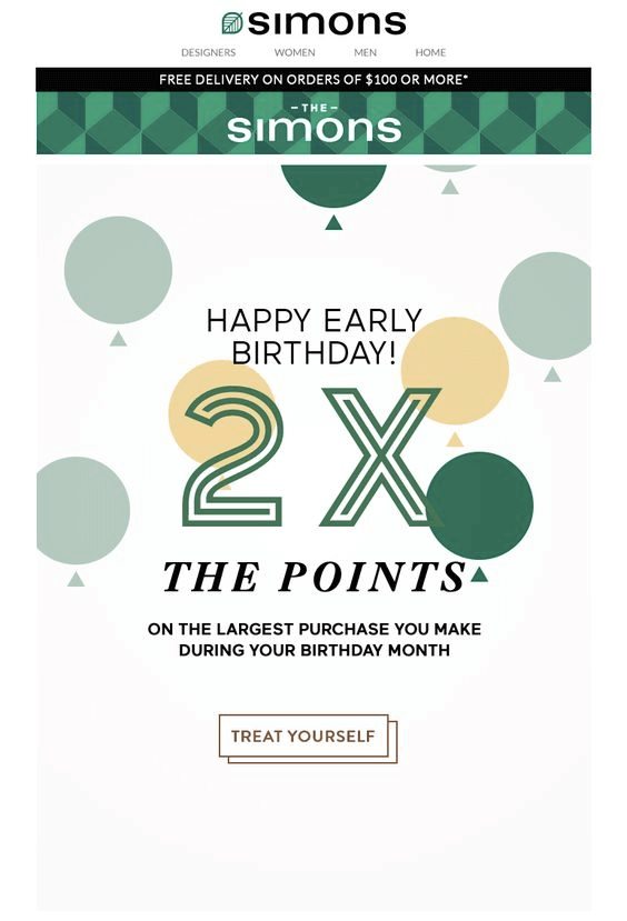
Loyalty Points Boost
Simons' birthday email effectively leverages a loyalty program by offering double points on the largest purchase made during the birthday month. The CTA "treat yourself" is strategically used to encourage a larger-than-usual purchase, possibly enticing the reader to buy something they might have been eyeing for a while. The double points incentivize the consumer as they are more willing to buy, knowing they will receive something in return.
Simon isn't just sending out birthday wishes but making it a win-win for everyone.
Best Practices for Engaging Birthday Email Campaigns
The best birthday emails are more than just a celebratory message; they're an opportunity to deepen your connection with your subscribers. To make sure that your birthday wishes stand out in a crowded inbox, it's important to follow some tried-and-true best practices.From creating an automatic birthday campaign to the art of the perfect call-to-action, here are our top secrets to crafting unforgettable birthday emails.
Automation is Your Birthday Campaign BFF
No one is to be left behind. Setting up an automated birthday campaign ensures subscribers feel acknowledged on their special day. It's not just about convenience; it's about consistency.Automation permits timely and personalized gestures that say, "We remember, and we care."
Send More Than One Birthday Email
One email is great, but why stop there? Celebrating a subscriber's birthday isn't just about the day itself; it's about the anticipation and the afterglow.Start with a warm pre-birthday greeting, followed by the main birthday wish, and perhaps a gentle reminder or a thank-you note a day or two later. It's a prolonged celebration that keeps the connection alive and makes your brand memorable.
Ensure a Smooth Redemption Process
If you're gifting your subscribers a birthday treat (and we highly recommend you do!), make the redemption process a breeze. The last thing you want is for them to jump through hoops on their special day. Whether it's a discount code, a freebie, or exclusive access, ensure they can claim it effortlessly.Part of this is ensuring a clear and compelling CTA. Whether you're nudging them to shop a birthday sale, read a special message, or claim a gift, your CTA should stand out.
Design Unforgettable Birthday Emails with Beefree
Whether it's a heartfelt message, a special discount, or an exclusive offer, it is proven that birthday emails strengthen brand-consumer relationships. And with only 31% of retail email marketers sending birthday greetings, there's a huge opportunity for you to stand out.As shown above, playing with color, layouts, images, and interactive elements is the name of the game. And while it might seem challenging and time-consuming at first, it doesn't have to be.With an intuitive drag-and-drop interface and a catalog of over 1,600 templates, Beefree makes designing birthday emails a piece of cake ;).Not sure where to start? Try this free birthday email template.
12 Exceptional Email Newsletters to Inspire You
Email newsletters stand as a beacon between your brand and your audience. In one cohesive and on-brand email, you can share everything from news to announcements to updates and inspire action, building stronger connections with your subscribers.The artistry behind crafting a newsletter that not only informs but captivates is a journey of balancing aesthetic appeal with potent content, ensuring each word and image is a step towards enriching subscriber engagement. As connoisseurs of well-crafted email newsletters, within the confines of this blog, we'll share 16 email newsletter examples, each uniquely highlighting the impact of successful communication in its own special way.
Behind the Best Email Newsletter Examples
Understanding the mechanics of email design means recognizing and appreciating the subtle nuances that elevate a newsletter from good to exceptional. Below, you'll find a collection of designs that brilliantly mix visuals and content, each one shining a light on the exciting opportunities that your own newsletters can explore.
E-Commerce Newsletter Examples
Serumize
The presented newsletter comes from "Serumize," a brand dedicated to skincare. This specific edition from their "Skintuation" blog emphasizes the importance of correct skin cleansing to achieve clear, healthy skin.
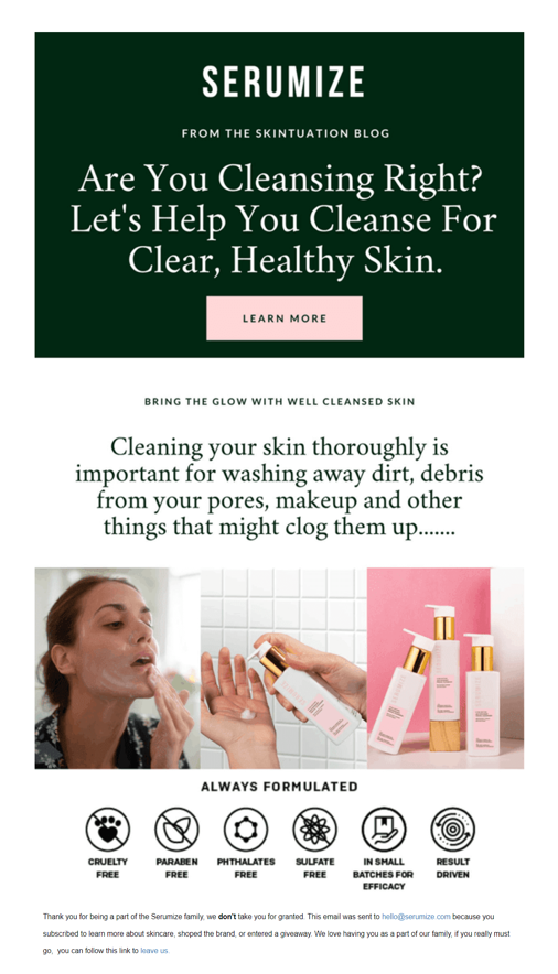
Stand-out elements:
- Engaging Content and Visuals:
- One of the standout features of this newsletter is its use of engaging content complemented by visually appealing imagery. The headline "Are You Cleansing Right?" is not only attention-grabbing but also prompts the reader to delve deeper into the content. When accompanied by high-quality images of the products and a model showcasing the cleansing process, it gives the viewer a comprehensive idea of what the brand offers.
- Clear Call to Action:
- The "LEARN MORE" button is prominently placed and effectively serves as a call to action. Its distinct color and positioning ensure it catches the reader's attention, leading them towards more detailed information or potentially to a purchase.
- Transparency and Trustworthiness:
- Serumize has incorporated icons at the bottom of the newsletter, highlighting the qualities of their products, such as "Cruelty-Free" and "Paraben Free." This not only informs the consumer about the product's attributes but also builds trust by showcasing their dedication to safe and ethical formulations. Additionally, the personal touch in their thank you note at the end adds a feeling of community and appreciation, making the reader feel valued and connected to the brand.
Business Newsletter Examples
Moz
This newsletter is from Moz, a reputable name in the domain of search engine optimization (SEO) and digital marketing. Through its "Moz Top 10," the brand aims to provide its subscribers with valuable insights, updates, and resources in the ever-evolving realm of SEO and online marketing.
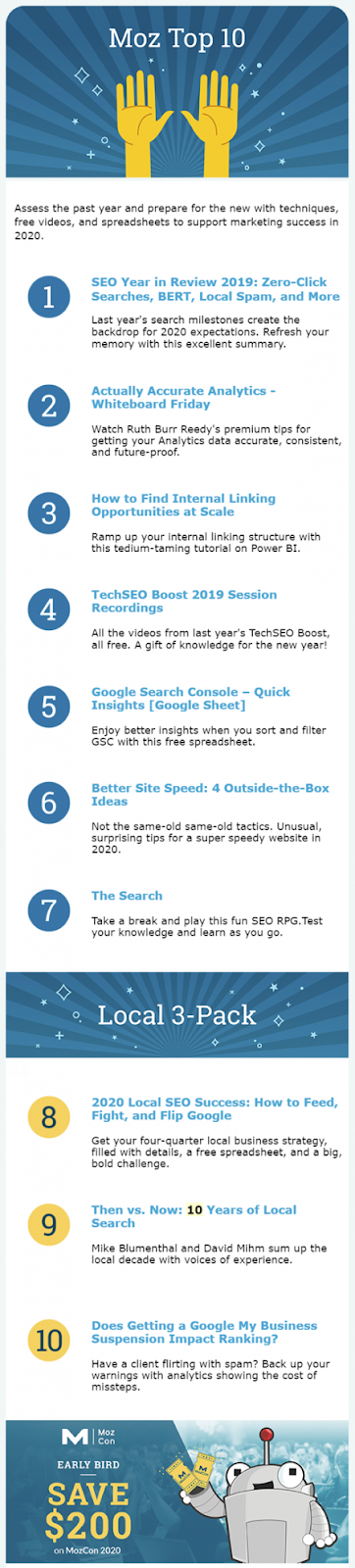
Stand-out elements:
- Curated Quality Content:
- Moz's strategy of listing the top 10 articles or resources is an excellent way to keep readers informed about the latest and most pertinent topics in the industry. Each entry is concise yet descriptive, allowing subscribers to gauge the relevance and importance of the content quickly. This curation reflects Moz's expertise, providing readers with confidence that they're getting a distilled version of the most significant industry happenings.
- Variety and Interactivity:
- Including diverse resources, from video sessions like "TechSEO Boost 2019" to interactive games like "The Search," showcases Moz's commitment to catering to various learning styles and preferences. By mixing traditional resources with more engaging, interactive content, they ensure that readers remain engaged and are more likely to explore the provided content further.
- Clear Value Proposition and Incentives:
- The newsletter not only updates readers but also offers tools and resources that can be directly implemented, like the "Google Search Console – Quick Insights (Google Sheet)." Additionally, the promotional segment at the bottom about an "Early Bird" discount serves as an incentive for readers to act and get involved with Moz's offerings, effectively driving potential conversions
The Hustle
The newsletter presented is from "The Hustle," a daily business and technology news platform that condenses vital information into bite-sized, digestible pieces. This edition, dated May 7, 2021, delves into the intricacies and value proposition of airline loyalty programs while also offering readers a mix of interesting tidbits and thought-provoking snippets.
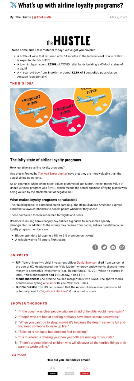
Stand-out elements:
- Engaging Big Idea Segment:
- The newsletter opens with a "Big Idea" section, focusing on airline loyalty programs. By leading with a captivating visual and a headline that poses a question, the Hustle immediately piques the reader's curiosity. The section provides key insights, like the surprising financial value of loyalty programs compared to actual airline operations. Such an approach not only educates but also offers a fresh perspective on a topic many might assume they're familiar with.
- Diverse Range of Content:
- One of the strengths of this newsletter is the diversity in content. Beyond the main story, there are "Snippets," which cover various topics from finance to sports and media, catering to a broad audience spectrum. This strategy ensures that even if a reader isn't particularly interested in the main topic, other sections might catch their attention, increasing overall engagement.
- Shower Thoughts for Engagement:
- Adding a touch of whimsy, the "Shower Thoughts" section offers quirky and contemplative statements likely to resonate with many readers, potentially becoming a talking point or even being shared on social platforms. This inclusion, while seemingly light-hearted, enhances user engagement and offers a delightful conclusion to the reading experience.
Product Newsletter Examples
Fridababy
The showcased newsletter is from "Fridababy," a company specializing in innovative baby and toddler products designed to simplify parental challenges. This edition is dedicated to introducing their new product, the "DermFrida Bath Mitt," aiming to transform bath times into a fuss-free experience for parents and their little ones.
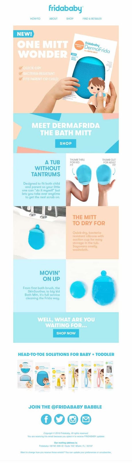
Stand-out Elements:
- Eye-Catching Visuals and Cohesive Design:
- Fridababy has effectively used vibrant, playful visuals that immediately draw attention to the new product. Using a child's illustrated hand juxtaposed with the actual product not only adds a fun element but also emphasizes the product's utility. The cohesive color palette, centered around the product's color, further accentuates the product and creates a visually appealing design that's consistent throughout.
- Clear Information and Benefits:
- The newsletter does a commendable job of highlighting the product's features, from being a "quick-dry" mitt to its "bacteria-resistant" nature. The segment "A Tub Without Tantrums" cleverly emphasizes the primary benefit for parents—making bath time a breeze. The succinct points give a quick overview, allowing potential customers to grasp the product's advantages at a glance.
- Comprehensive Product Range Showcase:
- Towards the end, the newsletter smartly showcases a range of their other products, reminding subscribers of their holistic approach to baby care. This not only reinforces brand recall but also encourages cross-selling. The invitation to "Join the Fridababy Babble" further promotes community engagement and brand loyalty.
The Body Shop
The featured newsletter comes from "The Body Shop," a globally recognized brand known for its ethically produced beauty and skincare products. This edition emphasizes their new avocado-themed body care range, showcasing the benefits of this natural ingredient while highlighting promotions and the essence of the brand's ethos.
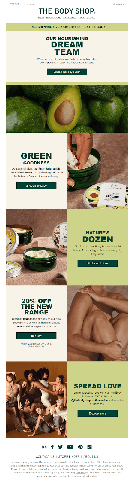
Stand-out Elements:
- Cohesive Thematic Presentation:
- "The Body Shop" has brilliantly leaned into the avocado theme, creating a visual treat for the eyes. From the prominent avocados to the green-hued product packaging, everything in the newsletter ties together seamlessly. This cohesive presentation not only emphasizes the natural ingredients of their products but also creates a memorable and distinct visual identity for this specific range.
- Clear Call-to-Action and Offers:
- Throughout the newsletter, there are clear and enticing CTAs. Whether it's the playful "Smash that buy button" for the avocado range or the "Buy now" for the 20% off promotion, each segment clearly guides the reader on what to do next. Coupled with attractive offers and promotions, it nudges potential customers towards purchasing.
- Emphasis on Brand Values:
- The "Spread Love" section at the bottom, featuring diverse models, is a subtle yet powerful nod to the brand's commitment to inclusivity and positive body image. By incorporating this imagery and message, "The Body Shop" reinforces its brand values, creating a deeper connection with its audience beyond just the products it sells.
Professional Newsletter Examples
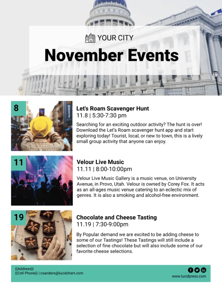
Your City
From interactive scavenger hunts to melodious live music sessions and delightful tasting events, the city is bustling with activities for locals and tourists to indulge in and enjoy.
Stand-out Elements:
- Clear Visual Cues and Structured Layout:
- The newsletter employs a clear and straightforward layout, a boon for easy readability. The dominant imagery of the city's iconic building sets the geographical context instantly. Dates are boldly highlighted, ensuring readers can swiftly pick out the timings for each event. The accompanying images for each event serve as visual cues, giving readers an instant feel of what to expect.
- Concise and Informative Descriptions:
- Each event's description is concise yet comprehensive enough to give readers a clear idea of the activity. The "Let's Roam Scavenger Hunt," for example, is not just presented as a fun outdoor activity but is specifically pitched towards tourists, locals, and newcomers alike, broadening its appeal. The "Velour Live Music" description mentions the owner's name and the venue's unique selling points, such as a smoke and alcohol-free environment.
- Call to Action and Accessibility:
- Strategically placed at the bottom, the contact information ensures that interested parties have a direct line to the organizers. An email address allows for easy communication, while the placeholders for address and phone number suggest that the newsletter would provide multiple ways for readers to reach out, enhancing user accessibility and interaction.
Webinar Newsletter Examples
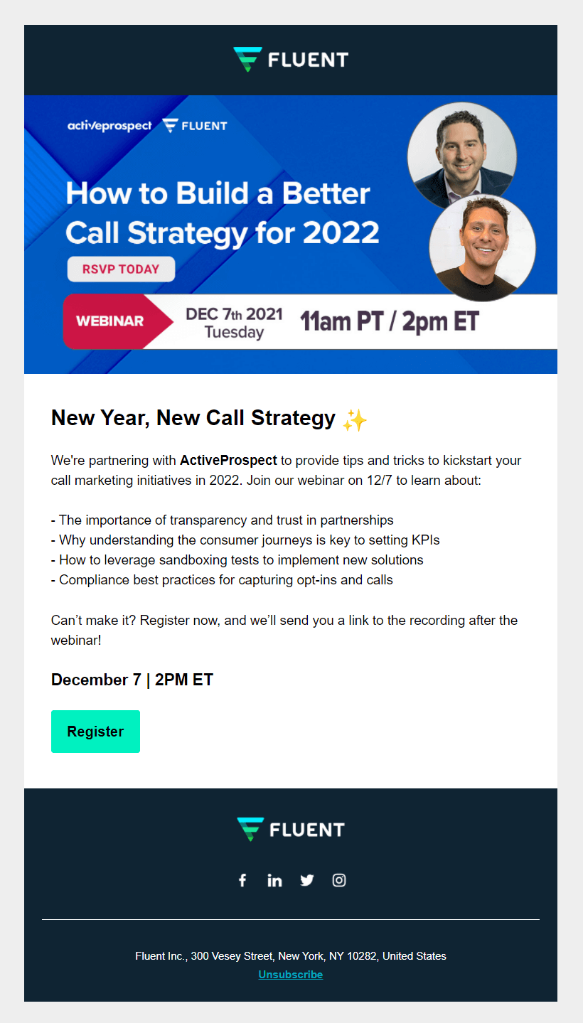
Fluent
This newsletter is from Fluent, a marketing company, announcing a collaborative webinar with ActiveProspect. This webinar aims to provide insights and strategies for building a superior call marketing plan for 2022, appealing to businesses and marketers looking to enhance their communication strategies for the upcoming year.
Stand-out Elements:
- Visual Clarity and Conciseness:
- One of the standout features of this newsletter is its clear, concise, and visually appealing design. The bold, catchy header "How to Build a Better Call Strategy for 2022" immediately captures the reader's attention. Including headshots of the speakers adds a personal touch, giving a face to the experts who will be presenting. The highlighted date and time ensure readers can quickly jot down the event in their calendars.
- Detailed Content with a Direct CTA:
- The newsletter does an exceptional job of detailing the webinar's objectives in a bullet-point format, which allows potential attendees to gauge the content at a glance. By touching on crucial points like transparency, consumer journeys, and compliance best practices, Fluent emphasizes the comprehensive nature of the webinar. The clear "Register" button is a straightforward call-to-action (CTA), prompting immediate registration. Additionally, the assurance that a recording link will be sent even if someone cannot attend the live session helps capture a broader audience.
- Transparent Communication:
- The footer section, which includes Fluent's address and an unsubscribe option, ensures transparency and adheres to best email marketing practices. It establishes trust with the recipients, showing that Fluent respects their privacy and their right to opt out of such communications.
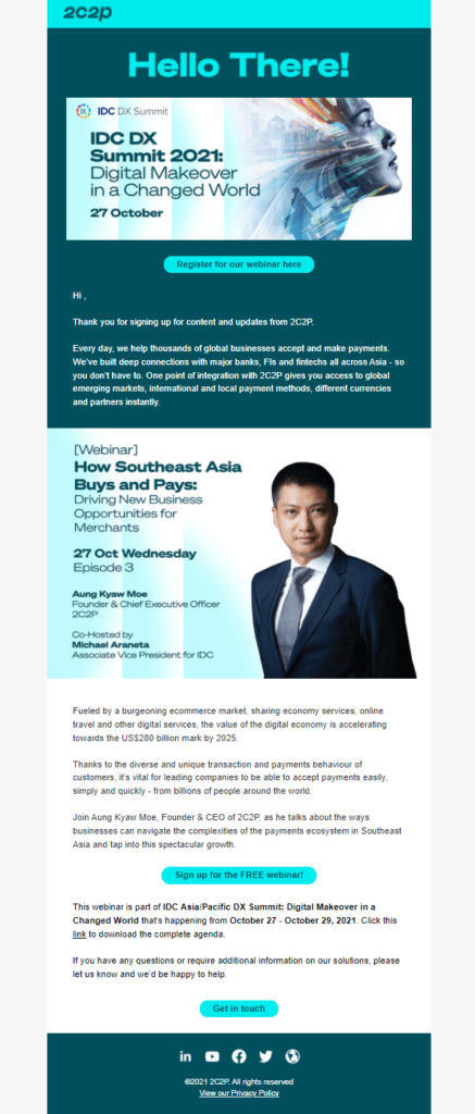
2C2P
By providing solutions that facilitate payments across diverse markets, 2C2P positions itself as a critical bridge in the digital payments ecosystem. This specific newsletter emphasizes their upcoming participation in the IDC DX Summit and a webinar centered around the buying and payment trends in Southeast Asia.
Stand-out Elements:
- Clarity and Segmentation:
- One of the standout aspects of this newsletter is the clarity it offers. Each section is distinctly separated, allowing for easy navigation. Whether it's the invitation to the IDC DX Summit or the details about the webinar, readers can quickly glean the primary focus points, enhancing user experience.
- Engaging Content and Value Proposition:
- The description of the digital economy's growth and the potential it holds for businesses is compelling. By highlighting numbers like the "US$280 billion mark by 2025," the newsletter taps into a sense of urgency and opportunity. Moreover, by showcasing their CEO, Aung Kyaw Moe, as the speaker for the webinar, 2C2P is subtly underscoring their expertise in the domain. The emphasis on the complexities of the payments ecosystem in Southeast Asia positions the webinar as a must-attend for businesses keen on tapping into the region's potential.
- Direct Calls to Action (CTA) and Accessibility:
- The newsletter doesn't merely provide information; it guides the reader towards specific actions. The "Register for our webinar here," "Sign up for the FREE webinar!" and "Get in touch" buttons are direct CTAs that foster engagement. Additionally, providing a direct link to download the complete agenda for the IDC DX Summit ensures readers have immediate access to detailed information.
Blog Newsletter Examples
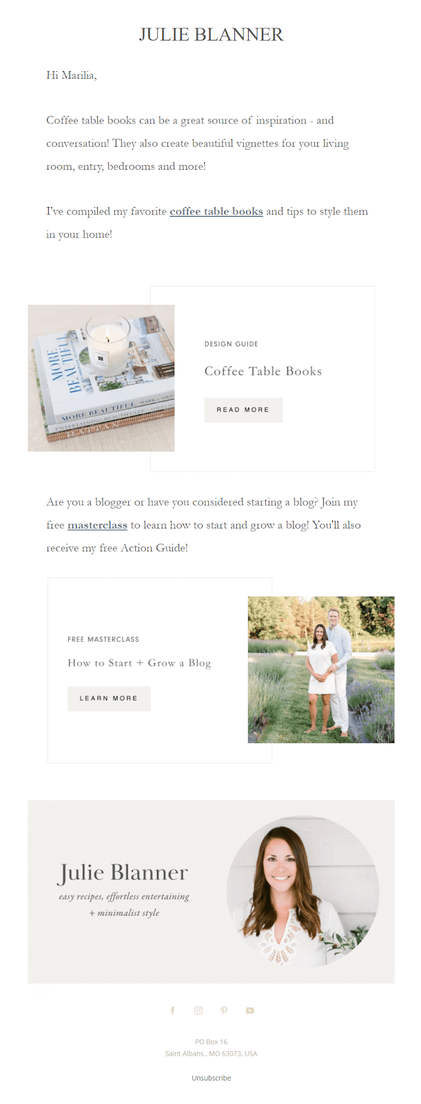
Julie Blanner
The newsletter in focus is from Julie Blanner, a lifestyle influencer known for her approach to easy recipes, effortless entertaining, and minimalist style. Through this newsletter, she introduces her readers to her favorite coffee table books and extends an invitation to her free masterclass on starting and growing a blog.
Stand-out Elements:
- Personal Touch and Relevance:
- One of the standout elements of this newsletter is its personal touch. Addressing the recipient by name ("Hi Marilia") creates an instant connection, making the reader feel individually acknowledged. Furthermore, by offering content on coffee table books, Julie provides value that aligns with her brand's aesthetic and resonates with her target audience's interests. This tailored content is crucial in capturing and maintaining the reader's attention.
- Visual Consistency and CTA:
- Julie's newsletter excels in visual consistency. The soft, muted color palette and the curated images reflect her brand's essence and the promise of "minimalist style." The images not only provide visual appeal but also offer a sneak peek into what readers can expect by clicking on the "Read More" or "Learn More" CTAs. Clear and concise CTAs encourage user interaction and lead the reader down a predetermined path, increasing the chances of conversion.
- Offering Value and Engagement:
- Julie's invitation to her free masterclass on blogging is a strategic move to engage with her readership further. By offering something of value, like a masterclass, she not only establishes her expertise but also fosters a deeper relationship with her community. Additionally, including her profile at the bottom, complete with social media links, ensures that readers have multiple avenues to connect with her and explore her content further.
Restaurant Newsletter Examples
Allset
This newsletter is from "Allset," a platform facilitating a seamless dining experience by allowing users to order meals ahead for dine-in or pickup. This particular communication promotes their "Takeout August" campaign, aiming to incentivize users with a daily $2 off on their pickups.
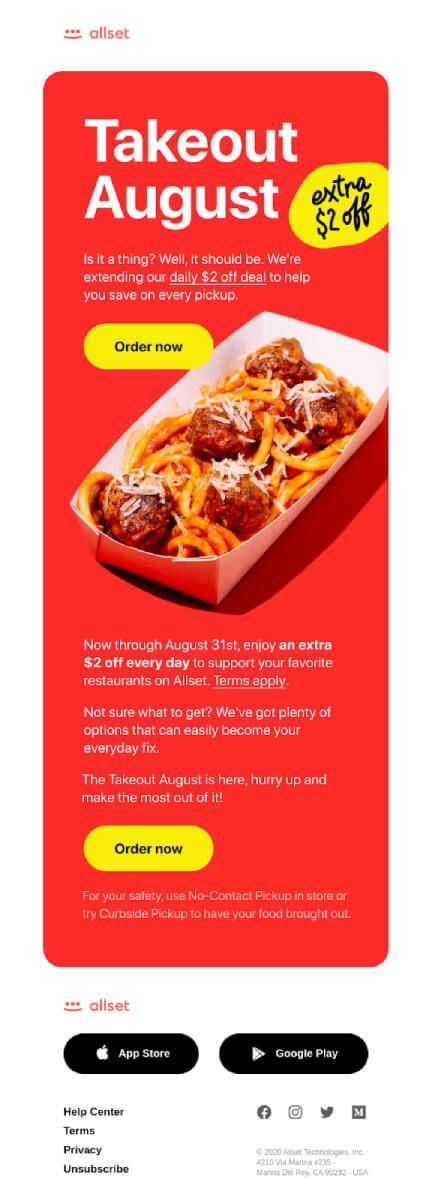
Stand-out Elements:
- Eye-catching Design and Clear Messaging:
- One of the primary strengths of this newsletter lies in its visually appealing design. The bright red background immediately captures attention, and the contrasting yellow emphasizes the promotional offer. The headline "Takeout August" followed by "extra $2 off" succinctly conveys the essence of the promotion. Furthermore, the image of a delicious meal not only tantalizes the taste buds but also gives a visual cue about the brand's service – offering delightful meals at a discount.
- Direct Call to Action and User Convenience:
- The newsletter uses multiple "Order now" buttons, strategically placed after introducing the offer and towards the end. This ensures that at any point if the user is convinced, they have an immediate way to act. Additionally, the mention of "No-Contact Pickup" and "Curbside Pickup" addresses current health and safety concerns, showcasing the brand's commitment to user safety. Such features can significantly enhance user trust and increase the likelihood of conversions.
- Integration of Mobile and Encouragement for Recurring Use:
- By displaying App Store and Google Play buttons, the newsletter encourages users to download the allset app, pushing for a more extended engagement. Coupled with the statement, "Not sure what to get? We’ve got plenty of options that can easily become your everyday fix," the brand subtly promotes recurring use, aiming to make their service a part of the user's daily routine.
Sweetgreen
The displayed newsletter is from "Sweetgreen," a brand known for its dedication to fresh, wholesome food offerings. Catering to the health-conscious and those who appreciate vibrant flavors, this particular communication emphasizes their summer-themed salads, reminding customers that summer is far from over.
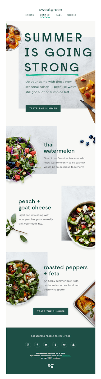
Stand-out Elements:
- Vibrant Visuals and Seasonal Relevance:
- The use of fresh, bright imagery in this newsletter not only emphasizes the freshness of the ingredients but also evokes a sense of the summer season. By stating, "Summer is going strong," Sweetgreen captures what many love about the season – the warmth, vibrancy, and extended daylight. This strategic play on the sentiment resonates with the audience, making them more inclined to indulge in the salads and extend their summer feelings.
- Detailed Descriptions and CTA:
- Each salad is accompanied by a brief, flavorful description that tantalizes the reader's palate. Phrases like "watermelon + spicy cashew" or "peach + goat cheese" are not just ingredients; they narrate a flavor story, hinting at the delightful contrasts one can expect. The repeated call to action – "Taste the summer" – is a compelling nudge, inviting readers to experience these flavor combinations for themselves.
- Brand Mission and Accessibility:
- Closing off with "connecting people to real food" not only reinforces Sweetgreen's brand mission but also subtly communicates their dedication to quality and authenticity. The inclusion of social media icons and their physical address enhances accessibility, giving readers multiple avenues to engage with the brand, whether it's for feedback, queries, or simply to follow their journey.
Company Newsletter Examples
Star Capital Bank
A renowned financial institution, Star Capital Bank, seems to be expanding its portfolio with a product that aims to benefit the globetrotters by offering them rewards, discounts, and perks for their travels.
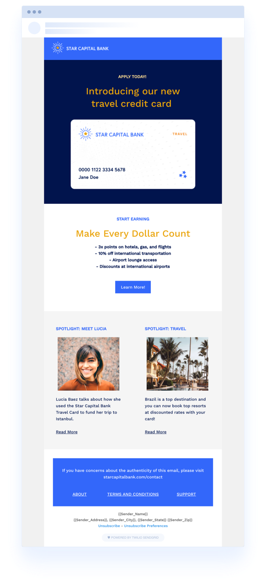
Stand-out Elements:
- Clear Highlight of the New Product:
- At the outset, the newsletter grabs attention with a vibrant visual of the travel credit card. Accompanied by the phrase "Introducing our new travel credit card," the positioning makes it instantly clear what the main focus of the communication is. This direct approach ensures that readers immediately understand the core message without distractions.
- Emphasis on Benefits:
- Rather than just listing features, the newsletter smartly emphasizes the benefits of using the travel credit card. The section "Make Every Dollar Count" details the rewards and perks cardholders can avail of, like 3x points on various categories and significant discounts. By outlining these tangible benefits, the bank effectively communicates the card's value proposition, making it more enticing for potential customers.
- Personal Stories and Destination Highlight:
- The spotlight sections, featuring Lucia's story and highlighting Brazil as a top destination, add a personal touch to the newsletter. Lucia's story offers a testimonial of sorts, detailing how the card benefited a real customer, which can resonate with readers and build trust. The Brazil feature, conversely, not only taps into wanderlust but also showcases how the card can be used for diverse travel experiences.
Create Email Newsletters That Stand Out With Beefree
In today's digital age, capturing your audience's attention is more challenging than ever. It is paramount to craft email newsletters that truly resonate and stand apart from the myriad of messages flooding inboxes daily. It is just as important to have the right tool to create email designs effortlessly.
That's where Beefree comes in.
Beefree offers 1,500+ customizable newsletter templates to fit your individual company needs. Our drag-and-drop editor makes it easy for anyone on your team to simply swap out content, add your branding, and export using your favorite sending platform. The best part? It's free. Happy designing!
9 Engaging Email Newsletter Design Tips and Ideas
When it comes to digital marketing, the tried-and-true email newsletter has proven to be a reliable communications tool for businesses of all sizes. Today, 41.5% of companies use email as a critical component within their marketing plans, and 81% of B2B marketers send email newsletters as part of their content strategy. Email is a proven marketing standard, and a newsletter is an easy way to communicate with customers, prospects, partners, or subscribers.
Despite the growing preference among consumers for receiving information via SMS and social media, email still reigns supreme, with 55% of consumers choosing to stay up-to-date with their favorite businesses via this channel. Email newsletters are one way to deliver engaging content through attractive designs while sharing valuable information with customers.
In this guide to engaging email newsletter design, we offer ten expert tips for designing engaging, creative, and thoughtful email newsletters to optimize engagement and elevate your brand.
How to Craft an Engaging Email Newsletter Design
Constructing an engaging email newsletter design requires a thoughtful blend of creativity, strategic know-how, and a basic understanding of best practices. Let's explore the world of email newsletter design and the elements that can make your campaigns stand out in a crowded inbox.
1. Newsletter layout and format: The Foundation
An email newsletter's layout and format serve as the foundational elements of your digital design. A clutter-free, well-structured format for newsletters helps improve readability and engagement with the content. The most crucial information in the newsletter should be at the top, with the lower body text neatly divided into sections using bullet points, headers, and sub-headers. We recommend a good amount of whitespace to improve readability and lend your newsletter a modern, minimalist feel.
The template newsletter uses a structured, clean format to highlight its content effectively, while eye-catching headings, colorful buttons, and well-spaced sections ensure a seamless reader experience.
2. Go Mobile or Go Home
Smartphones are everywhere and almost certainly in the hands of your email subscribers. Nearly half of all emails are opened each day on a mobile device, so ensuring compatibility is a must. Be sure your email newsletter is optimized for mobile with designed content, fonts, and CTA buttons that work effectively on a smaller screen for the best user experience.
To improve the reading experience on a mobile device, consider these design tips:
- Use a single-column layout to avoid the awkward side-scroll
- Keep the copy simple because no one likes to read a book on their tiny mobile screen
- Use standard fonts that are easily read on a hand-held device
- Keep colors limited and on-brand to avoid unnecessary eye strain
3. Typography Appeals to Readers
Fonts are essential in enhancing your email newsletter's visual appeal and readability. It’s best to stick to two or three fonts maximum – one for headlines, one for subheadings, and another for the body text. This approach ensures legibility and creates a sense of visual harmony.
When choosing fonts that readers will view online, experts recommend using a sans serif font like Arial, Helvetica, or Verdana. These fonts are the easiest to read and are most compatible with digital programs.
When designing an email newsletter for a desktop, it’s best to keep header text in the 22-24pt range and body copy between 14-16pt. Design your email using a responsive program, so the font size will adjust for a comfortable reading experience on mobile as well. We’d also recommend limiting the amount of text in your newsletter as much as possible so as not to overwhelm the reader. When you have a longer article to share, consider linking a teaser on your newsletter to the full article on your website.
Read more: How to Choose the Best Font for Email
4. What Your Colors Convey
Color psychology is a unique way to understand how colors can impact how someone feels. Did you know that your brand colors may have a certain emotional appeal to people? For example, research shows that black symbolizes power and status, green conveys wealth and relaxation, and yellow can make you feel optimistic or youthful.
It's essential to choose a color scheme for your email newsletter that resonates with your target audience psychologically. It’s also important to understand how your color choices could impact accessibility for those with vision impairments. However, you want the color scheme you choose for your emails to be consistent with your brand identity. This is important to ensure brand recognition and consistency.
The email template above is for a gaming audience. Notice how the use of color evokes a playful feeling and, alongside the layout, helps guide and engage the reader throughout. You can also see how the use of typography catches the reader’s interest.
Read more: 10 Creative Ways to Use Color in Email
5. Visual Perception is Everything
"A picture is worth a thousand words," even in email newsletters. Including relevant, high-quality images can enhance engagement levels and draw readers in. Make sure the images you choose thoughtfully reflect your brand identity and the message you are sharing. It’s also important that your email design is accessible and inclusive, staying consistent with your branding and themes. For example, the higher education template below uses images and icons to provide further context for the message and provides useful information about what the email is about with just a glance.
6. Capture Your Brand Through Tone and Copy
Beyond the look and feel of your newsletter, engaging copywriting is at the heart of your newsletter. Marketers should always strive for content that is not only valuable to the reader but interesting and personable. Use a tone that echoes your brand’s personality and write as though you’re speaking directly to the reader, making your content more relatable and human.
Read more: The Non-Marketer’s Guide to Writing Emails Like a Copywriter
7. Call Readers to Action
Well-crafted call-to-action (CTA) buttons guide your readers toward taking a specific action and engaging them deeper. Be sure your CTAs stand out, are compelling, straightforward, and meet accessibility standards. This includes making clickable areas large enough to be easily tapped and providing labels for links that screen readers can read. The email template below is an excellent example of how a prominent, clear CTA button can capture attention and invite action.
8. Consistency is Key
Consistency is the key to growing ongoing readership, from colors and fonts to imagery and sending schedules. The best times and days of the week to send your email are determined by when your audience is most active. Try testing a variety of times and days to see if one is better than another. Being consistent helps your readers to recognize your newsletters, fostering trust and brand loyalty.
9. A Newsletter Can Be Personal
It might surprise you that we suggest personalizing email newsletters, but the results speak volumes about why. Personalization can substantially improve engagement rates, with open rates improved by as much as 50%. Leverage your subscriber data to tailor content, subject lines, or images to individual readers, making your newsletters more relevant and engaging.
BONUS: Use Email Newsletter Design Templates to Get Started
If you're overwhelmed by the idea of starting an email design from scratch, Beefree's email newsletter design templates are a quick and efficient solution. These templates provide a great starting point for designing engaging newsletters with proven structures and designs you can customize to suit your brand, or they can be used for newsletter design inspiration or newsletter format ideas.
An engaging email newsletter design blends style, content, and user experience. With Beefree, you can customize email newsletter designs to your heart's content, mixing your creativity with the best practices discussed in this article.
Why wait? Start designing today with Beefree, and let your newsletters do the talking.
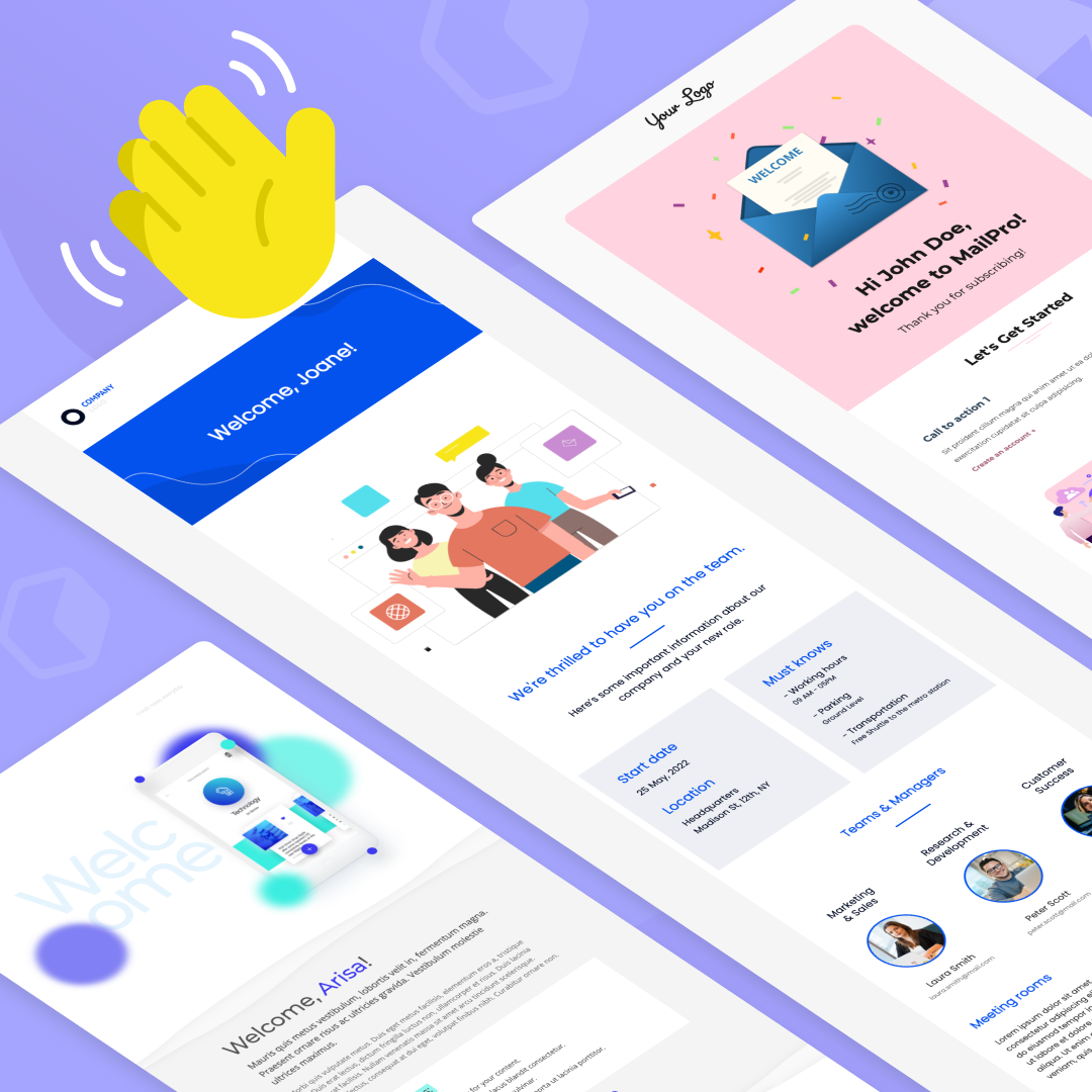
SaaS Welcome Emails: 7 Examples and Best Practices
A SaaS welcome email is like the opening act of a grand opera; it sets the tone, introduces the main characters, and creates an air of anticipation.In other words, it’s the very first point of interaction between your business and a new customer or prospect. Hence, its impact on customer engagement, retention rates, and the overall trajectory of the customer relationship can be significant.Research indicates that welcome emails generate 320% more revenue per email than other promotional emails. So, we're not merely discussing an introductory email here; we're exploring a crucial aspect of your customer engagement strategy.Simply put, welcome emails matter because they are an opportunity to make a strong first impression, onboard new users effectively, and start building long-term customer relationships.
The Essential Elements of Welcome Emails in SaaS
Creating a unique, engaging, and effective SaaS welcome email requires a careful blend of several key elements. Understanding these elements can empower businesses to formulate emails that resonate with their customers, therefore improving engagement and customer retention.Let’s review them.
Eye-catching subject line
The subject line is the precursor to the email body. It is the first aspect of the email that recipients see and plays a pivotal role in determining whether the email is opened—so an effective subject line needs to grab the recipient's attention immediately. A great subject line incorporates personalization or highlights an enticing offer to increase open rates.
Personalization and Tone
The tone of your welcome emails plays a significant role in determining how recipients perceive your brand.Personalized emails create a more intimate interaction, leading to increased customer engagement. This can range from simple techniques like using the recipient's name throughout the text or more advanced methods such as targeted content based on customer behavior.A friendly tone that aligns with the brand's image also makes emails more relatable and helps build trust, increasing the chances of long-term email engagement.
Relevant and Clear Call-To-Action (CTA)
The call-to-action (CTA) in your email is your guiding light for customer engagement; it directs your customers toward the desired outcome of the email.A relevant and clear CTA is one that aligns with both the content of the email and the overall objectives of your brand, with a direct, concise message that tells the recipient exactly what to do next.For instance, if the purpose of your email is to encourage a new user to begin using a feature of your SaaS product, your CTA could be "Start Using Now!" This CTA is relevant because it directly ties into the content of the email, and it's clear because it tells the user exactly what to do without overcomplicating anything.The CTA should be prominently placed within your email design, ensuring it catches the recipient's eye. A great way to do this is by using contrasting colors to make the CTA stand out. Above all, always ensure that your CTA text is compelling and clear.
Concise Messaging
The age-old adage, "less is more," indeed holds for email communication. The body of your welcome email should be concise, delivering only the most pertinent information to your reader.First, introduce your SaaS product and its primary value proposition to the user. Second, if there are important features that the user should know about to get started, highlight these briefly.Consider what your recipient needs to know to achieve the desired action and convey that information in as few words as possible. Does your user need to understand a specific feature of your software? Or perhaps they need to be reassured about your data security measures? For example, if your product is a project management tool, explain how it helps in task organization or team collaboration.Third, reassure your users about important aspects such as data security or customer support, if applicable.By condensing this information into crisp, clear sentences, you not only improve the readability of your email but also guide your recipients toward the desired action effectively. This approach ensures you deliver value while respecting your users' time.
Branding and Design
Consistent branding in your welcome email is essential for building brand recognition. Leveraging your brand elements, such as logos, colors, and fonts, can create a familiar and consistent experience for the customer.More importantly, a well-designed, aesthetically pleasing email reinforces your brand image, building customer credibility and trust.
Mobile Optimization
As more and more people adopt mobile devices, adapting your welcome emails for mobile platforms is a necessity. Ensuring that your email design is flexible, with accurate displays across a range of screen sizes, will make your communication accessible and user-friendly—regardless of the device being used.Read: Email Design for Mobile: Best Practices to Take Your Email Marketing Up A Level.
Successful Examples of SaaS Welcome Emails
Now that we've covered the importance and essential elements of SaaS welcome emails let's delve into real-world examples and templates provided by BeeFree. These examples demonstrate how top SaaS businesses utilize welcome emails effectively to drive customer engagement.
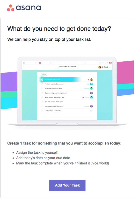
Asana Emphasizes Benefits
Asana’s welcome email is a testament to their understanding of users’ needs. The line, "What do you need to get done today?" instantaneously highlights the product’s value proposition.Within the email, they briefly outline the core features and advantages of using Asana, such as task management and project tracking, maintaining brevity while still demonstrating clearly their benefits.The prominent 'Add Your Task' CTA prompts users to take the next step and use the application. And the overall tone of the email feels friendly, helpful, and hopeful of their organizational day ahead with Asana.
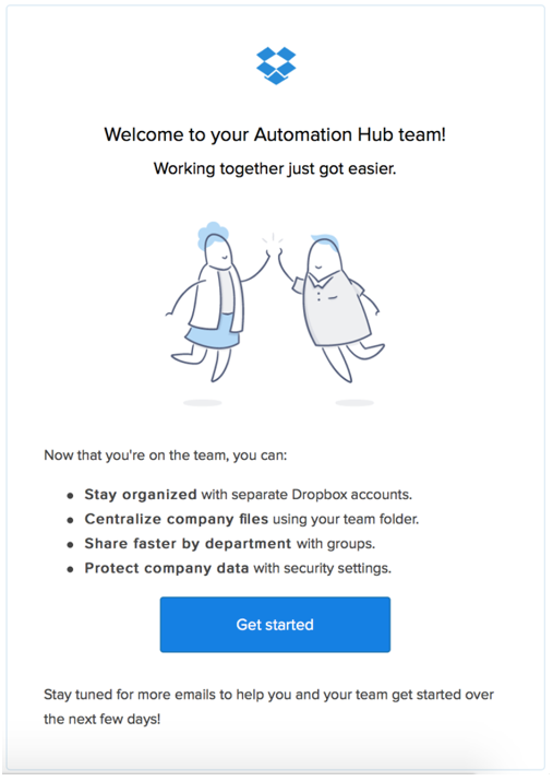
Dropbox Displays the Power of Simplicity
Dropbox employs the power of simplicity to its advantage. Their welcome email stands out because of its minimalist design and straight-to-the-point content.The email immediately offers a 'Get Started' CTA button, directing users toward their first interaction with the product.Additionally, they provide a brief rundown on using Dropbox and provide the reader with clear next steps of what’s coming in the next few emails. The direct, uncomplicated approach reduces friction and eases the onboarding process for users.
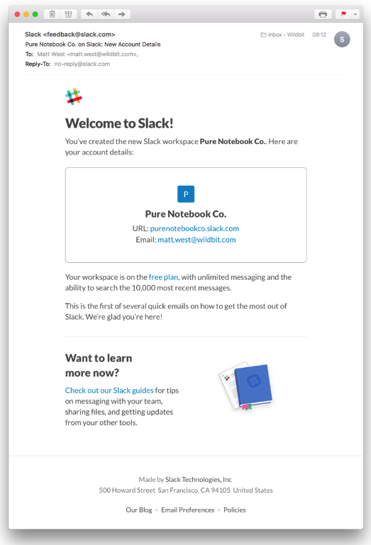
Slack Leverages Personalization
Slack's welcome email use of simple yet effective email personalization. The email begins with a friendly greeting, addressing the workspace name created by the user. It then proceeds to provide a personalized URL for the user's workspace, which not only offers convenience to the user but also plants the seed of a unique, tailored experience—encouraging them to engage further with Slack.
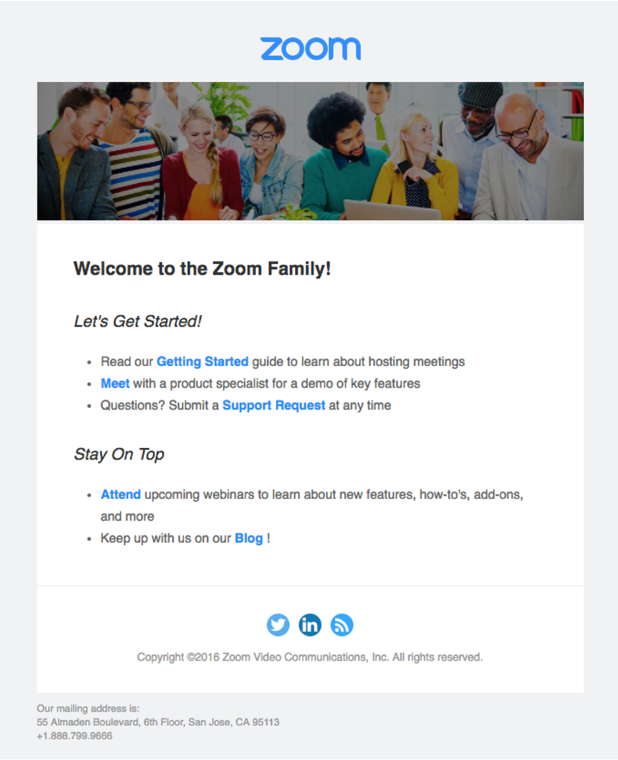
Zoom's Guided Assistance
Zoom’s welcome email provides new users with a comprehensive starting guide. The email is thoughtfully structured, presenting users with various resources such as training webinars, video tutorials, demo invitations, and support links. This approach not only eases the onboarding process but also emphasizes Zoom's commitment to user success. By offering these resources right in the welcome email, Zoom ensures users can smoothly transition into using their platform.
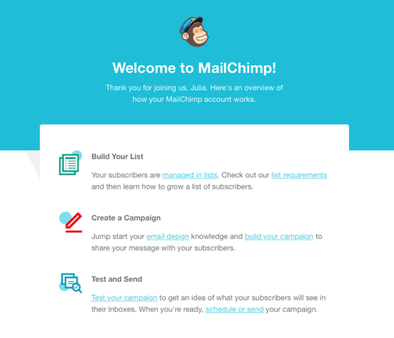
MailChimp Builds Connection
MailChimp’s welcome email establishes a warm, friendly connection with users from the start. The email begins with a personalized greeting, followed by a brief introduction to their services. They discuss the ease of creating campaigns with MailChimp and guide users to create their first campaign through several CTAs. This approach is effective in making new users feel valued and excited about their journey with MailChimp.
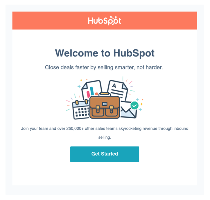
HubSpot Offers Resources
HubSpot keeps content itself to a bare minimum but speaks loudly with the few lines it does include in its welcome email. Brief lines like “Close deals faster” and “250,000+ other sales teams skyrocketing revenue” summarize the product’s key points while still encouraging action. This approach conveys HubSpot's desire for users to succeed and get the most out of their services, which can increase user engagement and long-term retention.
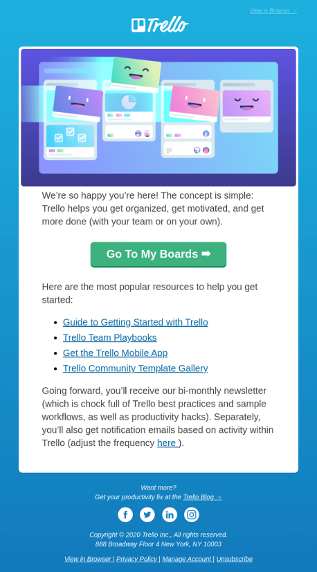
Trello Embraces Visuals
Trello's welcome email stands out with its visually appealing layout and vibrant colors. It delivers a concise yet informative message, guiding users on how to get started with their first board and introducing key features. Through its visually engaging design, Trello effectively conveys its brand persona of simplicity and creativity, setting the stage for a positive user experience that encourages exploration and productivity.
Start Creating Your Eye-catching SaaS Welcome Email with a Template
Creating an effective welcome message from scratch can seem daunting. Thankfully, using a premade email template can help make the process smoother and quicker. Templates help with the heavy lifting of having to identify what to write and where. A great email template should be easy to edit. be engaging, and offer guidance on the content.
Beefree’s SaaS Welcome Email Template
BeeFree's own SaaS welcome email template serves as a prime example of an engaging and well-designed welcome email. It features a simple yet eye-catching visual design, a space to insert personalization, and a brief section to list off features—all elements a SaaS business needs to provide a seamless onboarding experience. The best part? All of Beefree's templates are mobile-optimized to save you time and effort.
Get the Most Out of Your SaaS Welcome Email
The welcome email plays a pivotal role in setting the tone for your customer relationship and should be treated as an opportunity to establish your brand’s voice and personality. As simple as it might seem, that means it’s one of the most important pieces of content you can produce for your SaaSSo, be sure to remember these key elements when writing a winning email: Make sure it is eye-catching, personalized, concise, and mobile-friendly. Use these tips, get inspired by the examples, and make the most out of your welcome emails to foster successful customer relationships.Ready to get started? Check out Beefree’s library of email templates for more inspiration or dive deeper into welcome email design examples.
Creating An Effective Email Sign-up Form: 6 Expert Design Tips
In the dynamic landscape of digital marketing, an email sign-up form serves as an instrumental tool in fostering connections between businesses and audiences.
As a precursor to long-term customer relationships, an email sign-up form fuels lead generation and enables businesses to personalize communication based on user preferences.
Here we'll explore the essential elements of an effective sign-up form, from design to copy to layout, supported by real-life examples and industry best practices. As well as discuss strategies to engage subscribers post-sign-up.
How to create a high-converting email sign-up form: The key elements
Crafting an email sign-up form that guarantees conversions hinges on assimilating key elements into your design. Here are six essential elements supported by industry statistics. Note that these aren't exhaustive but are a great foundation to begin with!
Simplicity
Simplicity is the cornerstone of any high-performing email sign-up design. Fewer fields translate into less work for a user, leading to higher sign-up rates. In fact, statistics reveal that reducing form fields from four to three can boost conversion rates by up to 50%.
It's important not to confuse simplicity with a lack of detail and clarity. For example, we don't want to keep the customer from important information (such as privacy details) for the sake of simplicity. Still, we don't need to include the entire Terms & Conditions on the sign-up page (this can be appropriately linked).
CTA Button
The Call-To-Action (CTA) button is another common element of a sign-up form. Making the CTA button stand out using a contrasting color can enhance conversion rates by 14.5%.
Read: What's the best CTA button color for emails?
Privacy Statement
Users are growing increasingly conscious of data privacy. A privacy statement offering assurance of data safety can increase form fill-outs by 19%.
For extra security, you can also include a double opt-in email. This email is sent automatically to your new subscribers with a link to confirm the email address. By doing this, you can highlight your commitment to subscriber consent and ensure email addresses have been entered correctly!
Incentives
Giving incentives act as persuasive agents for users to sign up for your emails. This could be in the form of a freebie, discount code, or free trial. But really, any content that is not accessible to those who have not signed up.
Google found that 90% of customers will share their email for an incentive, so it's highly likely to reap more rewards than any incentive will cost.
Design and Placement
The visual appeal of a sign-up form and its strategic placement on your website can significantly influence user interaction.
For example, forms placed above the fold tend to capture significantly more leads than those placed below, as customers generally lose interest fast.
You can also create a pop-up form that appears after a certain period or when you visit a certain number of pages on the site. Just ensure these don't "pop up" too quickly, or it can put potential subscribers off!
Testing and Monitoring
A/B testing and performance tracking of your forms can reveal critical insights. Businesses with a clear testing and monitoring strategy can generate up to 45% more leads.
Design Elements in Practice: Email Sign-up Form Examples
Now, let's explore some noteworthy examples of the best sign-up form practices.
These email sign-up forms have been chosen to highlight specific design, copy, and placement strategies for you to utilize, but of course, they are not exhaustive! We recommend researching your competitors and favorite brands and using this list as a guide for what to look for when aiming for a lead into a newsletter subscription email.
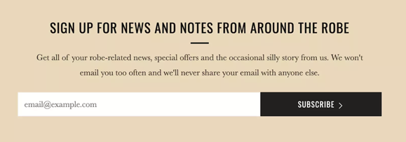
Using Minimalistic Design: Highway Robery
Highway Robery showcases how minimalism can lead to a compelling sign-up form. Their approach of "less is more" results in a design that's straightforward and free of clutter, allowing the user to focus on the sign-up process without unnecessary distractions.
They also use the contrast of black on the peach to make the CTA stand out, effectively guiding users to complete the sign-up.
It's got an engaging text that includes a brand-related pun and one input field, and the form contains no images, so the engaging copy is the main attention-grabber here.
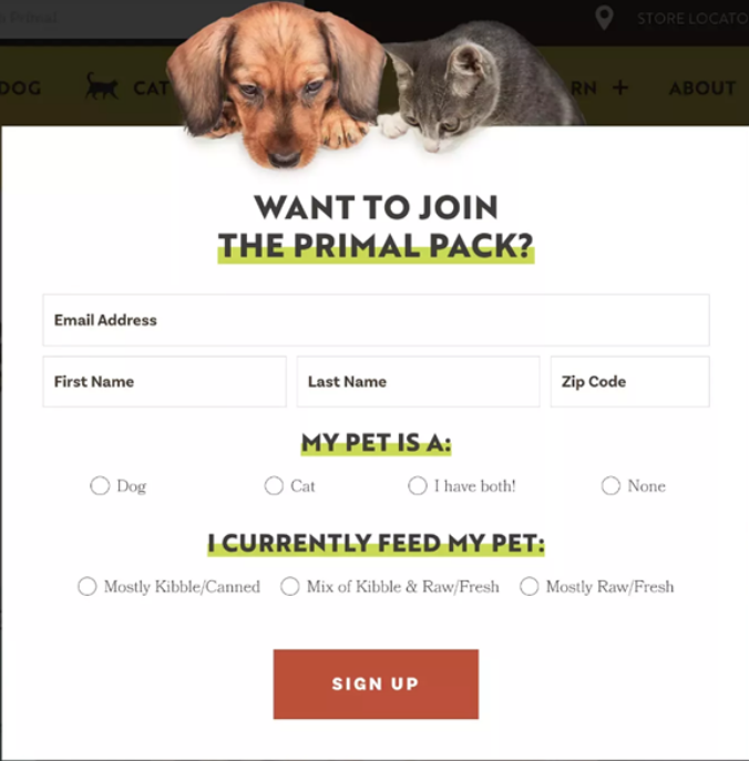
The Power of Visuals: Primal Pet Foods
This sign-up form exhibits the power of engaging visuals. By pairing creative imagery with a simple form layout, they create a connection between their brand and the user's emotions.
This emotional engagement can boost conversions significantly. In fact, compelling visuals have been shown to increase user engagement by up to 94%.
Also, note the volume of information this sign-up form example requests. Alongside the email, they ask the subscribers for their name, zip code, and pet-related info. While this may seem long, they have cleverly utilized the UI and made two-question check circles much easier and quicker than writing and more likely to get responses!
This allows them to collect valuable customer information and tailor further communications effectively.
Providing Value Upfront: Sherwood Media Snacks
This sign-up form cleverly highlights the value proposition by promising a "3-minute newsletter with fresh takes on the financial news you need to start your day". They clarify what subscribers will gain from signing up, providing an immediate incentive.
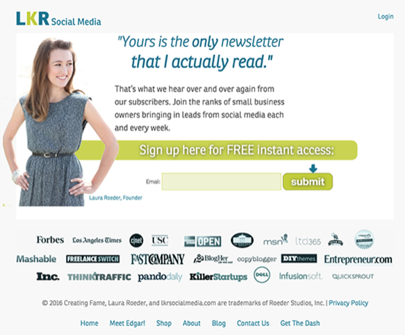
Using Social Proof: LKR Social Media
LKR Social Media includes a quoted testimonial on their sign-up form, leveraging the power of social proof.
This establishes credibility and enhances trust, which can significantly increase sign-ups. 92% of consumers trust user-generated content more than traditional advertising.
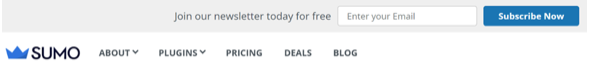
Integrating an email sign-up form: SUMO
SUMO integrates its sign-up form into its homepage layout and utilizes the above-the-fold method mentioned earlier. This seamless design can increase sign-ups as it does not disrupt the user experience and feels like a natural part of navigation.
Engaging Your audience beyond the email sign-up form
An effective email sign-up form is a fusion of design aesthetics, user psychology, and strategic thinking. And if you've made it this far, you're one step closer to transforming your sign-up form into a powerful lead-generating and customer-engaging tool.
The next step is to maintain their interest and engagement. An excellent way to initiate this engagement is by sending a welcome email. Welcome emailshelp generate 320% more revenue per email than other promotional emails.If you're ready to get started, explore our catalog of thousands of templates to help you attract, maintain, and nurture your audience. Happy designing!
How to Create Order Confirmation Emails for Repeat Sales
A strong, on-brand, and engaging experience is everything in e-commerce. Digital communications become the central focus of your brand’s marketing efforts without a face-to-face opportunity to win online customers. That's where an order confirmation email comes in.E-commerce merchants report that as many as 80% of sales will likely come from only 20% of your customers because they return repeatedly.While a digital experience with your audience begins when they first land on your website, they become repeat customers based on the impactful experience you provide after purchase. A confirmation email, more than just a receipt, is your opportunity to engage the customer - let us show you how!
What is an Order Confirmation Email?
Now that we’ve hyped up confirmation emails, I guess it’s time to explain what an order confirmation email is.In short, it’s a transactional receipt sent to acknowledge an online purchase. An electronic confirmation of purchase is important if you’re the customer; it legitimizes the purchase and provides the next steps (and peace of mind).So, what do brands stand to gain from sending transactional emails? This type of communication is an opportunity to build excitement over the purchase—a way of building and nurturing your relationship with your customers.And, of course, a great way to earn valuable repeat business is by introducing additional products or services.Typically, an order confirmation will contain the following:
- Order confirmation number
- Description of what was purchased
- Cost and payment information
- Shipping and delivery details
- Links to your return policies
- Customer service contact information
Features of the Best Order Confirmation Emails
The best order confirmation emails will go beyond the basic nuts and bolts listed above. Here are some additional features of an excellent order confirmation email.
Mobile-Friendly Design
According to Shopify, shoppers will make nearly half of all e-commerce purchases using a mobile device by 2024. People are shopping on their phones, which means they’ll also be looking for that order confirmation email on their smartphones. Mobile-friendly design is a must-have for order confirmation emails if you’re serious about winning repeat business. Read the blog: Email Design for Mobile: Best Practices to Take Your Marketing Emails Up a Level
Brand Voice
It will take more than sending a receipt to excite a customer. Help them see who you are and the value you bring by spicing up your email content with a brand voice. For example, you can integrate voice into graphics or add some delightful intro copy to your email. While the goal is to keep this email reasonably short, it’s still important to create separation between your brand and others.
Call-to-Action
If your ultimate goal is to drive repeat business and engagement, we’d recommend including a call-to-action for the customer to take the next step with you. So what is the next step?
- Cross-sell: show them other products they may like to purchase
- Up-sell: show them how to make their purchase better
- Referral: ask them to share your brand with others for gifts.
- Subscribe: promote newsletter or email sign-ups
- Engage: promote downloading your mobile app
- Reward: provide a coupon for use on a future purchase
- Feedback: ask them to complete a survey or leave a review
Email Subject Line
According to HubSpot, order confirmation emails have the highest open rate at 65%. Of course, this should be expected as the customer wants to confirm and review their order to ensure they were charged appropriately and that the purchase will arrive on time. Because there is great value inside the order confirmation email, it’s essential that the subject line clearly describes what’s inside. Here are a few ways to go about this:
- Administrative: Order #83627193 is confirmed.
- Thank you: Thank you for your purchase!
- Confirmation: Review your purchase
- Engaging: We’ve got your order!
Learning From an Order Confirmation Email Template
If you’re new to order confirmation emails or want to revamp your existing ones, consider using an order confirmation email template. Using a template can save you time when it comes to finding the right layout, sections to include, and overall design of the emails.BEE’s templates are designed with the customer in mind and follow email design best practices, including mobile-friendly layouts. Using our drag-and-drop interface, you can fully customize the email to match your branding and voice.
Examples of Order Confirmation Emails
Here are a few examples of order confirmation emails we love!
Amazon
If you’re one of the millions of Amazon customers, you’ve seen this before. Amazon keeps things short and sweet. You can easily see what was ordered, your total, and when it is expected to arrive. Some stand-out components are the large “view or manage order” button that allows customers to make changes with ease should something need to be edited. The “suggested products” section is also a great use of personalization and encourages repeat purchases.
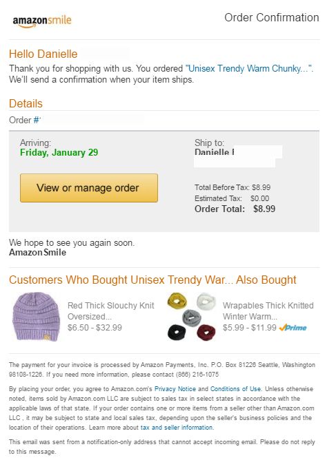
Source: https://www.pinterest.com/pin/144607838013729735/
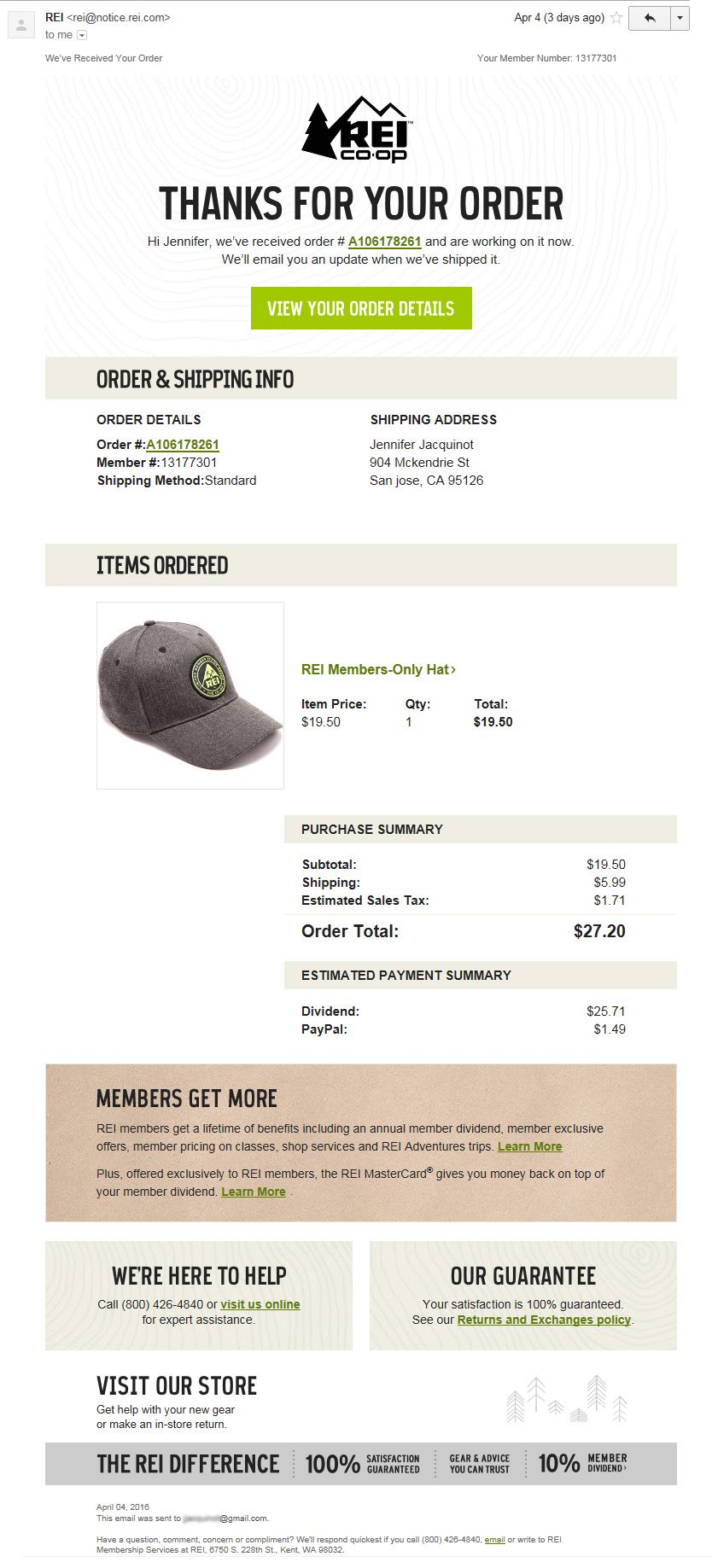
REI Co-op
REI’s order confirmation email is well-branded and easy to read. They’ve chosen to use the bottom of this order confirmation email to promote their membership and credit card programs. One stand-out component that encourages brand loyalty is the REI difference statement which promises a 100% satisfaction guarantee, offering peace of mind to customers with each purchase.
Source: https://www.pinterest.com/pin/70437474160298/
Order Confirmation Email Best Practices to Consider
The next time you send an order confirmation email, remember that there is more to it than a simple Leverage the high email open rate with the opportunity to cross-sell or grow customer loyalty and drive return sales. Don’t forget to include some elements of your branding. A great place to start is with a well-designed email template, like those available from BEE.
Design A Student Onboarding Email From Start to Finish Using Beefree
There are various ways that your university can leave a lasting first impression on incoming students. A great example is orientation day/week. This event typically starts a few weeks before the academic year begins. It is an effective way to get students to meet their classmates and teachers, tour the campus, and experience a small glimpse of the next four years. Undoubtedly, this is an important step in getting students excited and engaged. But what if there was a way to emulate this excitement far before orientation?
The onboarding process for a student is crucial in how they will feel coming into your university. How you handle the onboarding process determines how safe and secure a student feels about their decision and their willingness to engage in university activities such as clubs, volunteering, and even their classes.
Most universities miss that student onboarding begins the moment they decide to attend their institution. So, how can you create a student onboarding experience that gets them excited from Decision Day and beyond?
Student Onboarding Emails
An affordable and effective way to create an impactful student onboarding experience is through emails.
An impactful onboarding email is a great way to welcome students to college and communicate important information that prepares them for success and excites them about the journey ahead. Frequent and resourceful communication allows students to feel sure about their decision, which supports student retention and engagement rates.
Beefree makes creating on-brand email sequences easier for higher education marketers by providing optimized and mobile-friendly email templates.
But, before digging into your email’s design, let’s discuss the best way to get started with a student onboarding college newsletter.
Before designing, establish your goal.
The first step to creating email communication is to identify who the audience is and what information they need. Next, consider your goals for communication in the example of a college student onboarding email. When thinking about goals, also think about the types of content that would help you achieve them.
- Student Orientation - provide helpful campus information like facility hours, building policies, and available student resources.
- Engagement - build community by sharing information about upcoming activities or social events.
- Retention - ensure students have a great start to the year by sharing tips for success in the classroom and how to make new connections.
What goals does your email marketing team have? Strategizing them and listing them out can keep everyone on track for building a successful student onboarding college newsletter.
Let’s get to design.
Start from scratch or use an email template.
Beefree makes email communications a breeze for higher education email marketers.
Choose an existing template or create a new one from scratch. There are pros to both!
Beefree templates are professionally designed with your audience in mind and optimized for conversion. By starting with an existing template, you don’t have to worry about identifying which sections your audience needs, which layout, or where to add images and personalization. Simply drag and drop your unique content into the template and change style guidelines to ensure you stay cohesive with your university’s brand identity.
If you’re going the template route, start here: Higher Education Template Collection.
By “starting from scratch,” the possibilities are endless. Beefree gives you the unlimited design freedom to create fully customized email experiences by adding brand images, campaign videos, gifs, and more.
Email Design Best Practices for Using Beefree
Beefree allows anyone to design emails with ease, regardless of experience. Our intuitive builder is easy-to-use and requires minimal time to get the hang of it. Here are a few features that will allow you to get the most out of Beefree.
- Style settings - Whether you’re starting from scratch or using a template, start by setting your style guidelines into Beefree. Add your universities color palette, font systems, buttons, icons, and even select your desired width for emails and pages to get an easy start to design.
- Image library: Upload and keep your universities campus, faculty, and event images in one place so that everyone can access them easily when creating future emails or landing pages.
- Saved rows: Once you’ve built your repetitive content blocks, such as footers and headers, save them and reuse them for next time!
- Synced rows: Great for saved rows that need to be regularly updated, such as menu bars, social links, and terms and conditions. All changes made to a “synced row” will auto-populate in all other templates where that row lives, saving you time and minimizing errors.
Double Check Everything on Mobile Design Mode
Okay! So you’ve customized your email or template to your liking and saved your rows for next time. Now it’s time to test it on mobile.
85% of people open emails using their smartphones; therefore, it’s crucial that all emails are built with mobile in mind.
Beefree offers Mobile Design Mode to help you visualize exactly how your content will be shown on mobile.
A PRO tip is to toggle between desktop and mobile while designing to save time and make changes as you go
With Beefree, any changes to the below elements will only be applied to mobile mode for an optimized mobile experience:
- Alignments
- Button widths
- Paddings
- Spacer heights
- Text sizes
- Reconfiguring of elements
- Hiding elements
The best part about using Beefree for designing mobile-friendly emails is that there is absolutely no coding required.
Read: Email Design for Mobile: Best Practices to Take Your Email Marketing Up a Level
Collaborate with your team.
You’ve completed your email. Now it’s time to get feedback from your team. Simply begin the review process using our “Request for Approval” feature. The flow will then guide you and your team toward a fully on-brand and approved student onboarding newsletter.
This feature is available for Enterprise customers only, but Free and Team plans can still enjoy seamless collaboration by:
- Using “Send Test” to send your email designs to team members and request feedback.
- Provide comments within the email builder.
- Customize user and permission settings to let team members edit content (or not).
Engaging your whole marketing team to create a memorable student onboarding experience has never been easier.
From an Email to a Landing Page, Easy.
Once you have your email designs done and approved, it’s time to create additional assets that allow you to create a cohesive onboarding experience. Landing pages are a great way to expand the information included in your emails and further create an impactful onboarding experience for incoming students.
With Beefree, you can convert any email into a one-page landing page with just one click. From there, you can easily adjust the layout, content, and CTAs.
Start Designing Your Student Onboarding Emails With Beefree
The best part? It's free to get started.Create student onboarding email sequences, orientation day invitations, course reminders, and so much more. Sign up now!
A Guide to Crafting an Inspirational Welcome Message for Students
Today’s incoming higher education students are part of Generation Z. Meaning that when it comes to choosing the right university for them, they are likely to turn to online sources.When searching for the right university online, Gen Z looks for disruptors and organizations that reflect their personalities and values.Gen Z’s knowledge of technology and familiarity with social media makes them more likely to research their options online versus past generations. Nearly half of Gen Zers are online “almost constantly.”Because of this, your goal as institutional marketers should be to ramp up digital communications. Email is a great way to spur interest in your university and show them why you’re the right fit for them.Now you may be wondering…
Is Email Marketing Effective in Higher Education?
Email marketing remains a popular channel for communicating with Generation Z. Not only does it have a strong ROI with an average return of $44 for every $1 spent, but 85% of Gen Z prefers email over other forms of communication.With 58% saying they check their inboxes multiple times daily, there is ample opportunity to engage incoming students via email to get them excited about choosing your university.A well-written and designed welcome message is the perfect way to start a new relationship. It can help the student feel connected, encouraged, and your educational institution.So, how do you design an inspiring welcome message for students?Continue reading for some of our best practices in email marketing for higher education.
Crafting an Inspirational Welcome Message for Students
A welcome message is a meaningful way to set the tone for an engaging and successful long-term connection. For the best result, make sure your emails have a nice balance between valuable and inspiring content.For instance, when sharing information like campus resources, sprinkle in a hopeful message reminding them of their bright future.Welcome emails are emails with the highest open rates –86% higher, in fact. It’s the first impression, so make it count.To deliver a high-performing welcome message, it’s best to segment your content based on where the student is in their onboarding journey.For instance, a student majoring in science may require a lab coat and safety goggles, while a math major needs an advanced calculator. Understanding the student’s needs will help you to provide the most relevant and valuable information.
Best Practices for Designing a Welcome Message
There are many best practices to consider when designing an impactful welcome message for students.
1. Personalization
Create an instant connection with incoming students by personalizing messages for them. For instance, personalized subject lines make recipients 26% more likely to open your email.Our PRO tip?Go beyond the subject line. Include relevant information about the student, such as their current school, a potential field of study, or graduation date, using dynamic content to help establish relevance and personalized experience.
2. Clear and Concise Messaging
Research shows you have about eight seconds to capture the attention of Gen Z. This means emails need to be focused and easy to understand. Use bullet points, short paragraphs, graphics, and callouts to create interest in your email content.
3. Attention-Grabbing Email Design
Similar to keeping the messages clear and concise, images should be visually appealing and layouts easy to navigate. Remember that many Gen Z’ers will most likely check their email on a smartphone, so ensuring images and layouts are optimized for mobile is very important to engagement.If you’re not a professional email designer or need a little inspiration, check out the template catalog available on our website for a variety of easy-to-use and visually appealing email layouts.
4. Highlight Key Benefits and Opportunities
When writing email content, including the “what’s in it for me” angle.This would include the key benefits and opportunities the student will have by engaging with your educational institution. You can showcase the unique resources, extracurricular activities, or academic programs your university offers that set you apart.
Examples of Successful Welcome Messages You Can Copy ;)
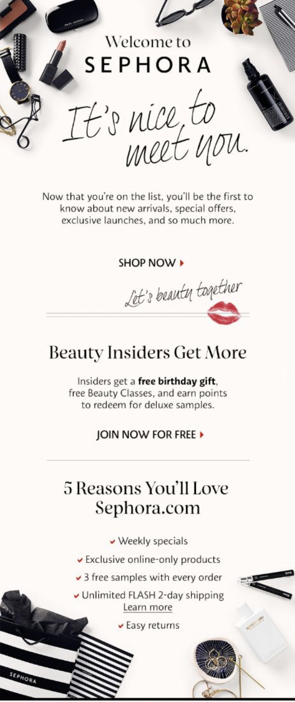
Many businesses and organizations use welcome messages to engage prospects or new subscribers. It’s important to start new relationships off on the right foot. Here are some examples of welcome emails we like.This email by Sephora uses white space and a fun font to capture attention. It’s well branded using Sephora’s signature black and white designs but has a few splashes of red for a pop of color that guides the eye downwards. The content does a great job of expressing the benefits of shopping at Sephora from a "whats in it for me" angle.
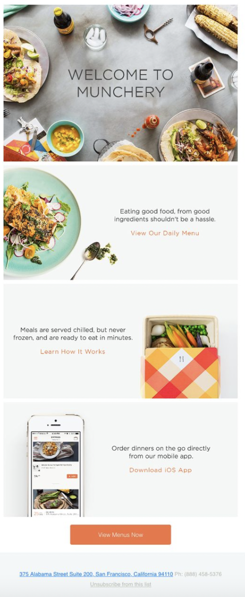
Source: https://www.pinterest.com/pin/123145371052121884/In this welcome email from Munchery, they use big, colorful images and a clear call-to-action. The CTA is a bright orange color that dramatically stands out.The content is short and sweet not to overwhelm the reader, and there is a good amount of whitespace.Universities can follow a similar idea by using engaging images to pull the reader in, while not overwhelming them with too much content within the email. Consider how images could be used to inspire feelings, like how Munchery makes us hungry!
Source: https://www.pinterest.com/pin/6966574414809343/
Optimizing Your Email Marketing Strategy
Once you’ve drafted your welcome message, remember the work has just begun. Now it’s time to test and refine the message over time to improve student engagement and action.Consider these additional ways to optimize your welcome email:
- Build a segmented list to incorporate more personalized messages
- Incorporate A/B testing to continually improve your message
- Analyze post-send data to refine messages and targeting strategies
- Improve the efficiency of your marketing program with tools and resources like marketing automation software or BEE Pro that can help streamline email design efforts.
Get Started with BEE Pro to Design Welcome Messages for Students that Inspire
There is no question that email marketing is alive and well with the upcoming generation of students. Ensure you build inspirational and captivating email campaigns, starting with strong welcome messages, to grow long-lasting and successful relationships.Design beautiful emails using best practices and mobile optimization quickly and stress-free with BEE Pro!
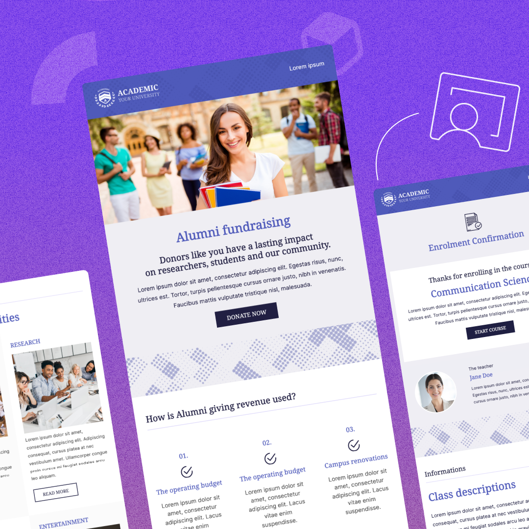
5 Email Design Tips for Alumni Engagement to Increase University Fundraising
In 2021, U.S. colleges and universities raised an impressive $52.9 billion toward their fundraising goals. Alumni donations accounted for 23% of that total, showing just how important strong alumni engagement is for a university's success.So, how do universities use the money donated by alumni?
- Maintain operations
- Offer scholarships
- Improve/update technology
- Support specialty programs, such as study abroad and athletics
- Revitalize campus facilities
- Fund research programs
Higher education institutions rely on donations to support their everyday operations and to be able to give back to the students through events, tools, resources, and courses. Coupled with the changes in the workforce and mostly digital society, funds acquired help universities provide students the latest software and technology, setting them up for success.
5 Tips to Increase Alumni Engagement Using Email
Statista projects businesses will send more than 375 billion emails daily by 2025. This means that any email communication you send to alumni must command (and keep) their attention.
We Know You Hear This A Lot, But Write Compelling Subject Lines!
The subject line is truly the most important line of copy in an email. Why? Because it helps alumni decide whether they want to open the email or not.A great subject line evokes an emotion, elicits curiosity, and at times, makes them laugh. But most importantly, emails for alumni serve as reminders of why they love their Alma Mater.Here are some tips for writing an attention-grabbing subject line.
- Keep it short: you should grab their attention with as little as 40-50 characters.
- Don’t sound spammy: even though you may want to give away a free item in exchange for a donation, don’t use “free” in the subject line, or your message could go to spam.
- Ask a question: use a question to remind them of a college memory, like cramming for a test in the library.
- Create a sense of urgency: remind them students need their support now for the upcoming year
Besides keeping it short and clear, here are some additional elements (with examples you can steal) to create a subject line that gets alumni to open:
- Draw curiosity: – trust us, you don’t want to miss out on this
- Urgency: One day left to make a difference!
- Belonging: We couldn’t have done it without you
- Personalized: , your help is needed
Use Personalization to Connect with Alumni
As we mentioned before, email inboxes are busy places. Personalization is an excellent way to get alumni to engage. When scrolling through the list of unread emails, readers are more likely to click on an email that calls them out personally.In fact, research shows personalized content engages readers. It improves open rates by 11% and clicks by 27%.When using personalization, consider what you know about your audience to generate successful email campaigns. Some personalized fields include:
- Name
- Last gift amount
- Donation history
- Graduation class
- College field of study
Use this information to interest readers beyond a simple “Hello, John.” We recommend weaving personalized details throughout the message to strengthen the idea you’re trying to communicate.Here are some ways to integrate personalization into a fundraising message:
- Thank you for your gift of [$10,000] last year.
- We appreciate the generous donations coming from the .
- Your support is helping to keep the department thriving.
Web is Dead: Optimize Email Content for Mobile Devices
Up to 41% of emails are opened on a mobile device, surpassing desktop (39%). While that might not seem like much of a difference, we will continue to see a spike favoring mobile in the coming years.This means that if your email is not optimized for mobile, you could be delivering less-than-stellar experiences for alumni. Always make sure that it is easy for alumni to complete the desired action.Here are some essential items to consider when optimizing your messages for mobile.
- Make the design feel app-like: use short amounts of copy and big buttons to take action.
- Use small file sizes: attention spans are short, and readers won’t wait for images to load.
- Use a large font size: no one wants to squint at their phone!
Don’t be Shy! Ask for a Donation.
When it comes to email marketing, beating around the bush won’t get you very far.A call-to-action is a direct statement leading the reader to take a desired step.Calls-to-action should be displayed as a large button or a highlighted link that the reader can easily click on.And if you’re too shy, we get it - there are various ways to ask for money without saying “Give Now” or “Donate Now.”After all, if every email you send says “Give Us Money Now,” alumni will eventually stop opening them. It’s good to change things up now and then to maintain engagement.Here are some options for inspiring call-to-action phrases.
- Make a Difference
- Donate Online
- See the Impact
- Support Students
- Leave a Legacy
- Join Us!
Remember, the alum audience is already invested in your university and wants to help in whichever way they can. A clear call to action makes it clear to the reader exactly how they can help.
Design Matters!
Inspire action in your university’s alums with engaging and strategic email design. Some ways to use design to level up your fundraising emails are:
- Send branded emails with university colors and logos to improve the legitimacy
- Incorporate images and videos in emails to evoke past college memories
- Use a layout that’s easy to navigate and write short copy
- Use an attractive and attention-grabbing color for call-to-action buttons
Great email design delights the reader and sparks memories of the fun they had in college. Feeling reminiscent of positive experiences can contribute to a larger sense of camaraderie with today’s students.One way to do this is to show them how their contributions are supporting current students in creating memorable, community-building experiences.Include photos or videos of life on campus, events, scholarship recipients saying “thank you,” or new equipment being used in class to relay feelings of gratitude and inspire future giving.
Increase Alumni Engagement With BEE Pro
Designing engaging alumni fundraising communications and newsletters has never been easier using BEE Pro. Our easy-to-use, mobile-responsive, drag-and-drop editor will help you follow email best practices to drive donations and alumni engagement.Start designing your university fundraising efforts using one of our free higher education templates made with conversion in mind.
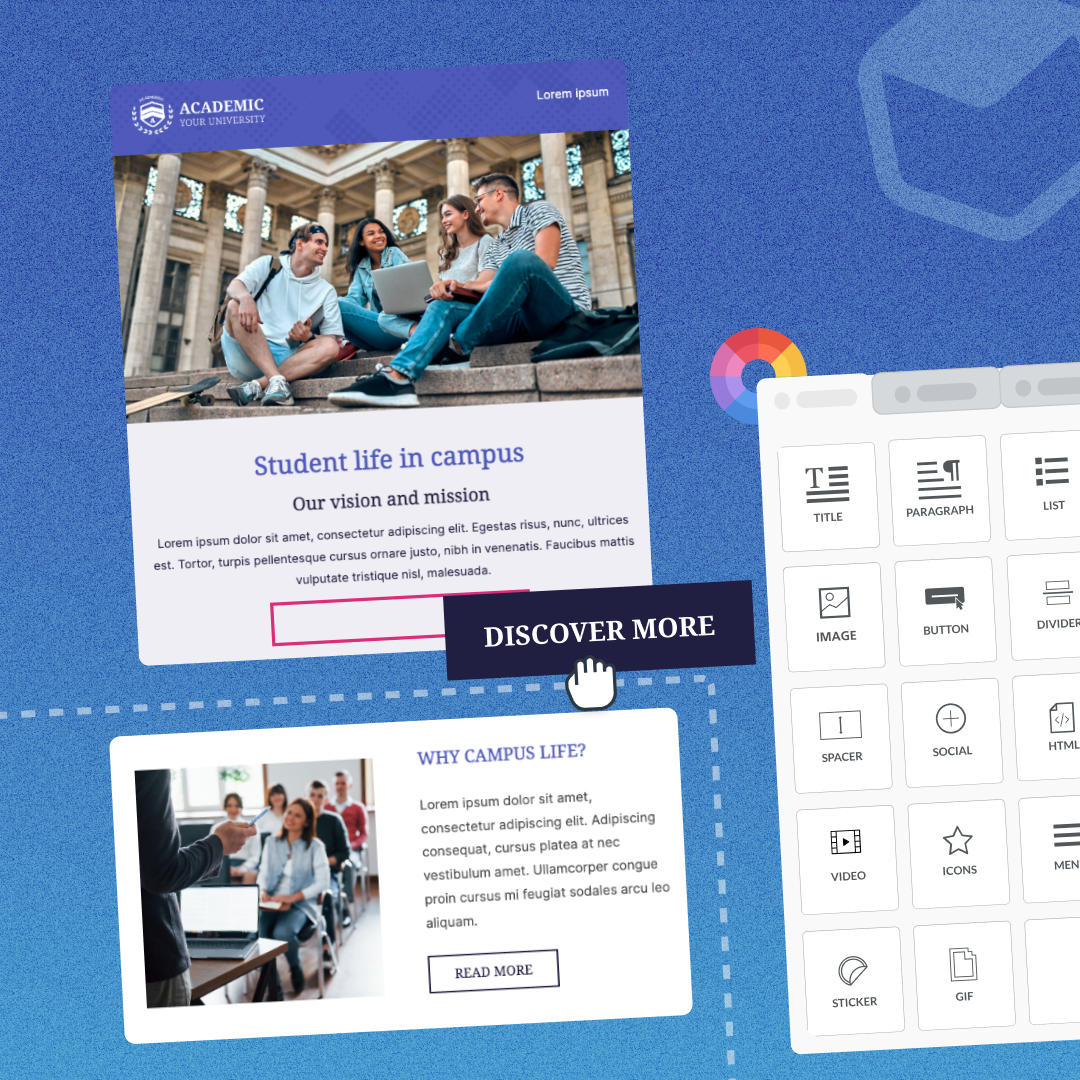
How to Drive Student Engagement Using Personalization in Email
If you look close enough, you'll find that most places serve you with a personalized experience. Like how Starbucks asks for your name when ordering, and Amazon recommends similar products you may like based on previous purchases. In recent years, even personalization in email has entered the marketing world with the development of dynamic email content and emojis.
Without even noticing it, personalization has become another thing we've grown accustomed to, making it harder for businesses to stand out. While digital needs have developed over time for many of us, Gen Z is different.
Gen Z spends more than eight hours a day and grew up with these "personalized experiences." They expect digital delivery in everything—education, communication, and marketing. And not just digital communications but engaging, thought-provoking, human, and well… personalized-to-them, digital communications.
So the question is, how can universities use personalization in email by leveraging what they know about them to increase student engagement?
Universities need students to be engaged. Students support universities in every stage of the recruitment process. Students are the best marketing tool. Incoming students look at factors like student retention rates, job placement, and academic achievement, all of which suffer if students become disengaged.
The future of the university relies on engaged students.
Understanding Personalization in Email
Today's consumers expect personalized email content, and 76% get frustrated if expectations aren't met. Consumers know that their time is valuable and that you need them more than they need you. When content is not personalized for what suits their needs or anticipates their desires, they'll probably feel disappointed or annoyed if they even open your email. The same can be said for students.
Email personalization is essential for communicating with Gen Z and the college population because they are looking for convenience and ease above all. They want to have all the information they need at their fingertips.
Beyond that, they want to feel taken care of. It's important to students that their university provides them with precisely what they need to succeed. And, of course, because not every student is the same — this is where personalization in email comes in.More than 80% of Gen z say they're more likely to choose a brand that personalizes content. The same can be said for whether or not they engage with their university.
Here are some ways your university can benefit from increased online student engagement with personalization:
- Improved open rates and response rates
- Boosted enrollment
- Streamlined online processes
- Enhanced emotional connections with students
- Better referrals and future giving
Knowing Your Audience for Effective Email Personalization
Segmenting an extensive email list into smaller groups is a best practice among email marketers that higher education professionals can easily apply to their marketing efforts.
Segmentation enables you to provide a more customized message that will resonate better with each smaller group of students.
In fact, brands that rely on email segmentation and personalization have seen revenue increase by up to 760%.
Now the question is, how can colleges collect this information?
A simple common practice is asking for it on your website's basic interest form or sending an automated survey once students accept the university. Some examples of segments could be:
- Areas of study: Each area of study could receive personalized emails on networking opportunities, jobs, and internships.
- Special interests/activities: You could share upcoming events or clubs depending on the student's interest.
- Dorm: You wouldn't want to send information about Dorm F to Students in Dorm A. Segmenting this group ensures that all the information you share applies to each student.
- Year in school: This helps deliver specific information about graduation, orientation, new-student activities, etc.
Email Personalization Inspiration
We’re big fans of showing, not telling. Here are a few ways brands use personalization to inspire your next student body email.
In this email from United, they use personalization to remind travelers about their upcoming vacation. Along with providing a clear CTA to book their next vacation. This email helps travelers keep United top of mind next time they think about a vacation.
You can follow a similar strategy in your higher education emails to inform students about specific classes or activities a student participated in or remind them to register for next semester’s classes. This email could provide all the details, like due dates, and links to the next steps. Like United, you want students to keep this email in mind when registering for events/classes.
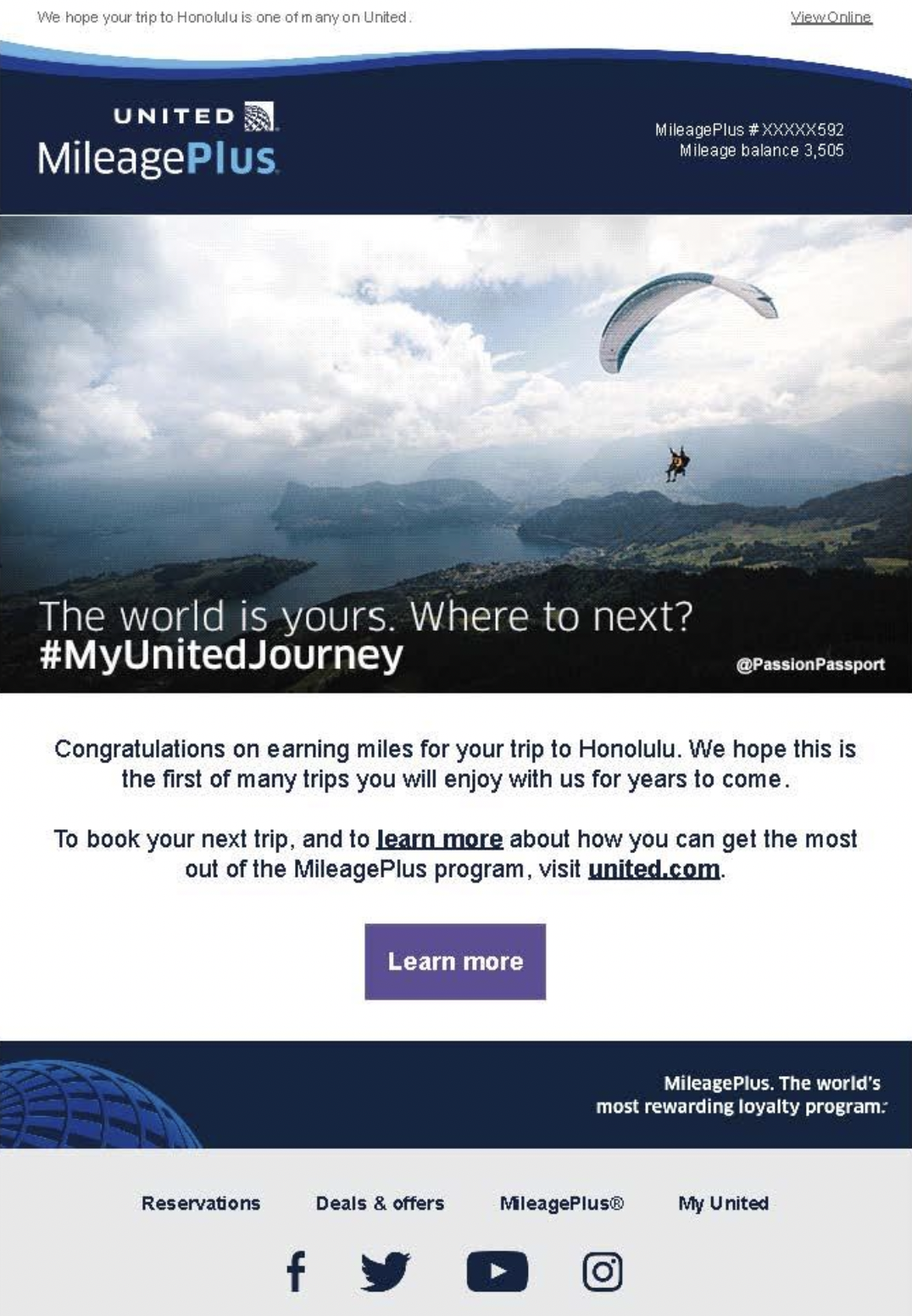
In this email from PetSmart, they use personalization by including information about this specific customer. For instance, the use of their email in the top right corner. Couples with the display of how many points they have until their next reward and information about their "pet family." They even take it one step further by asking for more information about the customer's pets. Perhaps to even further segment their list and therefore create more personalized emails.
A fun way to incorporate this into your higher education emails is by reminding students of how many credits they need until graduation and personalizing information about classes they’ve taken or professors they’ve had.
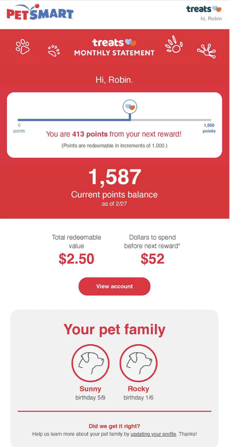
Crafting Personalized Subject Lines and Greetings
The subject line is the most crucial part of the email—it persuades the reader to open it, so don't forget to use personalization in the subject line when possible. Consider writing email communications as if you're writing to a close friend. This comfort level will help the recipient feel more closely connected with your school.Here are some ways to personalize a subject line to maximize email engagement:
- Lead with their name: , we hope to see you at orientation!
- Connect with their interests: 3 ways our rock
- Notice their graduation date: Only days left until graduation!
Using Dynamic Content to Personalize Emails
Rely on your marketing automation platform or CRM to deliver fully personalized email experiences using dynamic content. Systems offer a variety of ways to personalize email content. With these functions, you can replace entire paragraphs of text, images, etc., based on information stored in a recipient's profile.The email example above from PetSmart featured two dog icons with the names and birthdays of the pet family. Through dynamic content and segmentation, PetSmart creates a personalized email experience for this customer.Some technology-savvy schools have taken dynamic content further, includingpersonalized videosin emails! Personalization puts the reader into the story—helping them to envision themselves at the university. Gen Z is a high consumer of video content, making them the perfect target demographic for this type of effort.
Personalizing Calls-to-Action for Increased Student Engagement
Another way to increase student engagement in communications is to personalize the call-to-action (CTA). The CTA is your invitation to the reader to take the next step, whether applying, contacting you to schedule a visit, or completing a survey.To create a compelling, personalized CTA, keep the reader in mind. How can you connect with them emotionally using the information you have collected about them? A great example if to use "I" or "My" in the copy to make the button more intuitive for the reader.Here are some examples of personalized CTAs.
- Start now,
- Apply for
- I want to join!
- Yes, I'll share my insights.
BEE Pro Email Templates for Higher Education
Connecting with the students of Gen Z requires new, engaging means of communication. Email personalization provides them with an experience tailored to their unique needs and interests and allows them to feel cared for and connected with their university.BEE Pro allows higher education professionals to design on-brand, customized emails quickly and easily. A great example of BEE Pro in action, Dwayne Rice, Senior Associate Director of CRM Engagement and Digital Marketing from USC Marshall School of Business.Rice uses BEE Pro to create personalized emails for his 11 graduate programs to communicate with potential and current students and alumni.Start from scratch or use one of our ready-to-useHigher Education templates. Either way,get started for freeand happy designing!
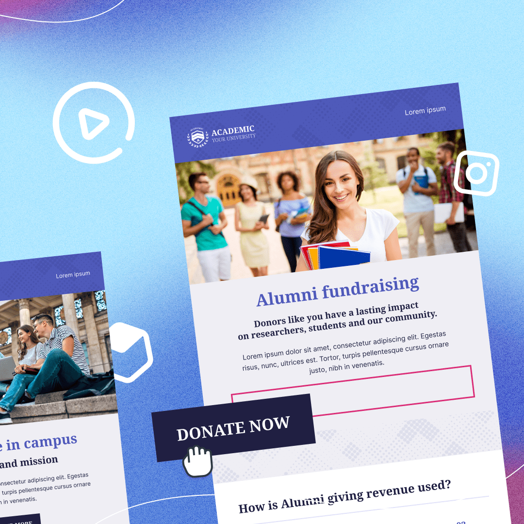
6 Tips for Designing a Great College Newsletter
The higher education industry encounters numerous challenges in the process of designing a great college newsletter. Challenges such as, struggling to keep up with the rapidly advancing technology in email marketing, contenting to limited resources, and ensuring that the campaigns are both relevant and engaging for their wide range of target audiences.The truth is, emails have evolved from simply being a form of communication to a tool for universities to establish connections with students, potential recruits, alumni, and their own internal teams.It's no longer enough to send simple text-based emails; now, the higher education industryhave to strive to ensure their messages are read and opened amidst increasing competition.Keep reading for email design ideas from professionals across different industry that you can implement today to design a great college newsletter.
1. Include Upcoming Events
"Make sure to include upcoming events on the college campus. When people read newsletters, it's nice for them to feel like they have things to look forward to. It also makes them feel like they're in an environment where there's always something fun or interesting going on. This lets them continue to look forward to receiving your newsletter."Maegan Griffin, Founder, CEO, Nurse Practitioner , Skin Pharm
2. Incorporate Images and Videos into Your Emails
"Incorporate images and videos into your college newsletter to make it visually appealing and engaging for readers. Images and videos break up text blocks and add interest to your newsletter, so it’s more likely readers will read all the way through. Additionally, images and videos illustrate your point or visually tell a story, so your audience better understands your messaging.When using images and videos in your newsletter, use only high-quality images that are relevant to your topic. Otherwise, you wind up distracting readers from the messaging rather than help them comprehend it."Matthew Ramirez, CEO, Rephrasely
3. Include Topics Readers Enjoy
"Newsletters usually suffer from low open rates because they fail to address the needs of their audience.This often happens with college newsletters because faculty assume students are solely interested in scholastic topics. College newsletters rely as much on marketing psychology as any business email campaign does.Your first step should be sending out surveys to collect data on students' interests. Then, infuse these topics into your newsletter in the form of content pillars. By weaving in the student body’s ongoing interests—clubs, campus events, or sponsored job opportunities—you'll instantly see an uptick in your open and click through rates."Brian Nagele, CEO, Restaurant Clicks
4. Try Black and White Design
"One tip for designing a great college newsletter is to consider using black and white design elements. Black and white visuals can provide a clean, modern look that will draw readers in and help make your content more readable. This way you can draw readers’ focus toward the content, rather than eye-catching color or images.It’s also important to make sure the layout is organized, with a hierarchy of headings and subheadings that naturally guide readers through the content.Try using a grid-based design to ensure that all elements and texts are in the appropriate place on the newsletter. This breaks up the monotony of a black and white composition, making it more engaging for readers."Shaun Connell, Founder, WritingTips.org
5. Make the Layout Easy to Navigate
"One great tip for designing a college newsletter is to make sure that the layout is easy to navigate. When it comes to layout, simplicity is key. Use easy-to-read fonts and spacing, and limit the number of different typefaces you use.Breaking your content down into digestible chunks and using headings and subheadings will help your readers quickly scan through the information. Add images and graphs that’ll break up the text and add interest, but make sure they’re relevant to your topic. You also want to be careful about how much information you include—newsletters can quickly become overwhelming if you try to pack in too much information."Kate Wojewoda-Celinska, Marketing Manager, Spacelift
6. Ensure Your Emails Are Accessible
I would ensure that your newsletter is accessible to individuals with disabilities across all devices.Responsive design is when a website or email newsletter is correctly rendered on a variety of platforms, including desktop, mobile, and tablet. Making responsive newsletters is essential as more people read their emails on mobile devices.Thankfully, there are several email marketing platforms available that make it really simple to create flexible newsletter designs.Alice Hall, Co-Founder & Creative Director, Rowen Homes
Design a Great College Newsletter using BEE Pro
The higher education sector is facing increasing difficulties in creating impactful and engaging email campaigns. With the evolution of technology and shifting design trends, higher education institutions must work harder to achieve their goals through email marketing.To address these challenges, it is crucial for these institutions to look to other industries for inspiration and stay current with the latest design trends.BEE Pro, a collaborative email builder, provides a solution to these difficulties. With access to the most recent design trends and over 1,500 templates designed for conversion, higher education institutions can easily create emails for various audiences, such asstudents, recruits, or alumni’s. BEE Pro's latest feature, "synced row", takes email creation to the next level. This feature allows for effortless and seamless updating of your design systems such as -- headers, footers, social links, and menu bars across all templates.Simply make changes to a row in one template, and those changes will automatically "sync" in all other areas where the row is used. This helps keep designs consistent, accurate, and on brand. To learn more about the "Synced Row" feature, watch the video below.https://youtu.be/aQAbfcxkqTg?utm_source=blog&utm_medium=post&utm_campaign=6-tips-for-designing-a-great-college-newsletter
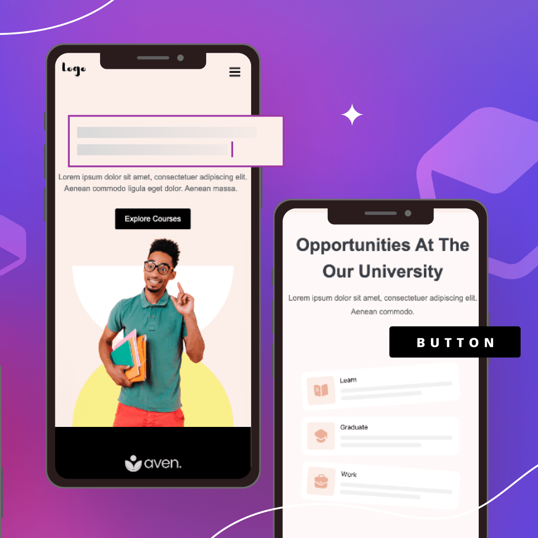
Email Design For Mobile: Best Practices to Take Your Marketing Emails up a Level
Evolution of Mobile-First Design
The term "mobile-first design" is one you may have heard before, but perhaps you've never put it to practice. To understand what mobile-first means, it's important to understand how web and email design has evolved over time.Previously, desktop computers were the most commonly used device to view websites and emails. Today, mobile phones are ubiquitous and part of our lives.We use mobile phones for most of our everyday tasks. From waking up tolistening to our favorite podcasts, managing our project, chatting on Slack with our colleagues, and, yes, checking emailsThe shift in how users view content forces marketers and designers to approach email creation with a slightly different mindset – using a "mobile-first" design method.
What is Mobile-First Design?
The mobile-first design method encourages us to build emails and websites considering the smallest device first. This means that as your design process continues, additional functionality and content is added for larger screens, such as desktops.A Bluecore report shows that "59% of Millennials and 67% of Generation Z use their smartphones as their primary email source." Given that a vast majority of your subscribers are most likely part of these generations, it is safe to assume that ignoring mobile-first design could result in low email engagement.It is easy to see that mobile-first is essential. However, it does come with its challenges that could become barriers to your success. These barriers include spam filters, ineffective subject lines, long graphic load times, or accessibility concerns.To get a better understanding of these challenges and best practices to tackle them, continue reading.
Why Should We Optimize Emails for Mobile Responsiveness?
Reports by Litmus show that "roughly half of all email opens occur on mobile devices." In fact, SaleCycle shows that "42.3% of people delete emails on their devices when they're not optimized for mobile."Unfortunately, a majority of marketers have yet to embrace mobile email design. A 2020 study by SuperOffice found that "nearly one in five email campaigns were not optimized for mobile viewing."By ignoring mobile design, even your best emails could be providing your reader with a poor email experience, and you could be missing out on the benefits it can provide, such as:
- Increased conversion rates
- Higher open and click-thru rates
- Fewer opt-outs
- Better email delivery rates
Mobile Email Design Stats to Make You Go Hmmmm….
Here are some moreinteresting mobile email stats that might make you consider upping your mobile email game.
- "Almost every report on email open rates concludes that mobile is responsible for at least 50% of all opens" (Campaign Monitor)
- "70% of users will delete poorly formatted emails in under three seconds." (Campaign Monitor)
- "Mobile transactions accounted for 71% of sales on Black Friday and Cyber Monday in 2021." (Shopify)
- "Smartphone users spend five to six hours daily on their phones, not including work-related use." (Statista)
See also: Top Email Design Trends for 2022
Creating Mobile Responsive Emails: 8 Best Practices
As we've outlined, you have much to gain from investing time in learning about responsive email design for mobile. According to MailChimp"launching a mobile responsive email design can increase unique mobile clicks by 15%".So, let's unwrap some essential best practices for creating responsive emails that convert and make you more confident in mobile email.
1. Best Email Subject Lines
The best email subject lines are the ones that intrigue you, offer you a deal, or require you to take action. While desktop allows up to 60 characters to reel your reader in, mobile-only has the capacity for 30-35 characters.
The Stats on Subject Lines:
- "Subject lines influence 33% of email recipients to open the email." (OptinMonster)
- "Subject lines can cause 69% of people to mark the email as spam." (OptinMonster)
- "Using an emoji in a subject line can increase open rates by 56%." (Experian)
- "Subject lines that use personalization increase open rates by 50%." (Marketing Dive)
- "Including a sense of urgency can increase open rates by 22%." (OptinMonster)
When you have so much riding on such a small amount of real estate, you may feel pressured to deliver brilliance each time.An effective subject line is one of the most important and it might seem like a difficult and daunting task. Lucky for you, we're here to help. Here are some tips to make writing a short and effective subject line:Ways to improve your subject line performance Right Away
- Personalize it
- Avoid salesy-phrases like "apply now," "cash bonus," and "earn money"
- Include a keyword for SEO Optimization.
- Add some emojis for an extra dose of personality
- Make it timely and specific
- Add a sense of urgency
- Keep it relevant to your copy
Don't Forget About Preheaders
The preheader is the text line displayed under the subject line in your email. You can use this additional real estate to get someone to open your email. We'll talk more about A/B testing and how you can test the effectiveness of your subject line and preheaders.
2. Best Practices for Designing Emails for Mobile
In a mobile-first email design world, design starts with the mobile user's needs and then the desktop user's needs. Approaching design with this mindset will ensure you're delivering the best experiences to most of your audience who choose to use mobile for email.A good mobile-first email design will include:
- A single-column layout
- Simple copy
- Standard fonts
- Limited, on-brand color
Single-column Layouts
A responsive email designed with a single-column layout will be well-received by users on any device. It is by far the most accessible format to navigate from a smartphone.The single-column email makes it easier to focus on the messaging, presenting information in a precise order using a hierarchy. The content will scale and fit nicely regardless of the device used to view it.
Copy
Continuing with our subject line guidance above, keep copy simple. It can be challenging for someone to read a large amount of text on a small screen, like that of a mobile device.Keep the experience enjoyable by landing your message quickly before users scroll past it. Here are some tips for how to write short, goal-oriented sales copy:
- Have one goal in mind, and try not to do too much more than that with one email message.
- Keep a consistent brand voice throughout the email.
- Use subject line and preheader text to add to the email's content.
- Use active words that engage.
- Get specific – don't use too many fluff words that take up space.
- Have someone else read it to make sure your message is clear.
See also: 4 Steps for Writing Better Emails and Collaborating Efficiently
Fonts
Have you ever tried to read a tiny font on a smartphone? Be sure to choose readable fonts – at least 22-point headlines and 14-point body text.We also recommend choosing a standard font and limiting the fonts used to no more than two. Defining this will keep your email legible and looking professional and on-brand.
Colors
We love color and think it can add a lot of fun to design. However, mobile email is not necessarily the right place for a crazy amount of color. Too much design in an email can be distracting from the message, so try to choose one primary color and one or two secondary colors for each email.It would be best if you also considered accessibility concerns when choosing the color for the email. For many mobile users, Dark Mode is a default setting. Not only does it enhance accessibility and reduces eye strain on those with light sensitivity, but also:
- Preserves battery life on devices by reducing screen brightness and using less energy.
- Offers a slick and cool dark interface that many prefer.
Read this article for Dark Mode best practices. When using BEE Pro, you can easily toggle on and off the Dark Mode feature to helpsimulate how your messages will be displayed when dark mode is enabled.
3. Optimize Images for Mobile Use
Images are a great way to create visual interest and engage your audience in the content of your email. However, images could also hurt your email's performance if not done correctly.See also: How to Optimize Images for Responsive Mobile EmailsSome common mistakes made when it comes to images include:
- Images too large to load
- Images not formatted for accessibility
- Poor image quality
- The image is not responsive
- The image is in the wrong format
To give your readers the best user experience, it's best to use responsive email images in your email design. Using responsive images is one way to keep your design mobile-first and provide a positive experience for mobile users.
High-Quality Images
It is best to export high-quality mobile and web images with a resolution of 72 DPI (dots per inch). While this might sound small, this is not one of those instances where more is better. A 72 DPI guarantees a high-quality image on web and mobile and prevents blurriness.It's also important to consider the image's color values. CMYK (cyan, magenta, yellow and black) color values are meant for print and won't display well on a digital screen. Instead, we recommend images in RGB (red, green, blue) because they work well for high-quality digital images.
Image Size
File sizes impact the total time it will take for email content to render once it's opened fully. In addition, on a mobile device, internet connections could contribute to long load times. Avoid these concerns by optimizing your image sizes for mobile-first email design.For the highest quality image, we recommend adjusting your content area width to around 600px. Images will adapt according to the device used to open the email, so this is the safest route to ensure a high-quality display. Be sure to compress your images for faster loading times.
Image Format
There are many different image file formats, each with pros and cons.
- PNG: These images maintain their quality when compressed and can export transparently.
- JPEG: These images are suitable for colorful photos but don't allow transparency and may lose quality with compression.
- SVG: These images are in a vector format, allowing easy resizing without losing quality.
Image Accessibility
Always consider if you should include accessibility components to assist visually impaired individuals. For example, here are two ways to make your images more accessible:
- Alt Text: Includes an image description that allows screen readers to describe the image to someone who cannot see it.
- Color Contrast: It may be hard for some to distinguish between colors. Reading colorful text on top of a bright background can be especially hard. Consult this guide by Color Oracle for tips on designing for people with visual impairments.
Keep Diversity and Inclusiveness Top of Mind
As you choose images for your mobile email design, be sure to consider your audience's diverse perspectives. Consider their genders, races, abilities, cultures, ages, and more.If your audience is diverse in these areas, then your emails should also represent this diversity. When you select images, consider if the people in your pictures represent different races, genders, abilities, etc. Here is an articleto help you write more diverse and inclusive emails.
4. Tips for CTA Design
A call-to-action (CTA) can be a link or a button. When designing your mobile responsive email, it is best to use large, colorful buttons for the CTAs. According to Constant Contact, "buttons are 25% more likely to be clicked than a link alone."Sometimes, a thin link can be challenging to find and click on a smartphone. Provide a big, colorful button to get the most attention from your readers. A suggested size is a minimum of 44px x 44px.After you consider how to design your button, next, think about what it says. The purpose of a CTA is to encourage your reader to do something. Here is a list of common CTAs:
- Sign Up
- Subscribe
- Try for Free
- Get Started
- Learn More
- Join Us
- Register
These CTAs are generic, and some may cause hesitancy because the reader doesn't know what they'll get beyond the button. What does "Learn More" mean?Marketing emails often use engaging CTAs that are more explicit about what the reader can expect. A few examples of more descriptive CTAs include:
- Download the eBook
- Sign Up for Weekly Newsletters
- Book a Free Demo
- Register for Free Webinar
In your email, it is best to drive attention toward a single action to take. Including multiple CTAs with different activities may cause confusion and, therefore, inaction on the reader's part. Similar to the guidelines for writing the best email copy, keep your CTAs focused on the one goal of your email and don't distract from that goal.Ensure accessibility of your CTAs by using HTML code to define your button instead of inserting an image. Within the code, you can include alt tags to identify the CTA text for a screen reader.
5. Best Use of Space
When designing the layout for your mobile-friendly email design, remember to make it user-friendly as well. It can be challenging to interact with elements on a mobile device if they are too close together. By leaving a good amount of white space around design elements and CTAs, you can help drive a more positive user experience.Often, simple emails can get the message across more easily. Utilizing white space allows a reader to focus more carefully on the action that you want them to take. A good email will contain your logo, simple copy, plain colors, and a clear call to action.How you choose to layout your email will have an impact on the user experience. A modular structure, similar to the layout options provided in BEE Pro responsive email templates, will ensure that your email layout is mobile responsive and presents information in an orderly way.Keep your email layout simple by including these three basic simple and skimmable design elements:
- Header
- Body copy
- CTA
Keeping the content simple and a clean layout will make for a very user-friendly mobile email experience.
6. Best Use of Scroll
According to Campaign Monitor , the average person receives 100-120 emails daily, not including spam. That's a lot of emails! If you take time to read and scroll through every email, that will consume a large portion of your day.That is why many people scan their emails for essential details and only typically give an email 10-15 seconds of their time.For this reason alone, it is important that your email's key message is immediately seen with only a short glance. Don't beat around the bush, or you'll miss out on a potential conversion opportunity.Most readers do not follow a typical left-to-right reading pattern when scanning emails. Instead, their eyes will fly over the copy and images, typically in an "F" pattern.If you have subscribers, they may only be looking at headlines and CTAs.Here are some content tips by Campaign Monitor tokeep your email skimmable
- Subject lines: For mobile audiences, the best subject lines will be 28 to 39 characters.
- Preheaders: Most email platforms allow 40 to 100 characters.
- Email copy: Ideal length is 50 to 125 words.
- CTAs: Keep it short and sweet at two to five words.
Keeping your email copy concise will keep your message clear and get your point across more quickly.However, keep in mind that CTA placement is still extremely important, even if you have a short email. Don't bury your CTA at the bottom of the email – there's a high probability they won't even get there to see it.Instead, drive a higher level of engagement when you place a CTA before the first scroll. This may mean including a button in your header image or immediately below it. Then, if your email is on the longer side, including a few more buttons later will give them ample opportunity to convert.
7. Is A/B Testing Emails Necessary?
A strong email marketing strategy will include testing to see if the improvement is achievable. Who wants to settle for the status quo? That said, there are a few different ways to optimize your emails with testing to increase results.HubSpot reports that "Q.A., A/B, and spam testing can lead to a higher ROI of up to 28%". So, where should you start?
Q.A. Testing
Use the test-send functionality available through your email provider to review emails, as they will appear to recipients before deploying them to your entire list. Doing this allows you to test appearance across multiple devices and email clients. Be sure to click on all hyperlinks within the test email to ensure they are linked correctly, and also review any personalization for proper setup.A good Q.A. testing process may also include a review by another person. With remote work at its highest levels, you may need a tool that will provide a suitable platform for collaboration.Ways you can speed up email development and team collaboration include:
- Reusable content blocks - These ready-made templates allow everyone in your organization to build emails in an organized and repeatable way. BEE Pro utilizes a reusable content block strategy to help users create focused and on-brand emails every time.
- Style guidelines - Empower all team members to take charge of creating mobile emails when you provide them with a brand style guide. Policies can include color palettes, fonts, text, title sizes, etc., and help keep communications consistent across the organization.
- User roles and permissions - Allow team members to provide feedback and collaborate faster when you all have access to the email design platform. With BEE Pro, team members can be assigned as designated reviewers and provide timely feedback to speed up email design and launch.
A/B Testing
A/B testing can help you improve the performance of your emails by allowing you to learn what performs better – A or B. This article by 99Firms states that "approximately 59% of companies will perform A/B tests on their marketing emails."
What should you A/B Test?
- Subject lines
- Call-to-action phrases
- Button colors, size, and placement
- Salutation
- Bullet points
- Video or no video
- Personalization
- Sending day of the week
- Sending time of day
In addition to these items, A/B tests are also helpful in understanding UX design and conversion rate optimization. A study by Forrester Research showed that "better UX design could result in up to 400% increases in conversion rates."
Spam Testing & Email Deliverability
You can use a third-party testing app to check your email for red flag errors that may send your email to a spam folder. Nearly 16% of all emails go missing or get caught by a spam filter. Common triggers that could cause your email to identify as spam include:
- Long, wordy emails
- Lots of exclamation points
- ALL CAPS
- Too much salesy language
- I.P. address reputation
- Domain reputation
In addition to these items, some design choices could help keep your emails from the spam folder.
What is the CAN-SPAM Act?
The CAN-SPAM Act enacted in 2003, states that all marketing emails are required to have an unsubscribe option visible on every email. A simple mistake such as forgetting the unsubscribe link could lead you to be found in violation of CAN-SPAM and receive fines or penalties.Other requirements for staying in compliance include:
- Don't send emails to people who have previously opted out
- You must remove someone from your list within ten business days of opting out
- Each email must have the physical address of the sender on it
- Subject lines can't be deceptive or misleading
If you make it hard for a recipient to unsubscribe from an email, they could flag you as spam, and your email service provider could stop sending your campaigns. Unwanted emails can really bug some people.
8. Accessibility Guidelines for Emails
According to the CDC, 26% of adults in the United States have some kind of disability, making Accessibility design, not a choice but a necessity.The Americans with Disabilities Act (ADA) was implemented in the U.S. to ensure businesses considered how they were delivering products, services, and communications to all Americans. While some outlined guidance is specific, the law doesn't provide much detail around ADA email compliance standards. This makes our job even more critical in monitoring ourselves and ensuring we communicate in an accessible way.Email accessibility is about making sure allyour email recipients can access your message.Here are some best practice guidelines to ensure your mobile-friendly email designs are accessible:
- Create descriptive subject lines
- Don't rely solely on color to emphasize – use underlines with hyperlinks
- Use responsive design
- Structure content with headers
- Include alt text with images and graphics
- Ensure legible font size and high color contrast ratios
- Include white space
- Include an HTML language attribute
- Left-align text
- Include captions in videos
The most beneficial changes email marketers can make to email accessibility is to keep content short, subject lines descriptive, and links and buttons easy to see.
Mobile-Friendly vs. Responsive Email Design
When you're preparing to begin optimization of an existing email built for desktop, you should consider if you want to build your emails mobile-friendly or with a responsive email design. Before you can make that decision, let's compare the two options.
Email Width
When you design an email as mobile-friendly, you essentially design the email to fit a mobile device. Typically, a mobile-friendly email will be constructed as a fixed width to the width of a mobile device.Responsive emails, however, are slightly different. First, their construction allows them to conform to the width of whatever device views the email. So, the email will be viewable at full width, whether viewed with a smartphone, tablet, or desktop.
Font Sizes
A mobile-friendly email will only display fonts at the size they were coded, for instance, 14-point body text. However, a responsive email will optimize the font size automatically in proportion to the original to display it legibly on the chosen device.
Layouts
We mentioned earlier that single-column layouts are ideal for mobile-friendly emails. While this is true, designing a multi-column email specifically for mobile is still possible.A responsive email, however, will adjust a multi-column email for a desktop to a single-column display for a mobile device. As part of this adjustment, elements can hide if the programmer chooses to help keep the email at a reasonable length.
How BEE Pro Helps Optimize Email for Mobile
Mobile design mode, available in both BEE Pro plans, helps email marketers optimize email for mobile devices. Functionality in the platform allows users to hide elements to save mobile users space and control how pieces will stack on the smaller device screens.With mobile design mode, users will save time toggling between desktop and mobile designs without needing to enter a preview mode. Also, if you want to change your mobile design, you can do this independently of the desktop design version. We think this is a more efficient and intuitive way to create mobile responsive designs in less time.
Optimize your Mobile Email Design with BEE Pro
With BEE Pro mobile design mode, the system will optimize your email for the best display on a mobile device. This includes adjustments to:
- Alignment - When desktop designs have a multi-column layout, sometimes the alignment can look odd on mobile. Instead of hiding the contents, the mobile design mode will center-align it to look better.
- Text size - Set different text sizes for paragraph, list, title, button, menu, icon, and form for mobile display.
- Padding - Set different padding values for mobile and desktop.
https://www.youtube.com/watch?v=Vki0LNdPtJM
Mobile-friendly Email Responsse Template
BEE Pro provides over 1,500 mobile responsiveemail templates. All of our templates are designed to provide you with peace of mind and ensure that all content is arranged to display optimally on mobile devices. Here are some tips for finding the right email template for you:
- Usage: How will you use the email? Is it for an announcement or a sale? There are many usage category options.
- Industry: Get closer to the look you want by filtering down to the industry level. A wide variety of sectors are offered, including automotive, health and wellness, and fashion.
- Automated: Will your email be sent in an automated message format? There are several great template options available to get your brainstorming. Consider abandoned cart, confirmation, thank you, and password reset emails.
- Seasonal: Grow customer relationships with timely seasonal email messages. We have various seasonal options, including Chinese New Year, Fashion Week, and the Super Bowl.
After you've selected your template to use, easily drag-and-drop content into the email or landing page. Switch from Desktop to Mobile mode to ensure design and content looks good on any device.
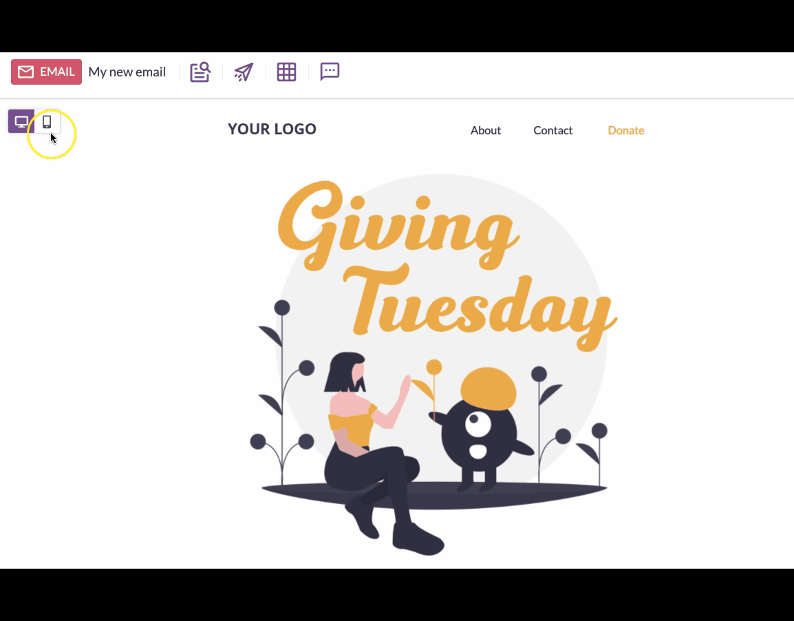
How Mobile Email Design Implemented with BEE Pro
The Director of Communications for the College of Natural Sciences and Mathematics at the University of Denver became a BEE Pro advocate after speeding up his design process to get work done faster.Since a large portion of his audience where busy college students with mobile devices, he needed a tool that allowed him to optimize emails for mobile. Our intuitive builder provided him with the flexible layouts he needed, along with key features like mobile optimization, for him to be successful at his job.With BEE Pro, the director could quickly complete email designs with easy-to-implement content blocks and use mobile optimization to design on-brand emails. It worked well with his email-sending platform and made his email marketing experience much smoother. In addition, quick preview tests allowed his boss to review emails quickly and stay organized for a more seamless workflow experience.You can read more about the University of Denver's BEE Pro story.
What Comes Next?
Now that you've become a pro at mobile responsive email design, check out our tips on creating landing pages that convert. You can use BEE Pro to effortlessly create responsive landing pages from scratch or use one of our templates.BEE Pro helps anyone design emails and landing pages with our easy-to-use, drag-and-drop, no-code editor. Get access to over 1,500+ email and landing page templatesprofessionally made by 30+ Designers. We are always launching new designs, so there's always something new to discover!Take your email and landing page design to the next level by subscribing to BEE Pro. Happy designing!

Stay informed on all email trends
From the latest creative design strategies that inspire your next campaign to industry best practices and tech advancements, our newsletter is the go-to for all things creation.