

Design
3 Steps to Create a Free Email Marketing Campaign
Email marketing is an essential part of your business, but it's something that can get expensivevery quickly. How can you create an email marketing campaign that doesn’t break the bank? Answer: By looking for free tools that help you produce high-quality content.With BEE, you can create a full email campaign set — even one with a built-in landing page with a form that collects user data. This type of email can give you a higher conversion rate, and although it might look complicated, it’s actually fairly simple to create. Here’s your guide to creating a free email marketing campaign in BEE.
How to build a landing page that matches your email marketing
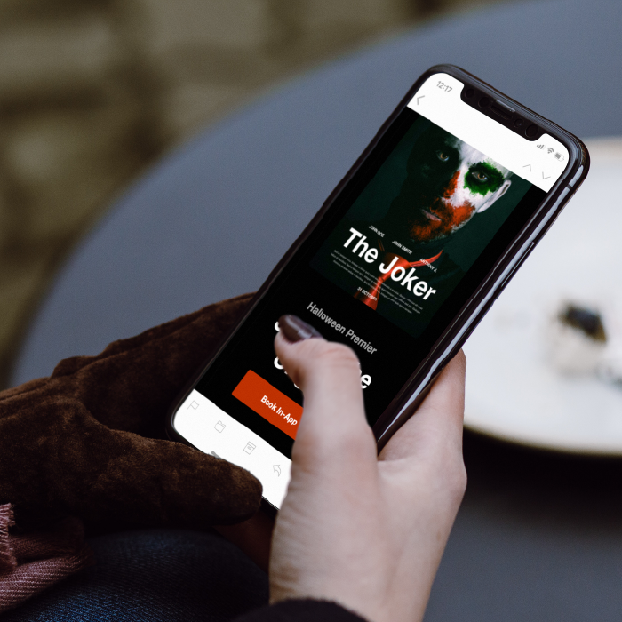
You can create an entire email campaign set using BEE’s email marketing software, complete with an email that has a Google form embedded to collect user data. It’s easier for readers to enter their information directly into the email instead of having to open up a separate webpage, so by creating this type of email, you’re more likely to see a high conversion rate. Here are three simple steps you can take to create your free email marketing campaign. (P.S.: This example uses one of BEE’s free email templates and pulls in a Google form for the landing page, so the whole email campaign is completely free!)
Step #1: Create an email
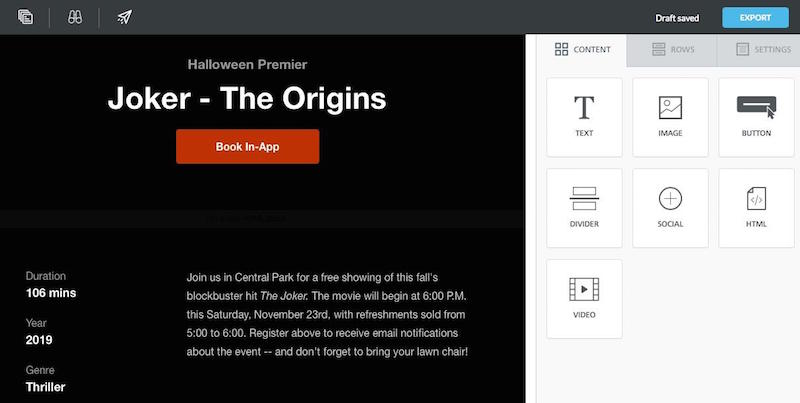
Select one of BEE’s free templates and create your email message, complete with graphics, text, and images. In this example we’re promoting an event, so our email includes language that mentions the date, venue, and other need-to-know details. We’ve also added a call to action that asks people to RSVP by filling in a form — which we’ll create in the next step.
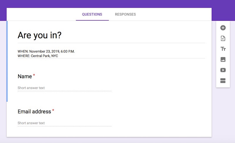
Step #2: Create a Google form
Save your BEE template and hop over to Google forms for the next step in the process. Open up a blank form and fill it out, leaving space for readers to give you any relevant information.
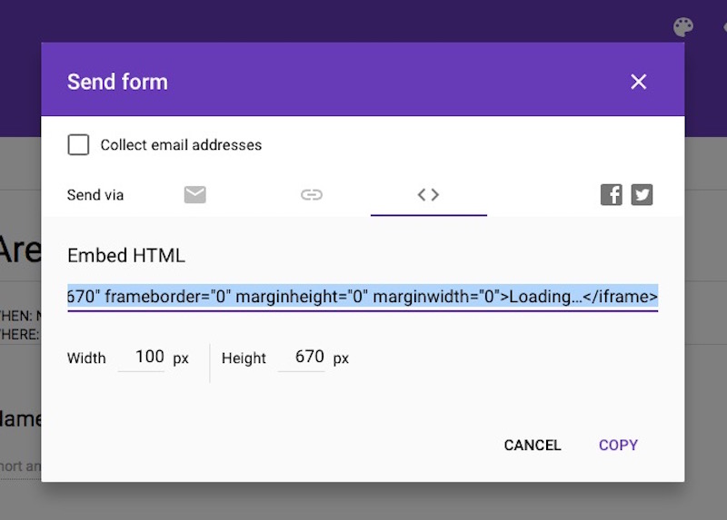
When you’re through creating the form, click the “Send” button in the upper right-hand corner and then click on the HTML symbol (this is the third option in the “Send via” row and looks like this: <>).Before copying the code, customize the dimensions so that the width is 100 pixels and the height is 670. By doing this, you ensure that the form will be responsive on both desktop and mobile. When you’ve adjusted the form size you can copy the HTML.
Step #3: Add the Google form to your email
Head back into the BEE editor and add an HTML content box to your email. Once you drag and drop the content box, you can copy and paste your HTML code from Google into the text box on the right sidebar, and your Google form will appear in the email. If the form isn’t the correct dimensions (100 x 670), scroll through the code in the text box until you find the width and height; then type in the right numbers. Save the email and download it, exporting the HTML. And that’s it! Your free email marketing campaign is ready to go.
Wrap-up: Free email marketing software
BEE’s free email marketing templates are the perfect way to create your next email campaign. By using BEE and other free tools such as Google Forms, you have an affordable method of making emails that will get conversions and help your business. Try BEE’s free templates today!
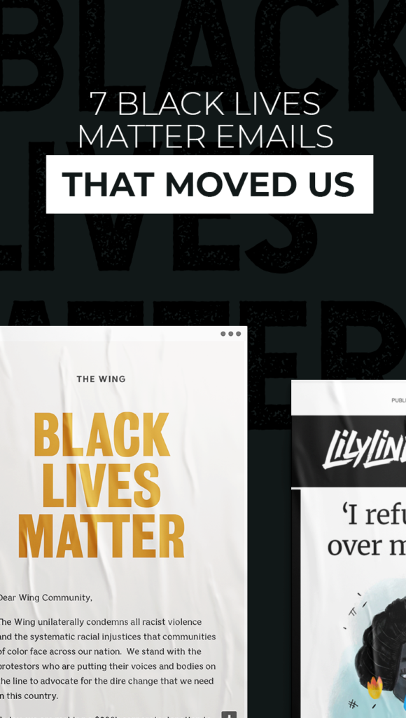
7 Black Lives Matter Emails That Moved Us
The #BlackLivesMatter movement has been taking over our social media feeds and inboxes alike. Here at BEE, we wholeheartedly speak out against racism and affirm the value of all Black lives. We’re thrilled to see so many brands and email newsletters doing the same by sending their subscribers educational resources or places to take action.We realize, though, that crafting a good Black Lives Matter email can be difficult. This is a heavy topic — and it’s extremely important. How can your email design back up #BlackLivesMatter in a way that helps, not hurts? Take a look at these seven Black Lives Matter emails to get some ideas for your own timely messages.
Crafting a good Black Lives Matter email can be difficult. This is a heavy topic — and it’s extremely important. How can your email design back up Black Lives Matter in a way that helps, not hurts?
The Lily
Lily Lines, a women-centric newsletter created by The Washington Post, sent an excellent Black Lives Matter email to its subscribers. We love the way this newsletter is organized: It starts out with an essay by a Black author and community organizer, sharing beautiful illustrations between every few paragraphs. It continues with a few brief news hits and a social media highlight. And the whole message is laid out with black text on a plain white background, making the important information clear and easy to read.Subject line: This is a difficult time. An activist has advice.

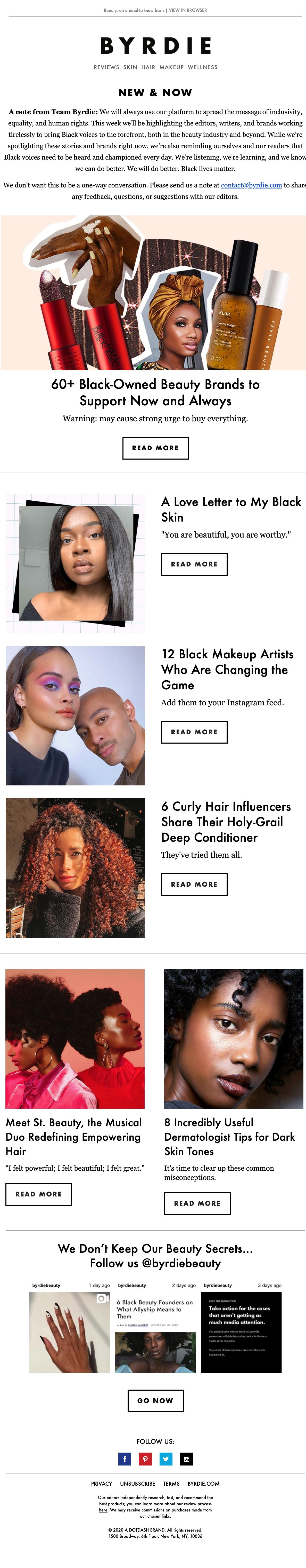
Byrdie
Beauty brand Byrdie was on top of things when #BlackLivesMatter began to trend. This brand not only made a statement about how it supports equality and human rights, but went a step further by sharing extra resources. Supporting Black-owned brands is a great way to recognize and support the Black community. Byrdie took this to heart by sharing a massive list of brands that are relevant to its readers. The majority of this email utilizes a simple single-column layout listing links for readers to check out.Subject line: 60+ black-owned brands every beauty lover should know
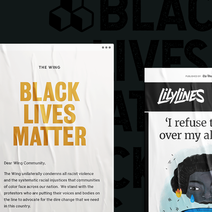
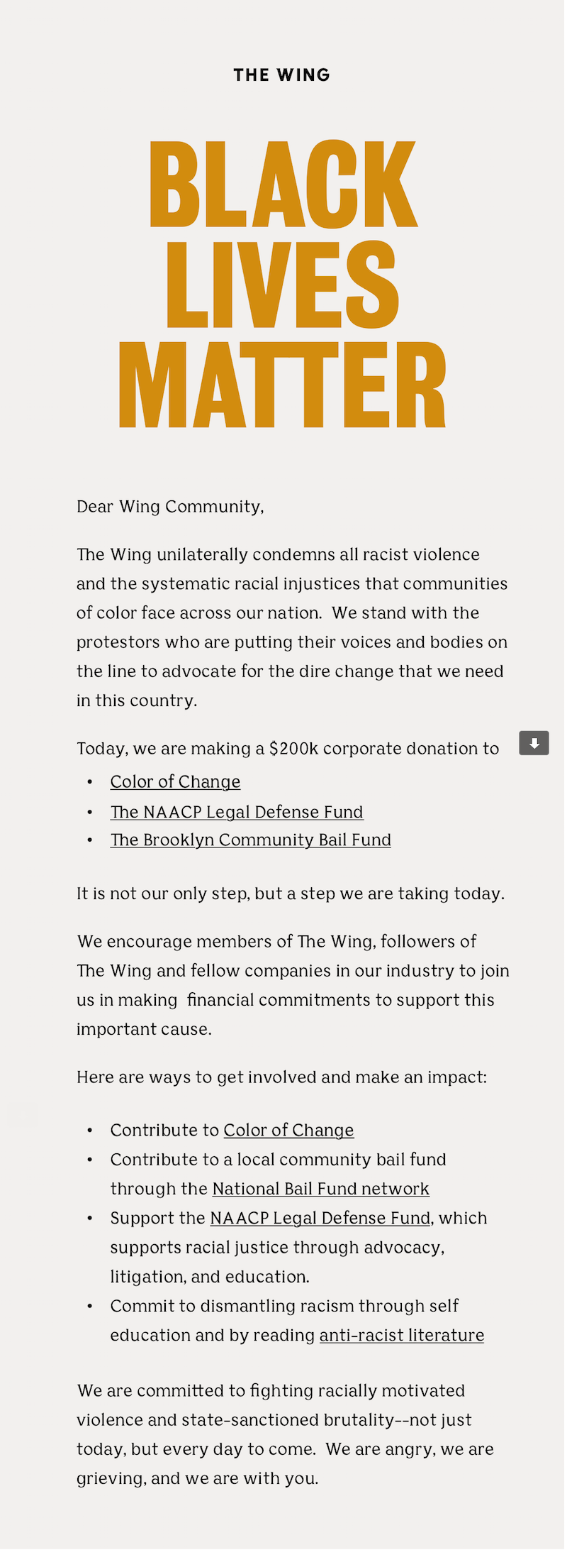
The Wing
When it comes to trending causes that matter, your first instinct might be to think out of the box. If everyone is talking about the same topic, your contribution needs to stand out, right? But in most cases, simple is best. Black Lives Matter emails aren’t about your brand — they’re about the movement. So take a cue from companies like coworking space The Wing, who created a simple yet highly impactful email design. The background of the email is off-white and doesn’t detract from the message, and the words “Black Lives Matter” are in a strong font front and center. Importantly, The Wing backs up its statement by making a financial donation to the cause and encouraging its readers to do the same.Subject line: Black Lives Matter
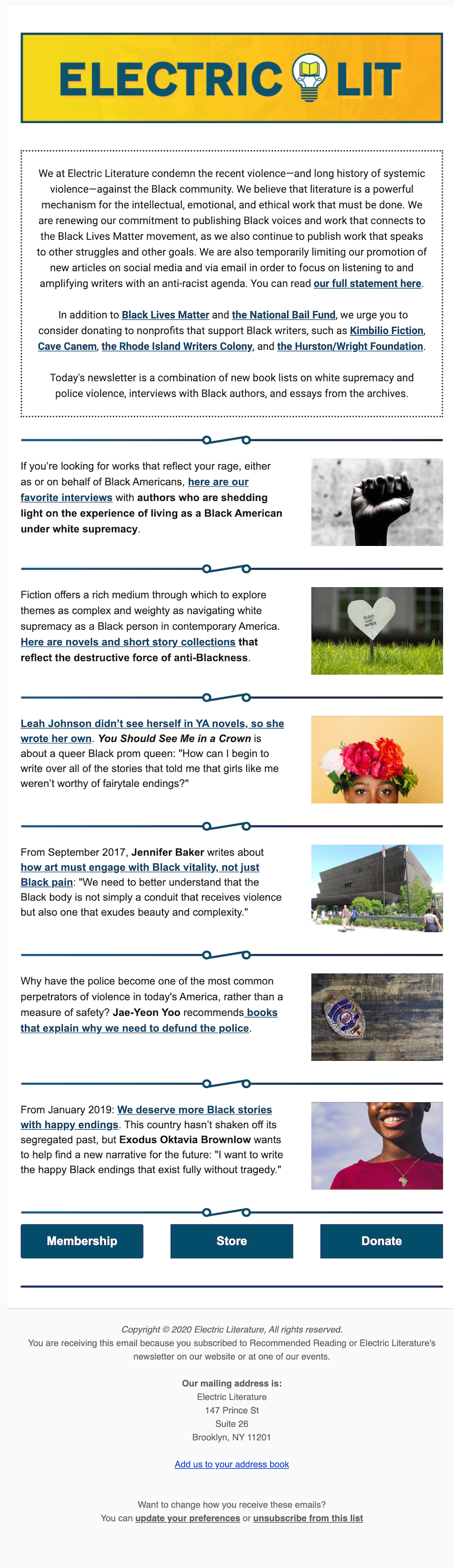
Electric Literature
Electric Literature is another example of a great Black Lives Matter email that makes the content relevant to its audience. The email is organized with the most important information — Electric Lit’s statement condemning violence against the Black community — at the top. Next there are simple but attractive dividers to separate the rest of the content so you can easily scan and find what you’d like to read. The message doesn’t have an overt CTA. Instead, it quietly includes three buttons at the bottom for anyone who wants to click.Subject line: Read Black writers, now and always
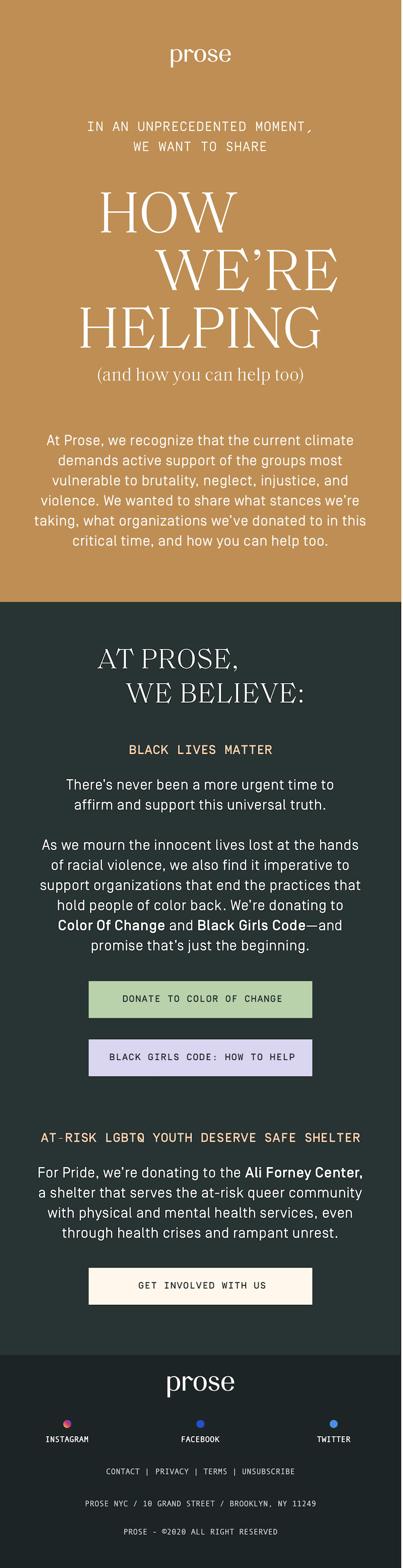
Prose
Prose uses a muted color scheme and incorporates a few different fonts in this Black Lives Matter email. The white font is easy to read on the background colors and the quiet colors are appropriate for the message that’s being shared. Prose gets right to the main point of the email — Black lives matter — and encourages action from its readers.Subject line: A note to our community
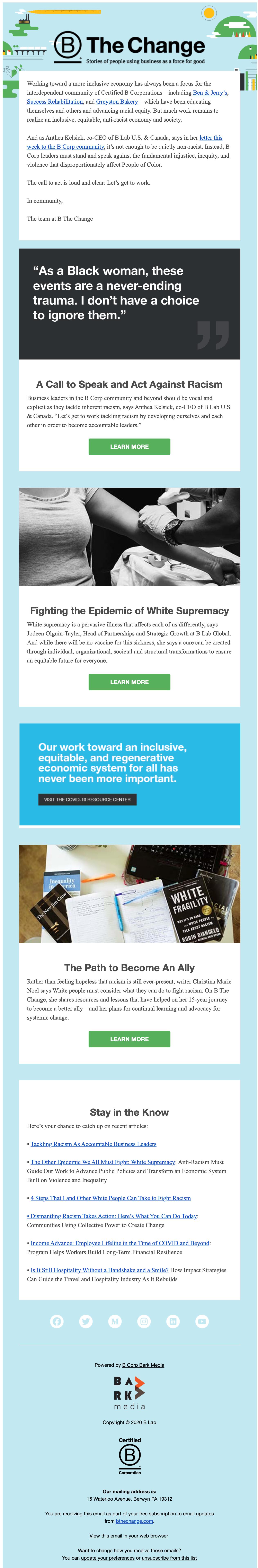
B The Change
B The Change uses strong, powerful language to evoke a response from readers. Under its initial statement, the company follows up with several resources where readers can learn more or take action. We love the black-and-white images and text that make the green CTA buttons pop.Subject line: Let’s get to work tackling racism
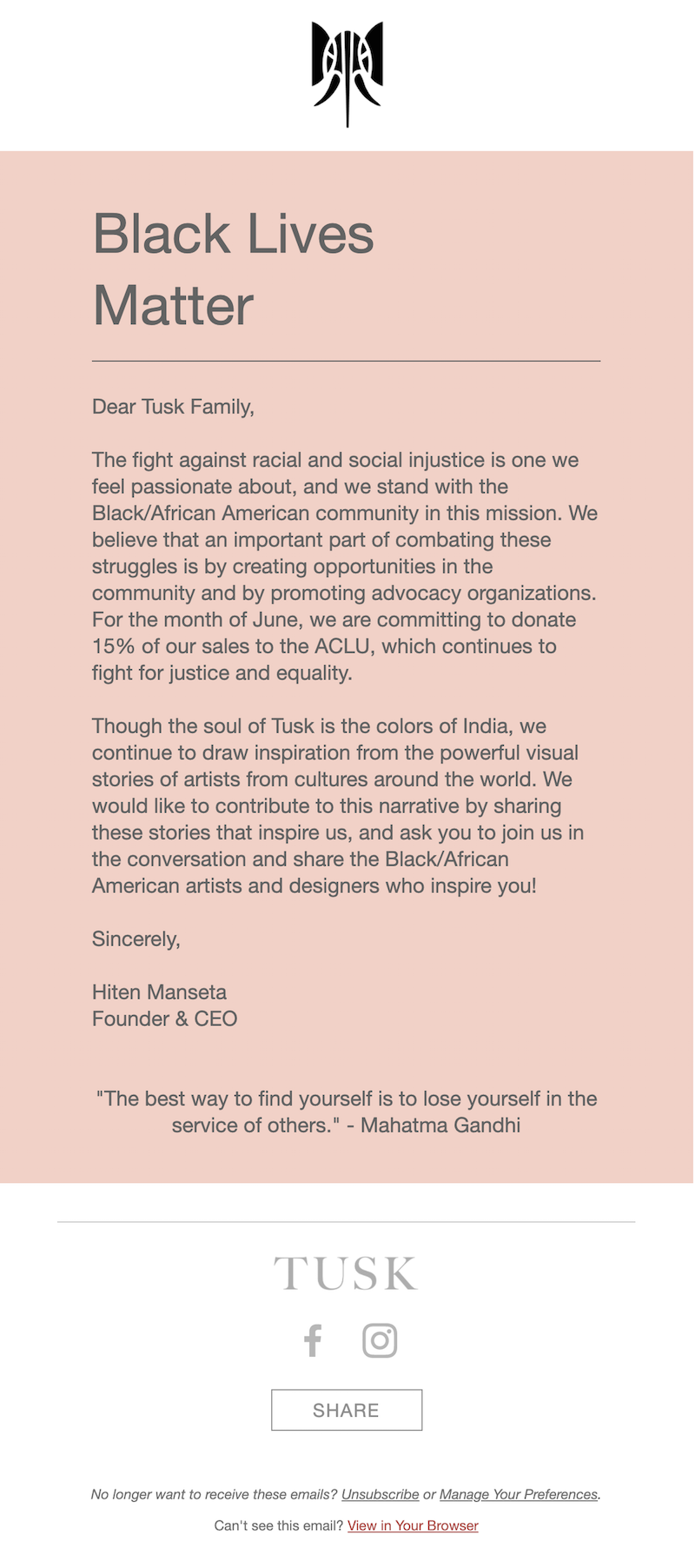
Tusk
Remember, with Black Lives Matter emails, simplicity is the best way to get this important message across. Tusk takes this principle to heart. From the subject line to the color scheme to the length of the copy, everything about this email is simple and basic. And because there aren’t any flashy design elements to detract from the copy, the message of the email truly stands out.Subject line: Black lives matter
Wrap-up: Black Lives Matter email templates
Now is the time to stand in solidarity with the Black community and send an impactful Black Lives Matter email from your brand. Choose a professionally-designed, mobile-responsive email template from the BEE catalog to send out this important message. By using Black Lives Matter email templates, your brand can add its voice to this historic movement and play a small role in making a difference.
Share this post with your friends! Pin it on Pinterest ?
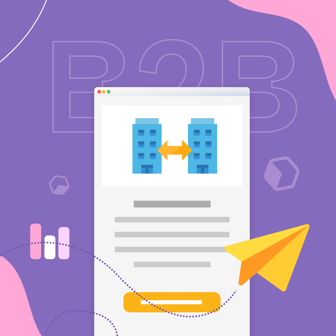
The Complete Guide for Your B2B Email Marketing Strategy
If your B2B company isn’t already heavily focused on email marketing, now is the time to start. More than 30% of B2B marketers say that email is the channel with the biggest impact on their revenue — making it clear that a strong B2B email marketing strategy is essential.A B2B strategy is going to look different from a B2C email marketing strategy. If your target audience is other businesses, you’ll need to plan your email marketing with their needs in mind. Focusing your efforts on the needs of your audience can boost your customer acquisition significantly.Ready to get started? Take a look at this top-to-bottom guide to help inform your B2B email marketing strategy and drum up more business for your brand.
Start with lead gen
Your B2B email marketing strategy should start at the very beginning: with lead generation. All of your lead gen should be done with your B2B audience in mind. Chances are, that audience is hanging out on platforms like LinkedIn. Stats back this up, showing that 65% of B2B companies succeeded with lead generation from LinkedIn. Strategic landing pages, blogs and SEO are also helpful in acquiring more B2B leads.
Segment and customize
As your email list starts to grow, segment that list into different categories so you can send personalized emails to each one. You can segment a B2B email list the same way you’d split up any list, using determinants such as geographic location, activity and purchase history to divide your customers. Add additional segments by sending out a survey email that asks questions relevant to your business. Then create segments based on the responses.(Pictured: Discover Your Users by designer Hector Titus Ruiz.)
Send relevant content
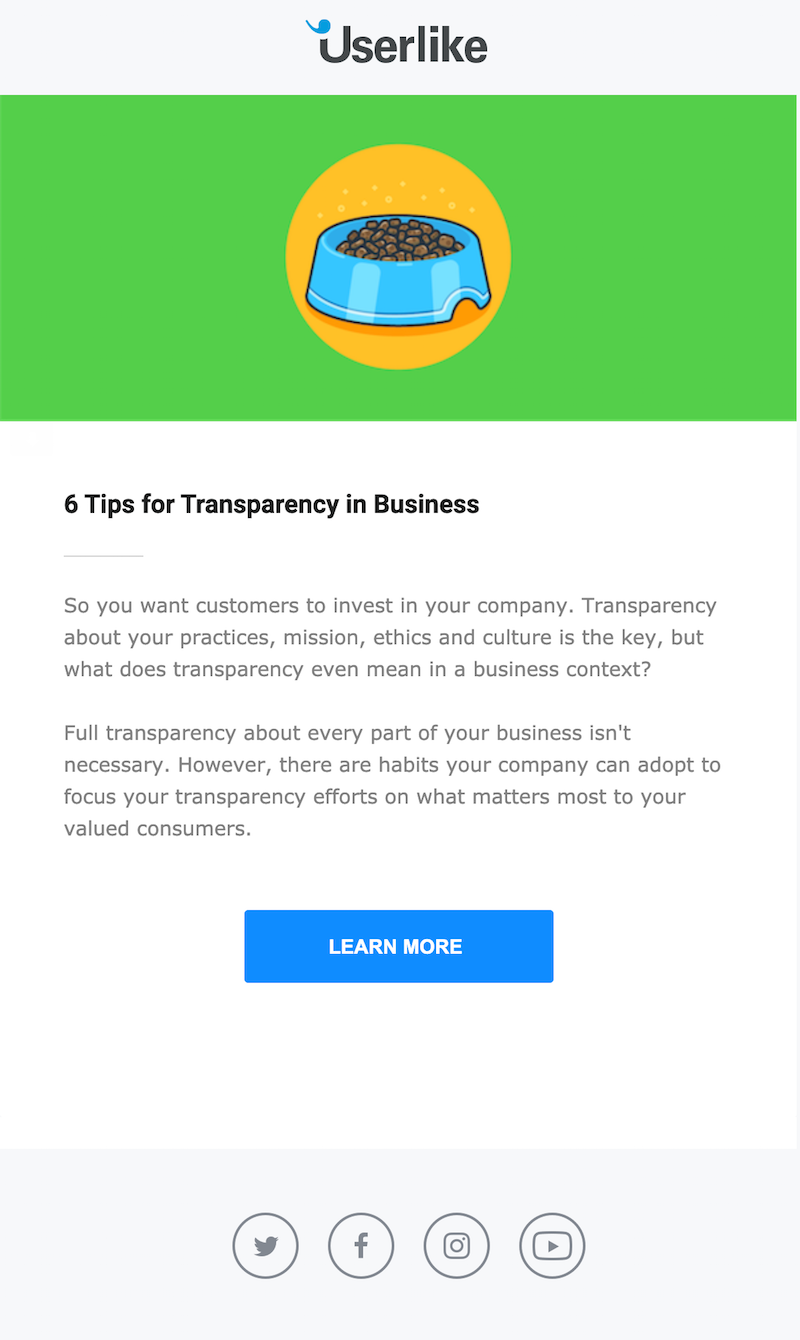
One of the best B2B email marketing tips is to focus on sending helpful pieces of content (as Userlike does below). B2B email marketing relies more heavily on educational content than B2C does: 90% of top-performing B2B content marketers put their audiences’ informational needs first. When you send high-quality content, you’re sending what your B2B readers want to hear. Over time, you’ll establish your credibility by helping them solve their business problems. When you do go for the hard sell, they’ll be more likely to listen.Subject line: 6 tips for transparency in business ?
Target millennials
Your audience is other companies. But who exactly are you speaking to? Put a face to your audience by looking at helpful B2B email marketing statistics. For example, 46% of all B2B researchers and buyers are millennials. This means that you can boost conversions by shaping your tone of voice, references and other elements of your marketing emails to appeal to millennials.
Create emails that are mobile responsive
More and more B2B employees are using smartphones. Over 50% of B2B searches take place on smartphones, with mobile driving or influencing an average of 40% of revenue in leading B2B organizations. That’s why it’s essential that your B2B email marketing templates are mobile responsive. Pick email templates that perform equally as well on desktop and mobile, easily adapting to the device where they’re being read so your B2B customers can take in the information at a glance.
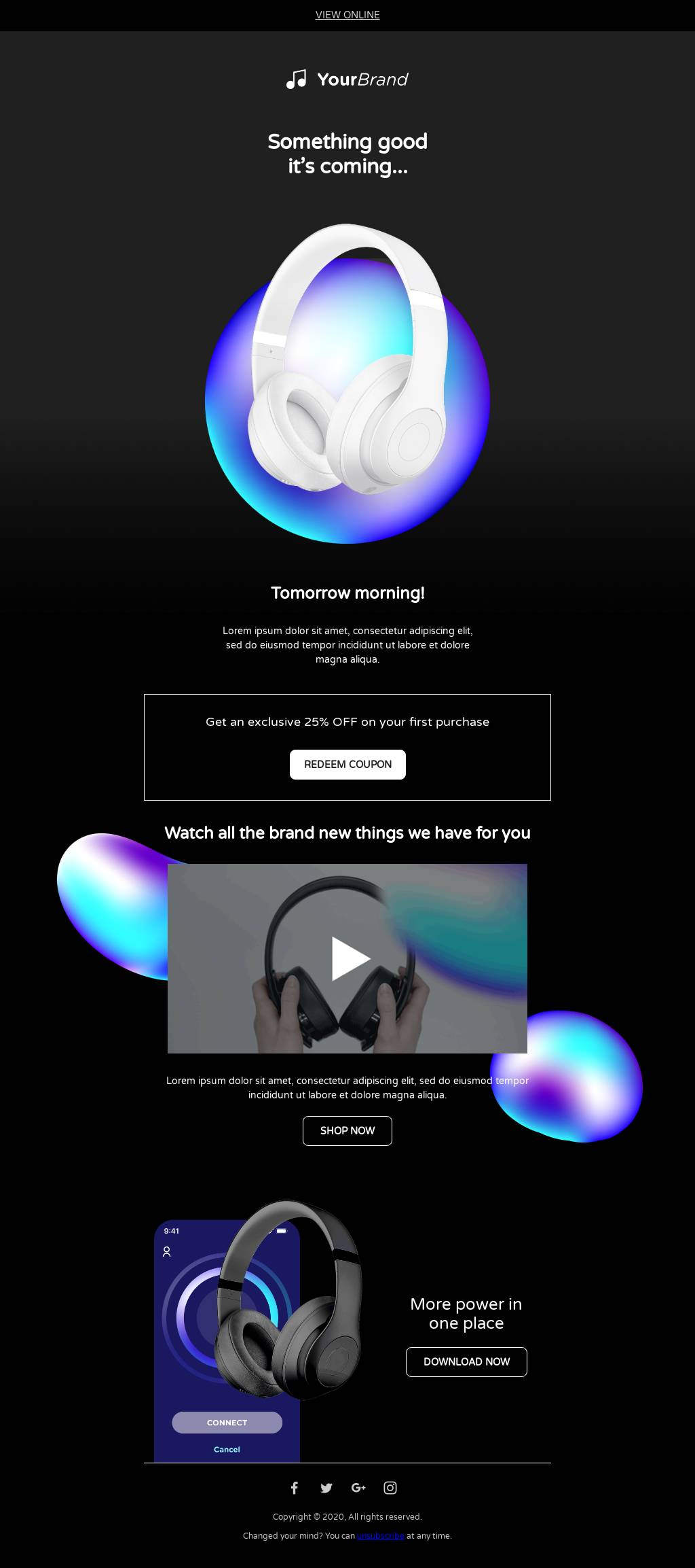
Share company updates
Any time you have company news, share it! Research has shown that many B2B email subscribers sign up because they want to stay updated on company news. News items you could share include:
- New employees joining the team
- Winning an award
- Introducing new products or pricing
(Pictured: Something Good Is Coming by designer Yorbi Barriento.)
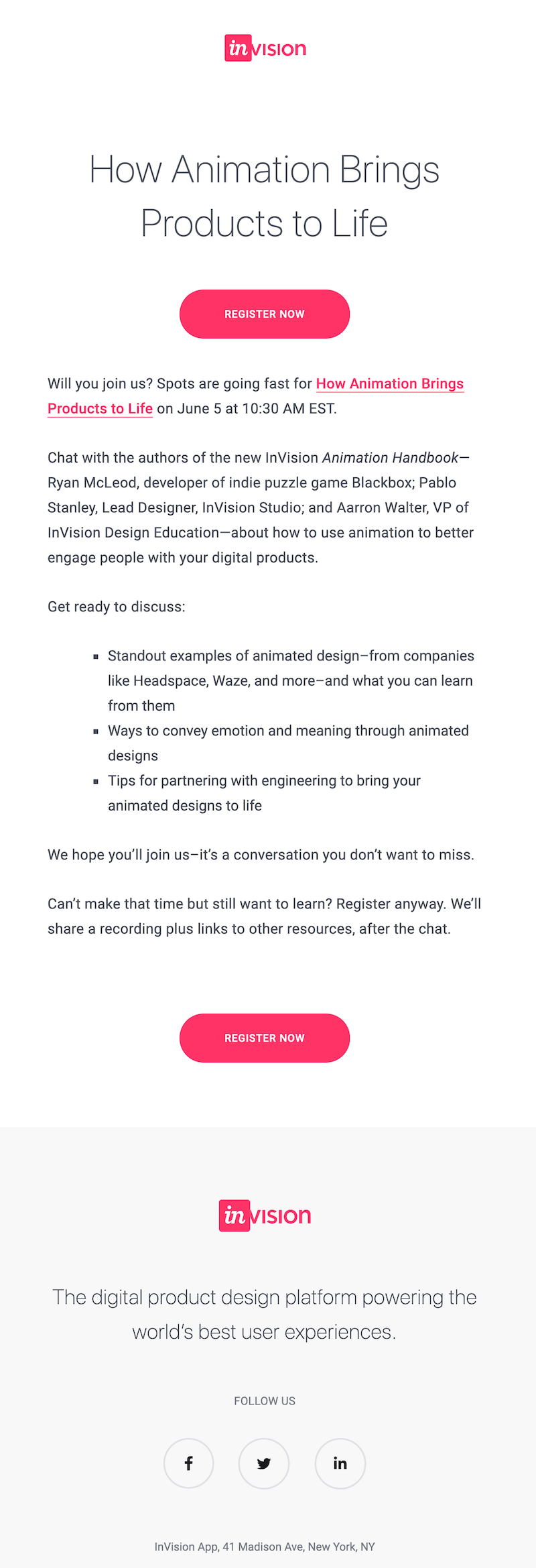
Promote a webinar or event
If you have a webinar or event coming up, promote it to your B2B email list. You have an audience that wants to continue to learn and grow. So as long as the topic of your event is tailored to them, your event promotion emails are likely to get a lot of opens.In this B2B email marketing example, digital product design platform InVision shared a brief list of information an upcoming webinar would include. InVision also acknowledged that its customers had busy schedules and promised a recording after the event.Subject line: Will you be joining us? “How Animation Brings Products to Life” webinar
Wrap-up: Rinse and repeat these B2B email marketing tips
Now you’re ready to launch your B2B email marketing strategy — from the first step in the lead generation process, all the way to your signature for business email. Make things easier on yourself by using B2B email marketing templates to create your emails. BEE templates are mobile responsive, visually attractive and easy to customize. Use our templates to give these B2B email marketing tips a try and help your email strategy get off the ground!
3 Ways to Incorporate Retro Design into Your Email Marketing Campaigns

Retro design is making a comeback and is one of the top email design trends of 2022. According to The Designest, this wave of retro design includes elements from “Art Deco, Good Old ’90s, and 2000s Nostalgia.”
Design and Nostalgia
A simple explanation for why trends keep coming back, even those we wish never would, is nostalgia. People crave to relive the “simpler times” when they didn’t know what the future would hold and their worries seemed small. As marketers and designers, we have the power to use design to evoke that same feeling nostalgia creates: the warmth, the calm, the hopefulness.What does this mean for you?For one, making your readers happy is always a plus. When your readers connect with you, they are more interested in your content and will continue to read and look forward to the next message you send. They are also more likely to take action on what you’re asking from them. But even if it doesn’t get that far, you’re guaranteed to make a lasting impression because of how you made them feel.As technology and design advance, the human desire for something shiny, different, and new grows, but you can never go wrong with a little nostalgic design. Know your demographics to identify which era will resonate with them the most and bring them back to “the good old days.”
3 Ways to Incorporate Retro Design Into Your Next Email or Landing Page
Retro design encompasses various eras, each with its own unique elements. Because of this, the possibilities of what you can create are endless. Don’t be afraid to mix and match and make something memorable. If you’re unsure where to start, here are three simple ways to add a retro feel to your email design.
Color
Unconsciously, color plays a role in the way people feel, react, and make decisions about a brand and its product. In this case, color is the easiest way to communicate and illustrate an era that evokes nostalgia within your readers. For example, when you think of the 80s, what’s the first thing that comes to mind (besides leg warmers and leotards)?Perhaps the color pink, blue, or neon green?
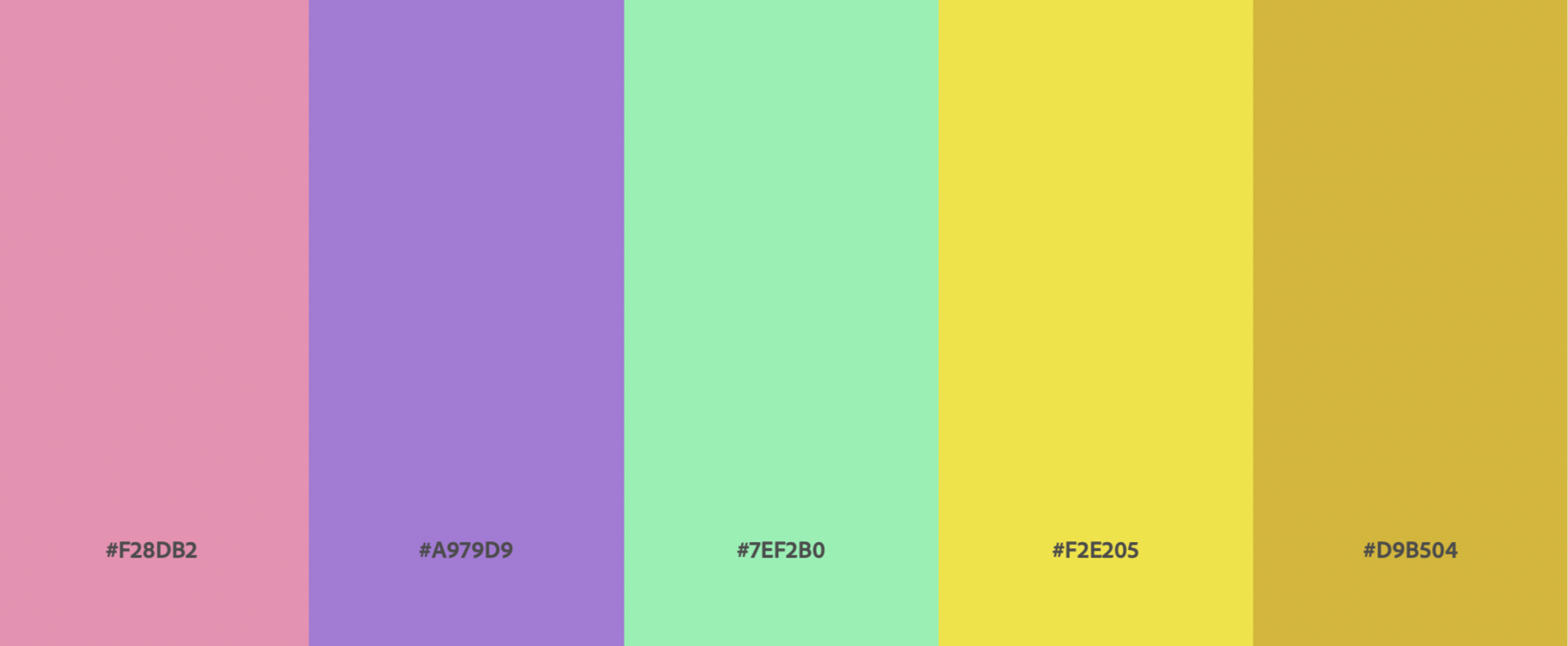
You can use tools such as coolors.co, Adobe Color, and Pinterest to help you generate the perfect color palette for the era you want to recreate. If you’d create an 80’s feel to your next email design add the HEX codes in BEE Pro. You can also use this template by Veronica Medina.
Font
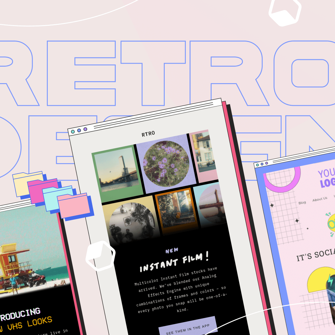
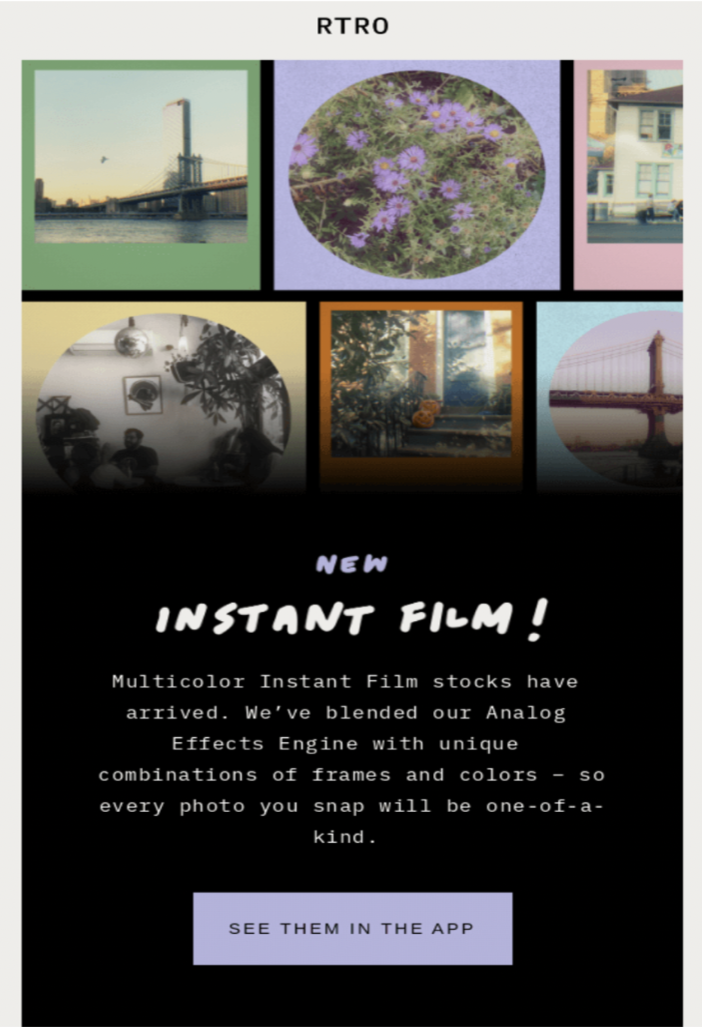
When it comes to retro design, there is just as much an emphasis on typography as color. The purpose of a font is to influence how the reader perceives and is affected by what you are trying. Take this example by RTRO. The “handwritten” font on the header paired with a monospaced font (inspired by the typewriter days) makes the email feel like a personalized note from RTRO to their reader. Use the Permanent Marker and Courier New fonts to replicate the same feel in your emails inside BEE Pro.
Shapes and Filters
If you’re not sure where to start embracing this email design trend, try playing with shapes and textures! Depending on the era you are trying to evoke, this can look different, but don’t be afraid to experiment and mix and match. This template by Betina Todorova incorporates those fun, bold colors that remind us of the 80s/90s paired with hand-drawn pop art style shapes influenced by the 50s.
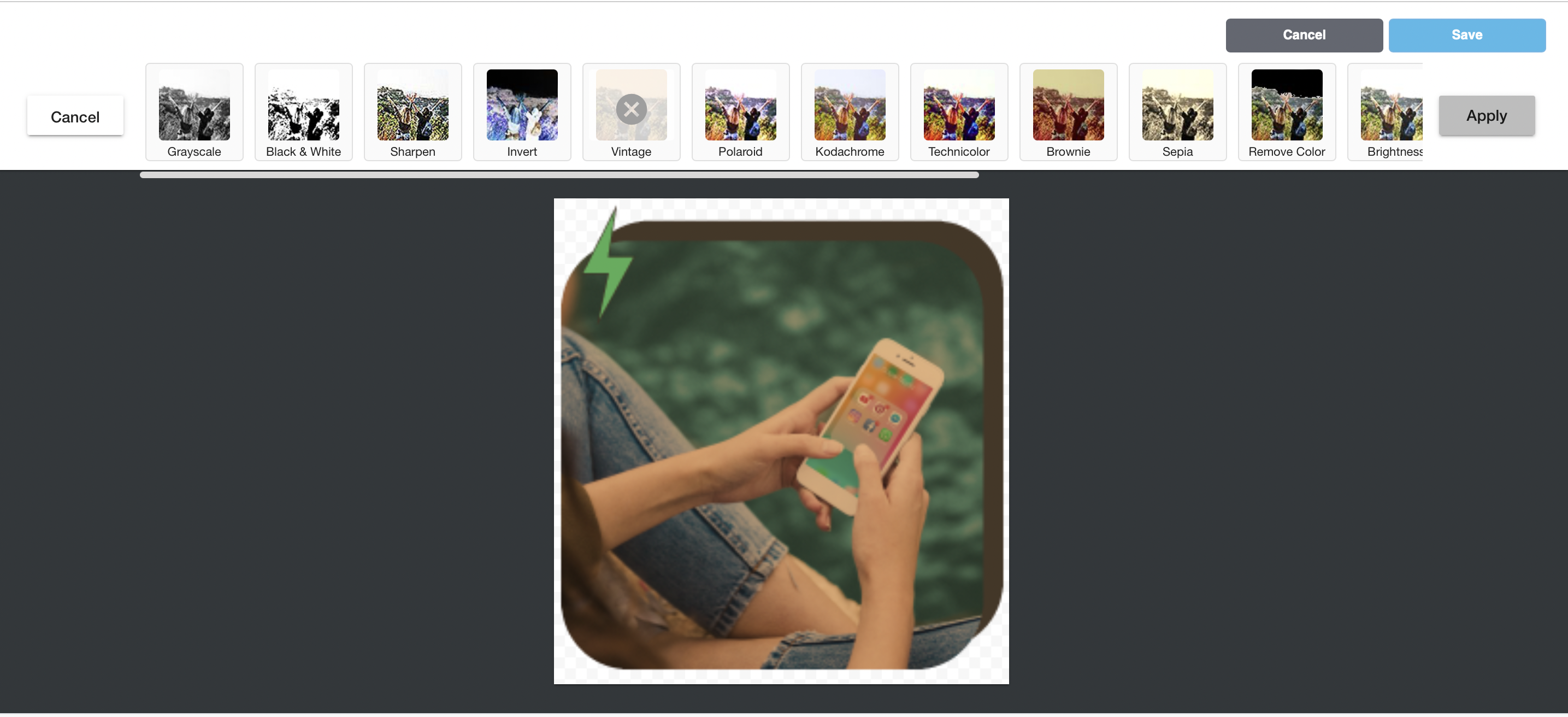
BEE Pro makes it easy to add a filter to images inside the editor. If you’re looking to double down on the vintage feel of your emails or landing pages, try adding the Vintage Filter and Noise to your images for a grainy/ film camera look
Ready to Create a Retro Email or Landing Page?
Start creating retro email and landing pages with BEE Pro for free. Using the tips we shared above you can customize any of our 1,300 templates to replicate the era you wish to illustrate.Have fun with it! Trends are meant to offer something different and memorable to your reader. When it comes to retro design, each era builds off the other. Don’t be afraid to experiment with different elements and try something new.If you need some additional inspiration, hereis our take on retro design. It is fully functional and ready to be used for all your email or landing page needs. Enjoy!
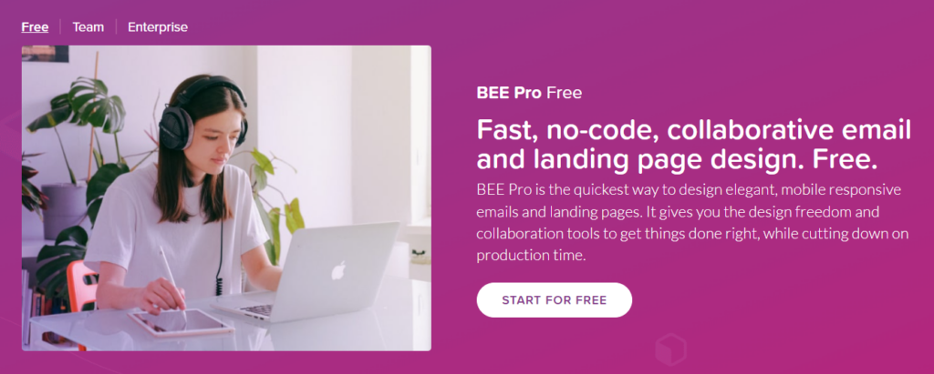
Announcement: BEE Pro Doubles Down on design democratization with the launch of a 100% Free plan
Although digital marketing has changed since its beginning 20 years ago, it’s no secret that email remains the most reliable way to communicate with your audience. According to Statista, there are 306 billion emails sent daily. The popularity of email marketing - coupled with the dramatic rise in remote work - has led to a seismic decentralization of email design.More than ever, professionals, business owners, and creators rely on email communications to stay in touch with their audiences, and need tools that help them create those emails quickly and on their own.BEE Pro has helped over 350,000 people create emails and landing pages with no-code, fast design tools since 2016. Starting today, a new free plan will support even more projects with a 100% no-charge subscription available to everyone.
Decentralization of Email Design
Why are hundreds of thousands of people using a tool like BEE Pro? The rise of remote work over the last two years dramatically accelerated a decentralization of digital asset creation, including email design. What used to be the responsibility of email marketers and HTML specialists is now a collaboration between people from different backgrounds and skill sets, often working in different locations.As a result, many are expected to have some knowledge of email marketing and design to get things done, regardless of their profession or the department within a company.It's a new world that comes with a few challenges:
- For one, learning new email design tools often takes time. The more difficult they are, the steeper the learning curve.
- When it comes to collaborating, a lot of time can be lost through the constant back and forth between people not working in the same location. This results in a loss of productivity and deadlines.
- More importantly, there is an over-reliance on designers to maintain the visual identity of all outgoing emails. This sometimes results in even further delays and keeps designers from working on more important tasks.
If everyone needs to create digital assets, then design tools must be accessible regardless of background, skill set, and budget. In other words, this decentralization of design requires a democratization of design tools, which need to make it easy and fast for anyone to create the digital assets they need. Otherwise, decentralized teams find themselves moving too slowly.In this contest, to be more useful to more people around the world, BEE Pro will now join the list of collaborative design tools offering a totally free plan.
How BEE Pro Fits Into The Democratization of Design
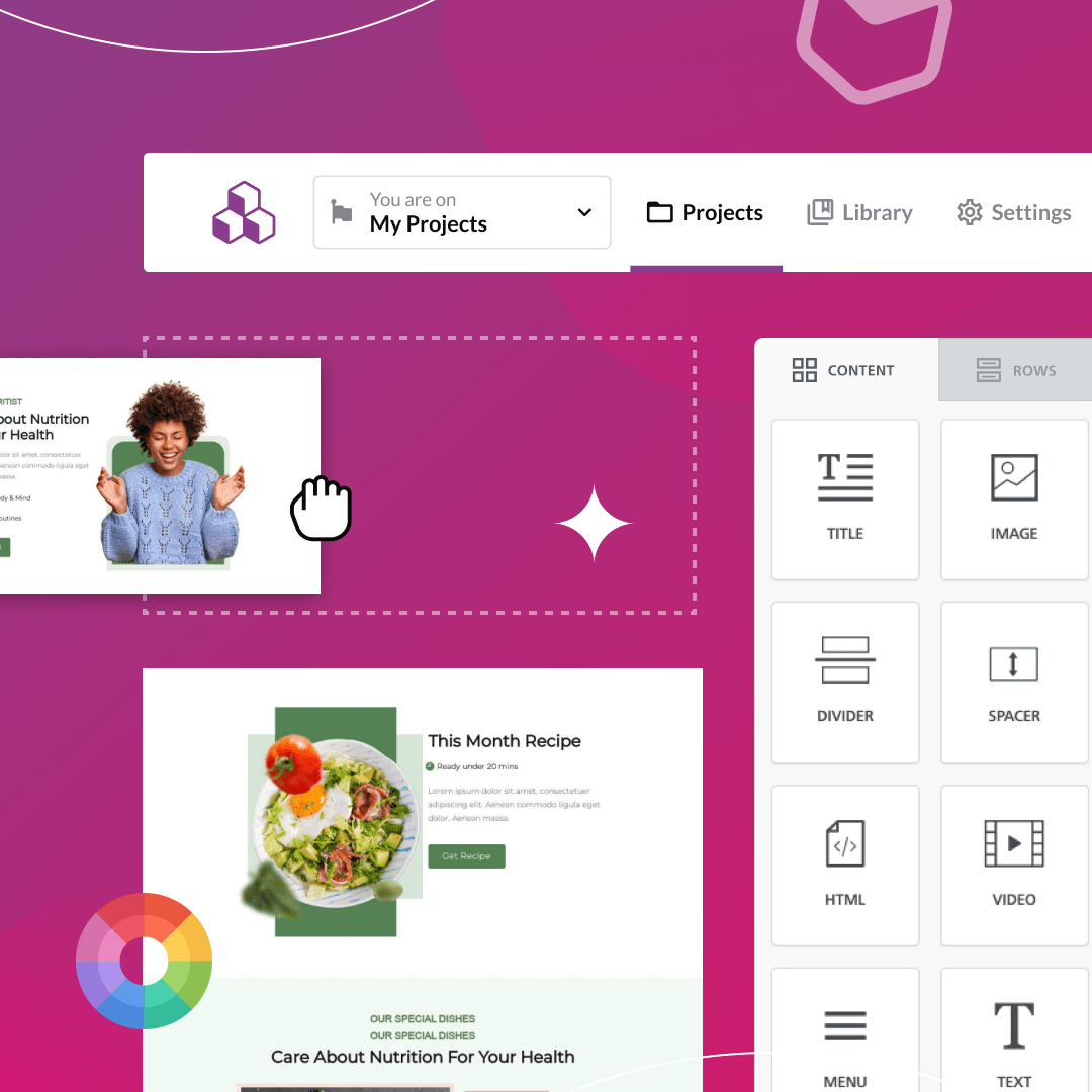
The democratization of design requires tools that are easy and flexible for everyone to use. But when those tools are available and adopted, another challenge arises: with more people designing, design consistency can be difficult to maintain, with possible negative consequences on a company's brand. Therefore, the same tools must also give a company brand control to ensure messaging and visual identity is consistent no matter who is designing.BEE Pro is not just a great design tool. It's a complete, no-code email and landing page creation suite that aims to address both concerns. Simple and fast design tools on one side. Brand controls on the other side.
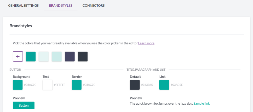
Example of configuring brand style settings in BEE ProThe built-in drag-and-drop editor makes it easy for everyone from educators and HR Departments, to Solopreneurs and Designers to create beautiful and responsive emails and landing pages. Custom templates, reusable content blocks and predefined style settings provide ways to maintain a consistent brand identity.Up until now, we have offered a two-week free trial for those interested in testing out the platform. The new BEE Pro Free plan gives everyone the freedom to test and experiment at their own pace, without any time limits.
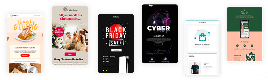
Examples of BEE Pro templatesWhat makes BEE Pro Free a particularly great place for everyone to get started is our rich email and landing page template catalog, which includes over 1300 free templates suitable for a wide variety of industries and use cases. The templates are professionally designed, mobile-optimized, and are fully editable through the drag-and-drop builder that's quick and intuitive for non-designers. For those with design experience, the editor provides full creative freedom to design from scratch.Another area in which BEE Pro helps decentralized teams is collaboration: it makes it really easy for team members and stakeholders to come together, design and review the content. For example, design-specific comment threads make reviewing and approving content faster and more accurate. For a quick inside look, here's a short video that shows how that works.https://www.youtube.com/watch?v=ooO44Q8HtSQ
Democratization of Design is Empowering
The idea that everyone can design beautiful and responsive emails and landing pages sounds scary to some. They fear there will be a loss of quality or overall bad designs as a result of allowing non-designers to create. For designers, the threat lies in a perceived decrease in the need for their skillset. Along with the possible extinction of their positions altogether. Regardless of where you stand, we’re here to put your concerns to rest.We believe that democratizing design is empowering, and created BEE Pro to help remove those fears. It was built from the start to make the collaboration between designers and non-designers fast and effective. Professional designers can create an entire design system in BEE Pro, made of templates, reusable content blocks, and predefined styles (colors, fonts, etc.).
Example of reusable content blocks in BEE ProNon-designers are able to get tasks done faster by taking care of the last mile. The democratization of design empowers them to learn new skills that allow them to do their jobs more effectively. In return, these skills allow them to take charge of small design tasks and stop over-relying on other teams to meet deadlines.The truth is, designers and creative teams will always be essential to organizations. Design systems and tools aren’t a threat to their positions, but rather allows them to focus on more important tasks.
How It’s Done at BEE
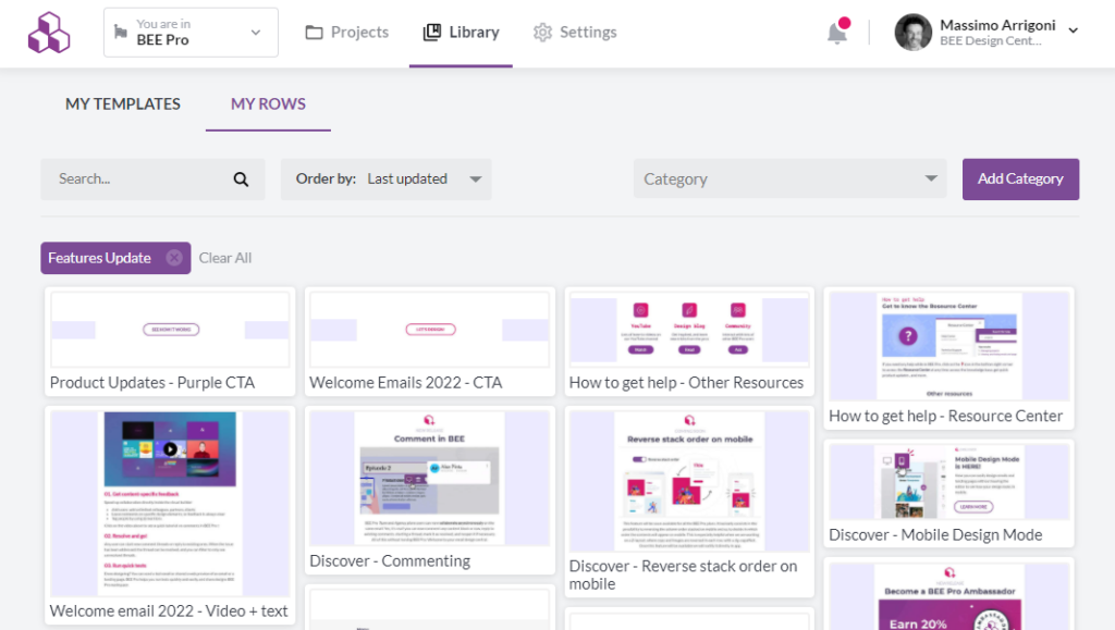
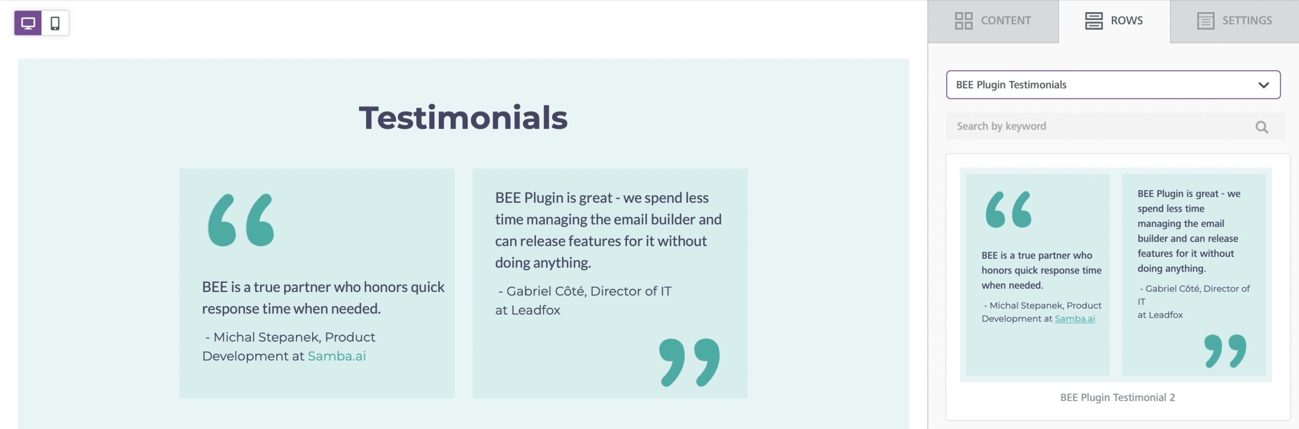
At BEE, we embrace the democratization of design and the collaboration between designers and non-designers that goes with it.For example, our sales team often needs to quickly create and send emails to potential clients, or share landing pages with them. At times, this conflicts with the timeline and deadlines imposed on the design and marketing team. We spoke with Yuliana Pandelieva, our Graphic Designer, and Tyler Bennett, Head of Sales to share with us how they use BEE Pro to collaborate more effectively. Yuliana shared that she “created a collection of saved rows (i.e. reusable content blocks) within BEE Pro to create emails on the spot that are tailored specifically to their client's specific needs. This included bios for the people from the sales team, information about the different product plans, testimonials from clients, etc.”
Example of the saved rows feature created by Yuliana for our BEE Pro sales team“BEE as an organization already has established a recognizable design style that is being used in all external communications, so generally speaking the task at hand was to create the required extra content in the same visual style, so the modules can be easily added and interchanged when needed.”Tyler shared that the biggest benefit of this design system is that “what used to be weeks worth of work can now happen within a few hours.”Different members of the team often find themselves collaborating on new emails and landing pages. Available on the BEE Pro Enterprise plan, real-time co-editing allows for an even greater level of collaboration, with people designing and copywriting at the same time, and things getting done even faster.
Here you can find all of the BEE Pro features and how you can apply them to your own organization.
BEE Pro, now free for everyone.
At BEE, we are fully embracing the democratization of design and are ready to support your organization in experiencing this new way of working. BEE Pro allows designers and non-designers to collaborate more efficiently, get things done faster, and stay on brand. The Free plan is a great way to get started, and paid plans are available when the tool is used more frequently, or when additional team management and brand control tools are needed.BEE Pro Free is now available to everyone.Before signing up, you can browse our catalog of over 1,300 professionally designed emails and landing pages, and try BEE’s visual builder to edit them, within two clicks.Over 10,000 emails and pages are designed and exported or published every day by BEE Pro users. Now it’s your turn!Sign up for your free account here.
The Best Free Design Tools to Produce Content Like a Designer
According to the Adobe Financial Analyst Meeting, there will be 900M Communicators and 68M Creative Pros by 2024. The democratization of design and the arrival of free design tools makes it possible for just about anyone to create content with ease and flexibility.As a result, designers and marketers are coming together to create beautiful, engaging, and effective marketing material such as responsive emails and landing pages.Over the years, we have seen a growth in new and free design tools that allow anyone to produce content like a designer. Here are some of our recommendations:
Four Free Design Tools You Need
When choosing which design tool is right for you it is important to choose one that is easy to learn and whose capabilities grow with your skillset.
- BEE Pro Free: BEE Pro Free is a drag-and-drop email and landing page editor that makes it easy to create responsive emails. With over 1100+ free templates, it’s perfect for non-designers to create quick and beautiful emails and landing pages. For those with design experience, it is detailed and customizable enough for you to design from scratch.
- Figma: Figma is an “all in one design platform” mostly used for web design and prototypes. This platform offers a variety of easy-to-follow tutorials for new users to explore their creativity. Designs created in Figma can be exported into responsive design tools for sleek and polished graphic design.
- Pitch: Pitch is a presentation platform where your team can design presentation decks for any occasion. It turns what used to be a boring task into a creative process. A great way to start incorporating Pitch is by promoting its use in internal meetings and presentations. This allows your team to experience the power of design for themselves.
- Canva: Canva is an online tool that allows you to create social media graphics, flyers, videos, and more for free. The resulting content does not have HTML attached so be careful when using it for web and email.
While many of these tools are intuitive, learning a new design tool is a process. It’s important to give your team the opportunity to explore each platform and see how they can use it to make their job more efficient.
How to support your team when using free tools
While design tools matter, it’s not a silver bullet for producing content like a designer. Integrating the right systems and workflows to support your team is essential.
Have Strong Brand Guidelines
In our latest blog on Design Systems, we spoke to Crystal Ledesma, Engineering Manager for the design systems team at Zillow. She shared with us that before Zillow began implementing design systems, the emails they sent their audience looked so different from each other that customers began marking them as spam.Luckily, there’s a way to avoid this.Brand guidelines are great examples of design systems at work. They ensure that your brand’s messaging and style remain consistent and easily recognizable through every touchpoint.These guidelines should include:
- Information on logo usage including size and spacing
- Guidelines on how to use color palette along with HEX and RGB codes
- Different font usages and sizing
- Design elements such as patterns, icons, and photography
Brand guidelines should be easy to share and understood by everyone in your organization. That way, every email and message that goes out looks like it’s from your organization (thank Crystal for this tip!).
Have Workflows
According to Lucidchart, a workflow can be described as a guide that “defines the steps involved in the process of getting work done.”Workflows are especially helpful in collaborative environments to ensure that everyone is working in an efficient and timely manner to achieve a common goal. Workflows promote transparency by allowing team members to share their progress openly.When creating one, make sure to lay out every step of the process from an idea to a final product. A simple example of a workflow for writing an email can look like:
- Determine the goal for the email.
- Plan your outline.
- Write the content based on the goal and audience.
- Provide feedback.
- Incorporate feedback and make final tweaks.
- Publish to the public.
Workflows are effective because of their simplicity and repeatability. They can be used each time you are working on a similar project. Make sure your workflow includes who is responsible for each task and/or phase, due dates for each phase, and when to give feedback.
BEE Pro, free for everyone.
If you’re ready to start embracing the democratization of design within your own organization, we have something for you.On March 30th, BEE Pro is launching a new plan available to everyone for free! BEE Pro Free is our easy-to-use drag-and-drop editor that allows anyone to create beautiful emails and landing pages from scratch or using our template catalog.We know the importance of design when it comes to emails and wanted to create a product that is accessible to all. Learn all about the BEE Pro Free here.
5 Inspiring International Women’s Day Emails
Originally published on Feb 19, 2020. Last updated March 7, 2022.International Women’s Day happens every year on March 8. Gender equality is an ongoing struggle that touches the lives of women and their families everywhere. This holiday is a chance to acknowledge the women in your community and be part of a global conversation that matters to your audience. If you're considering sending an International Women’s Day email, you should make sure it's thoughtful and will resonate with your readers. We've gathered some examples from brands that have done it right:
Gender equality is an ongoing struggle that touches the lives of women and their families everywhere.
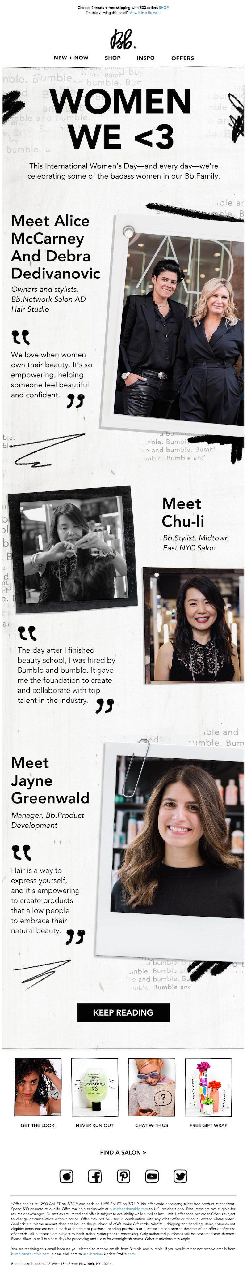
Tell a story like Bumble and Bumble
Storytelling may be the most essential way we connect with each other. And that's true for brands as well as individuals. In this example, Bumble and Bumble did this by spotlighting a few of its employees. You could also take a slightly different approach by soliciting user-generated content from your customers, asking them to share how they use your product to celebrate International Women’s Day.Subject line: Celebrate International Women’s Day
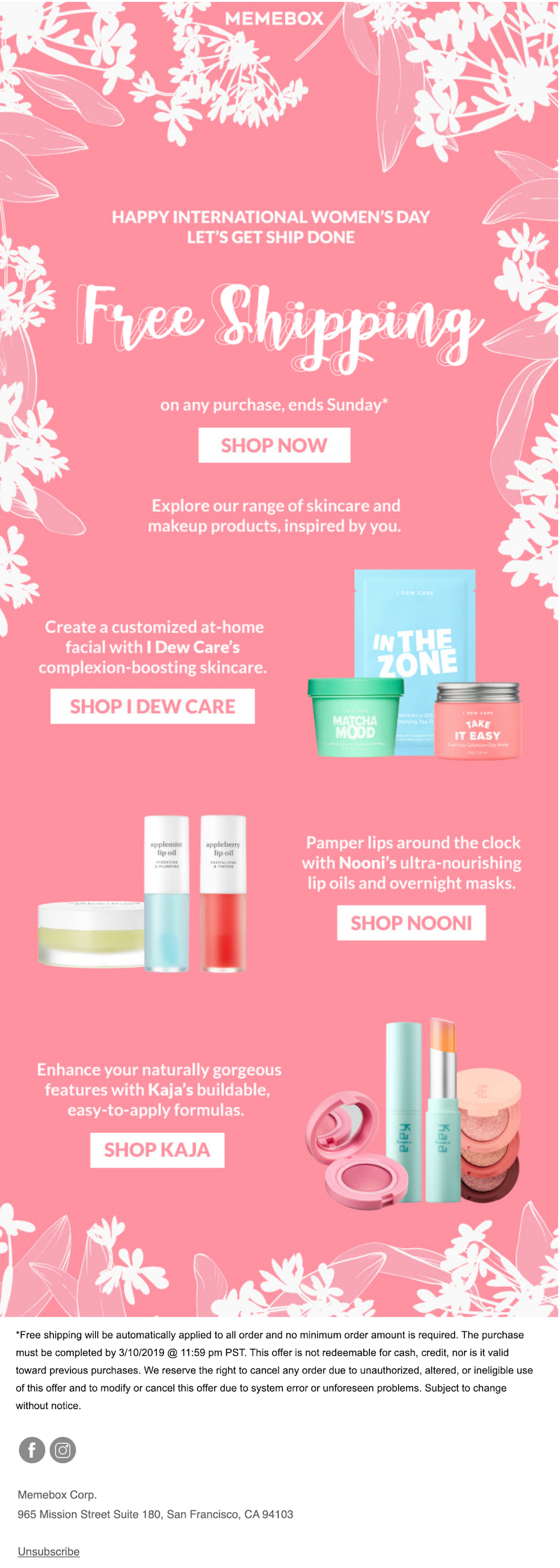
Keep it simple like Memebox
We’re slightly obsessed with this pink-and-white Memebox email. The graphic ferns and flowers around the edge make the perfect frame for the message. The copy is clever: “Let’s get ship done.” Create a similarly simple but beautiful email to showcase your products this International Women’s Day.Subject line: Celebrate International Women’s Day with free shipping
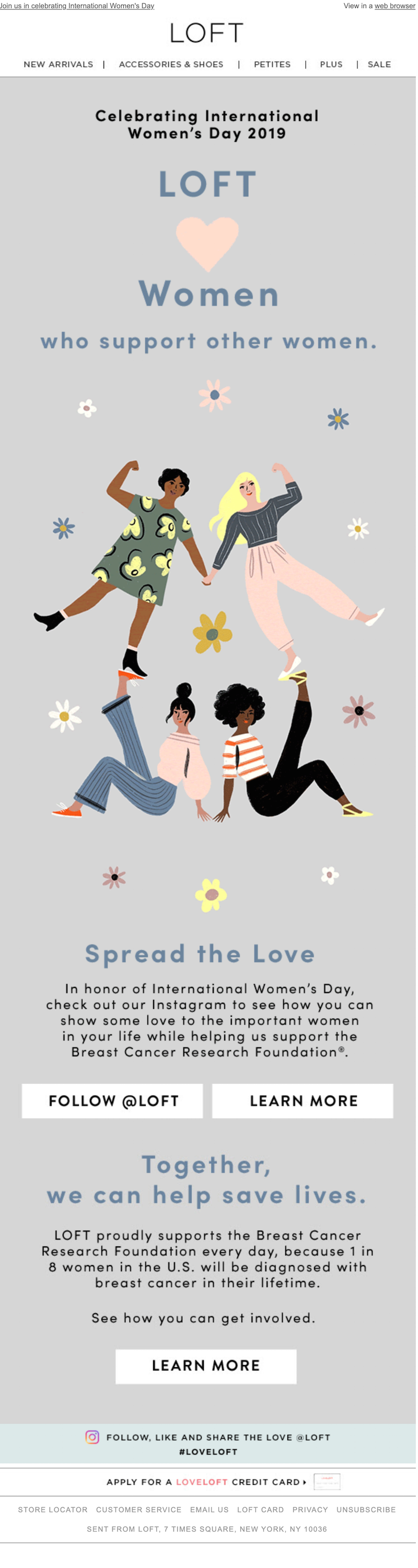
Be both strong and feminine like Loft
The pastel color scheme and graphic flowers on this Loft email give it a feminine feel, but the strong font keeps the overall design from being overwhelmingly sweet. In terms of strategy, Loft cross-promotes its Instagram content and chooses a cause to support. Being clear on what you support, whether it's a holiday or a cause, increases brand loyalty; 84% of consumers are more likely to support a brand whose values align with theirs.Subject line: Celebrating women (today and every day)
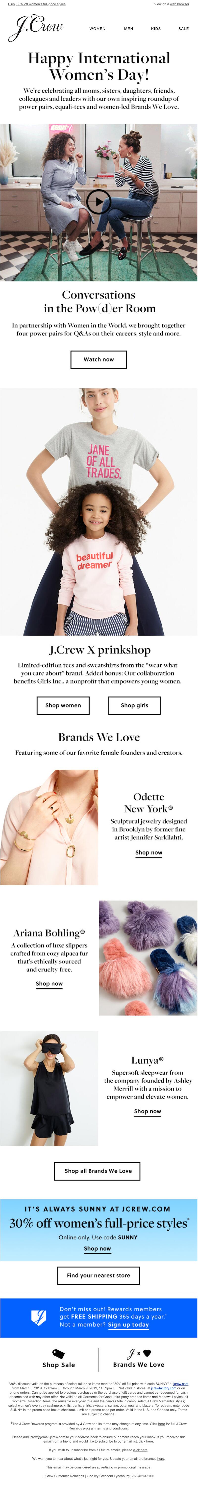
Share content and products like J. Crew
This sleek black-and-white J. Crew email shares an inspiring piece of video content before getting into the products the company has to offer. Your Women’s Day email is a great place to highlight relevant products — the apparel, gifts or other items that support the cause.Subject line: Celebrate International Women’s Day with us…
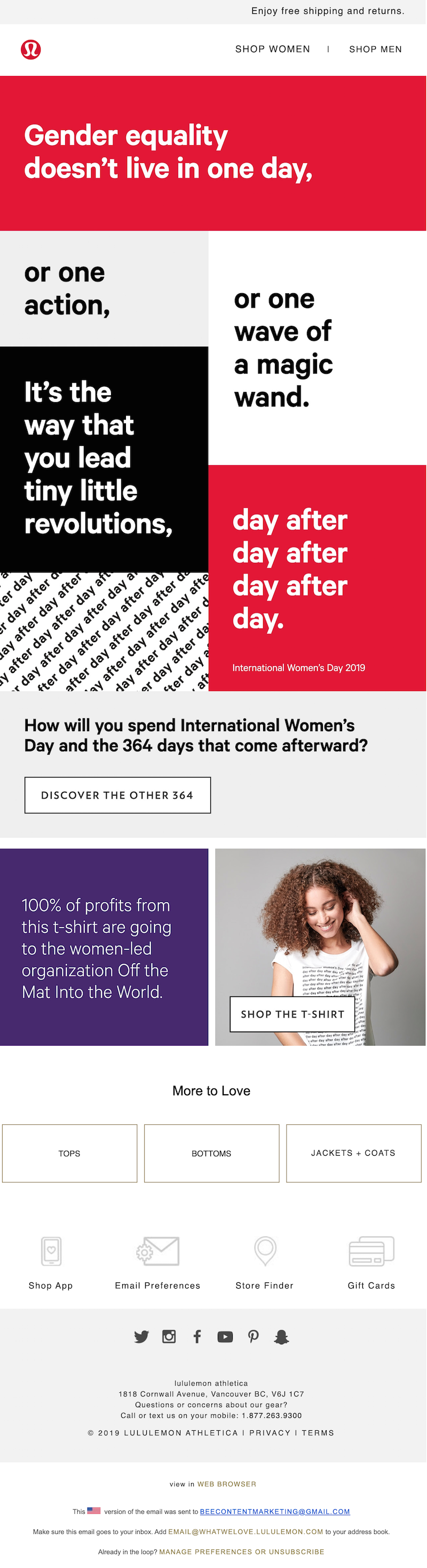
Promote action like Lululemon
As Lululemon points out, gender equality isn’t just important one day of the year. Encourage your readers to keep pushing for equal opportunities year-round. And like Lululemon, you can also create content that gives your readers actionable ways to do this. The links in the Lululemon email take the reader to a landing page with a podcast and a list of 364 ways to make a difference.Subject line: How will you spend the other 364?
Wrap-up: Create your own International Women’s Day email
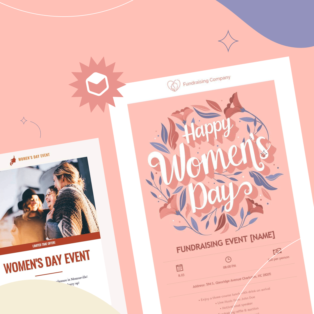
Ready to design your own email? We have the perfect International Women’s Day email template, designed by Galina Grahovska.
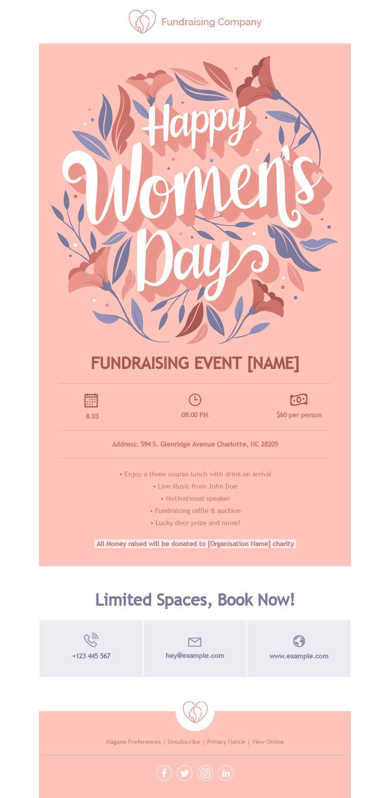
We also made aWomen’s Day email template that’s meant for fundraising events specifically. This template was designed by Martin Nikolchev.
Use these International Women’s Day email templates – along with all this design inspiration – to celebrate and encourage women all year round!
Dark Mode Design Best Practices
According to a 2020 study by Android Authority, 81.9% of participants use dark mode on their phones and 64.6% of participants expect sites and apps to automatically apply a dark theme or at least offer the option. Popular email providers like Gmail and Outlook have already launched dark mode as an option for their users, changing the game for email marketers and designers. So, what’s the hype with dark mode? By turning light background colors dark (typically a shade of gray or black), it creates a new user experience that:
- Enhances accessibility and reduces eye strain on those with light sensitivity.
- Preserves battery life on devices by reducing screen brightness and using less energy.
- Offers a slick and cool dark interface that many prefer.
With the increase in user screen time, it’s clear to see why users want this option.It’s time for marketers and designers (I’m looking at you) to stop ignoring dark mode when designing. Taking the extra step enhances user experience, ensures that your content is accessible to all, and prevents your emails from being sent to the dark place - aka the SPAM folder.
The Cold Hard Facts about Dark Mode You Can’t Ignore
Dark mode is becoming the norm. Almost every email client has adopted their version of it and readers expect a consistent experience.
Your readers matter.
The number one rule for content marketers and designers is to put the audience front and center. Considering and testing how content looks in dark mode vs. light mode shows your readers that you care about creating a consistent, cohesive, and accessible experience for all.
Email clients are unpredictable.
Depending on the email provider, there are three different ways that email clients might change the look of your content:
- No changes at all: In the case of Yahoo mail and Apple Mail there is no impact on how emails are viewed.
- Partial color invert: Email clients like Outlook only detect light-colored sections and turn them into darker colors.
- Full color invert: This is where everything is inverted. All the areas with light turn dark and vice versa. This is the Gmail apps MO.
It is important to make sure that designs are rendered as well as possible in both light and dark mode. If readers don’t recognize where the email is coming from, they will ignore it, delete it, and may unsubscribe altogether. This hurts your email deliverability in the long term.Take the extra step to ensure that your reader experience is consistent and enjoyable, regardless of their preferred mode.
How to optimize emails for dark mode
Designing for dark mode doesn’t have to be hard. Here are some of our best tips to start implementing today.
Avoid using true black
The high contrast between true black backgrounds (#000000) and true white (#FFFFFF) will make things more difficult to read, defeating the purpose of dark mode altogether. Instead, use dark gray (#121212) as the background color to soften the contrast.
Saturated Brand Colors
While your saturated brand colors look great in light mode, these colors are too bright and will affect readability.Before you run away, we’re happy to say there is no need to call your design team for reinforcement. Instead, have fun and experiment with a desaturated or muted pastel version of your brand colors.
Optimize Images and Logos
For many email marketers, this seems to be the biggest challenge when it comes to optimizing emails and landing pages for dark mode, but again, it doesn’t have to be. Here are a few ways to optimize images and logos.
- Use a logo that uses a brand color that isn’t black or white.
- If you have an image or element with a black background, add a white outline to improve its visibility and avoid it from fading into the background.
- Ensure images and logos are PNG format with transparent backgrounds.
- Keep things minimal. Dark backgrounds can give the illusion of limited space so keep things simple to not overwhelm the reader.
3 Dark Mode Design Examples
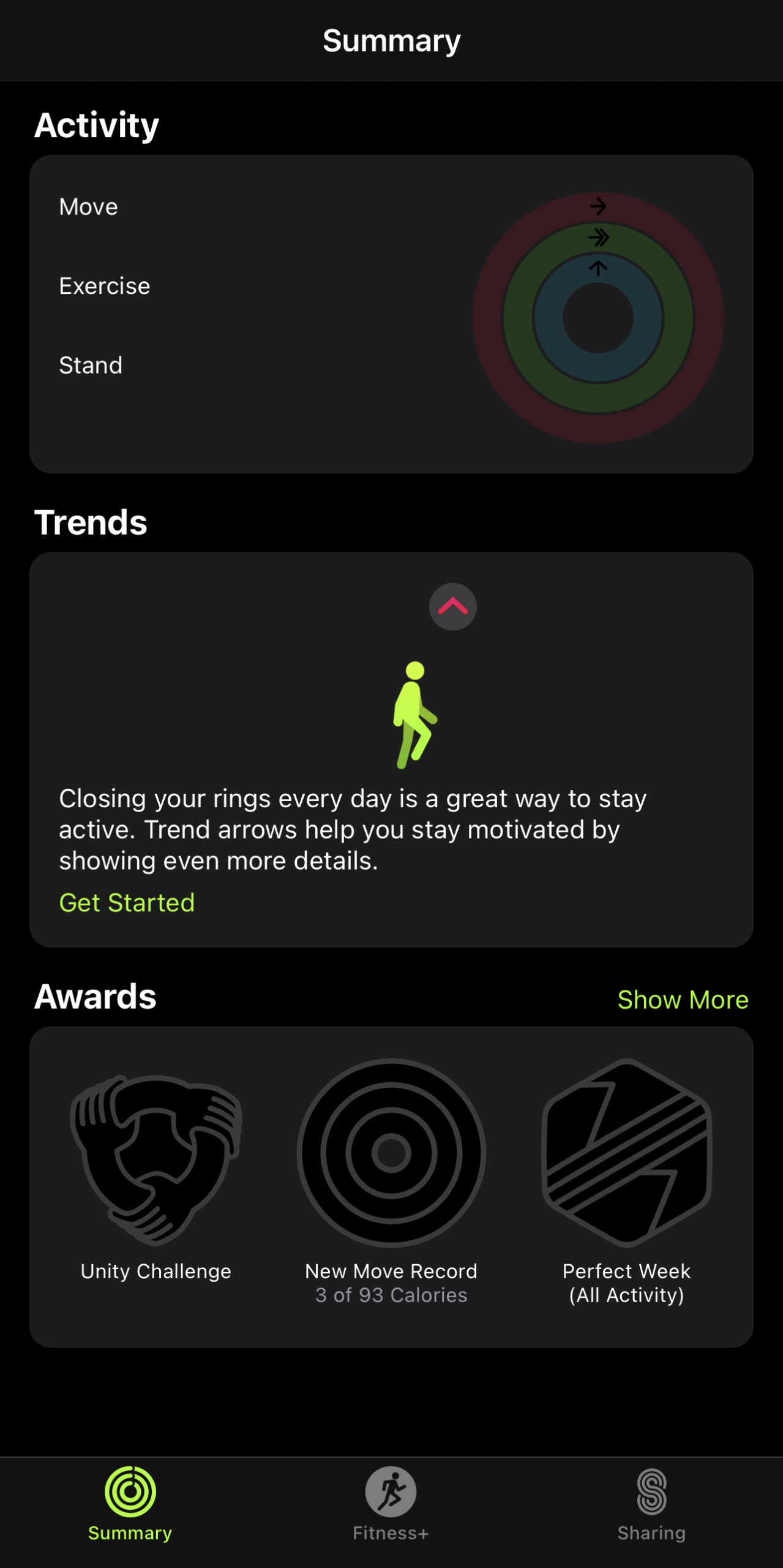
Are you a visual learner? Oh Good! We have a few examples of designs we love and why they work.Example 1: Apple Fitness AppThe Fitness app is a great representation of how using bold colors against black backgrounds is still possible without it being too harsh on the user. Dark mode shouldn't compromise the purpose behind the app. In this case, the final result is the same: it inspires movement and gets us excited to work out.
Apple Fitness AppExample 2: Notion AppTheis works because it exemplifies how dark mode shouldn’t hurt the essence of the product or the user experience. If anything, it enhances the experience altogether. Dark mode offers a level of sophistication and makes us feel fancy. All of these use different shades of gray to offer depth and create shadows without it feeling boring.
NotionExample 3: Google home screen
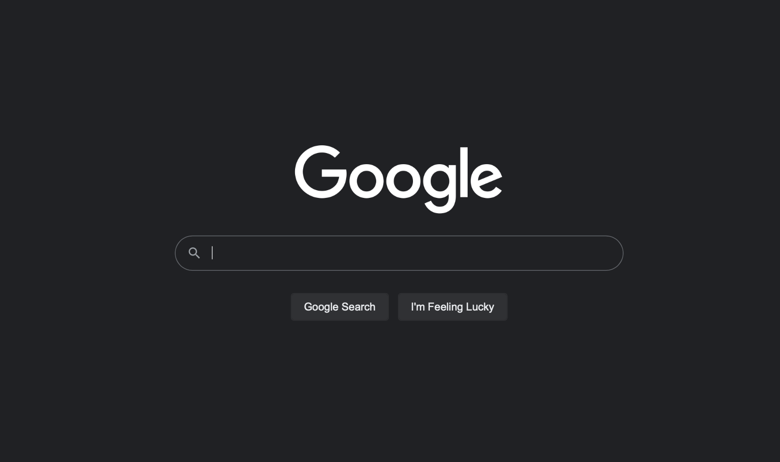
GoogleFinally, Google's dark mode offers a simple and elegant interpretation of dark mode. Notice that they don't use true black (the background color is #202124) and they differentiate the search and "I'm Feeling Lucky" buttons with a shade of grey (#303134). Everything else is white, so that CTAs are clearly readable.
It's time to stop ignoring the facts
Previously, email marketers and designers (looking at you again) have ignored the effects dark mode has on emails and landing pages. Partly because no one could have predicted how many users required this feature and partly because it seemed like a difficult task. We hope that we debunked that with this article. If we didn’t, then our apologies, but we want to offer you some hope.
The solution: Dark Mode Preview Toggle
How can you adjust your email designs to account for dark mode? BEE Pro has the solution. Starting March 16, 2022, our email and landing page design suite will feature a new Dark Mode preview toggle that will help you create emails with dark mode in mind.By simulating how your messages display in dark mode, it will help you recognize and avoid main design issues that may occur when an email message is received by a reader that has dark mode enabled.
Preview how your email will render in dark modeThis handy feature will help spot common “design mistakes” and ensure that you are creating cohesive and consistent experiences for your readers without limitations based on the mode they choose to use.We hope that you’re as excited as we are. If you’re new to BEE Pro get started for fee. You can also check out our HTML professional email and landing page templates and choose one that is dark mode friendly (refer back to our tips above).
How to Give Useful and Accurate Design Feedback on a Remote Team
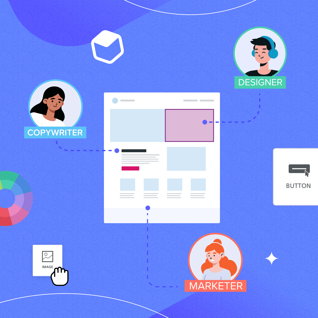
While there is no way to predict the future of remote work, one thing is for sure - remote collaboration is here to stay. Even if some businesses keep offices, nearly 50% of U.S. employees won’t return to jobs that don’t offer some type of remote work. For the design and marketing community, this makes remote design feedback a must.There are several challenges that come with remote collaboration. Vague feedback, lack of context for projects, and sharp learning curves for new tools make it difficult for teams to work on assets together.Nearly everyone needs to communicate these days: HR teams creating company newsletters. Growth teams designing a new onboarding email. Content marketers crafting landing pages for the latest campaign. And these teams always have a mix of skills. Designers, copywriters, marketers and more. Designing together is a must.This article will help make sure your feedback is constructive, as well as recommend tools that allow for remote design collaboration and comments.
How to give useful design feedback on a remote team
Whether your team has implemented formal design reviews or simply shares feedback on the fly, it’s pivotal to establish standards for feedback that leave individuals feeling empowered to do their best work.
Know your onboarding processes
Chaotic onboarding makes for difficult collaboration. Everyone wants to move forward quickly and with confidence, and leveraging design tool features is pivotal for this process.Before onboarding a new team member or client, know the following:
- Which design tool best suits the need of your business
- The collaboration features for communicating within the design tool and how collaborators will be notified (notification centers, tagging, emails, etc)
- How subscriptions work and the price per team member or user
Embrace radical candor
“Radical candor”, coined by author Kim Scott, refers to the practice of giving straightforward feedback while maintaining a positive relationship with your team. Scott ranks types of feedback on a scale that has Caring Personally on one axis and Challenging Directly on the other.She posits that there are four main types of feedback:
- Ruinous Empathy. AKA avoiding giving feedback to spare someone’s feelings.
- Manipulative Insincerity. Giving vague or lazy feedback to assert power over someone.
- Obnoxious Aggression. Giving accurate feedback in an unkind way.
- Radical Candor. Being honest about feedback while showing that you care about the person’s growth and success.
Radical candor is healthy in any work environment, but it’s especially useful when communicating online. Your team can't rely on body language and context. So it’s vital that you show empathy intentionally, while also being specific with the feedback that you’re giving.
Give feedback regularly and predictably
It’s natural for team members to want to know how to improve their work, but no one wants to be micromanaged. Set a regular cadence for feedback so they know when to expect critiques on their designs.It’s also best practice to have an agreed-upon rubric or standard for work, so that creatives feel that they are being evaluated equally and know what they are working towards.Beyond establishing the when, also establish the how. Which tools are you using to give feedback? How will you know when the feedback has been incorporated? What happens when one design has multiple collaborators?
Work with creatives to set goals
Every person is different and will best receive feedback in different ways. One way to ensure that your feedback is useful to the designers and copywriters you’re working with is to set mutual goals.For example, maybe you know that this designer is working on improving their mobile designs. In this case, you can tilt your feedback towards developing this skill set. This helps frame feedback as an act of mentorship, rather than a critique.
Address specific elements to move fast and prevent mistakes
When it comes to design feedback, specificity is king. It’s the difference between quickly addressing issues and getting things done versus becoming stuck in a slew of comments and never-ending back-and-forth.Highlighting specific elements using tools that have comment features is the best way to ensure that everyone is on the same page.
Tools to give design feedback
It’s challenging to be specific about feedback when working on complex digital assets.For example, how do you provide feedback on one call-to-action button when there might be four of them in an email? Or how do you give feedback on different versions of the same asset (like a desktop vs mobile-designed landing page)? Things get messy, fast.Depending on the digital asset you are working on, there are several tools to help you and your team collect design feedback quickly and accurately. Here are our favorites.
- BEE Pro: BEE Pro gives creatives the power to create response designs without any coding knowledge. Design emails and landing pages with your team using a drag and drop interface and always-expanding collaboration features.
- Figma: Loved by designers to create user interfaces of all kinds, Figma includes many collaboration tools, including real-time multi-user editing.
- Canva: Adopted by millions of users around the world, Canva helps teams collaborate on creating graphics for social media campaigns, presentations, videos and more.
- InVision: One of the pioneers in bringing collaboration to design tools, InVision continues to innovate and their Freehand product aims at merging a whiteboard with a digital design suite.
- Adobe XD: Adobe XD brings real-time collaboration to teams that are used to working with Adobe products. It also puts the accent on helping create design systems collaboratively.
Streamlining the design review process with Viewer role
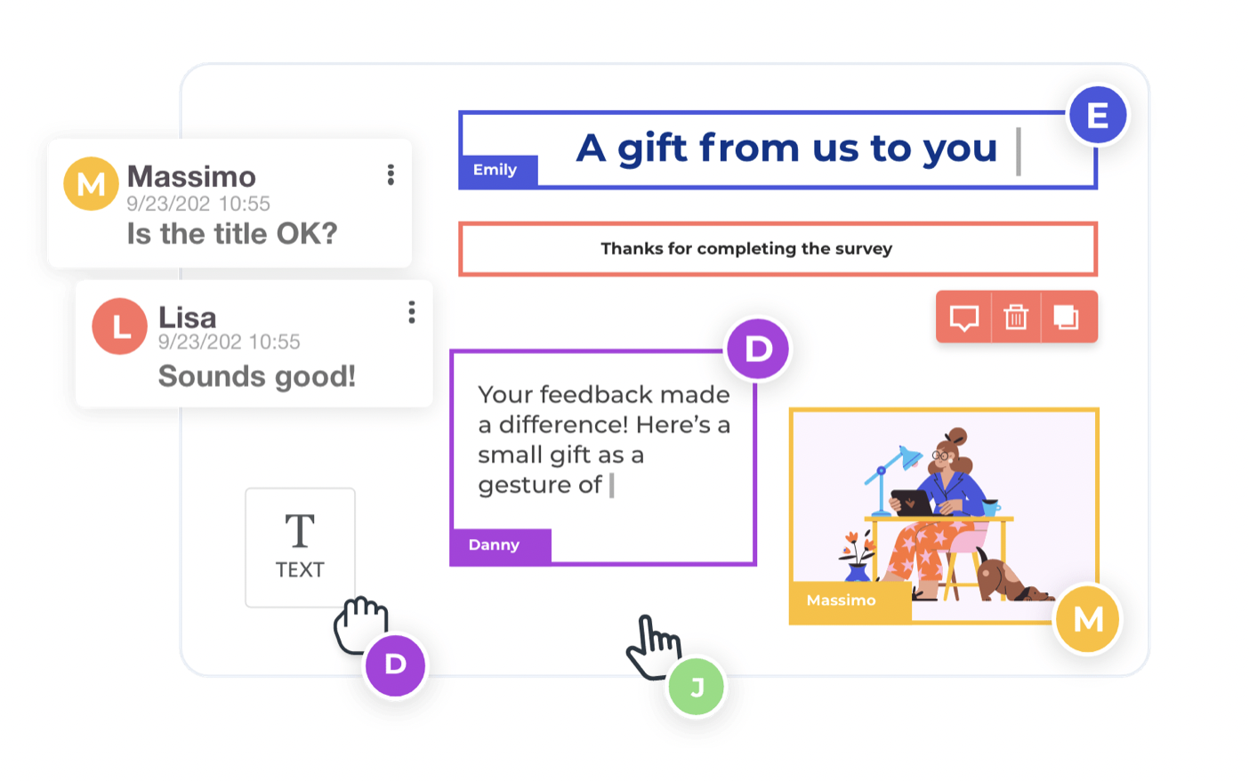
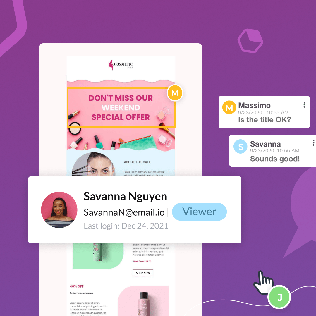
Emails and landing pages are often cross-functional digital assets. On top of that, different stakeholders come in and out of the process as a campaign develops. A member from another department may “check in” on the asset, or sometimes an outside partner or client needs to give approval before something goes live.When people are popping in and out of the workflow, it’s hard to keep track of feedback and changes. Especially when they don’t have a subscription to your design tool.We recently addressed this challenge, by introducing the new Viewer role in BEE Pro. It allows you to invite anyone (in or outside of your organization) to review the email or page you’re working on and provide feedback, without having to pay for another BEE Pro account.
A Viewer can comment directly in the visual builder, but they cannot edit the design or the copy.They can create new comment threads or respond to existing ones, so feedback is accurate and content-specific. But since they cannot edit, they don’t need to worry about accidentally breaking something - and you don’t have to worry about unwanted changes.BEE Pro helps businesses quickly design high-performing digital campaigns. With the new Viewer role, collaboration becomes even easier and faster. Available now on the Team plan and above.If you’re new to BEE Pro, contact us or get started with a free trial.
Improve Email Deliverability with 3 Design Tips
Designers and email marketers both have the same goal: to create high-performing email campaigns. When emails are delivered to the SPAM folder, performance plummets. We recently covered the ins and outs of design x deliverability in an Instagram Live discussion with Jennifer Nespola Lantz.
View this post on Instagram
A post shared by 🚀 Design with BEE (@beefree.io)
In this article, we're expanding on an important topic discussed in our conversation with Jen: design choices can impact your ability to deliver your email messages to the inbox (i.e. your email "deliverability").
What is email deliverability?
Email deliverability is the ability to successfully land your messages in the inbox. You can have beautifully designed, perfectly optimized emails - but if nobody receives them, that’s not really going to matter.Many things affect whether your emails end up in the inbox or not, including the reputation of your FROM address (the email address that the message comes from), the reputation of the sending platform, and even more technicalities like email authentication.Those are all important and you should discuss them with your email service providers. But even if you're not techy, your choices can affect your email deliverability.
How email design affects deliverability
Let's assume that all the technical stuff has been taken care of. Are there other choices that affect your ability to deliver emails to the inbox? The answer is "yes".At the core, it's about engagement. Mailbox providers (like Gmail, Apple Mail, and Yahoo! Mail) want to make sure their users are having a good experience in their inbox. In other words, they want people to receive messages that they want to engage with. Design choices that affect engagement, therefore, can impact deliverability.Let's look at some of them.
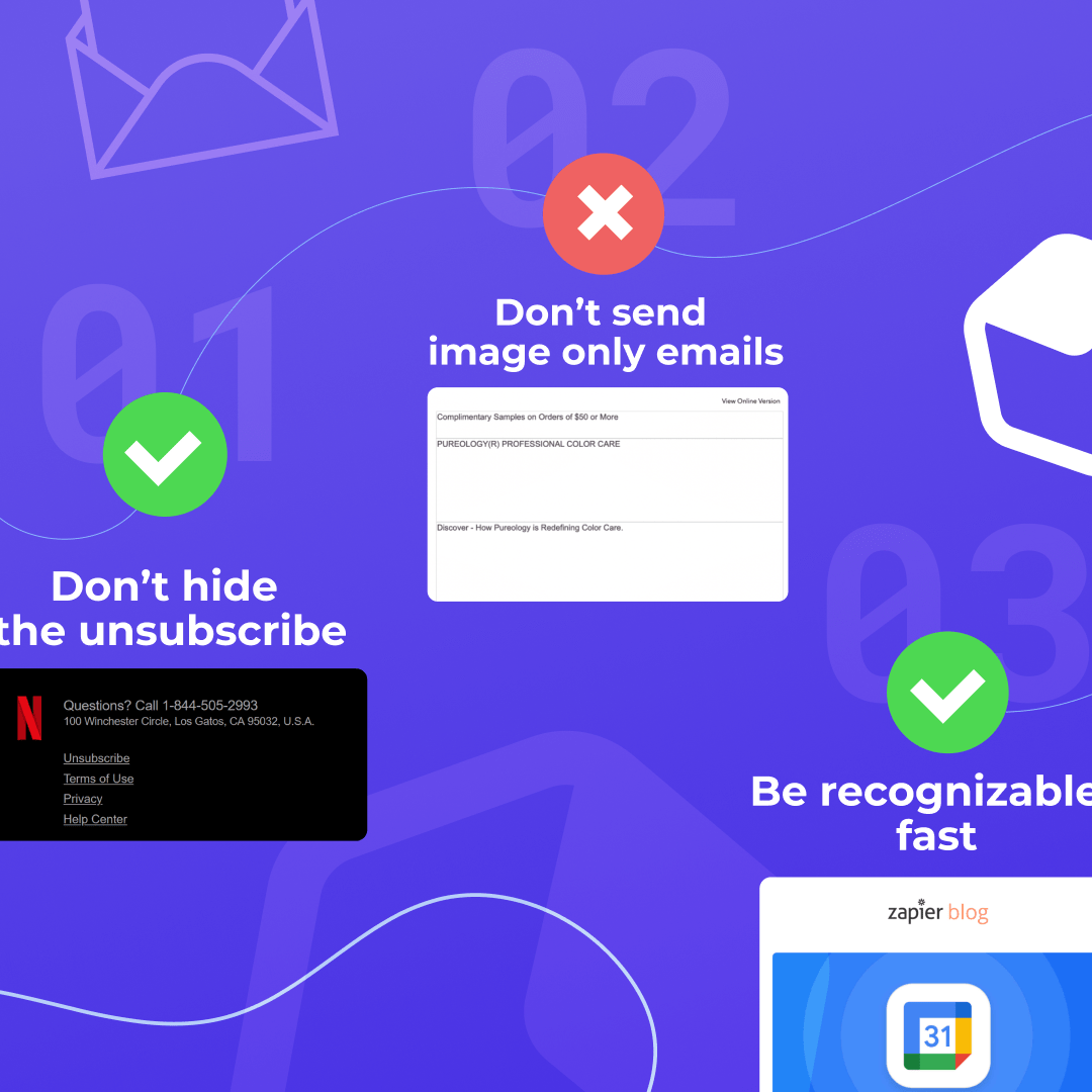
(1) Don't hide the unsubscribe
It's a bit counterintuitive, but the best way to make sure your audience is engaged is to make it easy for them to opt-out. You're emailing people, not email addresses. Even if you do a great job at segmenting your audience and sending them content they care about, there will be those that no longer wish to receive your messages. Make it easy for them to unsubscribe.There are two fundamental reasons to have a visible unsubscribe link:
- Spam complaints. If you make it hard to unsubscribe, your messages are more likely to be flagged as SPAM. That's a very strong signal to the mailbox provider that people do not want to receive your emails. If spam complaints rise, your likelihood of ending up in the SPAM folder gets higher and higher. In addition, your ESP may decide to stop sending your campaigns altogether.
- Engagement score. If everyone on your list actually wants to be there, your overall engagement score goes up. If 200 people click on a link in your email out of 1000, that's a 20% engagement score. If you sent the same message to 10,000 people and the number of clicks remained the same, engagement would go down to 2%. Clicks are just one of the engagement signals that mailbox providers look at to determine whether customers care about that message, but you get the point.
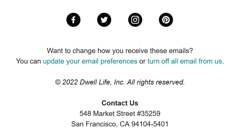
For example, Dwell Magazine uses a clear, transparent design for the unsubscribe preferences at the bottom of their newsletter:
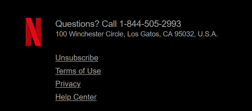
Here is another example from Netflix: notice that the unsubscribe link has the same size, color, and underline style as all other links in the section. There is no attempt to hide it.
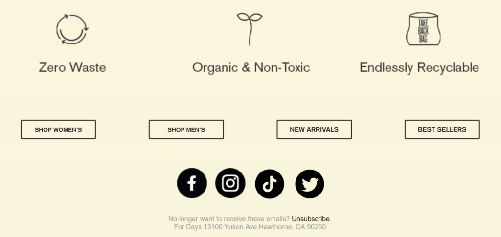
Apparel brand For Days, instead, wrote the unsubscribe in a font size that is so small that at first we didn't even see it. We love the design of their clothes, but they should reconsider the design of the email footer :-)
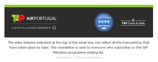
Similarly, Portuguese airline TAP chose to make the "Cancel Subscription" link almost invisible in their email. Not a good idea.
(2) Don't send image only emails
There are many reasons not to send emails that only contain images. Among them: they will not be seen when images are turned off, they're slow to download when the quality of the internet connection is poor, and they often don't render well on a mobile device. On top of that, they often get treated as SPAM by the inbox providers because spammers try to conceal text by using images. Spam filters typically consider that kind of message as high-risk and put them in the SPAM folder.The same is true for messages that includes minimal text (i.e. a very low text to image ratio).We cover this in details in Why you should avoid sending image only emails.
(3) Be recognizable, fast
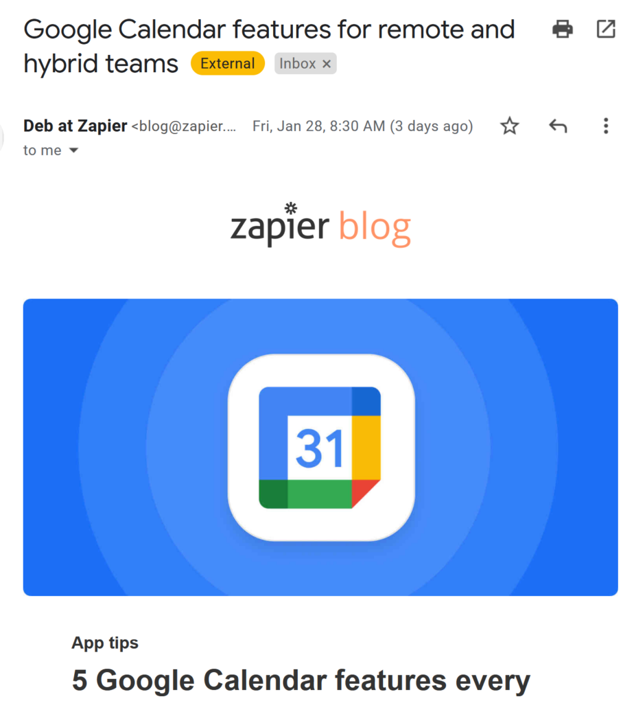
How quickly do you decide whether to read an email when you're browsing through your inbox? In an era of 8-second attention span, we take even less time to glance at an email and decide whether we're going to read it or not. It's crucial that your messages are easily recognizable, so your readers don't have to spend any of that short attention span figuring out who is sending them the message.One way to do this is to use a recognizable, consistent FROM name and email address. This not only helps your recipients recognize you, but it also helps you build a reputation with the mailbox providers. The alternative is problematic: the more you change things, the more uncertainty is created and the more difficult it is for Gmail & Co. to decide that the incoming message is to be trusted.For example, task automation company Zapier has been sending blog updates from "Deb at Zapier (blog@zapier.com)" for some time. This adds a recognizable human element for the recipient ("Deb"), while creating consistency for the mailbox provider (the FROM email address has been "blog@zapier.com" for a long time).
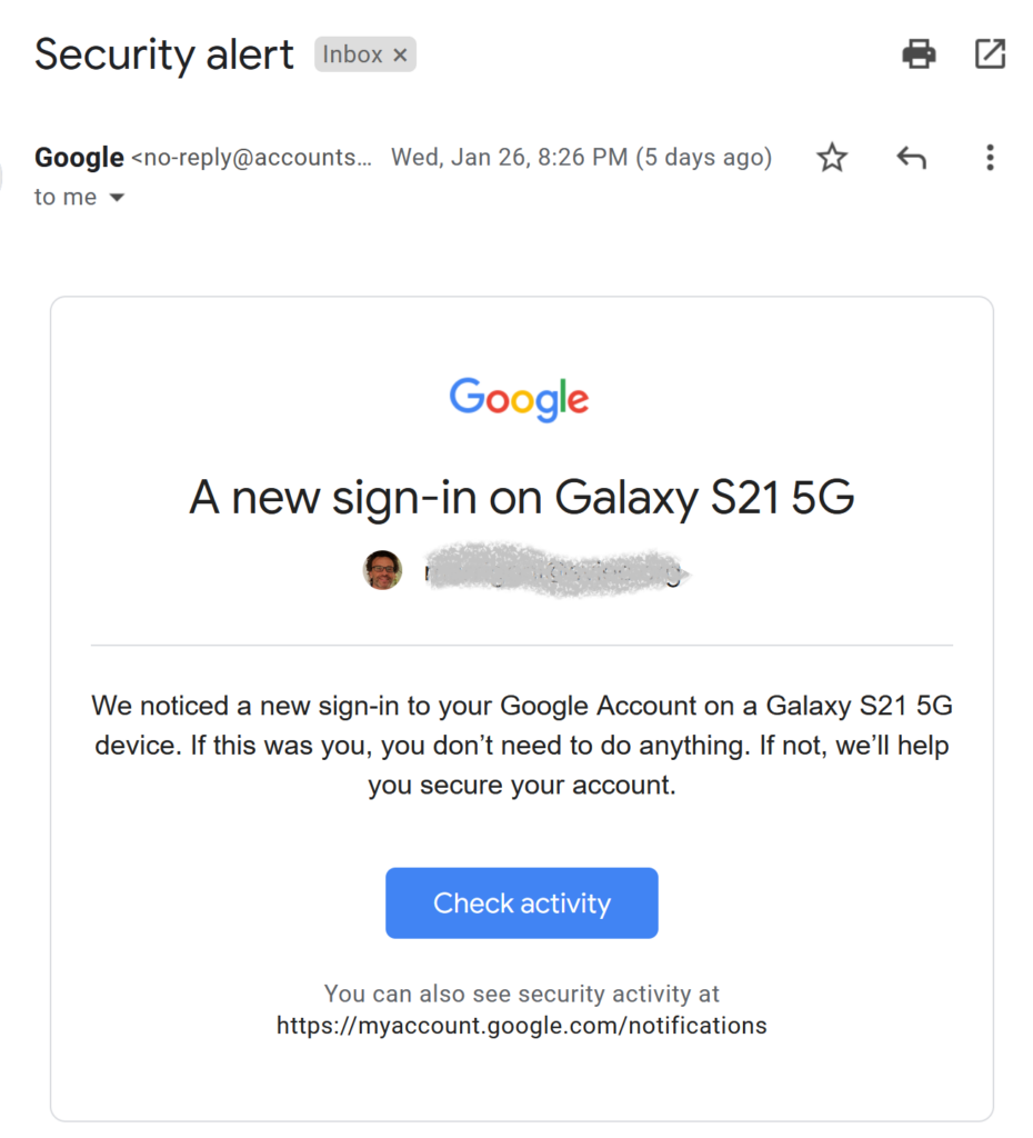
Equally important is to employ a clean, brand-focused, consistent design, especially when it comes to transactional emails (those are emails that you would never want your customers to flag as SPAM and not receive.) For example, Google uses a clean, minimalistic, on-brand design for security alerts: font, colors, logo, links...everything is quickly recognizable.
Wrap-up: email design does impact campaign deliverability
The choices you make from a design point of view can impact your ability to deliver emails to the inbox over time.Make sure that:
- You don't make it difficult for people to unsubscribe
- You have a good balance between text and images
- Your customers can quickly recognize your messages
With BEE Pro, you can quickly design emails that perform well. You can also create and save all sorts of different email footers with clear unsubscribe links, and then re-use them quickly when you need a specific one for a newsletter or promotional campaign.Get started by checking out our free email template catalog
Top Email Design Trends For 2022
Email design trends are always changing and smart design moves last year might not be what put you ahead of the pack this year. As you step into 2022, make space for growth by staying open to new ways to engage with your customers and prospects.Keeping up to speed with email design trends will strengthen your email marketing campaigns and allow you to consistently stand out in the inbox. Here are email design trends to expect in 2022.
6 Email Design Trends for 2022
As email design continues to evolve, be sure to keep up with trends so your marketing campaigns stand out amongst your competitors. Take note to get ahead on your 2022 campaigns with these 6 key trends.
Optimism and lightheartedness
After enduring years of restrictions, lockdowns and masks, it's time to bring fresh air and fun into our email designs. Take a look at the colors and gradients you're using. What emotions do they evoke? What stories are you telling in email? At the end of the day, we’re designing for the humans at the other end of the screen.
Dark Mode
According to a poll by Android Authority, over 90% of users use some type of dark mode on their mobile devices. Dark mode is growing in popularity, as it makes for a less eye-straining reading/working experience. Plenty of devices - both desktop and mobile - allow for an easy switch to dark mode. The days of choosing between a light design and a dark design are over. Make sure you optimize every design for both.
Mobile Design
Optimizing your email designs for mobile devices is becoming more and more important every year. Tests have found that 42.3% of people will delete an email if it’s not optimized for mobile. As new tools evolve to enable detailed responsive design, keeping mobile design trendstop of mind is a must.
Animations
Emails are expected to become more interactive and animated in 2022. As our technology continues to evolve to enable larger image files, we’re able to bring in designs that are more eye-catching and exciting for subscribers. Add more GIFs and scroll animations to your list of bold email design ideas.
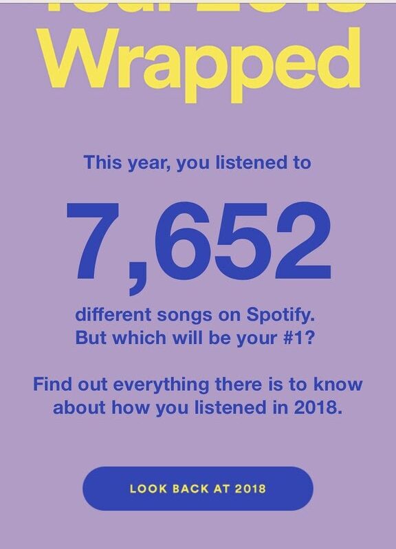
More personalization
Adding to the beginning of your email no longer counts as personalization. A truly personalized experience calls for segmentation, merge tags and crafty use of customer data. Examples like Spotify Wrapped have changed the game for what customers expect to find in their email.
Artificial Intelligence
AI is no longer in the distant future. In fact, it’s already here. If the aforementioned trends feel overwhelming to you, enlisting the help of AI-powered tools may be the answer. AI can help craft subject lines, choose color pallets, and even deliver customized content to your customers.
2022 Email Design Trends with BEE Pro
Now that you have a leg up on email design trends headed your way in 2022, it’s time to take advantage of them. Start designing your emails with BEE Pro to optimize your designs so they’re ready to outstand the competitors in the inbox.Our drag-and-drop builder gives you the creative flexibility to design faster and export emails straight to your email service provider (ESP). Design from scratch or choose from one of our templates in our catalog of 1000+ templates. Start your free trial here.
Seasonal Landing Page Best Practices To Generate More Sales
It’s December, which means the holiday shopping season is in full swing. You might think it’s too late to start your seasonal campaigns, but there are still some moves to make to optimize last-minute shopping. One of the strongest moves is seasonal landing pages.Designing seasonal landing pages is your best support tool to keep the momentum going through the shopping rush. These pages work to:
- Drive conversions
- Increase opportunities for personalization and segmentation
- Improve SEO visibility
Boost your holiday marketing campaigns with these seasonal landing page best practices.
What is a seasonal landing page?
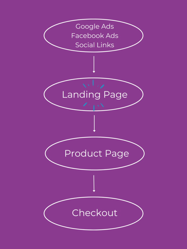
A seasonal landing page is similar to a regular landing page, but it specifically caters to the holiday seasons. Whether it be around Christmas or Valentine’s Day, the theme of the landing page changes but its overall purpose remains the same.For example, after clicking on social media links or Google ads, you will land on this holiday landing page, just as you would with a regular landing page.
The importance of seasonal landing pages
Creating a seasonal landing page is similar to designing a regular landing page, but just includes a specific seasonal look and exclusive holiday promotions. Here are a few benefits to implementing seasonal landing pages into your marketing campaign strategies:
- Drive more conversions. More content in front of your target audience brings more chances to convert.
- Increase opportunities for personalization and segmentation. Personalized and segmented assets work to build customer trust and loyalty long term.
- Improve SEO visibility. Seasonal keywords will allow your assets to pop up more frequently.
6 Seasonal Landing Page Best Practices to Generate More Sales
While seasonal landing pages are similar to regular landing pages, there are noteworthy differences. That’s why we’ve compiled the top 6 best practices for how to create the best holiday landing page.
Implement seasonal visuals
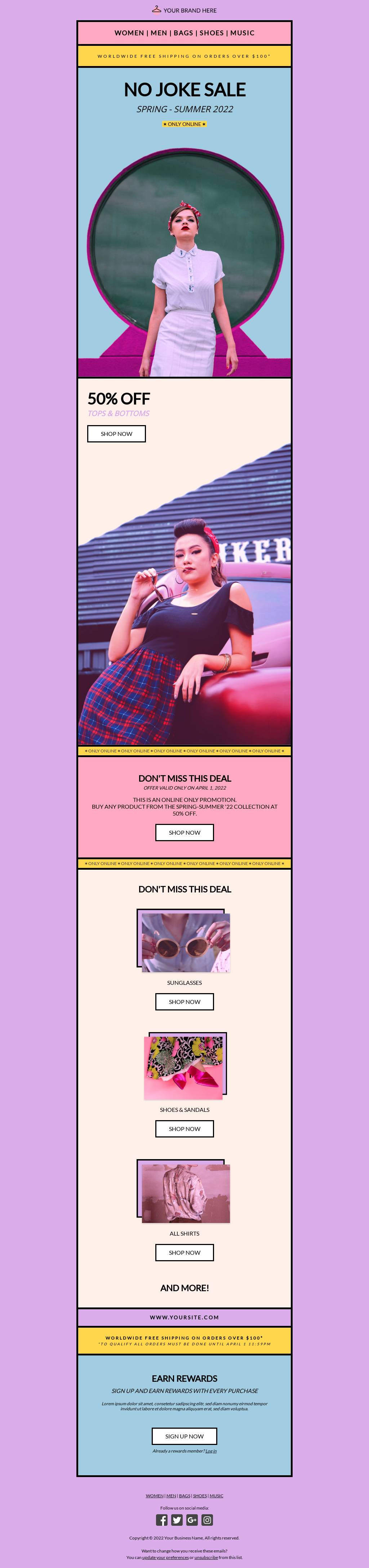
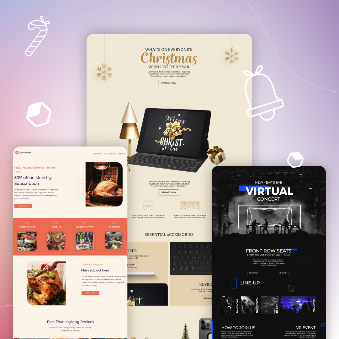
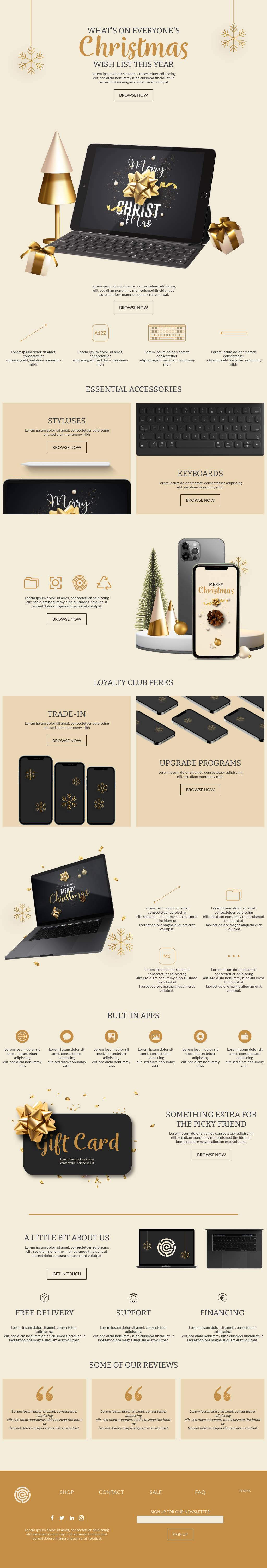
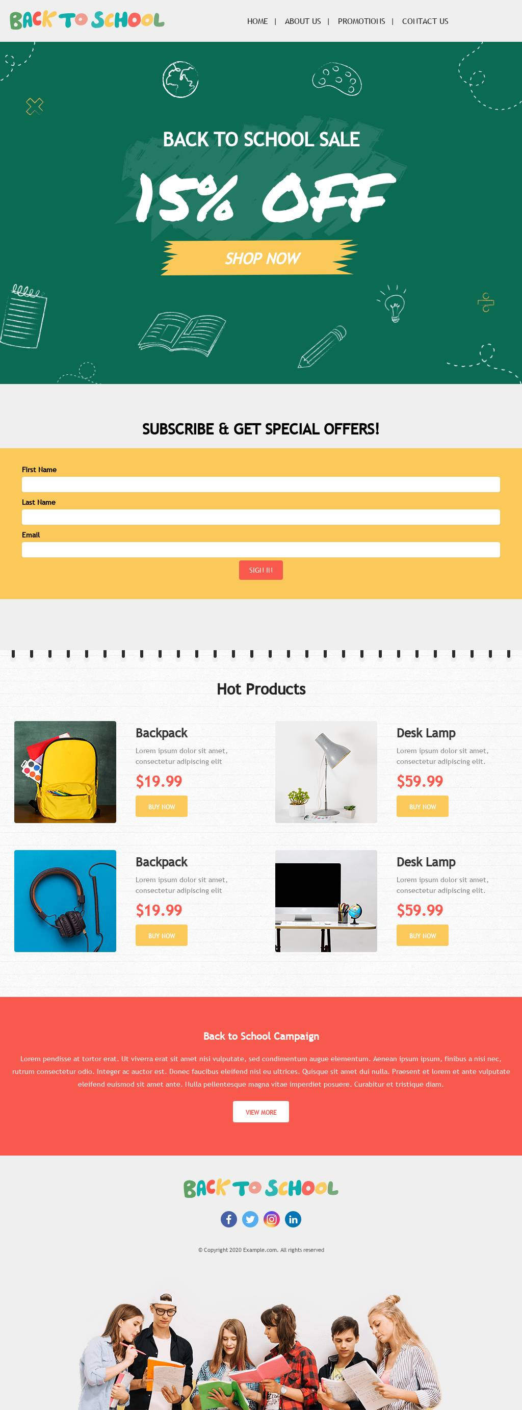
Design your seasonal landing pages to suit the time of year, season or holiday that you’re promoting. Use festive images, GIFs and stickers to draw your audience in. Also, include a compelling CTA and copy that is commonly used around that holiday to support your landing page design.Template: This seasonal landing page template includes gold bows, gifts and mini pine tree visuals to promote the Christmas season.
Give seasonal promotions
Showcasing promotions is oftentimes what gets customers to click. Make sure to get straight to the point when designing your seasonal landing page by making your deals prominent and clear for customers to see.Template: This seasonal landing page template includes a bold promotion right when you click in. The clearly displayed 15% off is clear for customers to see which will lead to conversions faster since they know exactly what deals they’re getting for the back to school season.
Include additional resources
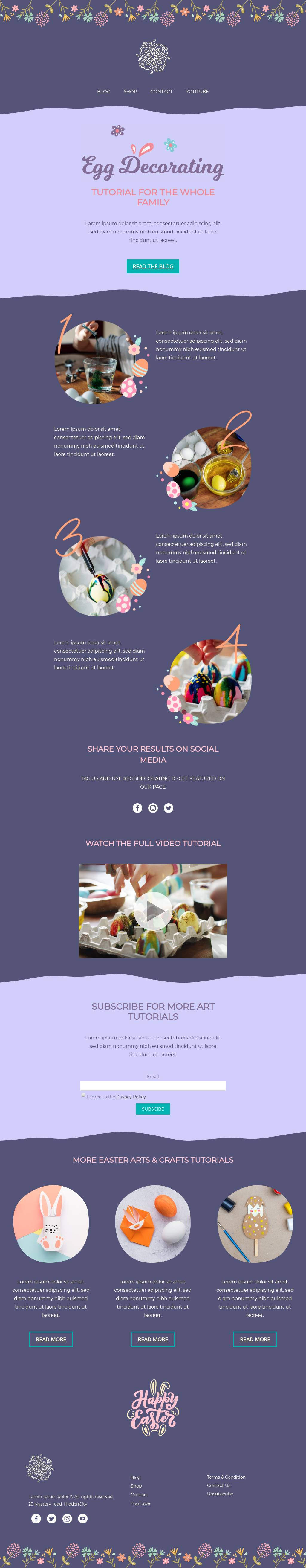
Provide customers with additional resources and details in your seasonal landing pages to explain why they should buy from your brand. Give a shopping guide, additional products that go along with the collection they’re searching or even try influencer marketing to showcase video reviews or promotions to persuade customers to purchase.Template: This seasonal landing page template includes seasonal colors and animated graphics along with a couple additional resources. The video tutorial, brief guide on how to decorate eggs and the CTA that leads to the blog are all helpful resources for your audience.
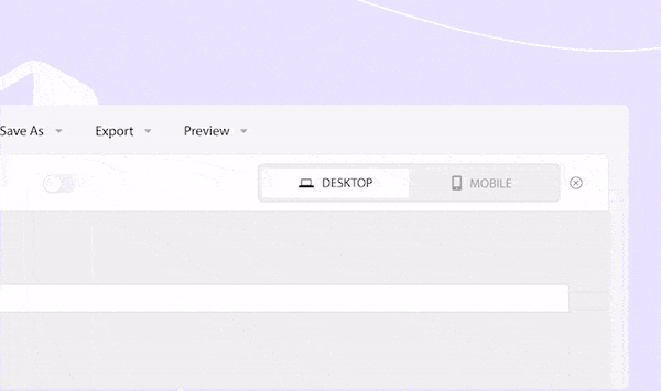
Optimize your seasonal landing page for mobile
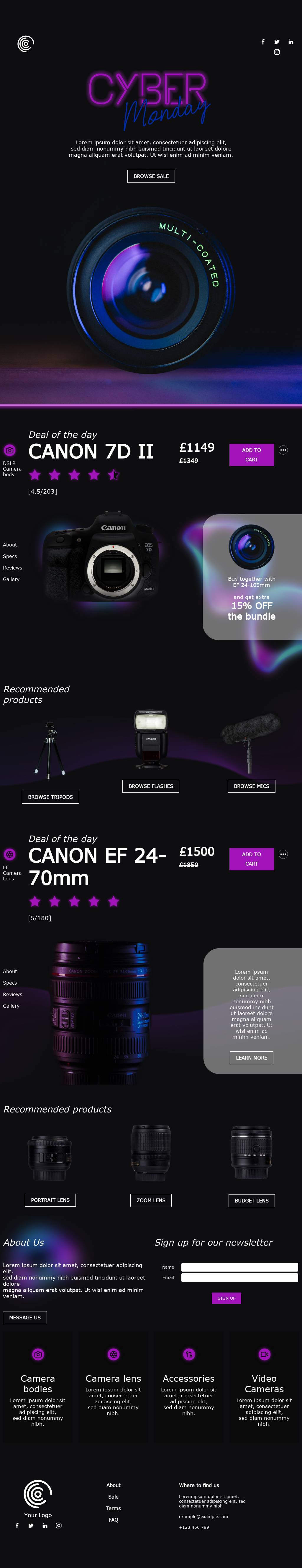
Make sure your landing page is set to render perfectly on mobile and desktop view. BEE Pro offers a Mobile Design Mode feature where you are able to toggle between desktop and mobile view during the editing process for a faster mobile optimization process.Template: This seasonal landing page template includes neon copy and coloring for a unique draw-in. Customers are intrigued by the visuals and will easily view the landing page in mobile view the same as it would show up for desktop. A busy Cyber Monday has people checking sales from all their devices, so it’s necessary to have your landing pages optimized for mobile.
Keep converting simple
Make it easy for your customers to convert by simplifying your processes. Include links to Stripe or PayPal payment systems in your landing page for an easy checkout process. Holiday seasons are busy, and simplifying the process with the help of your landing page is the perfect way to drive more conversions.Template: This seasonal landing page template includes “Buy Now” and “+” add to cart CTAs so customers head right purchasing. This reduces the friction of the busy holiday shopping time and simplifies the process overall. This template is perfect for the Valentine’s Day season.
Showcase reviews and testimonials
A convincing holiday landing page should include clear social proof and reviews so customers are convinced to buy from your brand over the competition. Seeing good reviews front and center on a seasonal landing page is a sure way to win customers over.Template: This seasonal landing page template provides reviews of what other customers are saying about certain items the brand sells. This New Years themed page is convincing customers with transparent social proof.
Create Your Seasonal Landing Page with BEE Pro
Good seasonal landing pages are a solid way to increase conversions during this insanely profitable season. They serve your target audience by providing quality visuals, promotions and more to draw attention in and boost sales.Designing a landing page doesn’t have to be a time-consuming task. With BEE Pro, you’ll design faster with features like branding kits and mobile design mode to optimize processes to get your landing pages as festive as possible. This will help your business sustain momentum throughout the whole holiday season.

Stay informed on all email trends
From the latest creative design strategies that inspire your next campaign to industry best practices and tech advancements, our newsletter is the go-to for all things creation.