

Design
9 St. Patrick's Day Email Marketing Tips to Bring Luck to Your Campaigns
Is your business ready for St. Patrick’s Day? While this holiday is Irish in origin, it’s popular in America, too: Over half of Americans celebrate this holiday, with a collective spending power of $6.16 billion. St. Patrick’s Day is the perfect opportunity to create an email campaign that boosts your revenue and sales. Use these St. Patrick’s Day email marketing tips to help your brand feel the luck of the Irish this March.
Over half of Americans celebrate St. Patrick's Day, with a collective spending power of $6.16 billion.
Use emojis in your St. Patrick’s Day email subject lines
Get clever with the copy in your St. Patrick’s Day email subject lines, making your readers smile or laugh. Use emojis, too — we’re seeing a lot of shamrock emojis, but you could also use a rainbow, beer or the Irish flag. And as usual, you’ll want to follow the email subject line best practices that apply to any holiday: Keep it short, describe what’s inside the email and personalize if possible.Here are a few example subject lines sourced from our inbox:
- Your Lucky Handbag ?
- Your Luck Is Running Out!
- It’s your lucky day! ☘️ Surprise savings inside…
- You’re in Luck ? 17% Off Sitewide
- It’s Almost Irish Whiskey O’Clock
- Your Lack of Green Is Disturbing
Choose a color scheme that fits your branding
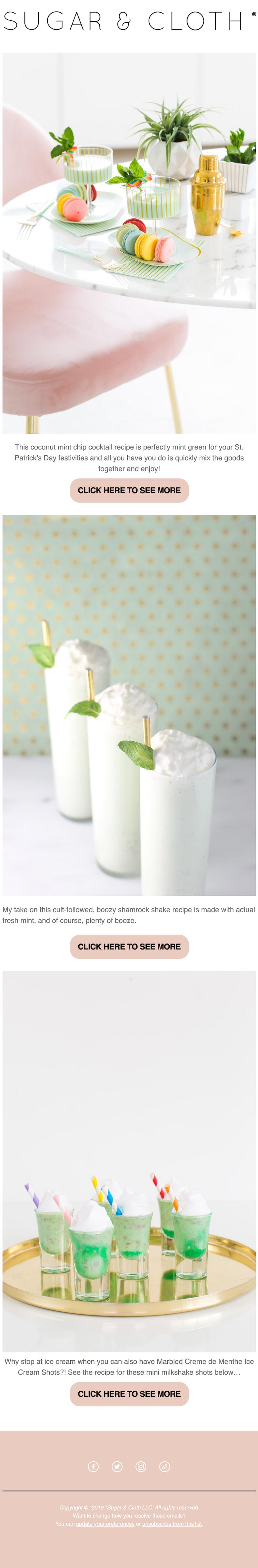
In this Happy St. Patrick’s Day email, blogger Ashley Rose at Sugar & Cloth chose a pastel color scheme that incorporated tones of mint green and pale pink. While you might not expect pastels for St. Paddy’s, they work: We’re transitioning into springtime, after all.Subject line: St. Patrick themed recipes! ?
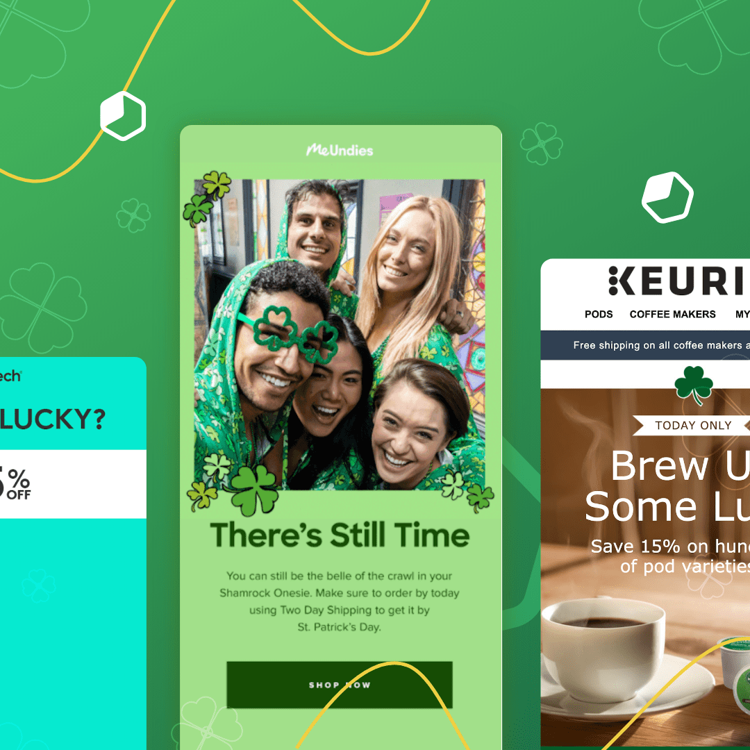
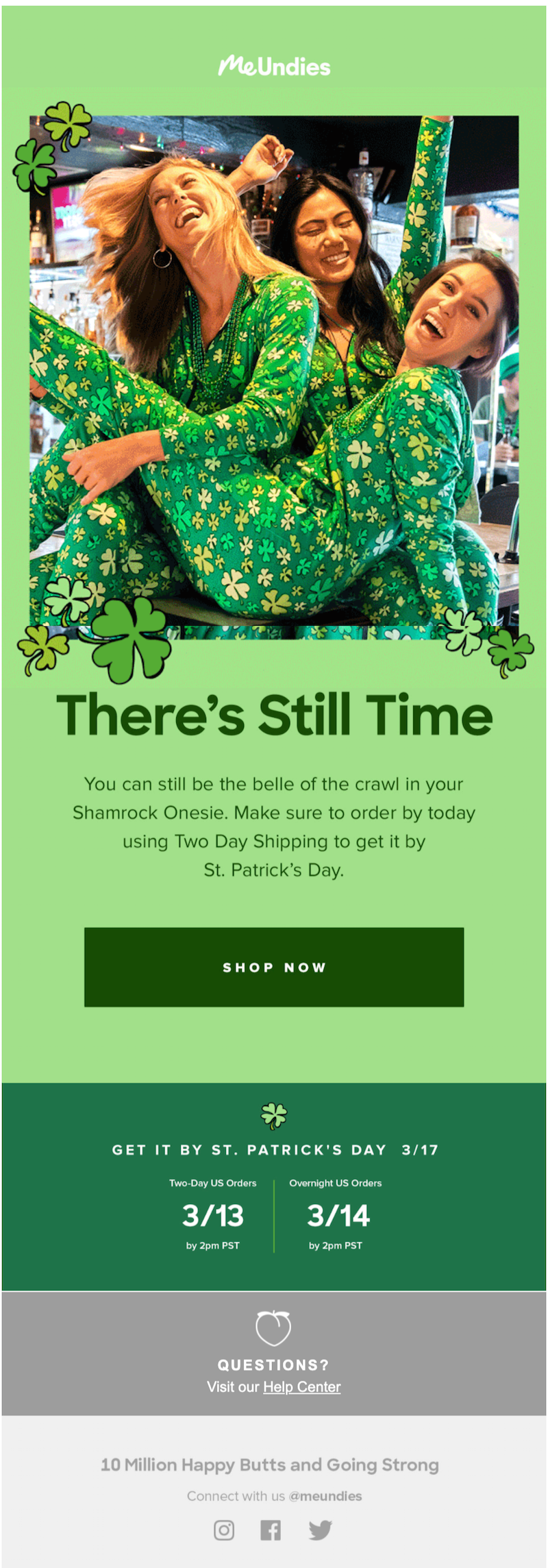
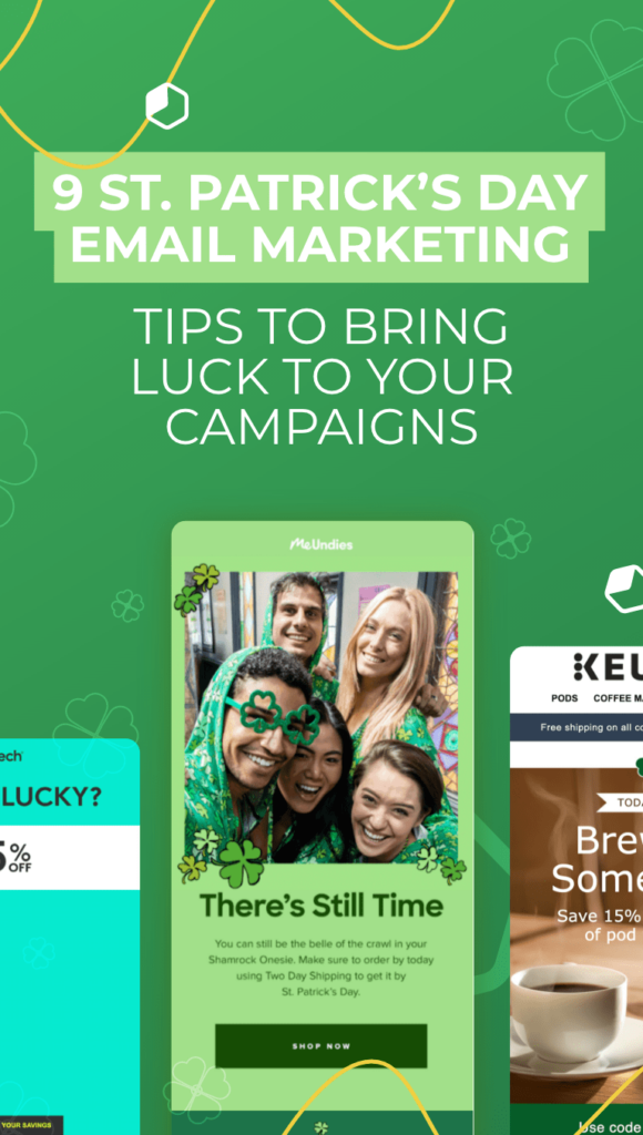
By contrast, MeUndies went full-out green in its St. Paddy’s message. For MeUndies — a fun, lively brand with a playful voice — the choice was a great fit. But for Sugar & Cloth, pastels were much more natural.Subject line: Last call to get shamrocks by St. Patrick’s Day ?

Both color schemes work equally as well for St. Patrick’s Day email marketing. The best choice of colors for you depends on your branding and the colors and personality you already have in place.
Cross-promote your St. Patrick’s Day content
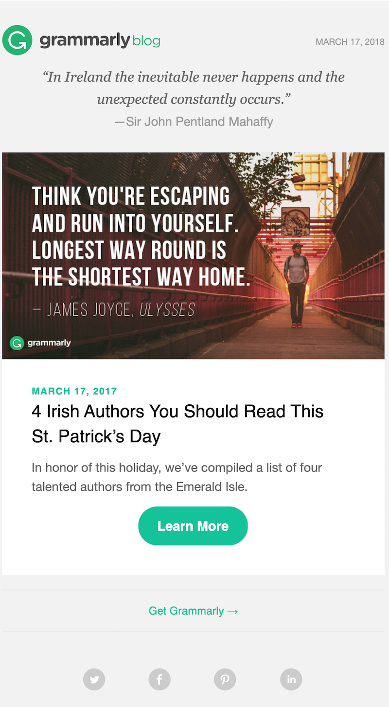
If you don’t already cross-promote your marketing content, you should: Cross-promoting helps your brand reach further for a lower cost. When you cross-promote, you share a piece of content that was created for one marketing platform on other platforms where you have a presence.For example, Grammarly wrote a blog post and then used that article as the focus of this St. Patrick’s Day email. The company could share the post on social media, too. Cross-promoting your content equals less work for you in the long run.Subject line: 4 Irish authors who will inspire your St. Patrick’s Day
Give a free (and relevant) gift with purchase
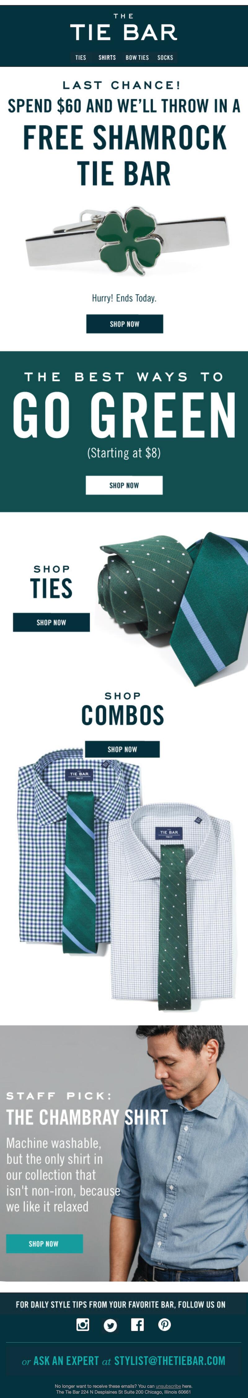
Many companies choose to give buyers a free gift with their purchase as a special holiday promotion. This popular e-commerce tactic works because it encourages people to spend more money than they might have otherwise. Just make sure your free gift is something your customers actually want. Tie Bar’s free gift is a winner for two reasons: It’s relevant to the company’s customers and it’s relevant to the holiday.Subject line: St. Patrick’s Day is in two weeks
Write clever copy
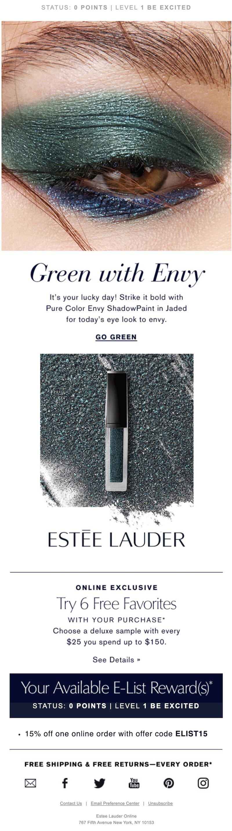
Write copy that converts by using catchphrases commonly associated with the holiday. Estée Lauder includes phrases like “Green with envy” and “Lucky day” in this St. Paddy’s email:Subject line: How to do St. Patrick’s Day ?
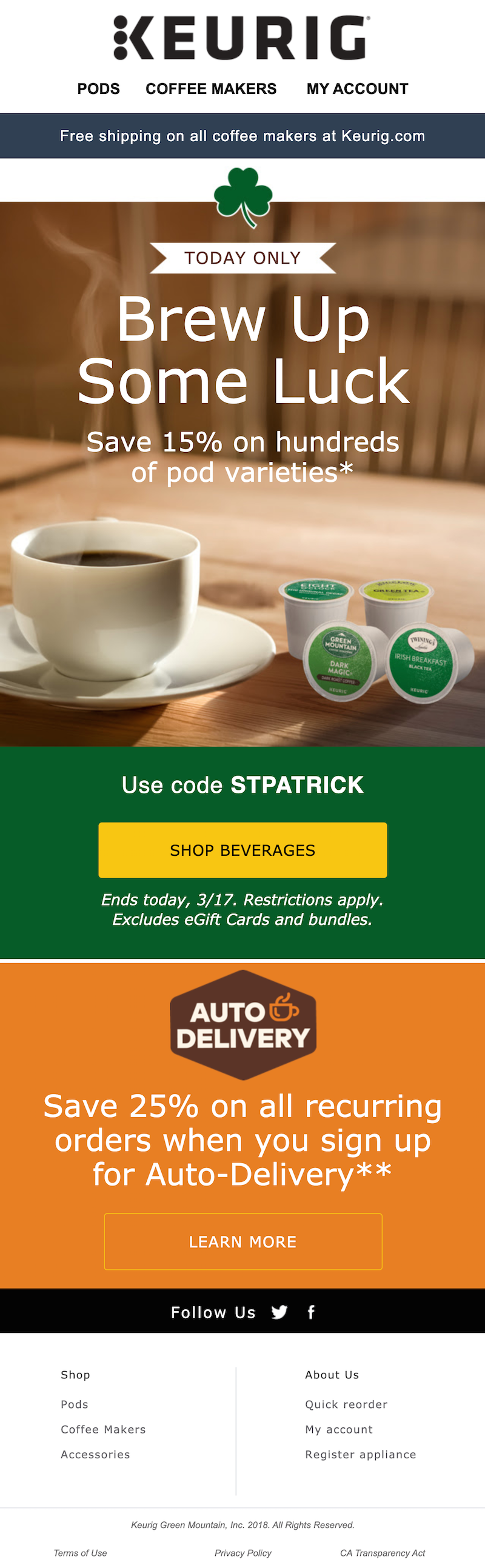
This message from Keurig is another great example of St. Patrick’s Day email marketing — we love the “Brew up some luck!” text at the top of the message. Tell your customers why your product is their pot of gold this holiday.Subject line: It’s your lucky day! Celebrate St. Patrick’s Day with 15% off pods
Send a St. Patrick’s Day email newsletter
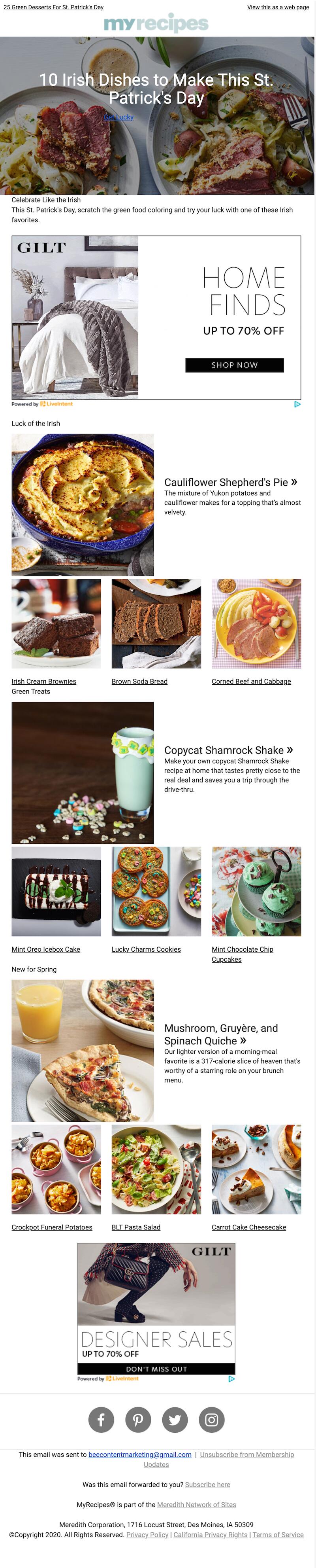
It’s not always about the hard sell. Email newsletters can do just as much good for your brand as marketing-oriented messages. Case in point: this MyRecipes newsletter that shared over a dozen recipes for the holiday. Sending a newsletter with content that’s relevant, educational, fun or all of the above can boost your open rates. It helps establish your business as an expert in your field, too.Subject line: Just add beer. Our luckiest recipes for St. Patrick’s Day.
Encourage your customers to go green
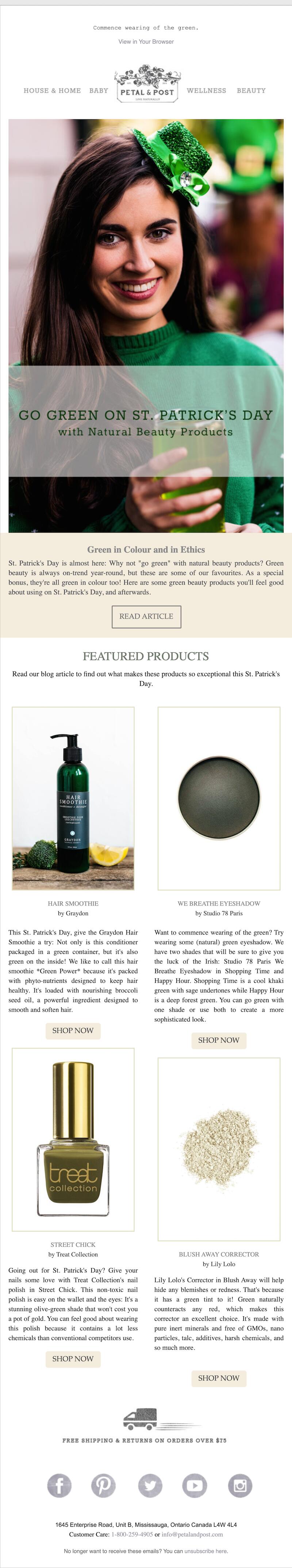
We talk a lot here on the BEE blog about finding the ways your product or service connects with a certain holiday and making those connections clear in your email marketing. Petal & Post does a great job: In this St. Patrick’s Day email, the organic beauty company encourages readers to go green (with a double meaning!).Subject line: Go green on St. Patrick’s Day
Find elegant typography
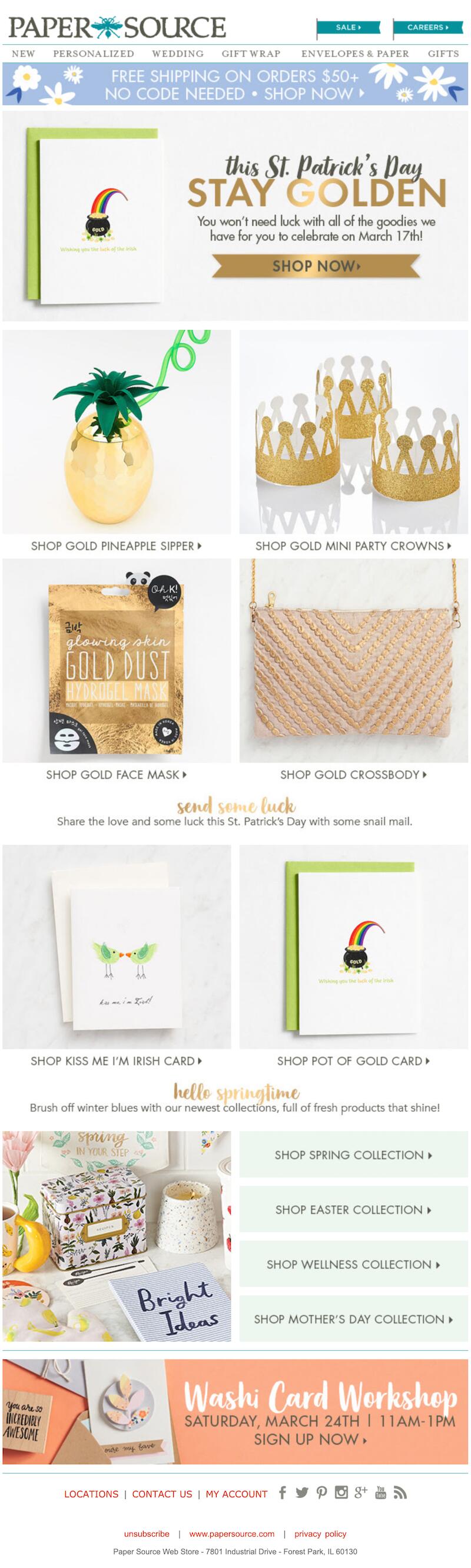
Typography can make or break an email campaign. We’re taking notes from this Paper Source Happy St. Patrick’s Day email that featured shimmering gold fonts to catch the reader’s eye. The same calligraphy font is consistently repeated multiple times throughout the email. It’s elegant, but not so fancy that it’s difficult to read — and it’s balanced out with more basic fonts in the rest of the text. Major points to Paper Source for going bold with this visually attractive font!Subject line: You’re in luck — our St. Paddy’s day gifts are pure gold!
Use gamification
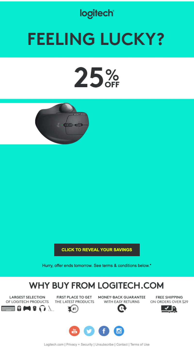
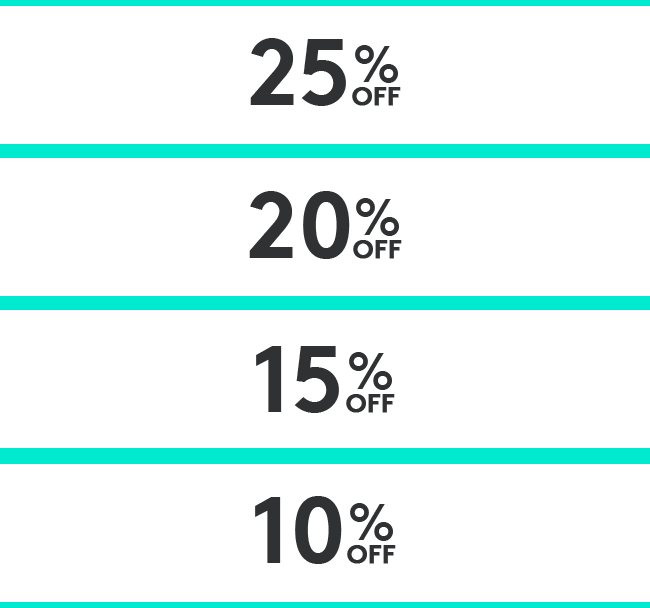
Want to engage your customers? Try using gamification in your St. Patrick’s Day email marketing. Including game-like elements in your marketing emails can increase both engagement and conversions. In this Logitech email, readers can play a “Mystery Savings” game, clicking to reveal their unique coupon code. It’s a great way to get customers to open the email, click through and eventually make a purchase with their newfound discount.Subject line: ☘️ Celebrate St. Patrick’s Day with 25, 20, 15, or 10% off
Wrap-up: St. Patrick’s Day email templates
Ready to start your St. Patrick’s Day email marketing? Check out our templates to help! Our St. Patrick’s Day email templates are responsive HTML messages created by professional graphic designers. Pick your favorite template and open it using the BEE email editor. Then all you have to do is quickly customize the message with your details before it’s ready to go to your email list. With our email templates, your St. Patrick’s Day email marketing can be a breeze. We’ll toast to that!
Share this post with your friends! Pin it on Pinterest ?
How to Land a Job With a Beautifully Designed Resume or CV Email

Job hunting isn’t for the faint of heart — especially in this day and time. No matter where you are in your career or how much experience you have, the process of networking, filling out countless job applications and painstakingly tweaking your LinkedIn profile is a draining one. Sending endless resume emails is just another to-do on the list.
When it comes to job applications, you’re probably used to writing a plain text email and including your resume as an attachment. Sending a designed email with your resume, however, can up your chances of getting the job. And if you use a resume email template, the design process is a lot easier than you might think.
Check out our video below for a step-by-step tutorial on how to write a resume and send it via email. Then keep reading to see resume email examples and learn how you can design an HTML resume email to land your dream job.
Resume or CV?
There’s a difference between resumes and CVs. Knowing which one to use is essential. A resume is short and concise: It provides an overview of your relevant skills, education and work experience. A CV (curriculum vitae) is a more comprehensive document that lists all of your academic achievements and prior jobs. Typically, people in the U.S. only use CVs in academic settings, such as when applying for a research fellowship. In Europe and in Canada, people sometimes refer to resumes as CVs. A resume is appropriate for any type of job.
Your resume should include the following information:
- Contact information
- Education
- Work history/experience
- Special skills
- Bio or summary (optional)
- References (when required)
Our Light CV template created by designer Yuliana Pandelieva is a good example — it contains each of these six elements. You could also consider adding a bio or summary section. The email has plenty of space to include the information a potential employer needs to know. But it’s still simple, clean and uncluttered, with minimal design.
Knowing how to write a resume makes a big difference in the job search. Our resume templates take the guesswork out of this task by including the must-have information. All you have to do is customize the email for yourself.
When to send a CV by email
Designing an HTML resume email might not be your first thought when you sit down to apply for jobs. But an HTML email could be beneficial in the job search. The recipient won’t need to download your resume as a document in order to view it. And if you’d like, you can post your resume on your website in this format, too.
A designed resume email might be especially appropriate in certain industries, such as marketing or design. Sending an HTML email can show that you have an eye for visuals and you recognize that appearances matter.
Ready to write a CV and send it via email? There are a few important principles to keep in mind. Here's what you need to know.
How to write a resume: examples
Organization
It’s your job to make sure your information is organized in a way that’s easy to read and comprehend. In our About Me template, designed by Yuliana Pandelieva, your name, title, contact info and a brief bio are all included in the header. The rest of the text is organized in two neat columns that are easy to skim.
Tone
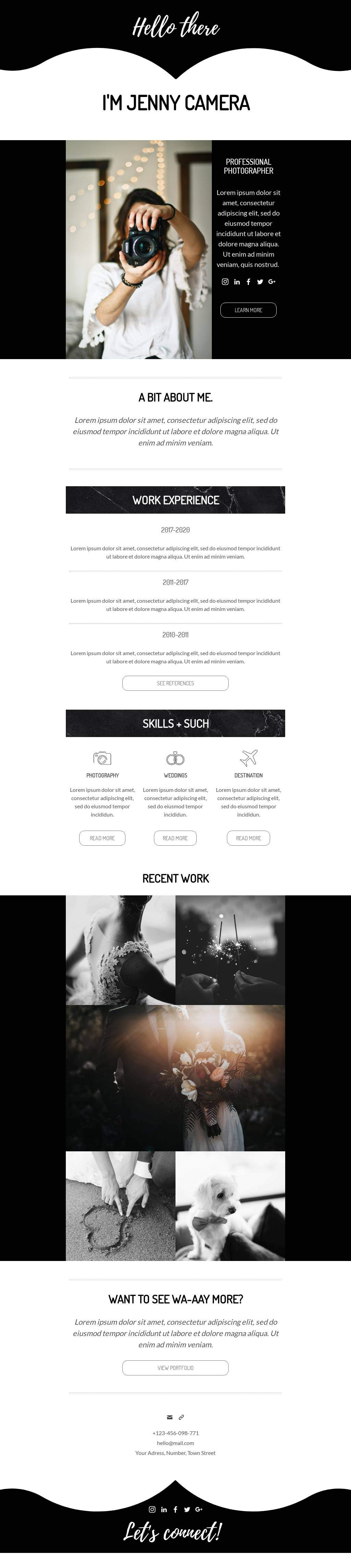
Some jobs require a formal CV. But in other contexts, a more conversational resume might be best. For example, our Hello There CV template created by Jen Schmaltz takes a casual tone. This email might be a good fit for a freelancer who works in a creative industry, such as photography. It’s a fun way to show off your personality at the same time you prove your skills. And many times, that’s exactly the combination you need.
Branding
You might think of branding as something that’s only applicable to companies and large corporations. But individuals can have their own personal brands, too — and that’s something you definitely want to show off in a CV submission.
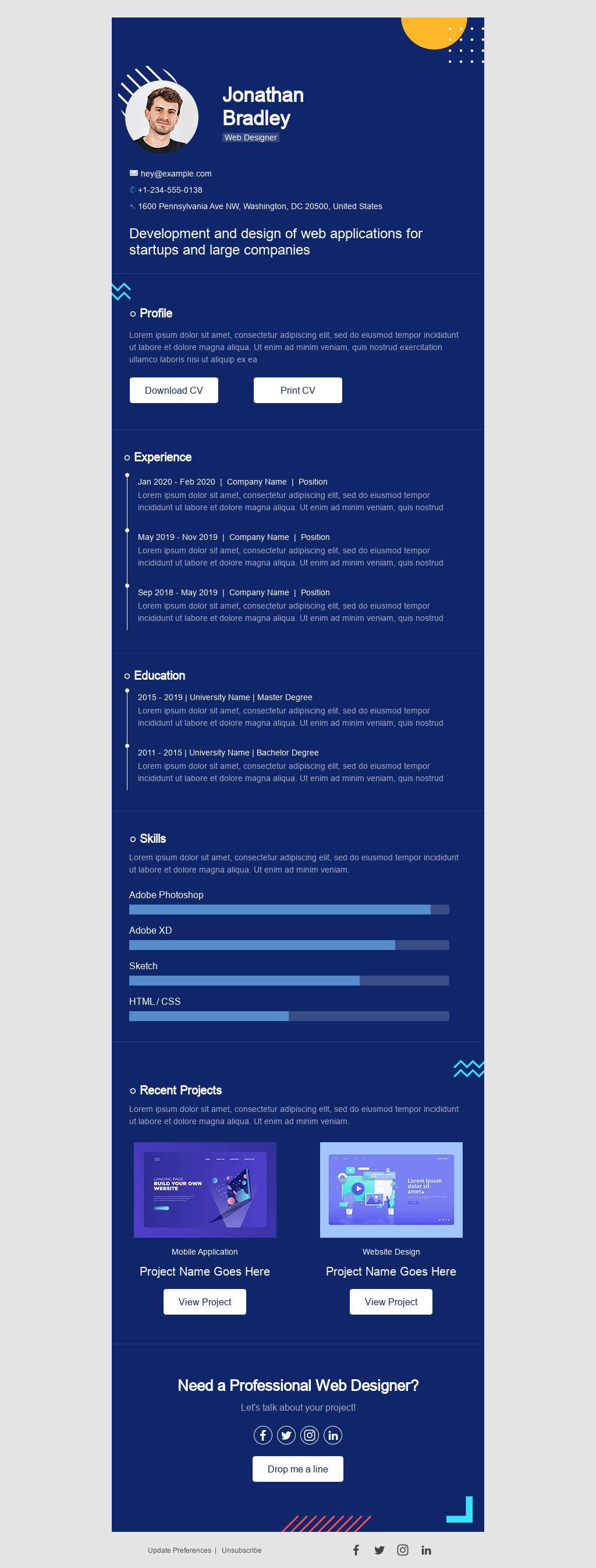
What colors do you use on your website or in your LinkedIn header? Do you have a logo with your name? What font is on your business cards? Incorporate all of these elements in your resume email. This will help your application — and you — be as memorable as possible. Our Blue CV template by Martin Nikolchev has a bold blue background with simple, no-frills fonts that are perfect for a computer or web designer.
How to send a resume via email
Now that you know what to write when sending your resume via email, it’s time to start designing! Our resume email templates can simplify your job search and help you stand out in a crowd of applicants. With these ready-to-use HTML templates, it’s fast and easy to customize the graphics and typography to reflect your experience and your personal brand. Then export the finished email to your Gmail account as an HTML message.
You can access the templates with a free trial of BEE Pro. With a BEE Pro subscription, you’ll be able to:
- Access all of our resume and CV email templates (and every other email template in the catalog, too)
- Save your favorite resume for further editing
- Export the final product to Gmail
A BEE Pro account also gives you the ability to save your resume templates so you can re-use them again and again throughout your job search. Ideally, your resume will be tailored to the specific job you’re applying for — which can mean extra work for you as you edit your resume every time you send it somewhere new. That’s where a resume email template saves time in the job search process: It’s simple to pull up your pre-saved template and make a few quick changes with the BEE editor before sending your resume out again.
You can also save time by exporting your resume email straight to your Gmail drafts. From there, you can make any final tweaks to the message before adding a recipient and a subject line and sending it off.
Wrap-up: Sending your resume through email
Your resume or CV represents you, so it’s essential to design it well. Send a well-organized, visually attractive resume email to showcase what you bring to the table. Platforms such as Jooble, a website that shares hundreds of thousands of vacancies, can help you find the jobs you're interested in. Then all you have to do is send your resume email template with BEE and rinse and repeat until you land that dream job.
Design Tips for Shipping Confirmation Emails
Email marketers invest a significant amount of time and energy into promotional emails: Here's our newest product! Here's our biggest sale! Here's our upcoming event!But some of the most-read and most highly valued emails among readers are transactional, not promotional. Transactional emails have a higher open rate and click-through rate than marketing emails. And for your consumers, shipping confirmation emails are one of the most exciting transactional emails to receive.It’s always fun to get an email confirming that your order is on its way. The positive association means that shipping confirmation emails are very likely to be opened and read — which makes them a great opportunity for building brand loyalty.Follow these design tips to create a shipping confirmation email that communicates well, reflects your brand and looks fantastic.
Shipping confirmation emails are very likely to be opened and read — which makes them a great opportunity for building brand loyalty.
Tip #1: Make tracking easy
It's a shipping confirmation email, after all. Above all else, readers want to know where their order is and when they can expect it to arrive. Shipping confirmation emails are all about tracking the order, and this message from Enjoy Life Foods is a great example. It’s simple, focused and makes it easy for readers to track their package.Subject line: ?Get ready to #eatfreely! Order 152309 is on the way!
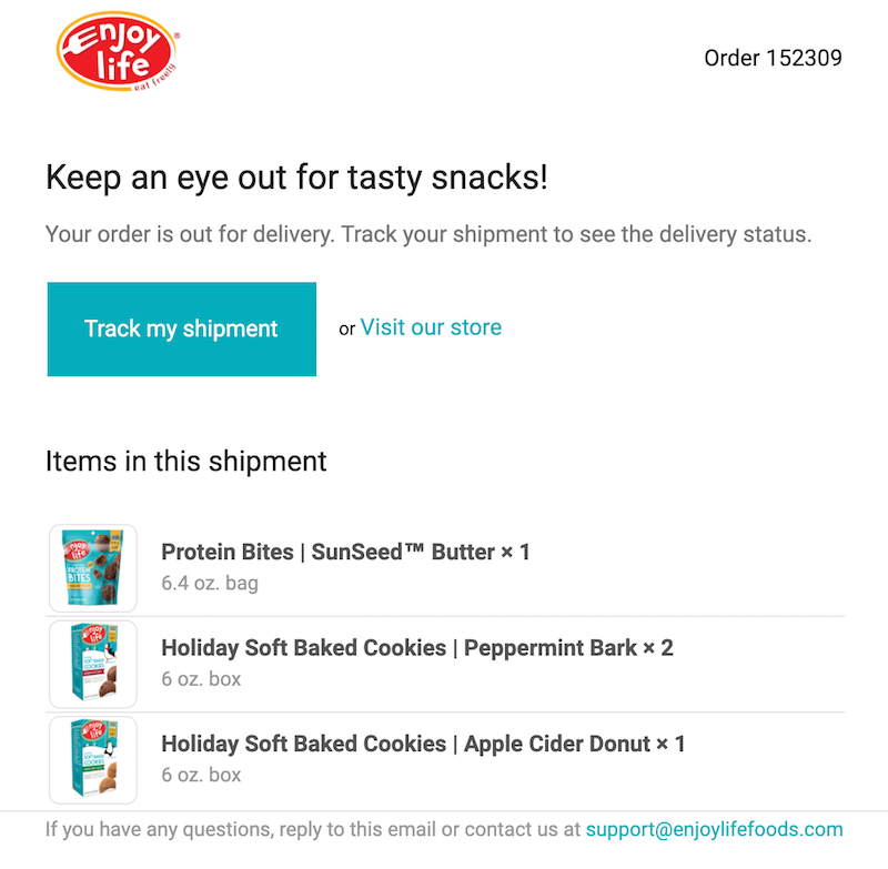
This effective, no-frills email accomplishes a lot in a few lines. A simple “Items in this shipment” list confirms what the order was. And the email is written in Enjoy Life’s light and fun brand voice, infusing a sense of joy into the message and joining readers in their enthusiasm. (We especially love the branded hashtag included in the subject line!)
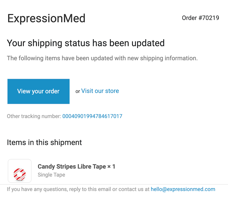
Tip #2: Optimize for mobile with a single column design
It's tempting to showcase purchased products in a grid or use multiple columns or sidebars in a shipping confirmation email. But a single-column design is usually the most effective, especially for mobile. Take this shipping email sample from ExpressionMed:Subject line: Shipping update for order #70219
Here’s how it shows up in a mobile inbox:
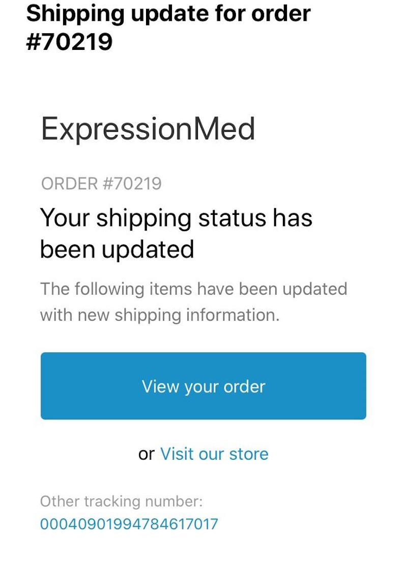
The single column establishes a clear content hierarchy, so it's easy for the reader to follow. The first key takeaway? The order has shipped! You can click on a bulletproof button to view your order or scroll down to see an image of the items in the shipment. We also love how the ample white space between sections makes the email feel uncluttered and improves readability.
Tip #3: Prioritize transactional content over upsell content
According to the CAN-SPAM act, the content of transactional emails must be "primarily transactional." In other words, these emails need to focus on the main message (order shipment, in this case) and shouldn't be used for marketing additional goods or services. While shipping confirmation emails can be a tantalizing opportunity to appeal to customers who already know your brand, don’t overstuff your message with extraneous calls to action. When in doubt, keep it simple — like this example from Mercy House Global.Subject line: Your shipment from Mercy House Global is on its way
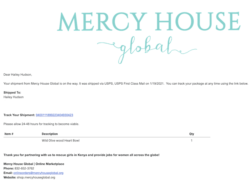
As a general rule of thumb, allow shipping confirmation details to take up at least 75% of your email. Marketing material can be included if you’d like to add an upsell. But position it at the bottom of the message and make sure it’s relevant.
Tip #4: Add helpful visuals
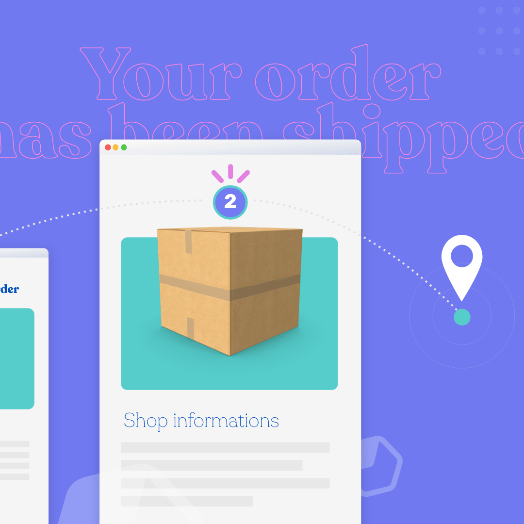
You may think there's not much to visualize with graphic design in shipping confirmation emails. But you might be surprised at the opportunities. This message from Etsy includes a helpful visual at the top to help customers see that their package is almost there.Subject line: Your Etsy order shipped (receipt #1908008238)
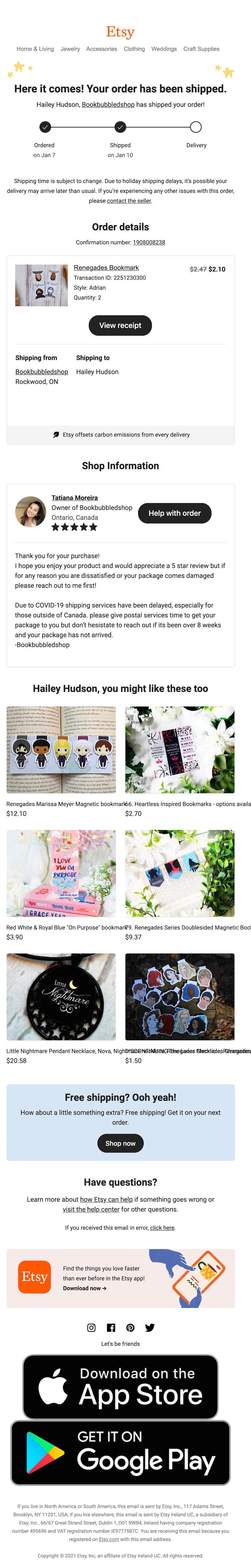
You could also try adding other types of illustrations, such as a map showing where you’ll be shipping the order from. And remember how we talked about adding relevant product recommendations at the end of shipping confirmation emails? Etsy does that here with a “You might like these too” section of products.
Tip #5: Be upfront about potential delays
It’s always important to be honest with your customers, especially during periods where shipping delays might factor into delivery time — whether that’s because of the COVID-19 pandemic or simply because of a busy holiday season. TeePublic includes a disclaimer at the top of this email:Subject line: TeePublic shipping confirmation order #6738438
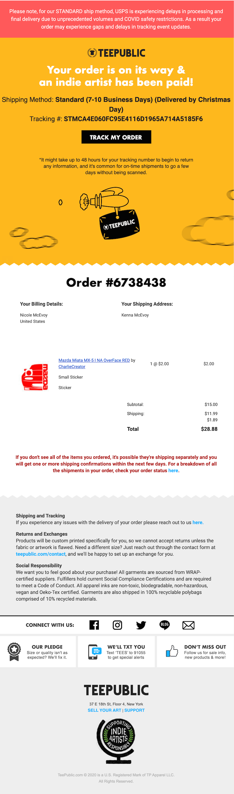
The section is easy to spot because it’s a different background color. And the text clearly explains what customers need to know: The postal service is experiencing delays, so if your order is late or you can’t view the tracking, don’t panic.
Wrap-up: Shipping confirmation email templates
Are your shipping confirmation emails living up to what you want to communicate about your brand? Try using our template to make customers happy and build loyalty! Created by designer Andrea Dall’Ara, this shipping confirmation email template is easy to customize using the BEE email editor. Use the template to give your shipping emails a boost!
Share this post with your friends! Pin it on Pinterest ?
Welcome Email Examples to Engage Your Subscribers
First impressions are powerful, and that’s just as true when you’re marketing your brand as it is when you’re getting dressed for a job interview or getting ready for a first date. When you send a welcome email to new subscribers, that email is a first impression and a first step in creating a strong customer relationship, so it’s imperative that you get things off on the right foot. A welcome email campaign can start to build credibility and loyalty, showing benefits long past that initial message.Want to create lasting customer relationships? A strong welcome email should put your branding front and center, let subscribers know they’re valued, and give readers an idea of what they’ll receive as subscribers. To guide your welcome email design, here are a few welcome email examples and tips from our email marketing pros.
What is a welcome email?
A welcome email is simply the email you send to people when they first subscribe to your email list. These emails are usually brief and straightforward but they serve several purposes:
- Confirming for subscribers that their sign-up was successful
- Giving a warm welcome to new subscribers
- Building on subscribers’ excitement about your business by telling them what they can look forward to from your emails so that they stay engaged with your brand
In these ways, your welcome email will set the tone for your future relationship with this new subscriber, so make it count!
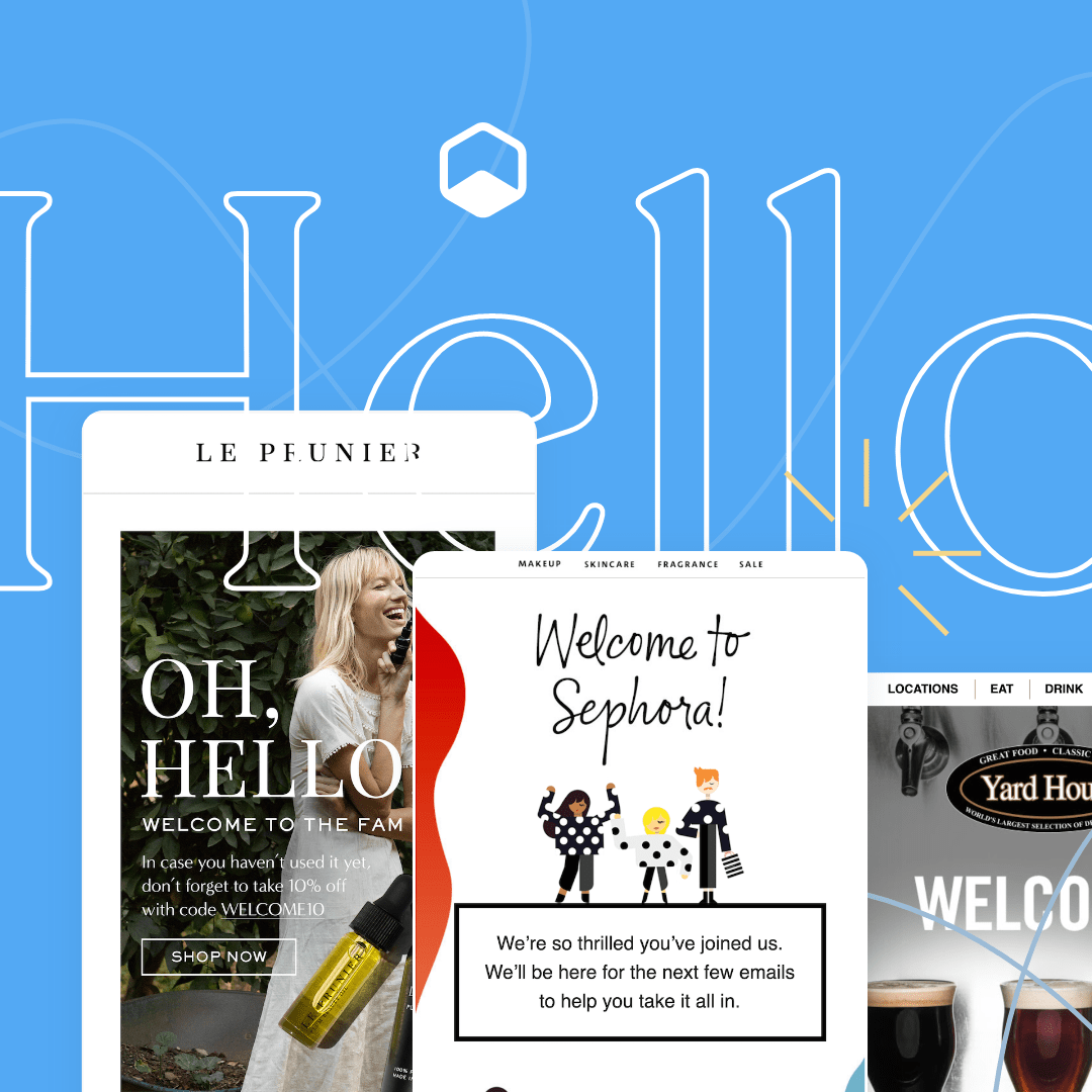
15 Examples of great welcome emails
Where do you start when crafting an effective welcome email that sends the right message and nurtures lasting customer loyalty? While every welcome email will be unique because it should be true to your brand, there are plenty of ideas and techniques you can use. We’ve curated 15 stellar examples of welcome emails to inspire your design process.
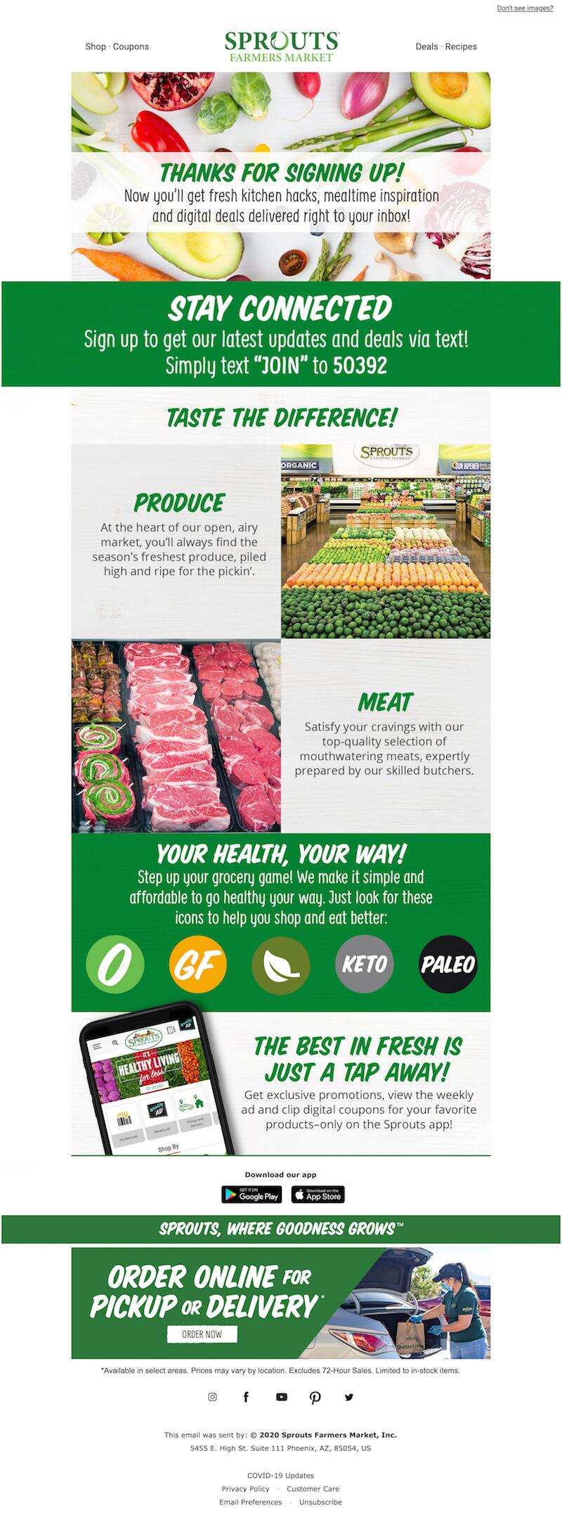
1. Sprouts
Type of welcome email: Brand introduction
One approach you can take to your welcome email is to use it to introduce the subscriber to your business. Give them an overview of who you are, why you’re a fantastic partner for them to have, and why they’ll love being a subscriber and customer. Check out how the grocery chain Sprouts tells new subscribers what makes them special in their welcome email.Subject line: Hey Hailey, welcome to Sprouts!This welcome email from Sprouts makes it as easy as possible for you to go shopping. The message gives you a peek inside the store complete with photos and an explanation of symbols used on their signage. For customers who have never shopped at Sprouts before, this welcome email example makes it simple to get started.Why it works:
- Introduces the brand’s shopping experience and what it has to offer
- Invites readers to engage further with text alerts
- Tells subscribers what to expect from future emails
- Makes the branding prominent by featuring the brand colors
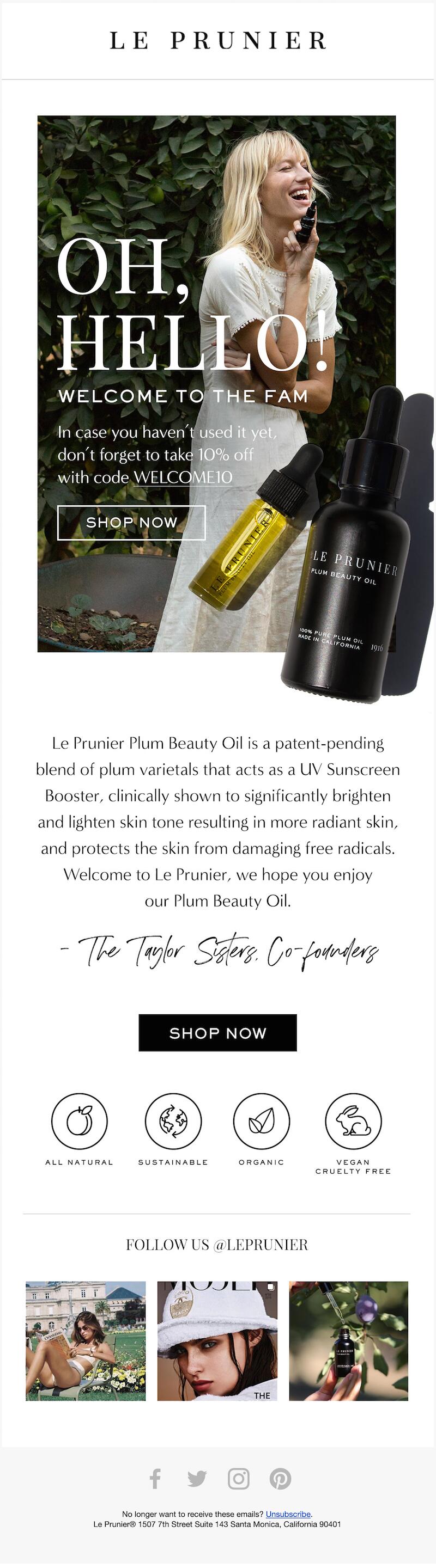
2. Le Prunier
Type of welcome email: Discount code
A discount code is a great component to add to your welcome email design. They give subscribers an incentive to shop while also making them feel appreciated as subscribers. Welcome emails with offers can boost revenue by 30% per email compared to welcome emails without offers. Try sending a simple 10% off discount code, like Le Prunier does here.
Subject line: Welcome to Le Prunier!Le Prunier uses the 10% discount to thank the reader for subscribing and to prompt them to shop the site, but its welcome email goes beyond this too. It puts its welcome message front and center so subscribers feel like they’ve been warmly embraced and it gives a brief elevator pitch too, introducing subscribers to the brand’s core product.Why it works:
- Features a simple design that’s easy to understand and doesn’t overload the reader with information
- Gives the subscriber the high points of the core product and its benefits
- Offers enough of a discount to encourage subscribers to shop
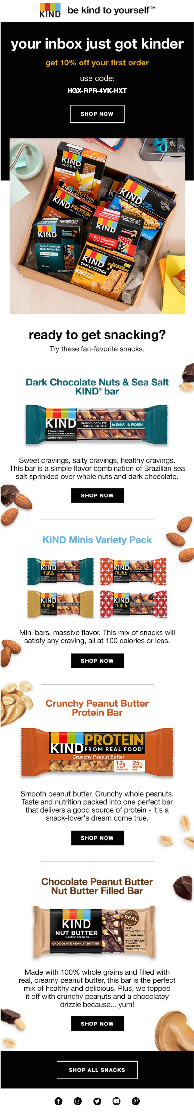
3. KIND Snacks
Type of welcome email: Product features
We’ve already talked about using welcome emails to introduce a subscriber to your business, but you can also take a more detailed approach by offering an overview of your core products. This serves the purpose of not only introducing the subscriber to what you have to offer but also attracting their attention and enticing them to click through and shop. KIND Snacks does this by showing off some of its most mouthwatering snack bars.Subject line: Welcome to the KIND familyThis welcome email example provides a nice overview of KIND’s products. In a simple single-column layout, KIND lists four of its most popular products, providing a photo, simple description and CTA button for each. At the end of the email, readers also have the option to “Shop All Snacks” via a separate CTA button that leads to the entire store.Why it works:
- Uses clever puns and relatable messaging to build familiarity with subscribers
- Features high-quality images that are appetizing and appealing
- Offers a discount to give subscribers more of a reason to click on their appetizing featured products
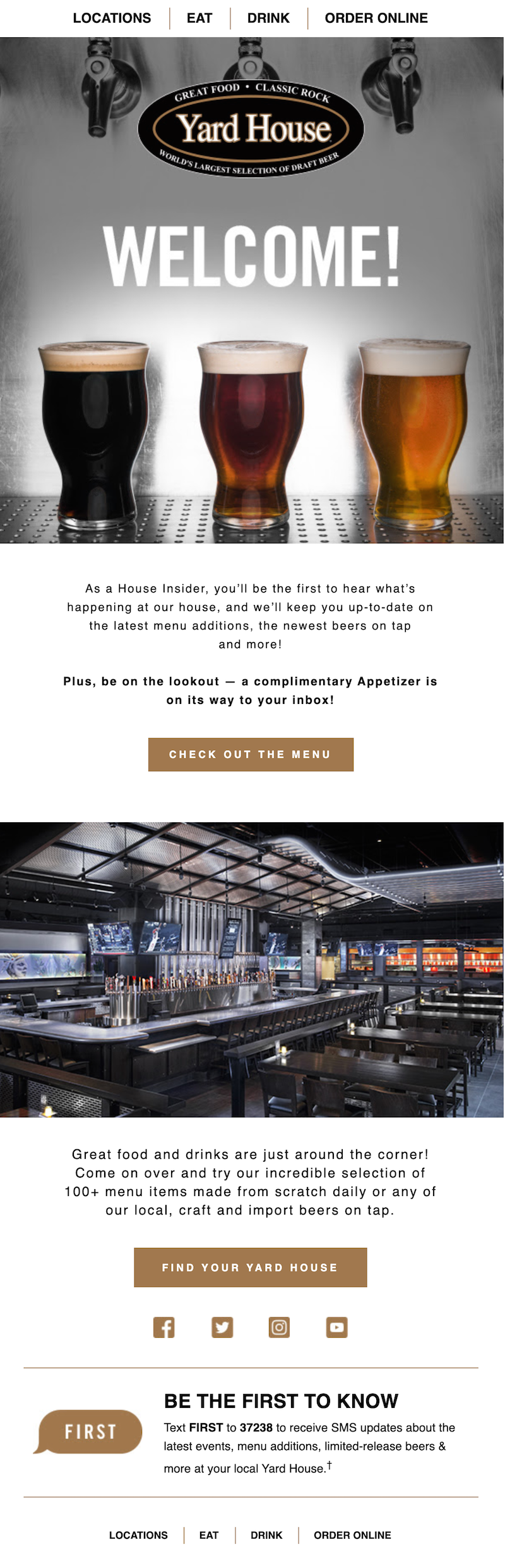
4. Yard House
Type of welcome email: Free gift
Customers can unsubscribe from your mailing list just as quickly as they subscribed, so it’s important to keep them engaged from the start. One way to do this is to reassure them that they have made the right choice by welcoming them with a free gift. Check out how restaurant chain Yard House has used this technique to generate enthusiasm from their subscribers immediately.Subject line: You’re officially a House Insider!After giving subscribers a warm welcome, Yard House lays out the perks for subscribers,like inside peaks at new menu items and an updated list of the latest beers on tap, but the main draw is a free appetizer for their next visit.It’s also important to note that Yard House sends this welcome email as soon as somebody signs up for the company’s newsletter. It’s best not to wait too long to send a welcome email to a customer. When they opt in to your emails, your brand is on their mind — they’re expecting to receive a message. So your welcome email is more likely to be opened and read if you send it right away.Why it works:
- Features an appealing and on-brand design
- Clearly articulates why the subscriber should be glad they signed up and should continue to subscribe
- Encourages subscribers to visit the restaurant with the special offer of a free appetizer
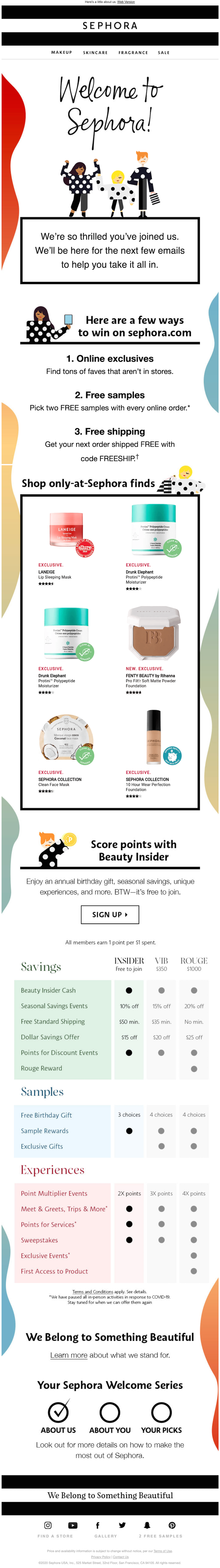
5. Sephora
Type of welcome email: GIF
Many of your subscribers get dozens or even hundreds of emails every day. You want your welcome email to stand out so it delivers the message that you have carefully crafted. One clever and fun way to do this is with an eye-catching GIF. The movement of the GIF grabs readers’ attention and draws them in so they’re more engaged in the introduction to your brand.Subject line: Welcome to Sephora! 🎉Sephora uses the cute GIF at the top of the welcome email to snag the subscriber’s attention and then it uses other techniques to welcome the subscriber and tell them what the brand has to offer. It highlights a few of its exclusive products and its free rewards program. And we absolutely love the checklist at the bottom of the message: The “Your Sephora Welcome Series” lets readers see what’s coming to their inboxes next.Why it works:
- Uses a GIF that’s attractive and engaging but isn’t so complex that it makes the email download slowly
- Gives subscribers an incentive to take a step further and join the brand’s rewards program
- Recommends products to encourage readers to shop
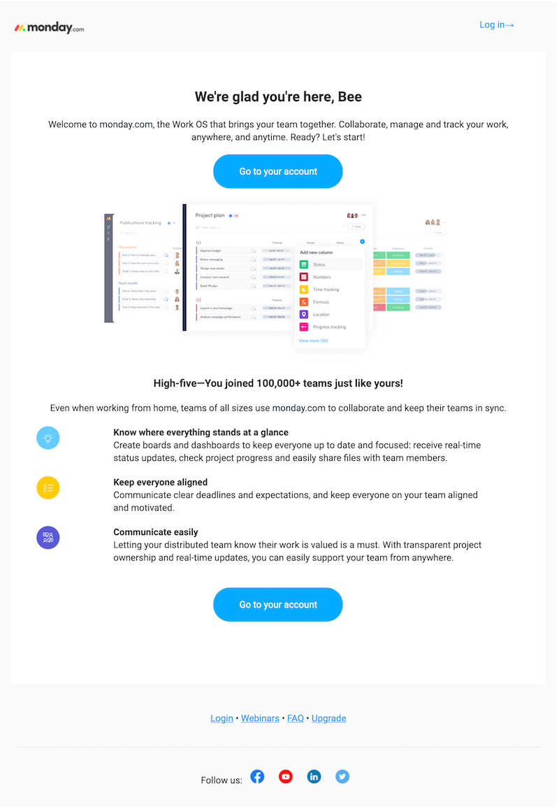
6. Monday.com
Type of welcome email: Social confirmation
Showcasing that other people are using a product is a great way to encourage new customers to sign up because they think, “if that many people use this, they must be enjoying it!” That’s an excellent strategy for a variety of different marketing projects including your welcome email. Let subscribers know that they’ve now joined a popular club (or could join it by taking the next step and becoming a customer). One brand that does this well in its welcome email is Monday.com.Subject line: Welcome to monday.comIn this welcome email example from Monday.com, the company includes a user statistic, tapping into the bandwagon effect to get more people to jump on board. To add even more reasons to enjoy the brand’s product, it provides a bulleted list of features, shining a light on the benefits of Monday.com’s services and letting you know how the platform works.Why it works:
- Speaks to users’ desire to find out why the product is so popular
- Keeps the email short and to the point, serving as a true introduction without overwhelming readers with information
- Encourages ongoing engagement with a clear call-to-action to take subscribers to their accounts and explore the platform’s features
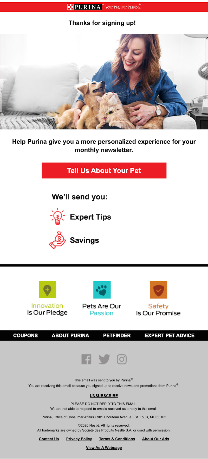
7. Purina
Type of welcome email: Getting to know you
Your welcome email doesn’t just tell subscribers about your brand - it can tell your brand about subscribers too. When you strategically use your welcome email to ask for more information, you can better serve your new customers. You’ll be able to use that information to segment your emails, sending each subscriber relevant, personalized content they want to read.You can create segments based on geographic location, purchase history, or other information about your customer. It’s all a matter of what you’re able to learn about your subscribers, and your welcome email is an excellent place to start. Take a look at Purina’s welcome email and how they use this strategy.Subject line: Bee, welcome to the Purina familyIn this welcome email, Purina asks new customers for more information about their pets. The “tell us about your pet” CTA button takes you to a page where you can check off whether you have a dog or cat and input their name, birthday, and size. All of these questions provide Purina with more opportunities to specifically market to individual customers.Why it works:
- Uses a clear CTA to direct subscribers toward the customer profile
- Maintains a simple design so the CTA doesn’t get lost in the clutter of too much information
- Builds familiarity with the brand by highlighting the brand’s values with the three icons and statements at the bottom
8. Warby Parker
Type of welcome email: Keeping it simple
A welcome email doesn’t have to be overly detailed and complex. In fact, a simple, straightforward design with plenty of white space will allow your subscribers to take in your core message without being distracted by other information. One brand that does an excellent job of using strategic white space is Warby Parker:Header: "You're all signed up"
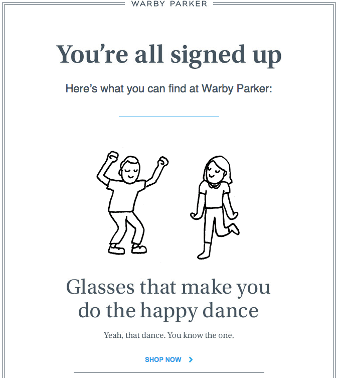
The brand also grabs their subscribers’ attention with a clever GIF:

Warby Parker‘s mission is to make shopping for glasses simple, easy, and fun. The company’s welcome email reflects that brand mission with a simple message that’s easy on the eyes—clean and modern-looking with lots of white space—but still exudes a fun energy with the animated graphic right at the top. There is good support for GIFs in email clients (see this Litmus report on the subject), and they are a great way to put some fun in your messages.
Why it works:
- Uses a simple design to keep the core message from becoming choked by clutter
- Creates a positive association with the brand through happy and lighthearted messaging
- Provides a CTA that invites subscribers to start shopping
- Uses a GIF to engage readers and stand out
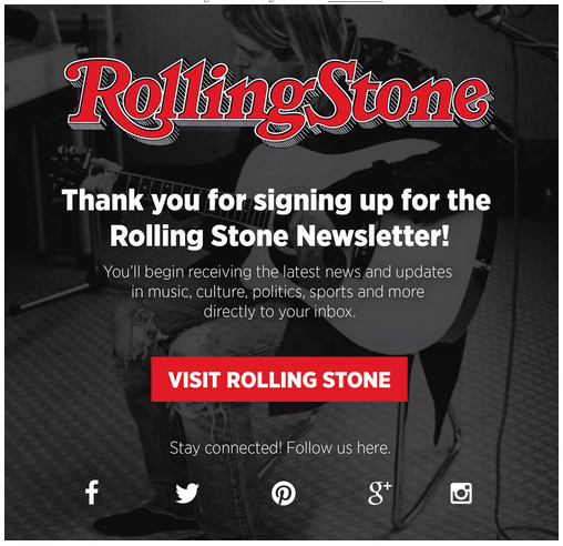
9. Rolling Stone
Type of welcome email: Social media engagement
Your welcome email is an introduction to your brand, so it’s an excellent place to let subscribers know where they can learn more about you. When you feature your social media pages in your welcome email and link to them for an easy user experience, you encourage the subscriber to become more invested in your brand and be part of your community. Check out how Rolling Stone does this:Header: "Thank you for signing up for the Rolling Stone Newsletter!"Rolling Stone doesn’t inundate subscribers with content right away. Instead, the magazine’s message is simple: “Thank you.” It confirms for subscribers that the newsletter will be on its way, and in the meantime lets them know where to connect with Rolling Stone on social media.Why it works:
- Simplistic design keeps the focus on welcoming subscribers and highlighting the brand’s social media pages
- Social media icons are recognizable but still within the brand’s color scheme, keeping them consistent with the brand’s image
- Let subscribers know what they can look forward to in the newsletter
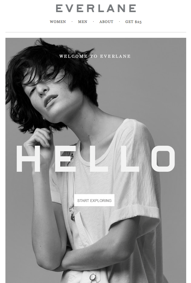
10. Everlane
Type of welcome email: Strategic imagery
Some new subscribers are learning about your brand for the first time while others might have been familiar with your brand for years before subscribing. In either case, using the right photography or imagery can immediately build more familiarity between the subscriber and your brand. As the saying goes, a picture is worth a thousand words, so featuring one powerful image in your welcome email can set the tone for the way new subscribers see your brand.Everlane knows the power of one fantastic photo and they put this to work in their welcome email.Header: "Hello"Everlane has one of the simplest top navigations we’ve seen, allowing the eye to go straight to the brand’s beautiful black-and-white photography. The photo is right at the top, with barely any overlaid text. Subscribers who want to shop or read more can click through to the website, but for those who can only spend a few seconds, photography sends an immediate message about the style of the brand and what to expect.Why it works:
- The featured photo takes up most of the email and clearly communicates the chic yet simplistic nature of the brand and its products
- The introductory offer in the header navigation stands out because of the design’s simplicity
- Email is straightforward and to the point without trying to push subscribers in too many different directions
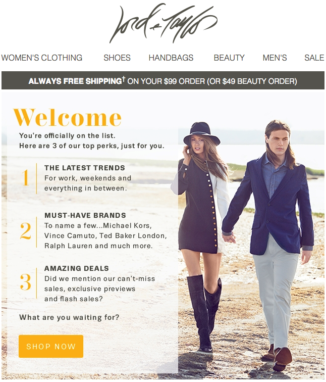
11. Lord & Taylor
Type of welcome email: Value proposition
When a customer subscribes to your mailing list, you get a more engaged customer who will see your brand routinely and will be more likely to buy frequently and become a loyal long-term customer. But what does the subscriber get? You can answer that question in your welcome email by listing out the perks and the value the subscriber is getting. This encourages them to not only stay subscribed but to open your emails when they come in. Check out how Lord & Taylor does this:
Lord & Taylor welcomes subscribers with a list of the three things you can expect from their emails: trends, brands, and deals. It’s the value proposition behind their campaigns, the “why” you made a good move by signing up. The message is coupled with great photography, a pop of brilliant yellow, and one takeaway: shop now. There’s no need to scroll on and on; in fact, there’s barely any reading to do. The shortlist says it all quickly and beautifully.
Why it works:
- Articulates subscriber perks clearly and cleanly
- Features on-brand styling and imagery
- Grabs attention with a banner announcing free shipping
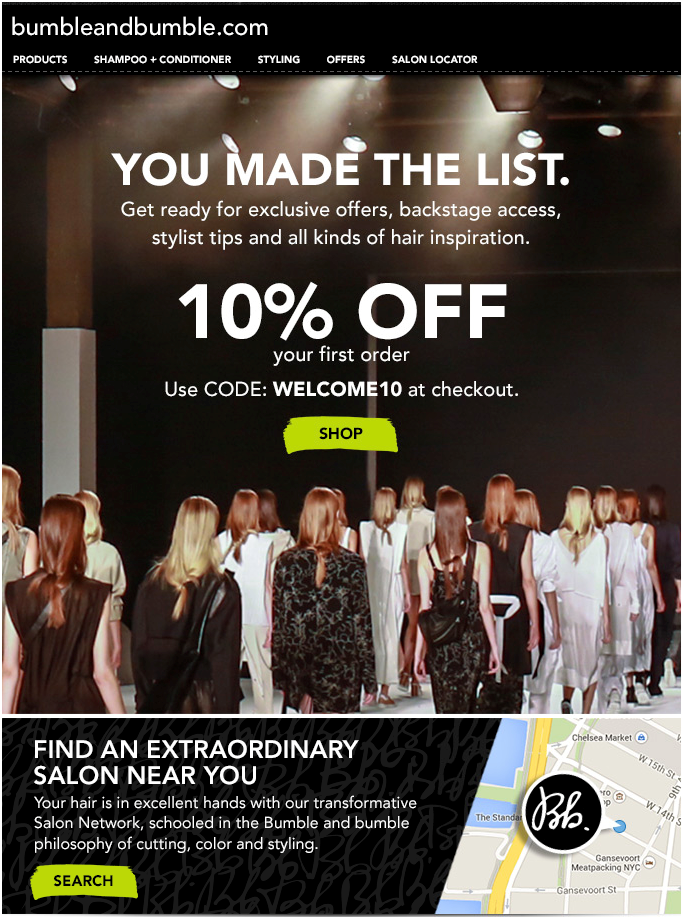
12. Bumble and bumble
Type of welcome email: Exclusivity
Everyone wants to feel special and feel like they’re part of something unique. You can give subscribers that validation in your welcome email by making them feel like they’ve joined an exclusive club. Whether or not your subscriber list or your rewards club actually is exclusive or limited, you can use messaging and imagery that makes subscribers feel like elite insiders. Take Bumble and Bumble’s welcome email for example:
Header: "You Made The List"
The “you made the list” headline immediately makes subscribers feel wanted and included. Bumble and Bumble continue in that vein by showcasing the perks of being part of the club, like exclusive offers and backstage access. Subscribers feel more like a part of the community and more invested as a result.
Why it works:
- Positions mailing list as elite and desirable so subscribers want to stay on the list
- Uses imagery from the backstage of a fashion show to enhance the idea that the subscriber is now an insider
- Guides subscribers toward the next step of shopping or visiting a salon with an online discount code and an easy way to find the nearest salon
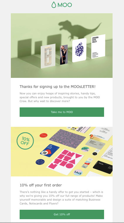
13. Moo
Type of welcome email: Inviting entertainment
When a customer subscribes to your mailing list, it’s (hopefully) the start of a more engaged, active relationship with that customer. While many brands aim to encourage that added engagement in their welcome email by incentivizing the subscriber to go shop, you can also do it by enticing the customer to come to your site for entertainment. Intrigue them with the content you have to offer and beckon them to your site for an enjoyable read.
To see this in action, take a look at Moo’s welcome email:
Header: "Thanks for singing up to the MOOsLETTER!"
Moo does a great job of covering a lot of ground without overwhelming readers. They intrigue the reader with the promise of inspiring stories and helpful tips right off the bat. By using a large, easy-to-read font, keeping messages brief, including great images, and allowing for white space and breathability between sections, Moo also squeezes in multiple calls-to-action (go to the website, get 10% off, connect on social) without it feeling like too much.
Why it works:
- Appeals to subscriber’s desire for entertainment and enjoyment rather than just pushing them to make a purchase
- Uses a clean and simple design so the CTA and the promise of great content aren’t lost
- Includes an appealing discount but doesn’t push a purchase as the only goal of the email
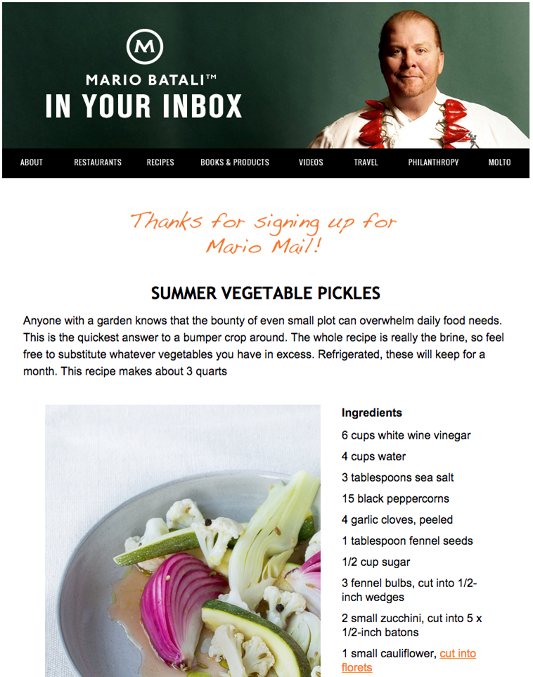
14. Mario Batali
Type of welcome email: Exclusive content
When someone signs up for a mailing list, there’s always still a question in their mind about whether the emails will actually pay off and be the right choice. Even if your mailing list is free, customers have to ask, “Is the content I’ll get worth the burden of having more emails crowding my inbox?” You can show them immediately in your welcome email that they made the right choice by giving them exclusive and exciting new content right away. Chef Mario Batali, for example, does this in a seamless way:Header: "Thanks for signing up for Mario Mail!"Mario Batali doesn’t mess around with his welcome email. Open it up and readers find their first Mario recipe, front and center. By diving into quality content right away, Batali makes an instant connection with readers and provides them with exactly what they are looking for. Plus, the photography is gorgeous, the text is easy to read, and there’s no clutter.Why it works:
- Presents valuable content without delays or making subscribers jump through hoops
- Gives subscribers a preview of what they can expect to see in future emails and why they’ll be glad they signed up
- Uses a navigation bar in the header to subtly invite subscribers to check out other types of content from the brand
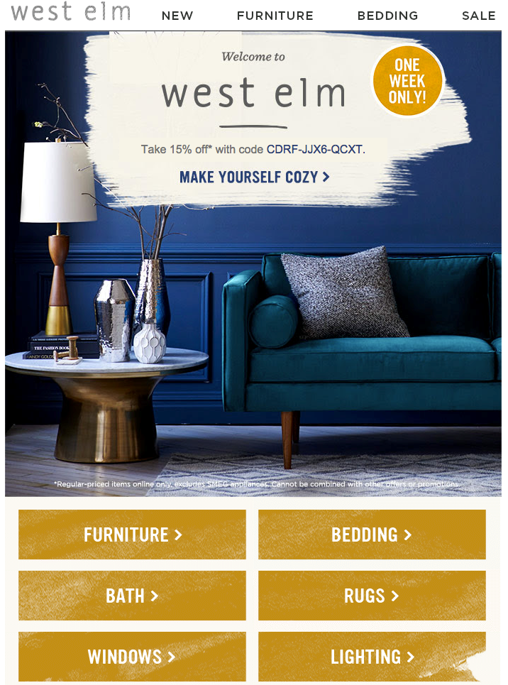
15. West Elm
Type of welcome email: Urgency
So much of marketing can be described as capitalizing on opportunities when they arise, and your welcome email is an excellent opportunity. The subscriber is already engaged enough to sign up so you know they’re interested in your brand, making this the perfect time to offer a discount to encourage them to shop. But you can take advantage of this opportunity even more by creating a sense of urgency for that discount.A limited-time discount makes customers want to shop and save right away because, if it slips their minds later, they might miss out on the savings altogether. Check out how West Elm uses this strategy in their welcome email:West Elm truly motivates readers to jump over to their site and get shopping: they offer a coupon right at the top and a noticeable alert that the discount is only valid for one week. They also make it easy to take advantage of the deal by including a simple, clickable menu reflecting the offerings of their site (furniture, bedding, etc.). By using gorgeous photography and keeping the email simple and full of links, readers almost can’t help but wander right over to its website.Why it works:
- The combination of a discount code and a very obvious time limit on that code prompts subscribers to shop now
- Beautiful and inviting photography is visually appealing and makes subscribers envision how the brand’s products could give their homes a similar look
- The email design is simple and straightforward, with enough detail to catch subscribers’ eyes but not so much to lose sight of the message and CTA
Welcome Email Examples Key Takeaways and Tips
The examples above are all effective welcome emails but they each use their own strategies and designs to make subscribers feel included, encourage sales and conversions, and nurture long-term subscriber relationships. Any of these designs can inspire your welcome email development, but your design isn’t the only factor in your emails’ success. Use these tips and takeaways to make your welcome emails even more effective:
Put thought into your subject line:
Your subject line should be appealing and eye-catching but it should also make the intention of the email clear. Try customizing subject lines like these:
- Welcome to ! Here’s a little treat.
- You’re in! Welcome to the club.
- Thanks for subscribing! Here’s 10% off to show our appreciation.
Be quick:
You want your welcome email to go out as soon as possible after a customer subscribes - ideally, you should set up automation that triggers the welcome email immediately when a new customer subscribes. This will capitalize on the subscriber’s engagement with and interest in your brand at that moment.
Consider a welcome email series instead of a single welcome email:
You could start with an immediate email that confirms the customer’s subscription and gives them a discount code to shop. A day or two later, you could follow it with a more thorough introduction to your brand or the features of your site, and another follow-up email could encourage further interaction by highlighting your social media pages and other ways to engage with your brand.
Quality counts:
Even if a customer already knows your brand well by the time they subscribe, your welcome email is an introduction to the value your mailing list brings. Use only high-quality images and valuable, interesting content to show subscribers that you’re worth the sign-up.
Personalize your welcome emails:
For example, you might have one design for the core of your welcome email but you can add personalized product recommendations or content recommendations at the bottom based on what the subscriber has viewed on your site. This both prompts the subscriber to shop and also makes the email feel more relevant to them.These tips and best practices can help you take your welcome email from a simple subscription confirmation to an excellent tool for strengthening your customer base.
Create welcome emails easily with a template
Now that you have all the secrets to creating an effective welcome email, let’s get to work! When you use the right tools, it’s simpler than you think. With the Beefree email editor, welcome email design is made easy. Our HTML email editor allows you to either create your own welcome email from scratch (with no HTML knowledge needed) or to start with one of our skillfully crafted templates. Find one of our welcome email templates that works for you, like this “Thanks for signing up!” template by Martin Nikolchev.
…or the “Hiring Simplified” email by designer Navid Nosrati.
Editor’s Note: This post was updated on September 2023 to ensure accuracy and comprehensiveness.
Share this post with your friends! Pin it on Pinterest?
How to Create a Transactional Email to Boost Your Conversions
As an e-commerce brand, transactional emails are one of the most effective weapons in your marketing arsenal. Transactional emails have higher open rates than marketing emails, plus a click-through rate that’s almost three times higher than non-transactional emails. That’s why these types of messages present a valuable opportunity for you to build relationships with your customers! Here’s how to create a transactional email that will give your conversion rate a boost both now and long-term.
As an e-commerce brand, transactional emails are one of the most effective weapons in your marketing arsenal. These emails have a click-through rate that’s almost 3X higher than non-transactional emails.
What is a transactional email?
Transactional emails are emails that are triggered by events — a user performs an action, and they receive a certain email in response. Examples of transactional emails include:
- Welcome emails
- User activation or trial expiration emails
- E-commerce emails (abandoned cart, receipts, confirmations)
- Request emails (password reset or verification code)
- Account-related alerts and security emails
- Re-engagement emails
- Support and feedback emails
Transactional emails are prompted by a specific customer action, and people expect to get these kinds of emails. If you request a password reset email, for example, you’re most likely going to be refreshing your inbox until you see the message come in. That’s why transactional emails have much higher open rates than marketing emails.Your transactional emails are more likely to be read, and that means they need to be top-notch. What’s more, this is a great place for you to subtly add some marketing and upsell your customer. Transactional emails are an easy place to sneak in a little marketing — it’s much easier to sell to people who already know about you than it is to seek out new customers.Wondering how to create a transactional email that will improve your conversion rate? Here are a few transactional email examples and tips.
Introduce yourself
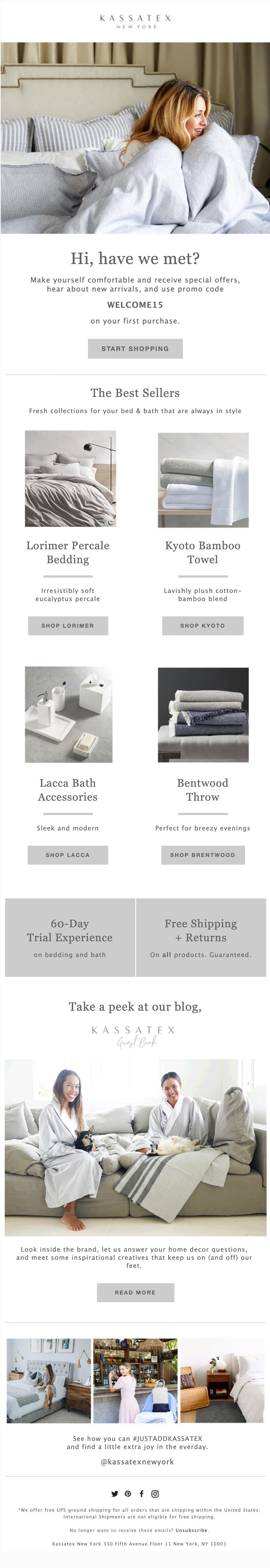
Share more information about your company so your customers can get to know you. A welcome email is a great place to highlight your popular products and make it easy for readers to shop. Kassatex promotes its bestselling products with a separate CTA button for each one:Subject line: Welcome to Kassatex!
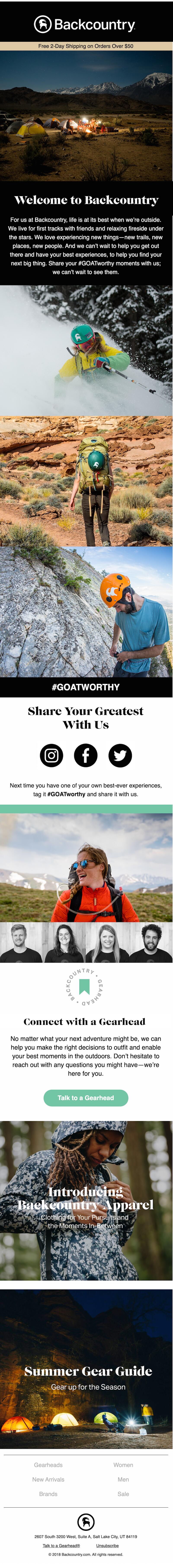
Backcountry also adopts this approach, sharing a gear guide in its welcome email. Adding product information to your transactional email design is a smart way to up your conversion rate.Subject line: Welcome to Backcountry
Offer an extra incentive
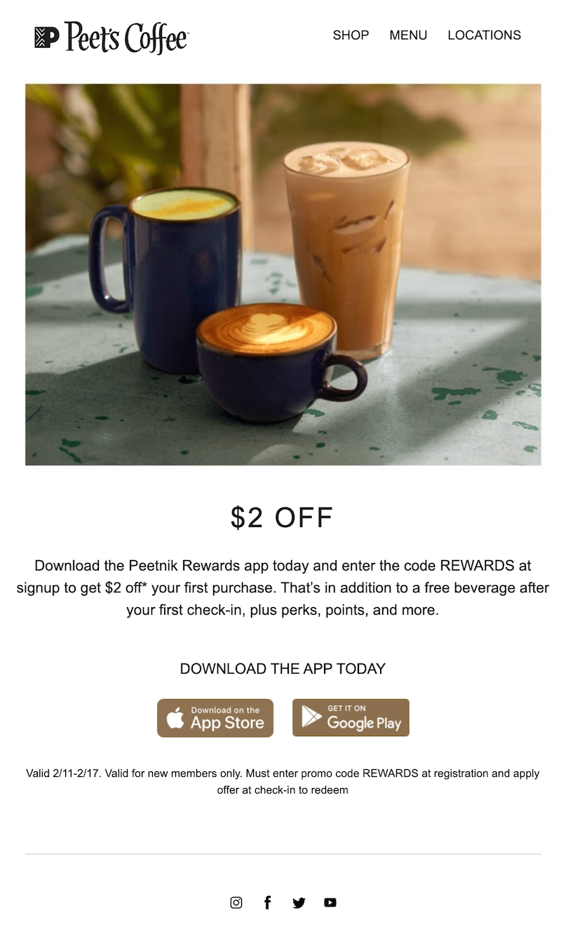
Provide your customers with an incentive — something that will encourage them to make a purchase, such as a discount or a special coupon code. In this welcome email, Peet’s Coffee gives new customers a code to get $2 off their first purchase. We’d suggest including your offer in the email subject line to help boost that transactional email open rate even more.Subject line: We want to welcome you
Upsell your customer
You can use your transactional email to upsell your customer — whether you ask them to simply add something to the order they've already made or bring up an entirely new proposition. An end-of-free-trial email is a good place to do this. You can also upsell your customer in an order confirmation email.
Create dynamic content
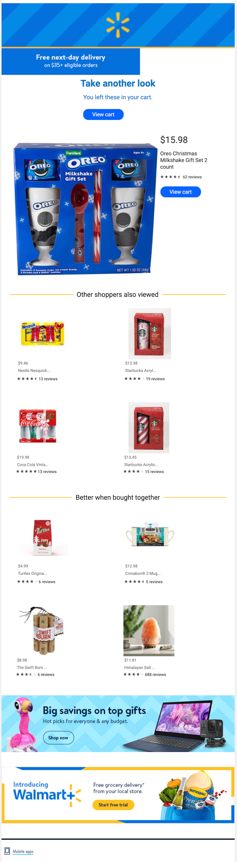
Abandoned cart emails are a hugely valuable type of transactional email. On average, these emails have a conversion rate that’s higher than 10%! Make your abandoned cart emails even better by drawing on the customer’s browsing history to add personalized product recommendations. For example, this message from Walmart presents the item left in the customer’s cart, but it also takes things a step further by providing some additional products to consider.Subject line: Check out before it sells out!
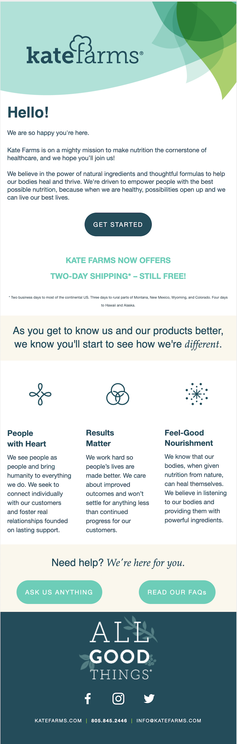
Broadcast your USP
What makes your company special? What perks or unique selling propositions do you offer that bring extra value to your customers? Highlight those selling points everywhere you can — including in your transactional emails. In this welcome email, Kate Farms (a company that makes feeding tube formula) mentions:
- Two-day free shipping
- A commitment to creating personal customer relationships
- A passion for progress
- The powerful ingredients used
When you consistently include this information, your customers receive the message without even realizing it. Over time, you’re helping them create a good impression of your brand.Subject line: Welcome to the Kate Farms family!
Make sure the emails are branded
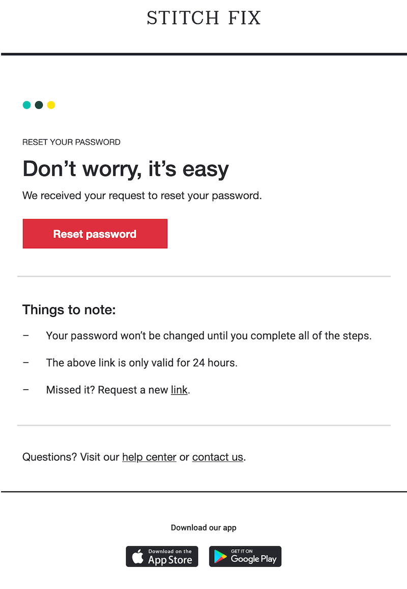
Our biggest tip for transactional email design: Your emails need to be clearly branded. This won’t necessarily boost your conversions right away. But increasing brand awareness and cementing customer loyalty will only do good things for your conversion rate in the long run. For example, in this email from Stitch Fix, the branding is subtle but there. The header is the same header Stitch Fix always uses. The color of the CTA button matches the company’s brand colors. And the subject line and copy use the same tone of voice as the brand’s other emails. All of these are important transactional email design choices that can improve a company's brand awareness.Subject line: Need to reset your password? No problem!
Wrap-up: Transactional email templates
Now that you know how to create a transactional email, you can use the BEE email editor to design yours. Our transactional email templates make it easy to create mobile-responsive, HTML messages — no coding experience required. Let the BEE editor kickstart your transactional email design!
Share this post with your friends! Pin it on Pinterest ?
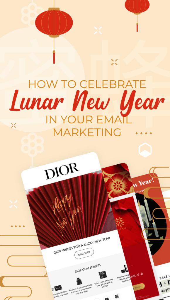
How to Celebrate Lunar New Year in Your Email Marketing
Every year, billions of people around the globe celebrate the Lunar New Year in spectacular fashion. By investing in Lunar New Year email marketing, you can build relationships with a large consumer base and even grow your brand.The Chinese Lunar New Year typically falls sometime in late January or early February according to the Gregorian calendar. This year, the festival will be celebrated on February 12. While the festival is more heavily celebrated in Asian countries, people across the world will welcome in the new year.This holiday is known by multiple names, including Lunar New Year, Chinese New Year and simply Spring Festival. The majority of the emails in our inbox use the term Lunar New Year in their communications. Take a look at these Lunar New Year email marketing ideas to get inspired for this special celebration.
Billions of people celebrate Lunar New Year each year. Use this time to build relationships with a large consumer base!
Decide who should receive a Lunar New Year email
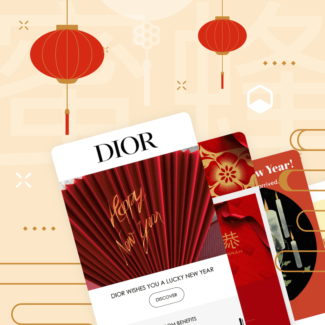
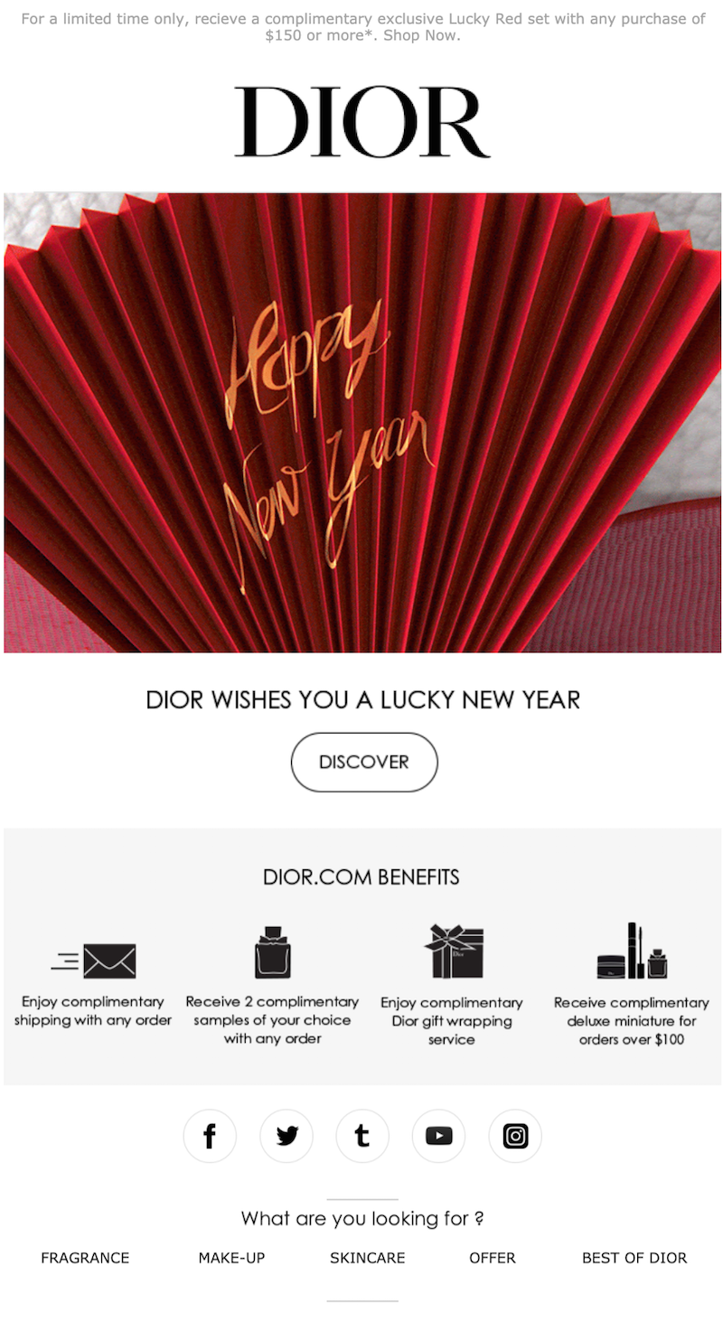
Of course you can always send your customers a straightforward email wishing them a happy New Year and offering a special promotion or good deal. But this is a good time of year to add a more personal touch, too. Consider sending a Lunar New Year email to clients as a way to strengthen your relationship with them moving into the new year. You can even send a Lunar New Year message to family and friends, wishing them a prosperous year full of peace and good health — similar to this message from Dior.Subject line: Happy Lunar New Year
Set a strategy for timing
Figure out the best timing to get your Lunar New Year emails in front of your subscribers. We recommend sending out Lunar New Year email greetings a few days before the holiday. If your audience isn’t overly familiar with Lunar New Year, this gives you a little time to share some information about the Spring Festival and get them up to speed.
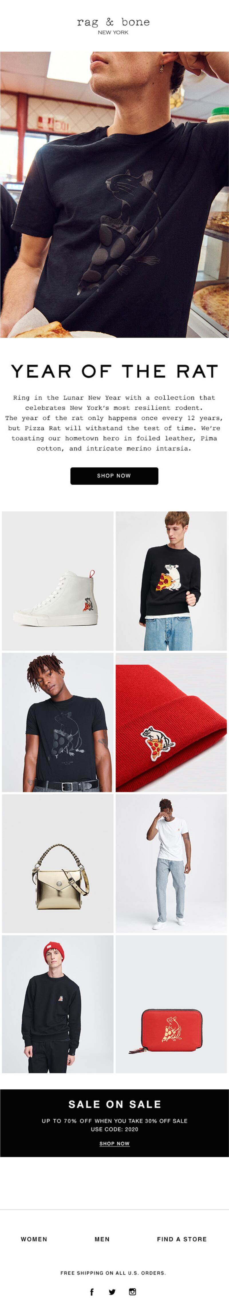
Incorporate the animal for this year
The Chinese New Year is based on a different animal each year according to the 12 animals that are included in the Chinese Zodiac. An easy Lunar New Year email marketing strategy is to play off of that animal as you design your Lunar New Year emails. In 2020, Rag & Bone designed an entire product line appropriate for the Year of the Rat:Subject line: Last days of Lunar New Year
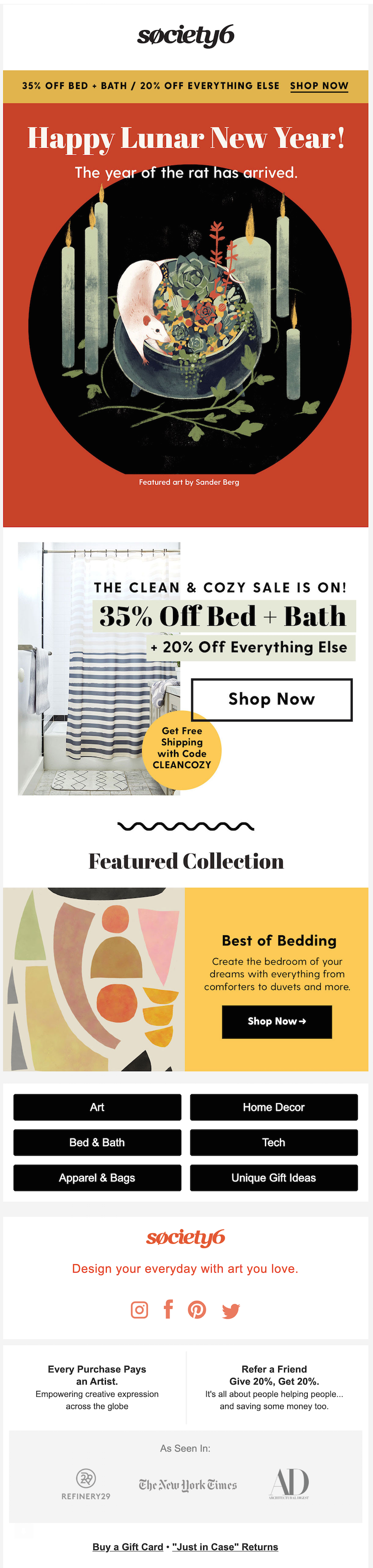
If you don’t have the time to fully commit to the theme, don’t worry! A simple note wishing your readers a happy Lunar New Year, like this beautiful graphic from Society6, is enough.Subject line: ? New Year | 35% Off Bed+Bath & Free Shipping
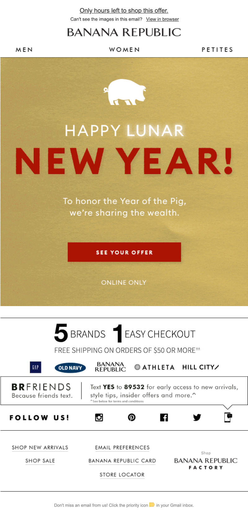
If you get stuck, try researching what this year’s animal represents. For example, in the Chinese zodiac, pigs represent wealth — leading Banana Republic to craft this Lunar New Year message in 2019.Subject line: Hurry! Our Lunar New Year offer ends soon
2021 is the Year of the Ox. While it might take a little more creativity to incorporate an ox into your marketing emails, this can still be a great starting place as you think of Lunar New Year email marketing ideas to use this year.
Use the best Lunar New Year email subject lines
Using the term “Lunar New Year” in your email subject line can immediately signal to your subscribers what the email is about. Many Lunar New Year subject lines also refer to different aspects of the holiday, mentioning “luck” or red envelopes. And when it comes to emojis, we’re seeing moons, party poppers and lots of animals (based on the zodiac for that year). Take a look at these subject lines sourced from our inbox:
- Lunar New Year! Up to 20% OFF sitewide ?
- Lucky you! Happy Lunar New Year
- ? Open your lucky red envelope ?
- Last chance for a Lunar New Year gift
- This Lunar New Year, let pigs fly
Add red and gold
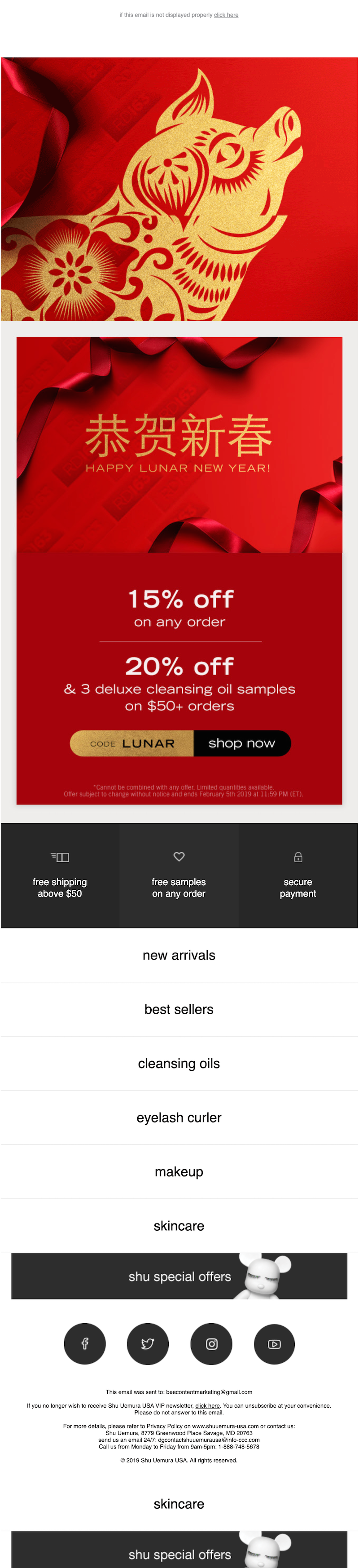
Lunar New Year email marketing is the place for lots of festive red and gold! These are popular colors used to celebrate the Lunar New Year because they symbolize prosperity. This message from Shu Uemera (sent in 2019, the Year of the Pig) has a red background with elegant gold CTA buttons and lettering throughout.Subject line: ? happy lunar new year!
Create educational content
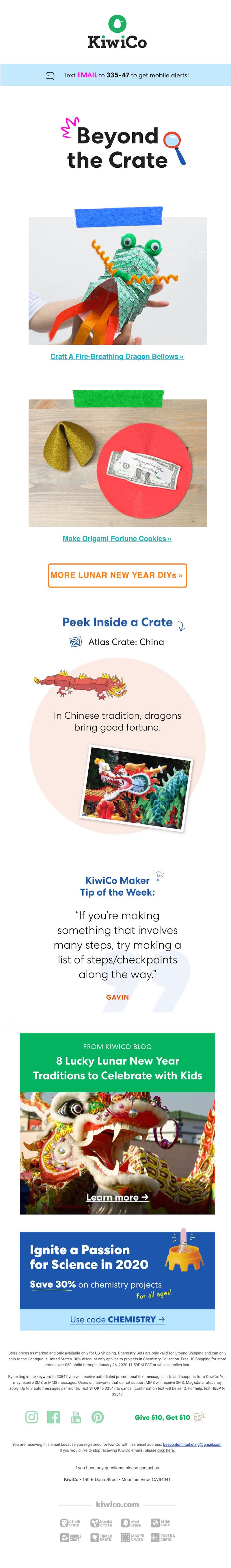
You don’t have to send a promotional email for Lunar New Year. Creating an email newsletter that shares educational content can also be a great idea. Share articles or information with your customers to help them learn about the Lunar New Year — and if possible, do so with a relevant angle for your brand. For example, businesses in the food and beverage industry could share about the type of food that’s commonly eaten to celebrate Lunar New Year. This KiwiCo email is promotional and educational all in one, letting you peek inside one of the company’s subscription crates to see some fun Chinese New Year-related crafts for kids.Subject line: Beyond the crate: Fire-breathing dragons, origami fortune cookies, and more Lunar New Year DIYs!
Wrap-up: Chinese New Year email templates
Now that you know how to wish a happy Lunar New Year in email, it’s time to start creating. Use our mobile responsive, HTML Chinese New Year email templates to help with your email design. With the BEE email editor, it’s simple and easy to create high-quality emails — no coding experience required!
Share this post with your friends! Pin it on Pinterest ?
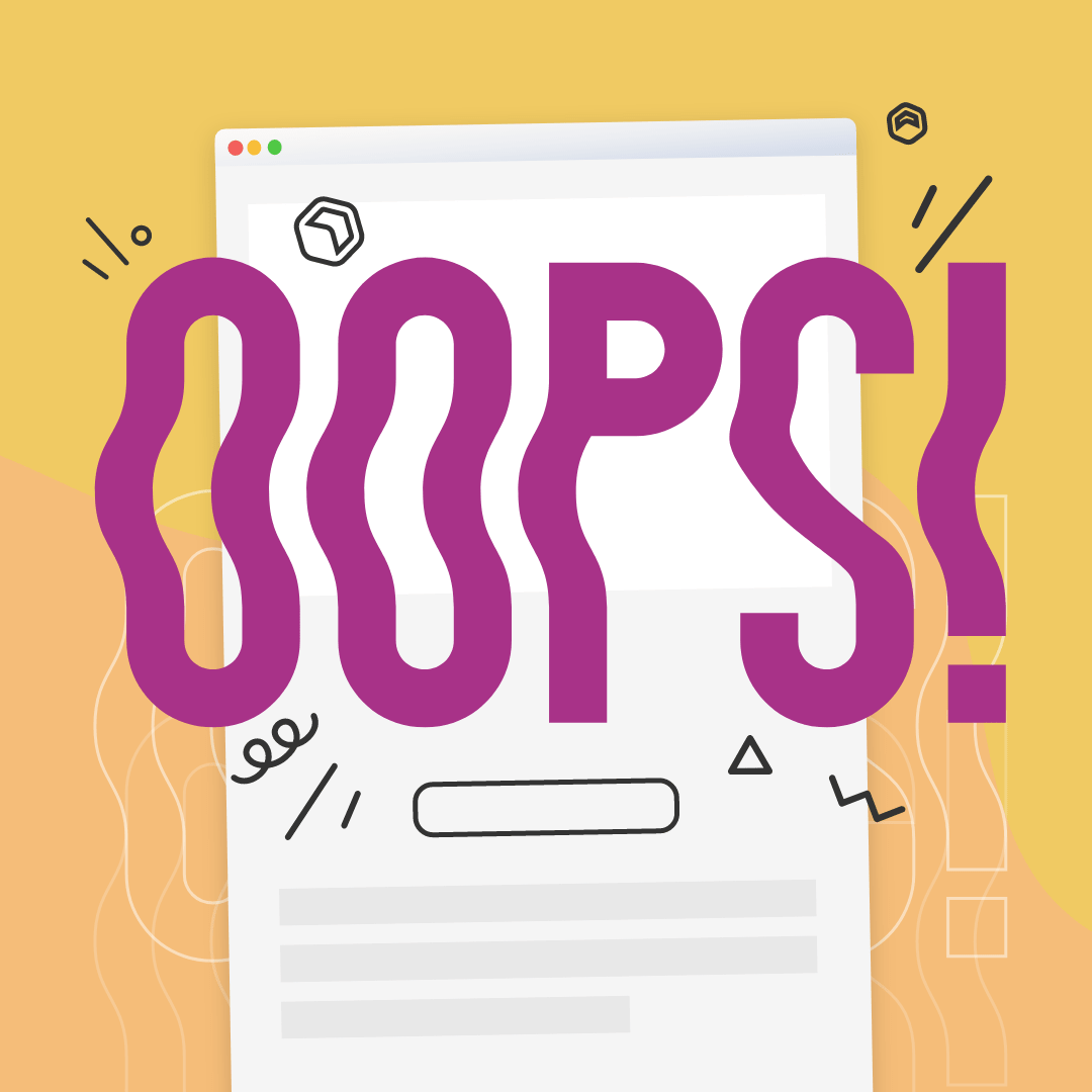
Sending Apology Emails: 3 Design Tips for Saying "Oops!"
We all make mistakes. And saying sorry by sending apology emails is part of doing good business.Whether your site went down, you sent an email with incorrect content or your users experienced some kind of technical difficulty, it's important to know how to send an effective apology email. Email marketers know that saying sorry is key to being known as a trustworthy, responsible and humble brand.Today, we'll examine the art of saying sorry with these tips for designing and sending apology emails.
Saying sorry is key to being known as a trustworthy, responsible and humble brand.
When to send an apology email
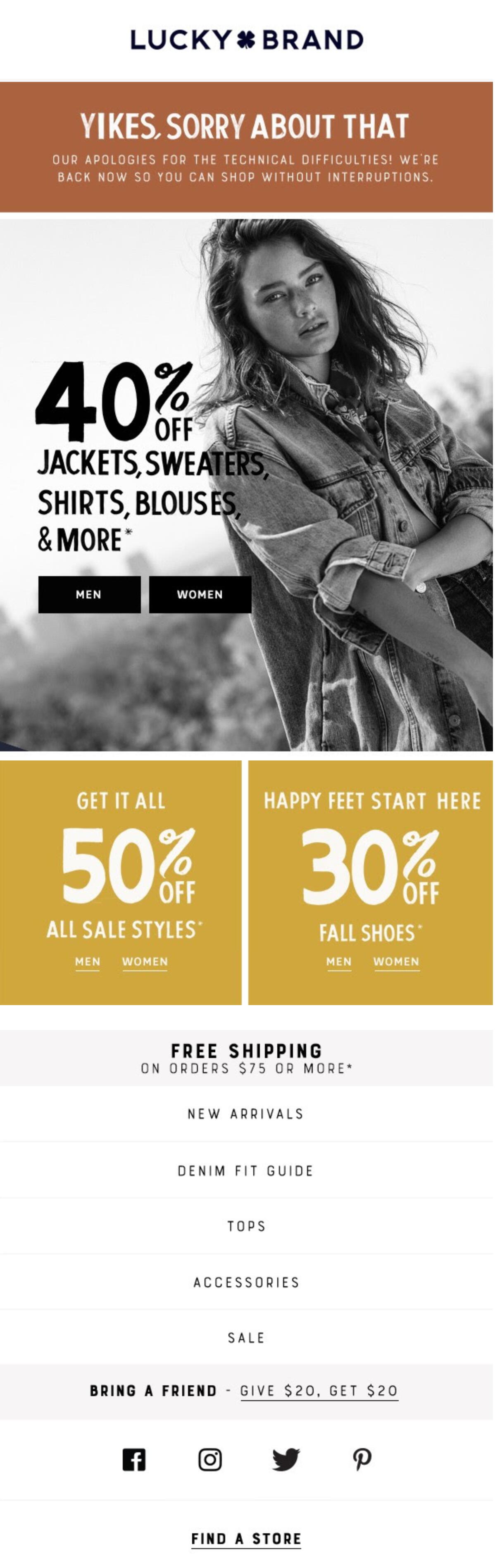
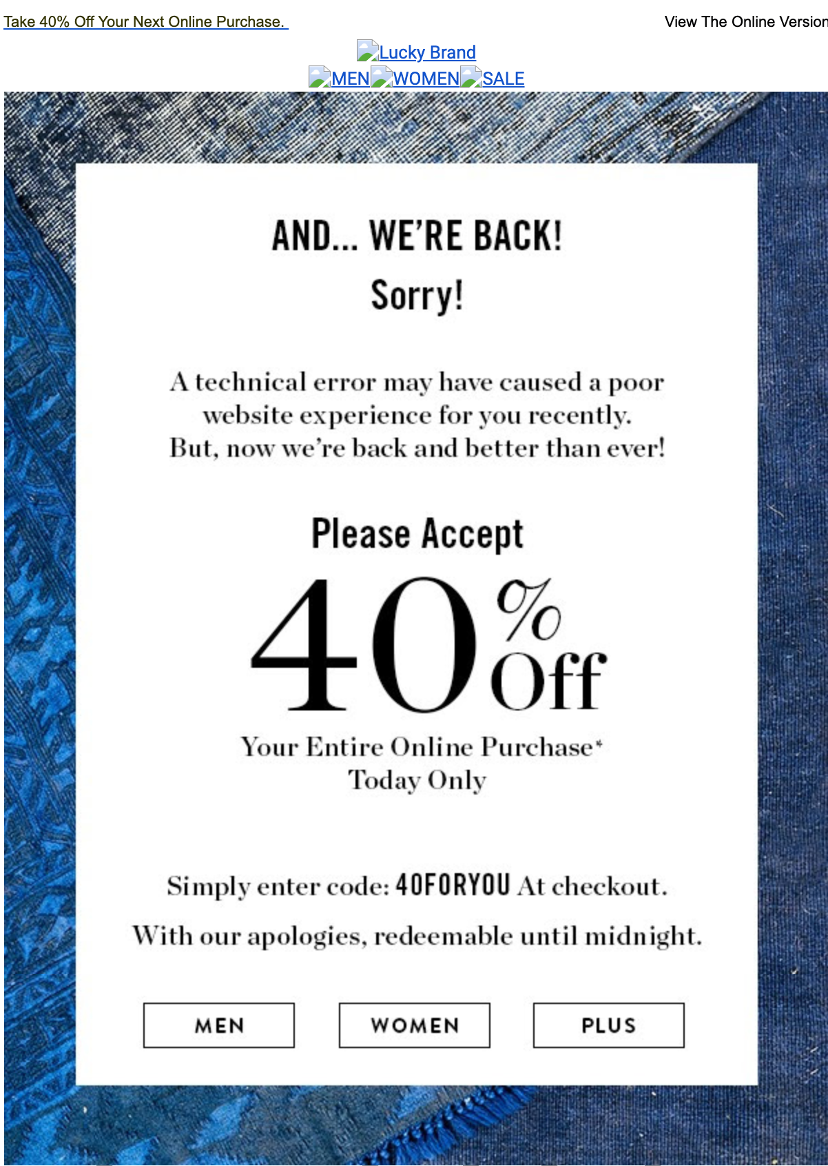
First things first: Before we get into email design best practices, let’s talk about when you should send an apology email. Some situations warrant an immediate, heartfelt apology, but others might not. It's best to save your emails for the cases in which they’re truly needed so you don’t barrage your customers with constant apologies.Some suggest sorting your mistakes into categories ranging from errors that are merely embarrassing (such as typos) to real issues (anything that might hurt not only your customers but also your business). Small mistakes may not need full apology emails, while bigger ones do.If you made a minor mistake that doesn’t justify an entire apology email of its own, consider simply adding a few lines of text in your next scheduled marketing email to rectify the error. Some issues can also be fixed internally. For example, if you accidentally included a broken link, try redirecting the URL from the back end instead of sending a brand new email.So when should you send an apology email? You’ll definitely want to say sorry if you made a mistake that affected customer experience. For Lucky Brand, technical difficulties on the company’s website were an issue that touched the large majority of customers — so the brand sent this apology email:Subject line: Oops, our bad…
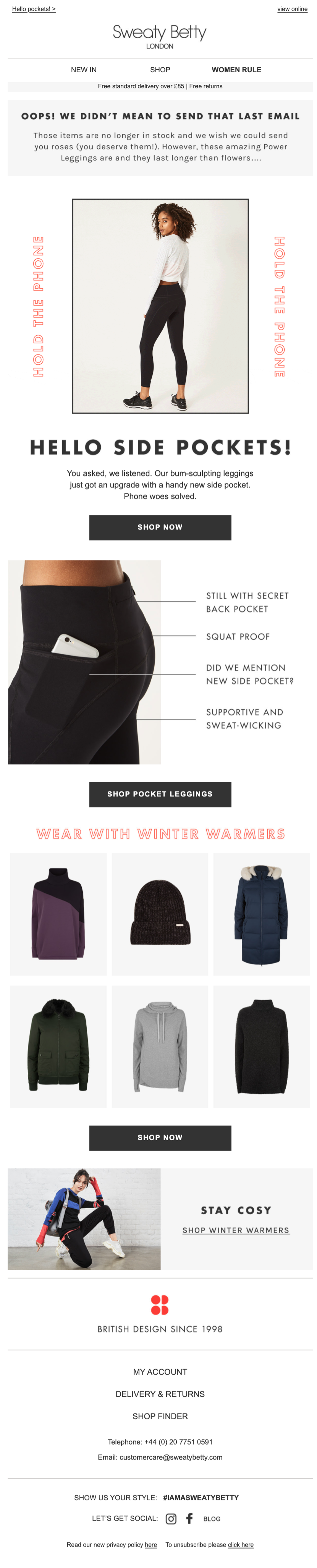
Sweaty Betty accidentally sent its email list a message that included photos and links to out-of-stock products. This was a problem that needed a public announcement to clear up any confusion.Subject line: OOPS! We didn’t mean to send that
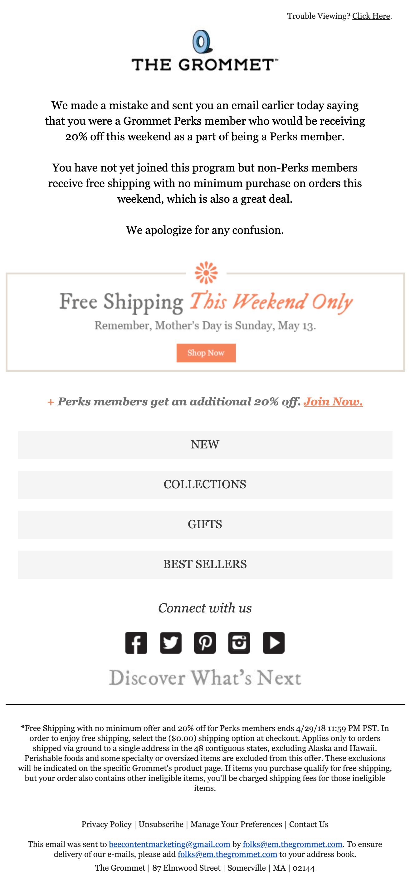
And here, The Grommet apologized for sending an email to the wrong segment.Subject line: OOPS: We made a mistake
Before you start sending off apology emails left and right, take a step back to evaluate the situation and make sure a new email is actually needed. If an apology is in order, use these tips to help craft your message.
#1. Be clear and specific about the correction
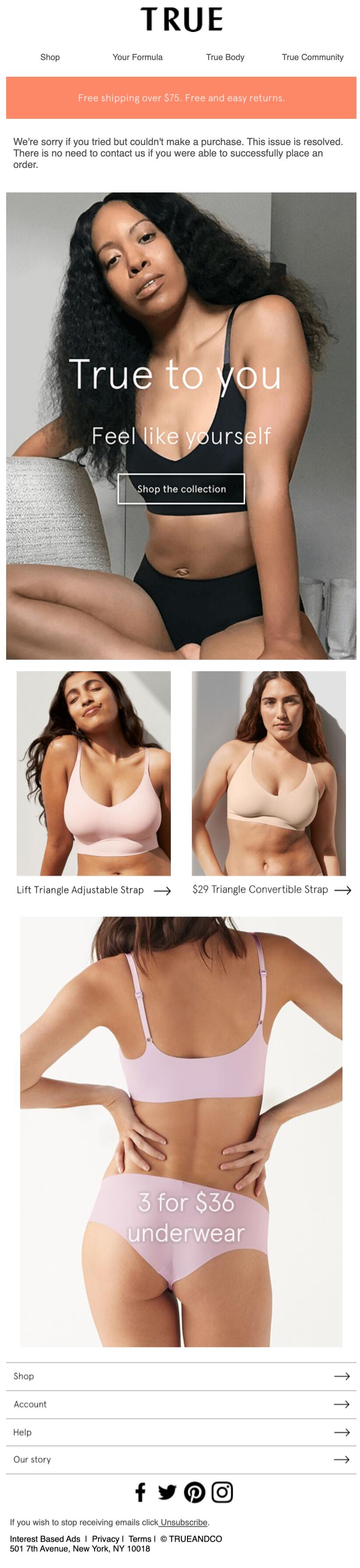
If you need to make a correction to an email that's been sent, be upfront about the change so readers aren't confused when they receive a second message. Clear things up right from the start by crafting a strong apology email subject line.In a correction email from True & Co, it’s easy to tell from the subject line that something went wrong. And once the email is opened, the apology is stated at the top of the message in just three sentences:Subject line: Oops… we’re sorry. Our bestselling bra is still $29
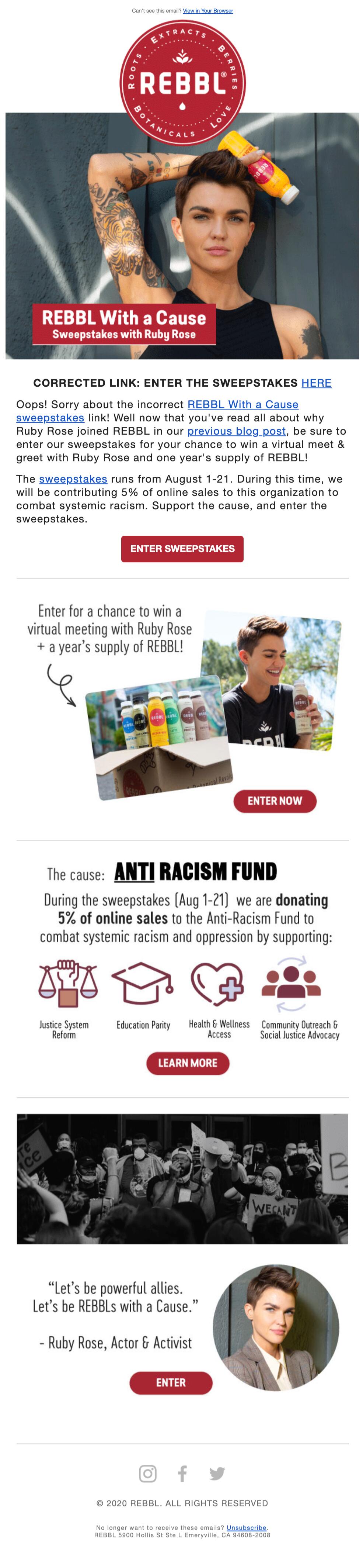
Positioning the correction and/or apology message at the top of the email makes it nearly impossible for readers to miss. This reduces confusion and builds transparency and trust. In the example below, Rebbl does a great job of this, too.Subject line: Oops - here’s the correct REBBL Sweepstakes link!
#2. Be humble and have a sense of humor
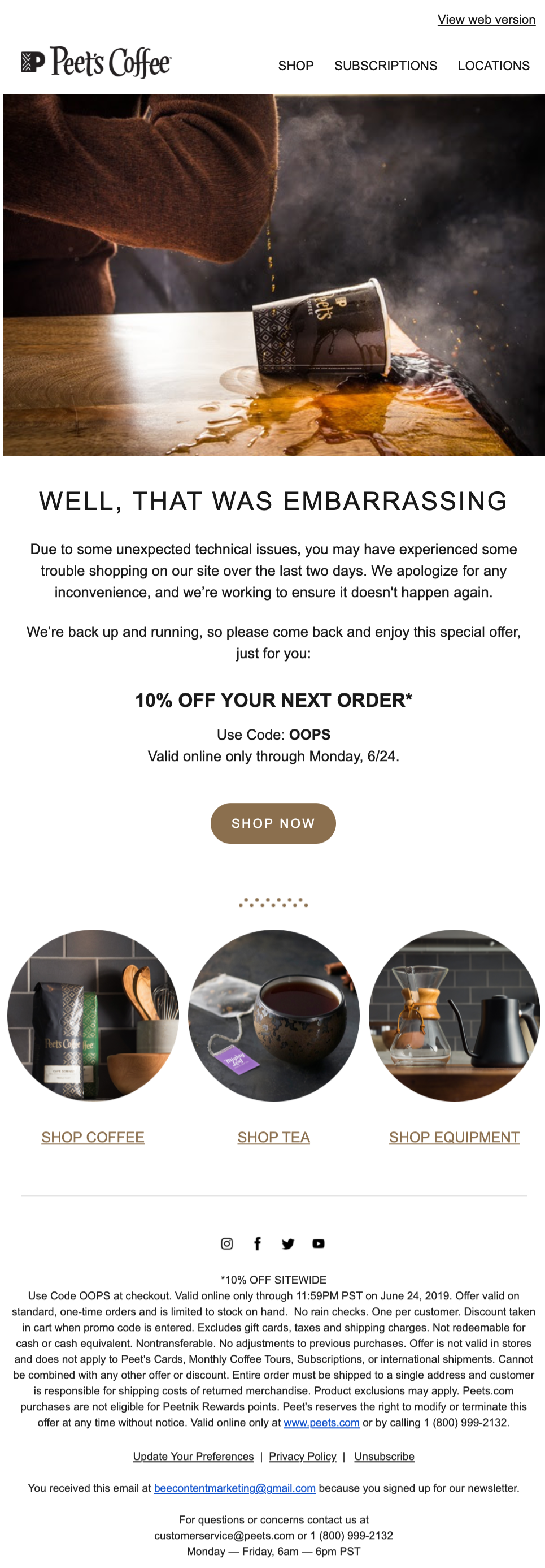
Showing a sense of humor is a great way to make your brand voice relatable. This can be especially valuable when issuing a correction or apology, which is one reason you see "Oops" often mentioned in apology email subject lines. This is a way of showing there's a human voice behind the brand and expressing that mistakes happen.This apology email from Peet’s Coffee brings a smile to your face. The photo couldn’t be more on-brand, and it gives the entire email a playful tone. And the special offer with code “Oops” makes it even better.Subject line: Oops! We're back online.
Keep your apology emails light and have a sense of humor about your mistake.
#3. Focus on the solution
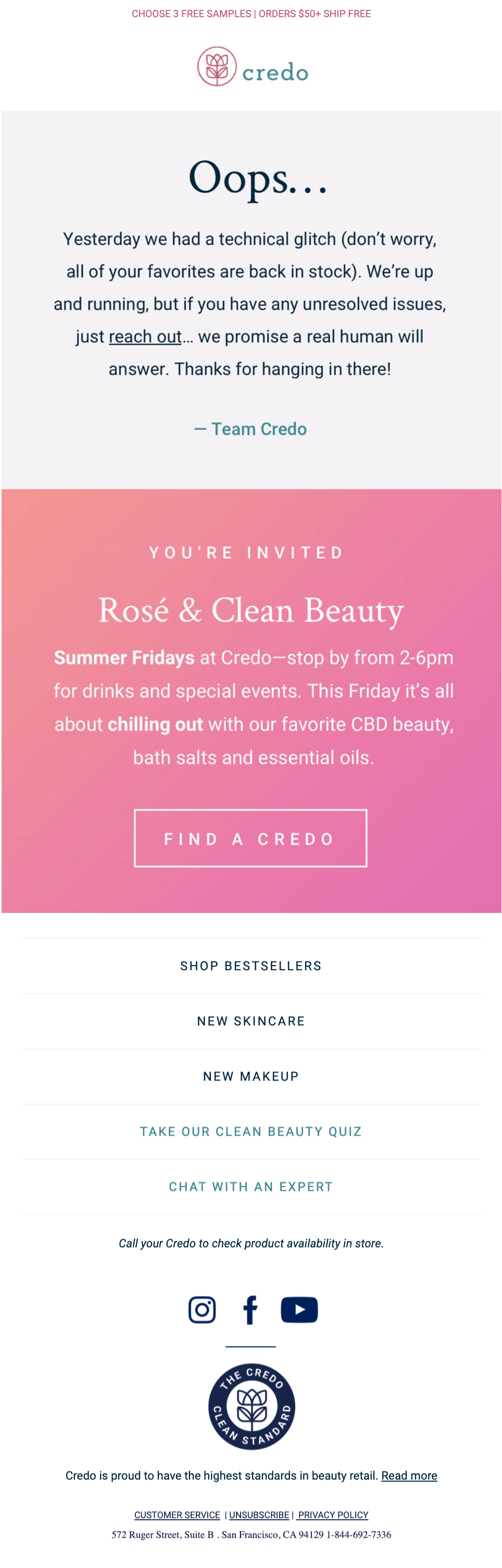
All the apology emails we've collected here have something in common: They cut right to the chase. Keeping your apology message short means it's more likely to get read, and it also allows you to focus on what readers actually care about: the solution. Often, this is a special discount code or promotion.At the top of this message, Lucky Brand placed a quick apology before getting to the heart of the story: a 40% off sale. Remember, saying sorry isn’t about you. It's about your reader, so focus on the solution that will benefit them.Subject line: Sorry! Technically speaking, we messed up
Here, Credo Beauty gets straight to the point by including a customer support link to help with any unresolved issues.Subject line: Oops ?
Wrap-up: Creating apology emails
Issuing an apology doesn't have to be painful. Just focus on getting your readers a solution as quickly and clearly as possible (bonus points for humor!) and you’re golden. If you’re in a time crunch to get your apology email in inboxes ASAP, use the BEE email editor and our HTML email templates to quickly create effective apology emails. Start designing for free today!
Share this post with your friends! Pin it on Pinterest ?
SaveSaveSave
Gamification Email Marketing: How to Engage and Play With Your Customers
Do you incorporate gamification into your marketing emails? If not, now is the time to start! Increasing engagement, boosting conversion rates and cementing brand loyalty — the benefits of gamification email marketing are undisputed. And what’s more, gamification is a whole lot of fun. Here’s what you need to know about how to incorporate gamification as part of your email marketing strategy.
Your customers are more likely to support you if you’re honest and upfront about everything, especially during times of crisis.
What is gamification?
Gamification uses game principles in non-game contexts. Any time you apply elements of game playing (such as scoring points or participating in a competition) to activities that aren’t typically structured as a game, that's gamification. Gamification in email marketing might look like:
- Competitions
- Quizzes
- Tests
According to a survey performed by Reflect Digital, 93% of consumers think gamification marketing is effective. And one case study showed that using gamification can get three times more revenue from email marketing!The goal of gamification is engagement. It’s a great way to make things more fun and help your brand be as memorable as possible in the minds of your consumers.
Why does gamification work?
Lead magnets, freebies and discounts are great ideas. But in practice, they don’t always work. Many users sign up just to get these bonuses. Then they ignore or unsubscribe from any subsequent marketing emails.This is where gamification comes in. Gamification can grab your readers’ attention and increase engagement. And when people get engaged with your messages, they’ll be more likely to continue engaging with your brand.Gamification in email marketing isn’t necessarily meant to generate more sales. Instead, gamification boosts engagement. Increased sales are often a natural consequence from there.
When to use gamification in email marketing
Here are a few situations in which using gamification in digital marketing might be a good idea.
In-between major holidays
You might be inclined to use gamification on special occasions such as holidays. But we actually recommend saving gamification emails for other times of the year. On holidays, your consumers typically do expect (and prefer) discounts over other types of content — especially on big ecommerce holidays like Black Friday or Cyber Monday.So instead, try sending gamification emails during stretches of time between major holidays. Gamification can be a helpful tool to liven up the more monotonous times of the year.
As event marketing
Another good time to use gamification digital marketing is when you have a special event coming up. Gamification can help build excitement around your event, generating buzz and getting more people to sign up.
For reactivation email campaigns
Gamification is also helpful for reactivation email campaigns. Your goal with these campaigns is reengaging users. So it makes sense that gamification would be a good fit! Try incorporating gamification into your next reactivation email campaign.
In your rewards program
Finally, try using gamification email marketing to put a spin on your rewards system or loyalty program. Customers are used to getting traditional rewards such as a small discount on a future purchase. But playing games to win rewards is often a new and exciting experience for consumers.For example, Expression Med Tape recently hid a virtual Elf on the Shelf on its website. Each day, the elf would move to a new page of the site. Any customers who found the elf would receive a special discount code.Set up your rewards system so that the more your customers interact and engage with you, the more points or rewards they get. That’s a win for you both.
Gamification email examples
Check out these real-life gamification email examples from brands for a little design inspiration.
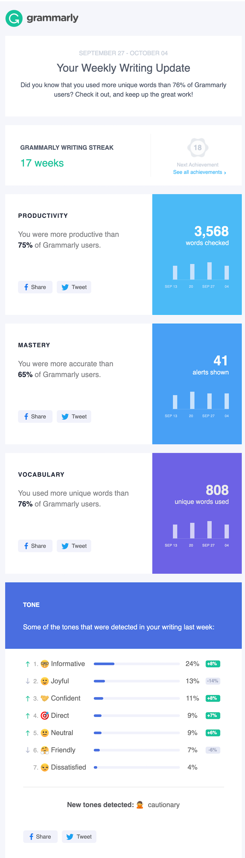
Grammarly
Grammarly included some fun gamification elements in this weekly writing update. Readers can see their weekly statistics plus how they stack up against other Grammarly users. This is a fun way to get users engaged and interested in their progress.Subject line: Way to work those unique words!
Madewell
Quizzes are a great example of gamification in email marketing. They’re highly engaging pieces of interactive content, often shared hundreds of thousands of times on social media. Here, Madewell sends a “short quiz” (bonus points for the pun) to its customers. Readers can scroll through and choose their answers to get a personalized product recommendation at the end.Subject line: Pop quiz (!)

SendFox
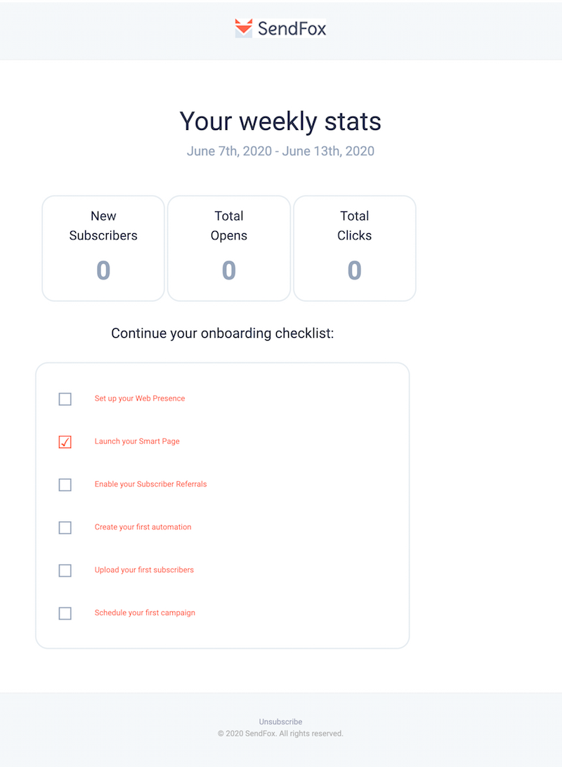
This message from SendFox makes onboarding fun for new customers. The email starts out by presenting the user’s statistics from the past week; then an interactive checklist helps the user finish setting up their account. Using gamification in a welcome email series can encourage new subscribers to stick around.Subject line: Your stats for June 7th, 2020 - June 13th, 2020
Chili’s
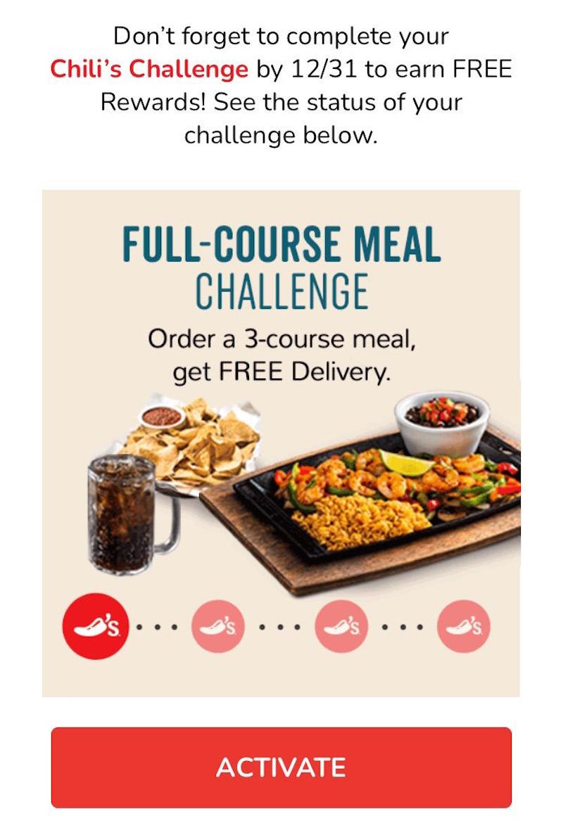
Remember how we said gamification is a natural fit for a rewards program? This message from Chili’s is an excellent example! Chili’s designed a game based around three of its products or services (one example shown below). Then the restaurant challenged its customers to complete each activity and get a special reward. The big red CTA buttons reading “Activate” encourage the reader to start playing.Subject line: Hailey, your monthly challenges are waiting!
Wrap-up: Create your own gamification emails
Feeling inspired to incorporate gamification into your own email marketing? Use the BEE email editor to help! With a simple drag-and-drop interface and a full catalog of premade email templates, the editor is highly user-friendly, making it easy to create top-notch gamification emails. Sign up for a free trial of BEE Pro to access even more design features and gamify your email marketing!
Share this post with your friends! Pin it on Pinterest ?
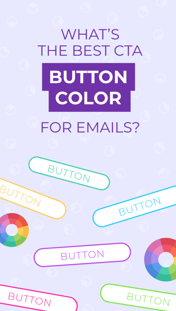
What's the Best CTA Button Color for Emails?
Originally published on December 21, 2020. Last updated September 10, 2021.Your email’s call to action is the driving force behind your entire campaign. You want readers to take a step forward in their buyer journey— whether you’re asking them to register for an event, make a purchase or read more of your content.Color is one of the most significant elements in making your CTA button noticeable. But which color converts best? Let’s take a closer look at how brands choose the best button colors for their emails and landing pages.
Your email's call to action is the driving force behind your entire campaign.
What is a call to action?
A call to action or CTA is a specific direction for your reader. Readers skim emails and landing pages, so having an obvious place to click gets them to the next step of their journey faster. CTA buttons are powerful marketing tools. In fact, Healthtech company Carelogger found that just changing their CTA button color increased conversions by 34%.
How color affects choices and feelings
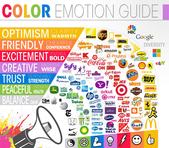
Color impacts how we interpret information. When you’re deciding on a color scheme for your email or landing page, it’s important to consider the connotations of that color.While color interpretation is highly dependent upon personal experiences, certain generalizations can be made about the psychology of color. The Color Emotion Guide from the Logo Company is often cited as a general guide:
People also tend to judge a color based on how appropriate they feel it is for a particular brand. In other words, your customers gauge whether a color fits your brand personality. This means there’s no single “right” color to choose. It’s a matter of what color evokes the energy and personality of your brand.
Best practices for your call to action colors
In order to convert, your call to action buttons needs to stand out from the rest of your design. While there is no perfect color that will lead to higher conversion rates, running A/B tests on different colors is an easy way to optimize your designs. Here are a few approaches to try out:
Use Your Brand Color
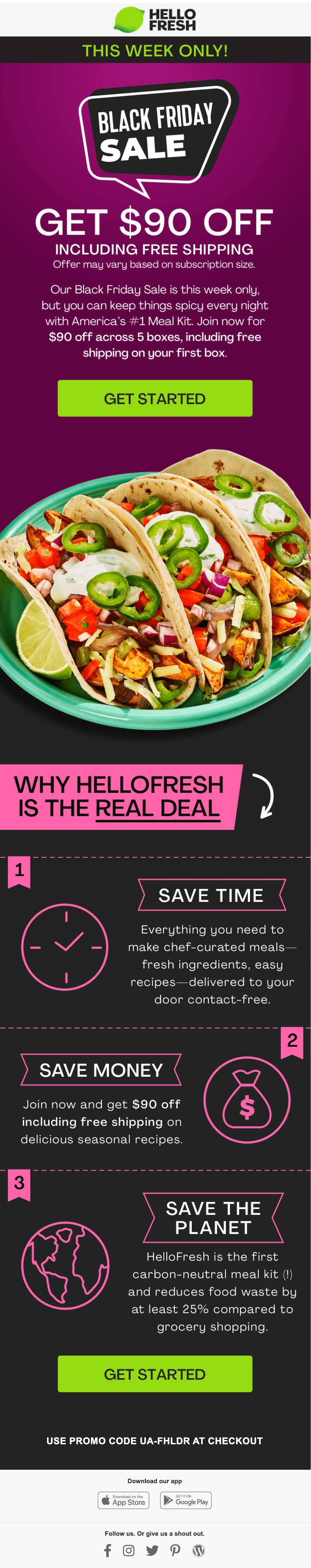
Brands often choose CTA button colors that match their logo color to establish design cohesion in email. When a color repeats itself throughout an email, especially at the top and bottom, it gives the whole message a balanced and unified appearance. This is an easy way to reinforce and boost brand awareness.Here’s what a matching scheme looks like in action with HelloFresh. Check out the lime-colored logo and coordinating CTA button.Subject line: Get $90 off! Avoid the crowds, get dinner delivered.
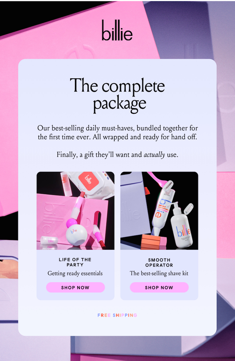
It’s also easy to spot these pale pink CTA buttons that perfectly align with all of Billie’s brand colors.Subject line: Need a gift?
Keep your CTA colors consistent
Subscribers will associate specific colors with actionable items. For instance, hyperlinks are often blue, which let’s readers know they can expect a clickable link in emails when they see a word or phrase in blue. This will go for your CTA color choice as well. Once you assign a color to your call to action buttons, subscribers will quickly learn to recognize that color for your CTAs in all your emails. Don’t confuse your readers by having too many colors for your CTAs. Assign one color for your primary CTA and one color for your secondary CTAs. This consistency will keep subscribers on your same page, always guiding them towards your intentional action items.
Prioritize your main CTA
Focus on choosing the best color for your primary CTA and then begin to think about placement and text hierarchy. Your primary CTA color and placement will purposefully guide your subscribers through your emails. Allison Valenzuela, BEE Freelance Graphic Designer, explains:“With color, you can help guide an audience's eye and how they take in information. Play with color after nailing down the hierarchy of your content and see what makes the most sense for the impression that you want to leave with your audience.”Consider how to keep your primary CTA top of mind when thinking about where to place it in your email. Make its size larger than the rest of your text in a bold shade of color.
Make your CTA pop
An eye-catching call to action will lead to higher conversion rates which means using a button color that blends in with the rest of your email content isn’t your best move when trying to attract subscribers.Allison explains that you should, “Look for a color pairing that allows the button to have a high contrast to the background. An example of high contrast would be a red or an indigo button on a white background.”It’s also important to consider the “isolation effect,” which is basically the idea that something looks more or less attractive depending on what it’s surrounded by. When it comes to color, some research has shown that people have a preference for one strong, bold color that reigns above the rest of the text.Another way to make sure your CTA stands out is by using different CTA colors while sticking to your brand kit. For instance, Instacart updates its CTA button color from email to email, using one green button and one orange button shown below. Both green and orange are Instacart brand colors, but the company makes colors pop more by switching things up within their brand color palette to match the most appropriate color for each message.
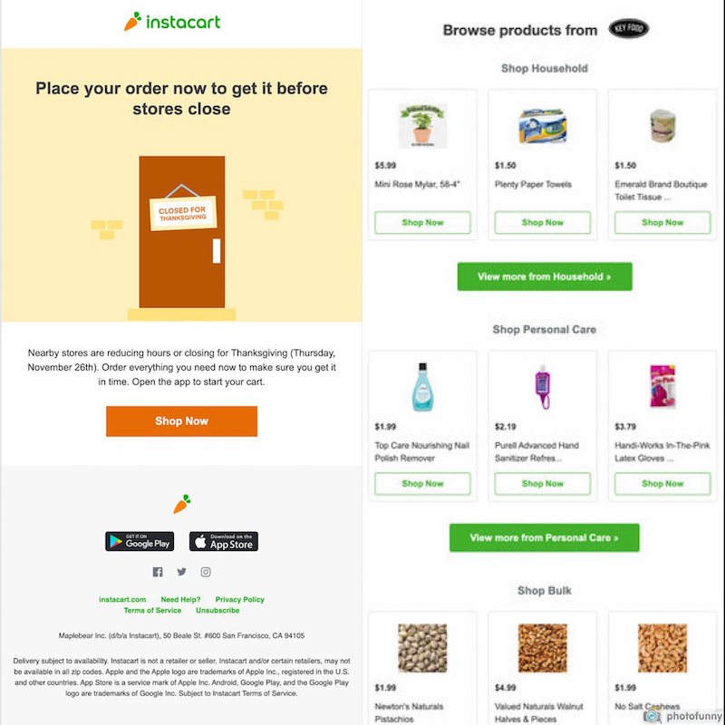
Changing your CTA button color from one email to another is effective when you have a well-established style guide and visual identity. Even when you change color schemes from email to email, your emails still reflect the look of your brand.
Test your CTAs
One color is not always better than another, an effective CTA color will vary based on text-hierarchy, brand style and a variety of other key factors. So be sure to set your call to action colors after you’ve tested them multiple times on your subscribers.Implement subscriber surveys to gain feedback on your CTA color and then run A/B tests until you find what leads to the highest conversion rates. Cycle through this process until you’ve solidified what your bulletproof button color should be.
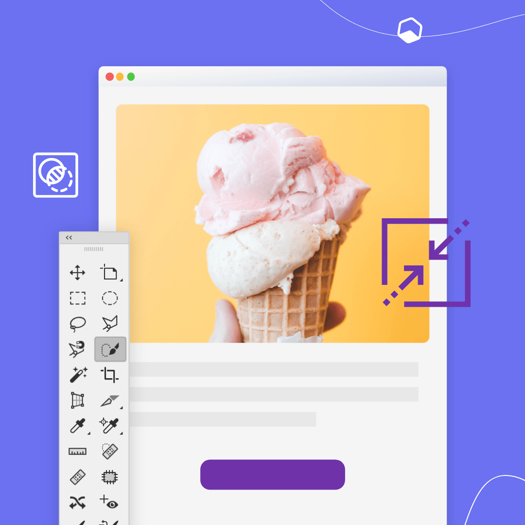
Create a CTA in BEE Pro that converts
Find the best functioning CTA color for your brand’s emails and landing pages, and then start creating in BEE Pro. With BEE, your CTA buttons will always be bulletproof, which means there is absolutely no coding required on your end. Customize your CTA buttons or explore how designers implemented CTAs in our template catalog. Give your CTAs a boost with a pop of color and start designing now.
Share this post with your friends! Pin it on Pinterest ?
Best Tips for Optimizing Images in Email Marketing Campaigns
Email design can be a lot of fun! Planning an email campaign requires creativity and imagination. But email design can also involve a lot of technical issues that you can’t be overlooked. One of these issues being -- how to properly optimize images for email marketing so that they render quickly and display well. Here are some things to keep in mind.
First, why should optimize images for email marketing campaigns?
If your images aren’t optimized, your email has the potential to look unprofessional and lead to poor campaign results. Heavy images may not download at all, or significantly slow down overall email load time. You don't know where your customers will be when they open your message: they may be experiencing a poor connection while commuting to work on public transportation, for example.Here are a few best practices to follow to optimize images in your email marketing campaign and minimize the risk of a negative impact on campaign results.
How to optimize images for email marketing
Use high-quality images
The first and most important point here should go without being said, but we’re going to say it anyway: Your images need to be high-quality, not blurry or pixelated. This TripAdvisor email wouldn’t have nearly the same effect if the image of those beautiful mountains was blurry — that would make the entire email look unattractive and downright unprofessional. Make sure your images have a resolution of at least 72 dpi and increase the dimensions so the images will be clear and sharp.Subject line: Get away in New York this weekend

Choose the best image size for email
The best image size for email marketing is 600-650 pixels. This size ensures your emails won't stretch out and get blurry when viewed on a desktop.If your image is the wrong size, it might not come across as high-quality and can potentially look grainy.
Choose the right file format
There are a few different file formats you can choose from as you optimize the images in your emails:
- PNGs. PNGs work for all kinds of images and are more high-quality than JPGs. They don’t compress when uploaded and are also a great choice for any image that includes text. However, PNGs have a larger file size, which means they load more slowly.
- JPGs. Used for photos only, JPG images have a small file size and load quickly. But they don’t work with text, they’re not transparent and they compress when uploaded.
- GIFs. Great for logos and animations, GIFs also have a small file size and don’t compress. The colors you can use are limited, though, and images might look grainy.
You don’t have to commit to one type of file format. Use different formats for different images depending on your goals for a certain campaign.
Be mindful of file size
Images with large file sizes can make an email take longer to load, which is one reason you may want to choose JPGs. If your email doesn’t load quickly, you’re out of luck: Most people will only wait a couple of seconds for the message to appear. Keep your file weight as far under 1MB as possible so readers don’t click away.
Don’t send image-only emails
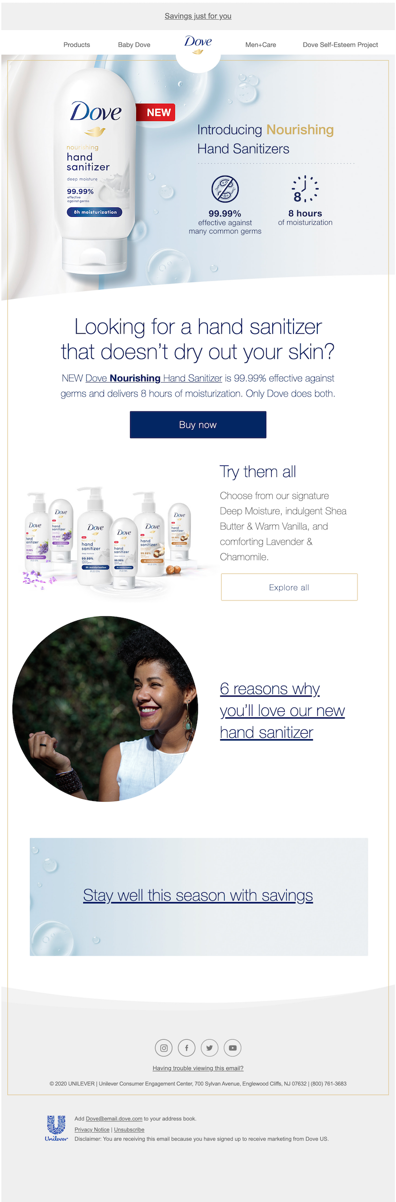
Image-only emails, or emails that don’t include any text outside of an image, have a lot of negatives. They’re commonly marked as spam. They aren’t accessible. And if something goes wrong with image viewing, your reader won’t be able to understand what the email is about at all.Don’t send image-only emails. Instead, strive for a text-to-image ratio of 80:20, like this Dove email that has a good balance of both images and text. It’s also important to make sure that you don’t put the most important information in images. Include some copy outside of images so your subscribers can read it even if they can’t view the images — like the product information Dove includes in plain text here:Subject line: Save your hands this winter & switch to Dove
Create clickable images
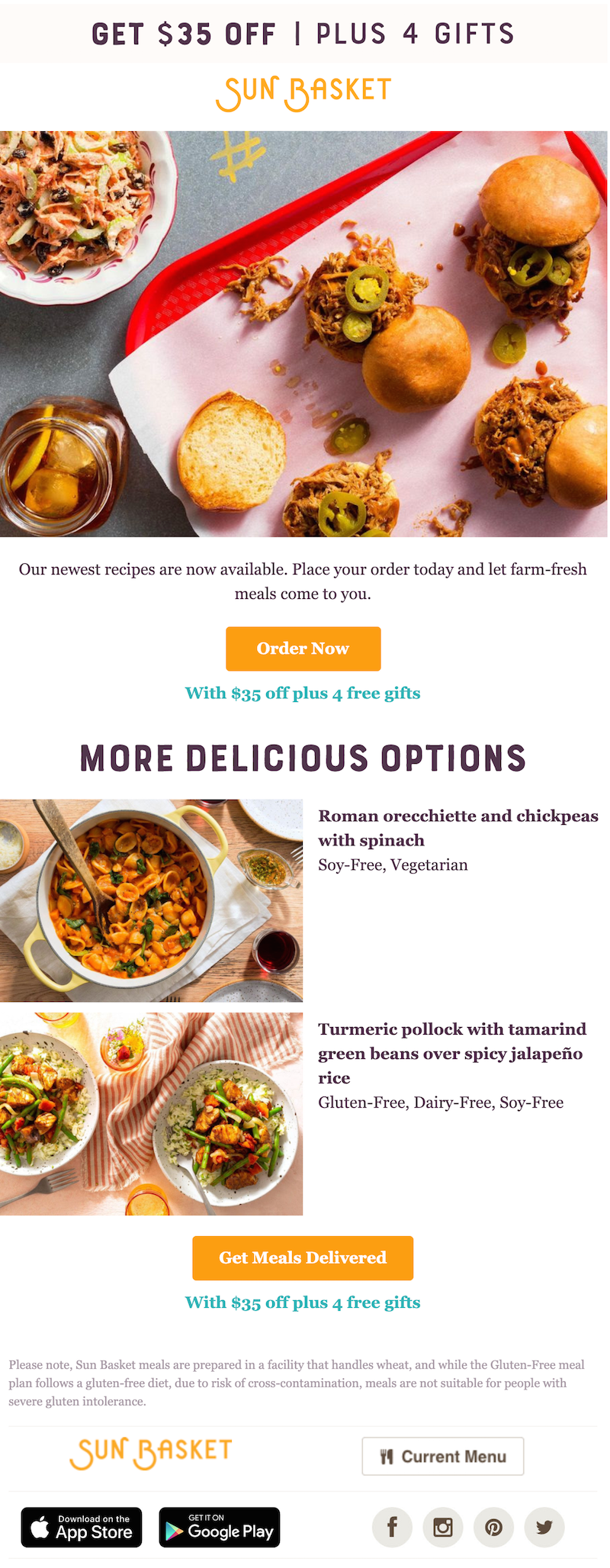
Many readers will click or tap on the images in your email. So when those images are clickable, it helps increase your click-through rate. For example, when you click the hero image in this Sun Basket email, you’re taken to a special landing page (slightly different from the landing page the CTA leads to) where you can start creating your basket. The smaller images are clickable, too.Subject line: New menu, more Chef’s Choice options
Optimize images for mobile viewing
As you optimize images in email, you can’t overlook mobile users. Mobile is responsible for at least 50% of all opens. And emails that don’t display correctly on mobile are likely to be deleted within three seconds! For best results, make sure your images are twice as large as the width of an iPhone screen and compress your image files.
Wrap-up: Optimize images for email marketing
Looking for a quick and easy way to design marketing emails and edit image size for mobile email? Check out the free BEE email editor to create your messages. You can also use BEE’s “Preview” feature to see how your email looks before hitting send.Optimizing images for email is a necessity. We hope that with these tips and the BEE editor in your toolbox, it will be a breeze.
Share this post with your friends! Pin it on Pinterest?
9 Best Fonts For Email And Landing Page Design
Originally published on December 17, 2020. Last updated September 10, 2021.Your font choice plays a large role in how customers perceive your brand. It dictates the appearance and feel to your email or landing page. While there is a long list of fonts available to use, don't let choosing the right one intimidate you.Each font has its own personality. When choosing the best fonts for emails and landing pages, look further than appearances, think about your customers’ motivations, font compatibility and how your fonts work to create a cohesive, readable piece.The perfect font will evoke emotion and leave a lasting impression on your customers, but most importantly it will be web safe.Web safe fonts are fonts that display on any application and are seen on any device. They are perfect for emails and landing pages because they are default fonts found on all computers and devices. They are trusted to clearly get your message across no matter what.Implement these email safe fonts and best practices to leave a lasting impression on your customers.
The perfect font will evoke emotion and leave a lasting impression on your customers, but most importantly it will be web safe.
Web-safe fonts you should use
There are a handful of fonts that render correctly in about any environment. These fonts are called “web-safe” fonts and are guaranteed to be the best fonts for email marketing. Although it’s tempting to choose cursive fonts, Comic Sans MS or Kristen ITC, when designing for email and landing pages, stick to these fonts instead:
- Arial - flexible, simple
- Roboto - certain, distinct
- Georgia - authoritative, formal
- Verdana - clear, direct
- Helvetica - modern, bold
- Open Sans - friendly, minimal
- Tahoma - welcoming, humanist
- Times New Roman - traditional, reliable
- Raleway - elegant, smooth
These fonts have great readability, which means a majority of email service providers will showcase your chosen font in the way you intended it to be seen. Use these fonts freely in all your email and landing page designs. While this collection seems small compared to all the fonts that are out there, it’s important to stick to these fonts to ensure that all emails will be received on all email service providers. To add variety to your designs, get creative with placement, color and other design elements for these fonts throughout your emails and landing pages.
How to choose the best fonts for email
The best font for email marketing should be readable and reinforcing your brand to keep you out of the spam box. Consider how your email or landing page is formatted: Are they more text-heavy or image-heavy? Match a font that is compatible with the format you decide to use; a text-heavy format should use a more simplistic style font while image-heavy will allow for more variety.Remember to keep your fonts consistent between content. The fonts you use for your emails are the same ones you use for your landing pages. This way, customers will begin to recognize your brand style more, ultimately reinforcing your brand identity. Keep this in mind and use these best practices to guide your font choice.
Consider your brand
The fonts you use will depend in part on your industry and the nature of your business. An elegant jewelry brand like Laura Lombardi Jewelry selected Script style fonts that are graceful and stylish:Subject line: It’s here! ✨ Our annual holiday sale starts now.
…whereas the sturdy, Serif fonts used by REI are a great fit for this outdoorsy brand:Subject line: Let’s make the holidays as easy as possible
Create a list of words that describe your brand best. Consider how you are going to incorporate those words into your emails and landing pages. Then, when choosing a font, ask yourself:Does your brand carry a…
- Cheerful or serious tone
- Professional or playful
- Formal or casual
Decide how you want subscribers to perceive your brand. After pinpointing adjectives to describe that tone, refer back to the web-safe fonts to match-up your desired tone with a few of the font descriptions listed. The best font to use for email marketing is a font that aligns with your brand’s personality.
Decide on how many fonts to use
How many fonts are too many? As a general rule of thumb, stick to a maximum of three fonts. Too many fonts will clutter your email or landing page and distract your subscribers.Limiting your fonts doesn’t mean you have to limit your creativity. Add variety to your designs by changing up the size and typographical emphasis you use. Try bolding or italicizing certain phrases or use all caps for certain words. For example, Golde uses different font sizes and even bolds certain words in that same font. The result is an eye-catching, skimmable email that looks uniform.Subject line: IT’S HERE
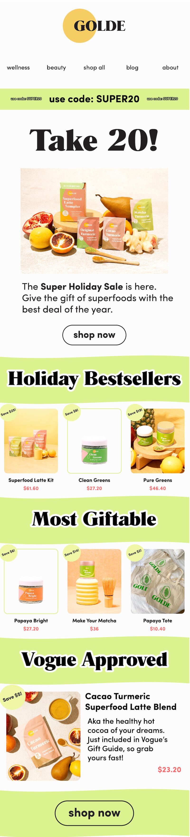
Choose header and body fonts
Consider selecting different fonts for the header and body of your email or landing page to make your designs more visually engaging. Header fonts should stand out and be eye-catching to subscribers. Body fonts, however, need to be more legible since they contain important supporting information. In this Joe’s Jeans example, the “Black Friday Sale” text is in a smooth, Script font which stands out and plays into the text hierarchy. The rest of the text is in a more straightforward font making it clear on what this sale has to offer. Subject line: Sweaters, cardigans, and knitwear
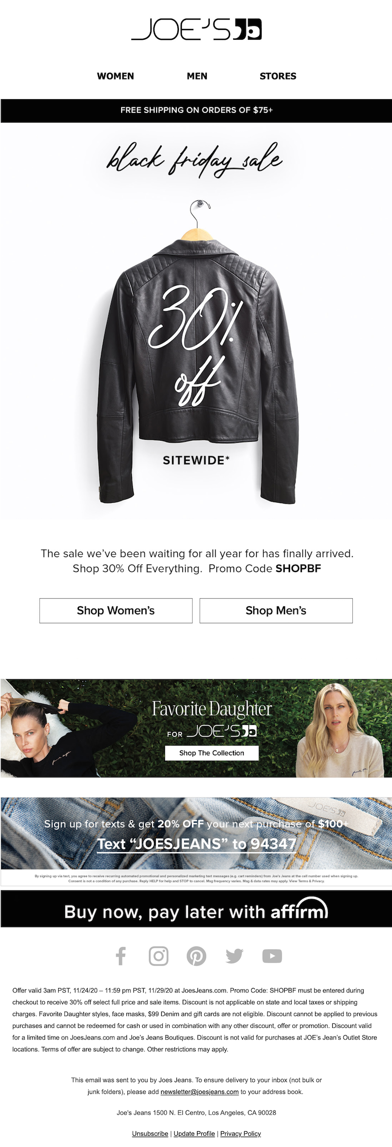
Select the best font size for your email
After you’ve settled on your web-safe font, you’ll want to consider the best font size to use for emails and landing pages. We recommend a range of 20-28 pixels for your headings and 12-14 pixels for your body copy for desktop and mobile devices.
Consider color for your professional email fonts
Your font color is another useful aspect to consider when thinking about the typography in your email or landing page. Color has a major impact on how customers perceive your brand. It shares insight on your brand personality and characteristics because color evokes emotion, meaning subscribers will get a feel of your brand values based on your color choices.When choosing a font color, consider what service or product you provide and what emotions you want customers to feel about your brand. Then, decide on a font color that compliments the background of your design. Don’t go overboard — two or three font colors is plenty. Black or grey body copy is always a safe, readable choice. This Dropps message uses blue headers and easily visible body copy.Subject line: Take 30% off our reusable wool dryer balls ?
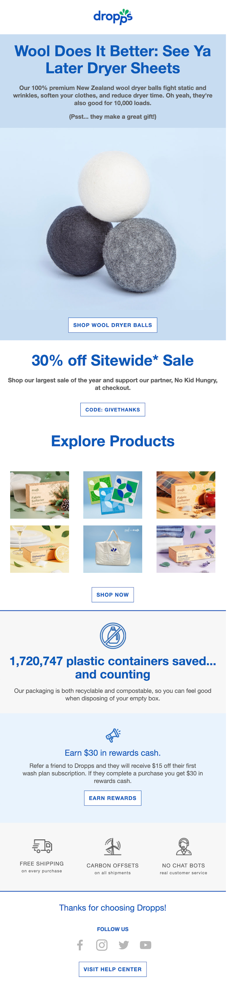
Use web-safe fonts for your emails and landing pages
The typography choices you make are crucial to the overall success of your marketing campaigns. Design in BEE Pro to quickly create perfect emails and landing pages with web-safe fonts. BEE makes it easy to pick your font and even set up and save your brand kit to easily access your desired fonts each time you head into the design suite. Start designing from scratch or explore BEE’s template catalog for a fresh look. Get started here.
Share this post with your friends! Pin it on Pinterest ?
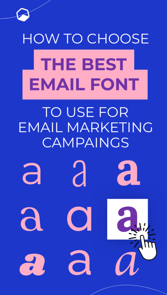
Get to Know Your Customers Day: 5 Email Design Ideas
Do you send Get to Know Your Customers Day emails? This fun "holiday" takes place on the third Thursday of every quarter — in January, April, July and October. It reminds brands to reach out to customers and work on developing those important relationships that will help your business grow. And if you design your emails the right way, this holiday can have major long-term benefits for your brand. Here’s what you need to know about Get to Know Your Customers Day, plus some email design ideas to try.
Get to Know Your Customers Day can have major long-term benefits for your brand.
Why send a Get to Know Your Customers Day email?
Get to Know Your Customers Day is a valuable opportunity for brands. Take advantage of this chance to follow up on the main holidays we’ve just passed and develop more of a bond with your customers. Forging stronger customer relationships should always be a priority. Companies that create an emotional connection with their customers outperform their competitors in sales growth by 85%!While marketing is essential too, don’t get so busy seeking out new customers that you forget to work on getting to know the ones you have. As your customer relationships are strengthened, not only will your customers be more inclined to buy from you — you’ll also understand how to better market to them.Check out these Get to Know Your Customers Day email ideas to engage your customers and increase their loyalty to your brand.
Get to Know Your Customers Day email design ideas
Send out a customer survey
Capitalize on Get to Know Your Customers Day by, well, getting to know your customers. This is a great chance to send out a customer survey and get some direct feedback on your brand. Email design best practices for survey invitation emails include providing an incentive, having an engaging subject line and being clear and direct about what you want your customers to do. Chobani displays every one of these best practices in the example below. It’s easy for the reader to take action!Subject line: Chance to win $200 gift card for taking our Chobani Rewards survey
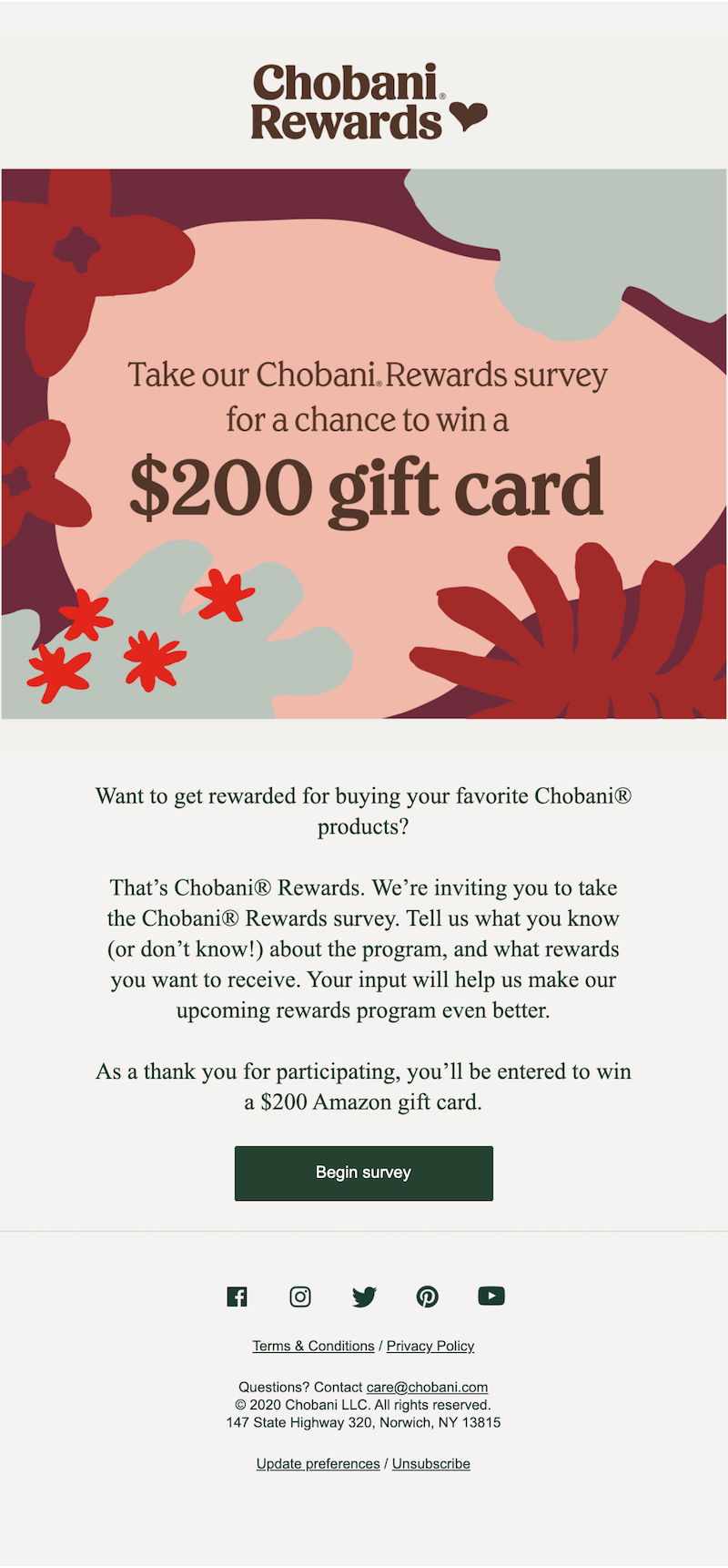
Start a loyalty program
Use your Get to Know Your Customers Day email to introduce your loyalty program. Loyalty programs have a lot of benefits for businesses: They can be used to attract new customers, re-engage current ones and increase your revenue overall. In this colorful and attractive email from Starbucks, the coffee company plugs its rewards program (dubbed Starland). The email makes it clear what readers will get out of joining the rewards program and includes a CTA for you to join now.Subject line: Deliciously different ?
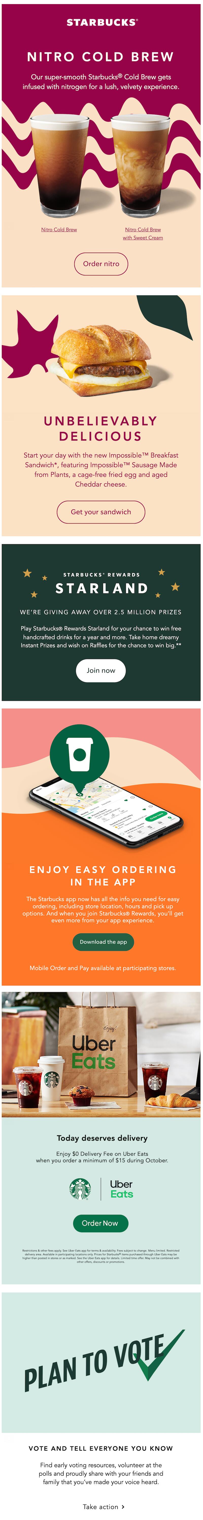
Dynamic content
Use dynamic content, recommending products to your customers based on what they’ve purchased in the past, and strengthening your relationship with them by helping them feel seen and taken care of. With this approach, everyone gets a tailored-to-them email with products they’d be more likely to buy. Skillshare sent an email with personalized class picks for each subscriber.Subject line: Your personal class recommendations
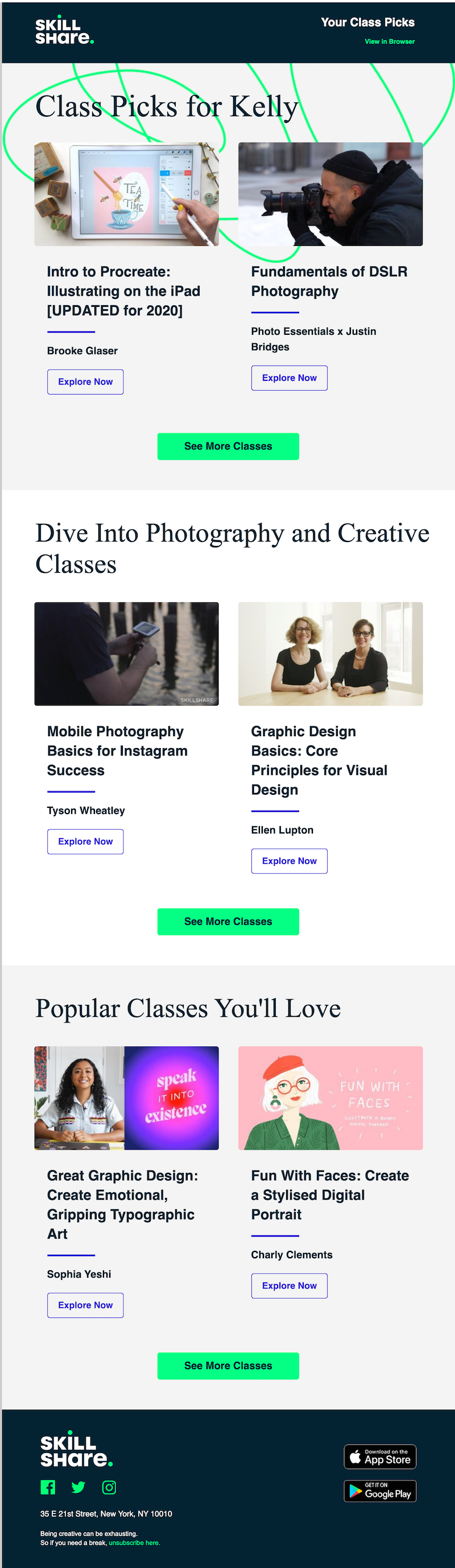
Make yourself available
Make yourself available to your customers. This is a simple concept, but all too often it’s something that companies don’t do. Being accessible to your customers is essential to improve customer service and strengthen customer relationships.You can do this by responding to emails, hosting an event (virtual or in-person) or inviting your readers to interact with you. Williams Sonoma even threw a specific customer appreciation event, providing a discount code to say thanks to its customers. The opportunities are endless. Just make sure you’re responsive and willing to talk.Subject line: Thank you. Thank you. Thank you.

Say thanks
The last of our Get to Know Your Customers Day Ideas is simple, but important: Say thank you. Expressing your genuine appreciation helps your customers feel valued. And when your customers feel valued, their loyalty to your brand will increase. Adding a special discount code like GAP did here only sweetens the deal.Subject line: Code GAPFALL is our way of saying thanks.
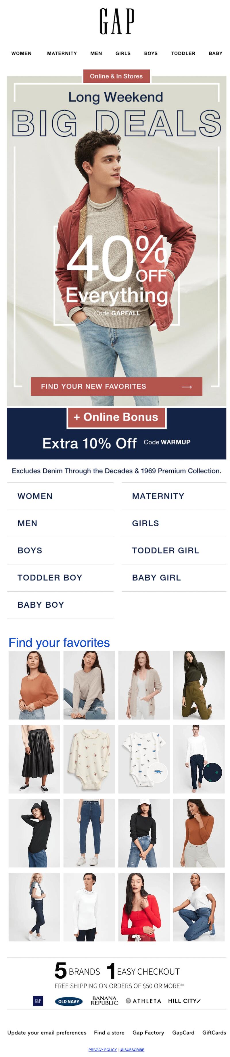
Wrap-up: Get to Know Your Customers Day email design
The first Get to Know Your Customers Day of the year is coming up on Thursday, January 21st! Prepare your emails now using the BEE email editor — a simple, free solution for email design. With these Get to Know Your Customers Day ideas in hand, you’re well on your way to creating better relationships with your customers this year.
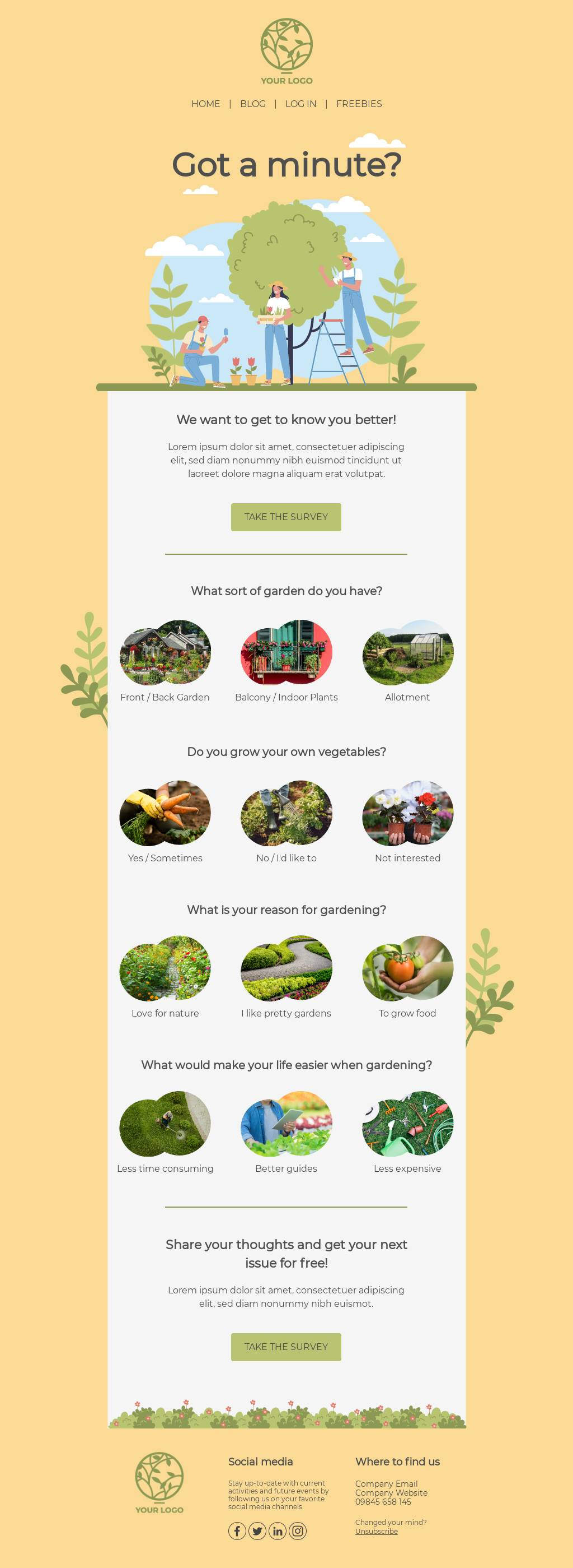
Share this post with your friends! Pin it on Pinterest ?

Stay informed on all email trends
From the latest creative design strategies that inspire your next campaign to industry best practices and tech advancements, our newsletter is the go-to for all things creation.