

Design
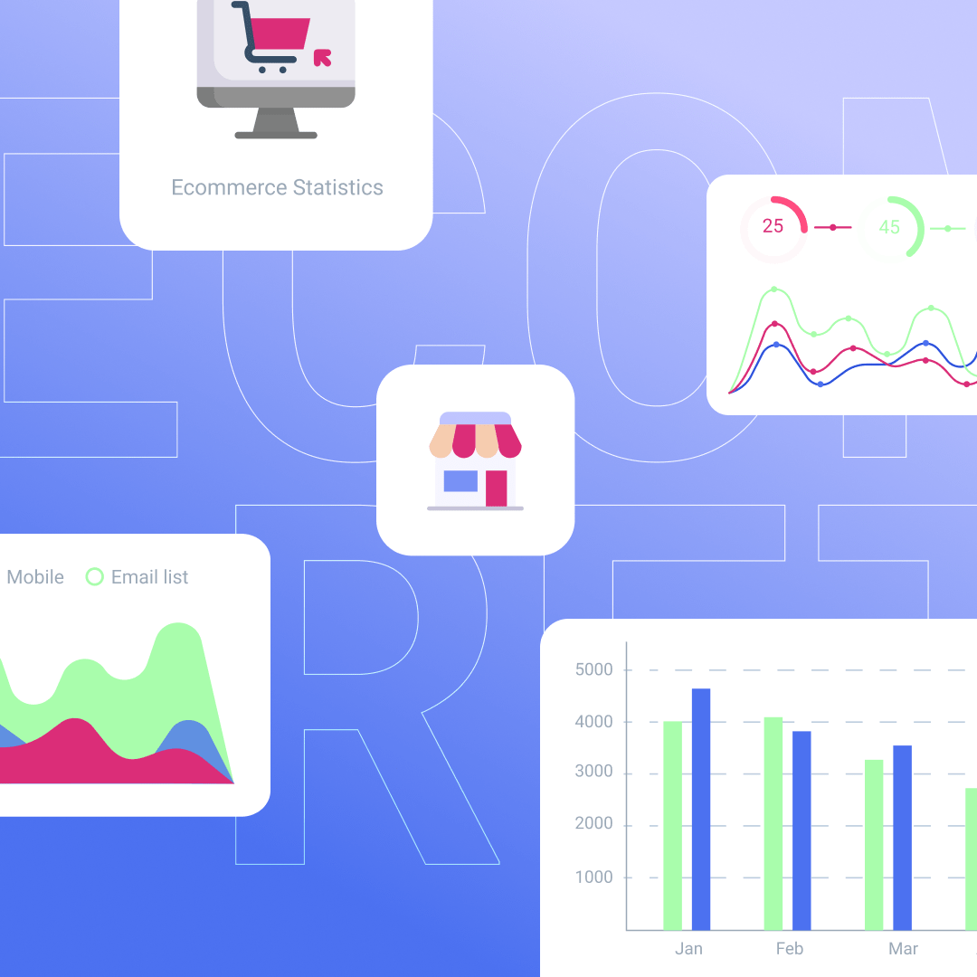
The Ultimate List of E-Commerce Statistics for 2021

Providing the best customer experience includes developing a strong e-commerce presence. Whether you’re a large or small business, every detail from your website to your email should be intact and meet customer needs to sell more products.Do you understand the values of your in-person and online customer base? Does your business have a strong in-store and online presence?Keep up with e-commerce marketing trends to make sure you’re answering yes to these questions. This will also help your business see some major growth and stay ahead of the increasing online competition.
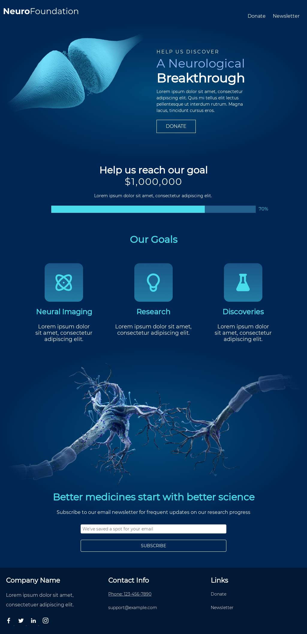
In 2021, holiday sales are expected to increase between 8.5% and 10.5% over 2020 (NRF, 2021)

Email E-Commerce Statistics
- About 61% of consumers prefer brands contact them via email (Statista, 2021)
- The average open rate for abandoned cart emails is 45% (Moosend, 2021)
- Shopify claims that in 2018, e-commerce email marketing was responsible for 24% of holiday sales (and this has only continued to grow) (Optinmonster, 2019)
- In 2020, 60% of e-commerce, retail, and consumer goods and service companies personalized emails based on former purchases, compared to the 38% in 2019 (Litmus, 2020)
- About 64% of small businesses use email marketing to reach customers (Campaign Monitor, 2021)

Social Media E-Commerce Statistics
- Having active social media accounts is important for your business. Online retailers with at least one active social media account make about 32% more sales than online retailers that don’t have social media accounts (Bigcommerce, 2021)
- About 55% of Gen Z-ers that are active on social media claim that their clothing purchases are influenced by posts they saw on social media platforms (eMarketer, 2019)
- E-commerce promotion on social media is encouraged, in fact, TikTok users are able to add e-commerce links in their bio (TechCrunch, 2019)
- In 2021, worldwide ad spending on Facebook and Instagram combined will reach nearly $95 billion annually (eMarketer, 2019)

Shopping Cart E-Commerce Statistics
- About 69.57% of shopping carts are abandoned (FreshRelevance, 2021)
- The top reason shoppers abandon carts is due to high extra costs (Baymard Institute, 2021)
- The average open rate for abandoned cart follow-up emails is 42.3% (Barilliance, 2021)
- About 23% of people will abandon carts immediately if you require account creation during the checkout process (Baymard Institute, 2020)
- Optimized checkout design would help e-commerce sites gain a 35% increase in conversion rates (Baymard Institute, 2020)
- Having an exit-intent popup has helped recover 53% of abandoning visitors (Optinmonster, 2019)

Online Shopping Statistics
- Over 2.14 billion people worldwide are expected to buy goods/services online in 2021. This is up from 1.66 billion global digital buyers in 2016 (Statista, 2021)
- 40% of online shoppers affirmed that the preferred payment method amongst online shoppers worldwide is PayPal (Statista, 2021)
- Retail e-commerce sales worldwide amounted to 4.28 trillion US dollars in 2021 and are projected to grow to 5.4 trillion US dollars in 2022 (Statista, 2021)
- One of the most popular online activities worldwide is online shopping (Statista, 2021)
- In 2021, it’s estimated that there will be about 2.14 billion global digital buyers (Oberlo, 2021)
- Free delivery is the number one reason people shop online (Oberlo, 2021)
- 50% of customers will stop visiting an e-commerce website if it isn’t mobile friendly, even if they like the business (Truelist, 2021)
Mobile Shopping Statistics
- Smartphones accounted for about 70% of all retail website visits worldwide in 2021 (Statista, 2021)
- Of the total US e-commerce sales, 45% are mobile e-commerce sales (Insider, 2020)
- About 57% of customers won’t recommend a business with a poorly designed mobile website (Sweor, 2021)
- 56% of in-store shoppers used their smartphones to shop or research items while they were in a store in the past week, says a global survey (Google/Ipsos, 2019)

In-Store Shopping Statistics
- By 2024, in-store sales are expected to reach $21.4 trillion globally (Statista, 2021)
- Now in 2021, retail sales have exceeded $4.4 trillion (NRF, 2021)
- During Q2021 in the US, 86% of total retail sales were non-e-commerce sales (USE Census, Bureau, 2021)
- About 58% of customers have said to be interested in attending in-store retail events in the future (Score, 2019)
- In-stores, about 81% of customers discover and evaluate new products (Salesforce, 2019)
- Almost 63% of customers buy more than what initially intended during in-store shopping (Salesforce, 2019)
- While returning a product, about 67% of customers admit that they bought something else (Salesforce, 2019)

Small Business Retail Statistics
- About 37% of small businesses don’t have a website (Visual Objects, 2020)
- 98.6% of all retailer firms in the US are small retailers (Score, 2019)
- $22,341 is the average monthly revenue reported by small retailers (Score, 2019)
- The average gross margin of small and medium-sized retailers is 51% (Score, 2019)

Global E-Commerce Statistics
- In 2021, e-commerce sales are expected to makeup 18.1% of retail sales worldwide (Oberlo, 2021)
- By 2023, e-commerce sales are projected to makeup 22% of retail sales worldwide (Oberlo, 2021)
- China is the leading country by retail e-commerce sales (Statista, 2021)
- Retail e-commerce sales worldwide amounted to 4.28 trillion US dollars in 2020 and by 2022, e-retail revenues are projected to grow to 5.4 trillion US dollars (Statista, 2021)

Bonus E-Commerce Statistics
- The largest group of digital buyers in the United States are millennials aged 25 to 34 (Statista, 2021)
- Many online consumers read up to 6 product reviews before making a purchase (Statista, 2021)
- Amazon is the largest consumer internet/online service company worldwide. As of June 2021, they have a market cap of approximately 1,735 billion U.S. dollars (Statista, 2021)
- In Q3 of 2020, about 2.17% of global e-commerce website visits were converted into purchases, which is down from 2.25% from the previous quarter (Statista, 2021)
- Customers shopping in fashion view approximately 32 pages before making a purchase (Statista, 2021)
- Roughly 45 percent of global e-commerce payment transactions were made by digital and mobile wallets, making the digital wallet the most popular online payment method worldwide. And this is set to increase to over 50% by 2024 (Statista, 2021)
Keep Up With The Latest E-Commerce Trends
Stay on pace with the latest trends so your business will succeed through the busy seasons. While the industry is ever-changing, it is worth your time to study up so you can get creative with your marketing strategies to stay ahead of the competition. Leverage some of these current trends to better connect with your target market this season.
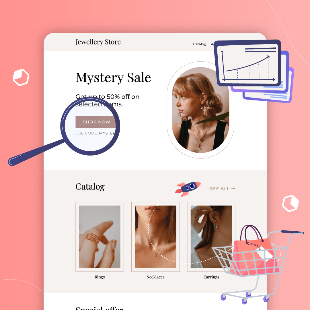
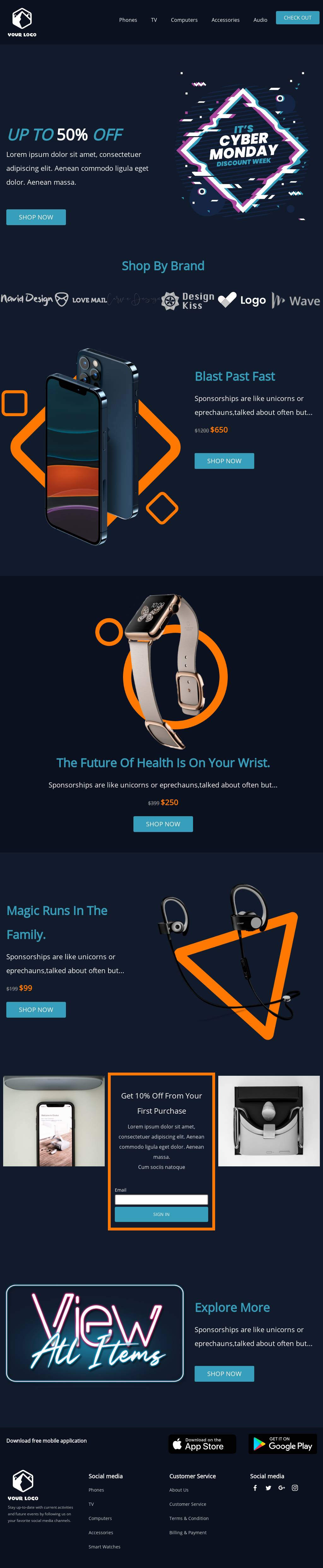
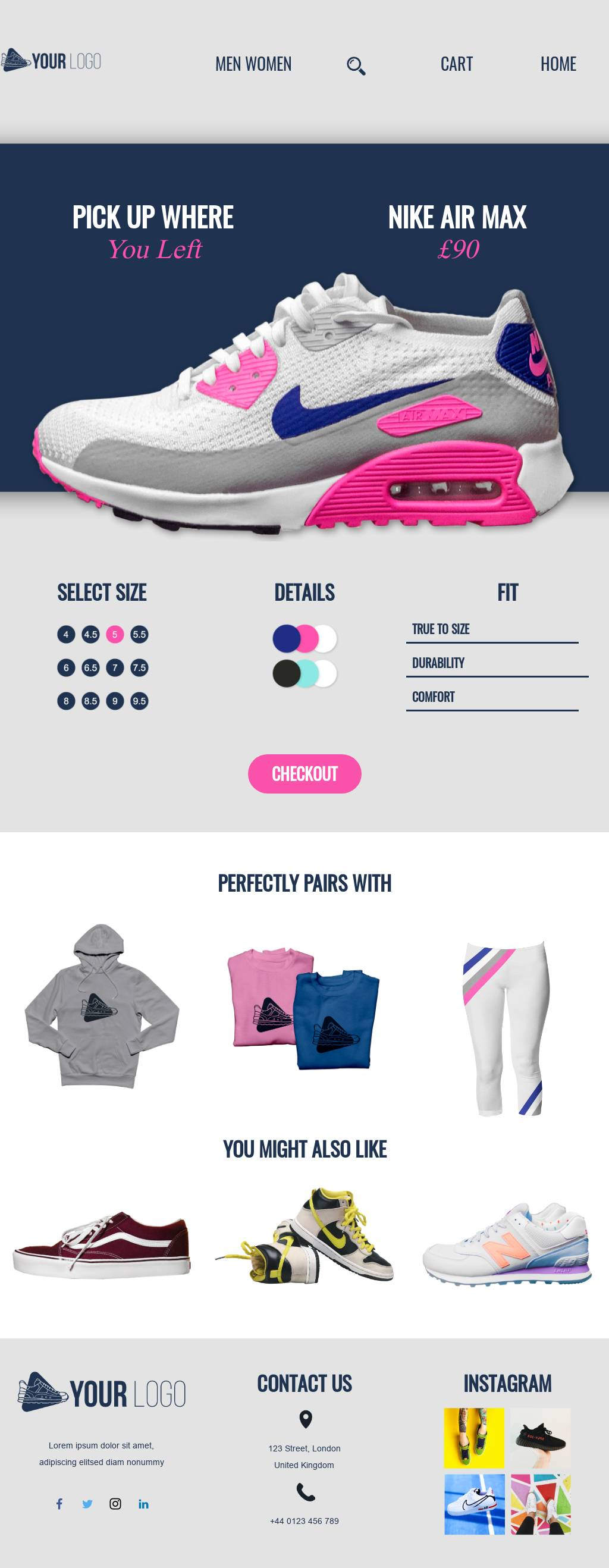
The Best E-Commerce Landing Page Examples
The National Retail Federation (NRF) predicts that about 57% of consumers plan to shop online this holiday season alone. This is a major increase from the mere 30% back in 2010.Preparing your e-commerce business for the online rush is a different playing field than in-store retail. E-commerce landing pages play a huge role in preparing for the influx of online visitors and purchasing customers during the busy season just as a storefront would for in-store retail.E-commerce landing pages provide a first impression to customers by showcasing what your business has to offer. This drives customer interest and leaves them with a decision of whether or not they want to purchase from your business.Making your first impression memorable comes down to the design for your landing page. Let’s run through benefits, strategy tips, and some examples of what the best e-commerce landing pages look like.
What is an e-commerce landing page?
An e-commerce landing page is an independent web page that visitors “land” on after clicking on a link from an ad, email, social media, or another marketing-related channel. E-commerce landing pages are designed to achieve one focused goal, and that goal is usually to initiate a purchase.Oftentimes, e-commerce landing pages are designed to intrigue customers and push them to purchase. To successfully do that, they should include a bold CTA, direct headlines, high-quality images, short copy and reviews or testimonials to exhibit social proof.
E-commerce landing pages vs product pages
Now that we understand what an e-commerce landing page is, it’s helpful to understand how these pages differ from a more detailed e-commerce page like the product page.Here’s a brief rundown of those differences:E-commerce Landing Pages
- One clear, main CTA
- Copy targets audience to achieve one goal
- No website navigation; only covers one specific topic
- Targeted product descriptions
Product Pages
- Multiple clear CTAs
- Initiates website navigation and access to additional content
- Created for multiple audiences that can navigate to different pages
- Optimized for SEO purposes
The main difference between these pages is that an e-commerce landing page elicits a direct action (which drives conversions) and the product page initiates more browsing.
Benefits of an e-commerce landing page
E-commerce landing pages are the link that guides customers from a social post or ad to making their purchase. While designing an e-commerce landing page might seem intimidating, the benefits of using them are well worth your time:
- Opportunity for A/B testing. Test different CTA colors, copy and other elements to see what best reaches your customers. A/B testing your landing pages is also a great chance to implement new ideas.
- Strengthening connections with your target audience. Find what elements appeal to your customers most. Do they prefer humorous copy? Colorful, big CTAs? Pinpoint what elements they’re enjoying and continue to create with those details in mind.
- Increasing ROIs for paid traffic. Visitors click on your social content or ads in hopes that you’ll answer a question they have or meet their needs somehow. E-commerce landing pages are the immediate answer to their questions and needs.
Strategy for your e-commerce landing pages
There are many types of e-commerce landing pages that you should design to promote to customers at different stages in their buyer’s journey. You should have landing pages that are personalized to reach:
- First-time visitors
- Visitors that have deeply explored your website
- Customers who recently made a purchase and make their way back to your website
Here are some ideas for your e-commerce landing pages at every stage of the buyer’s journey:
- Awareness/Interest. Benefits of your product or service, reviews or testimonials to prove credibility, your brand story.
- Consideration. More in-depth info about products/services, exclusive offers or anything that creates more urgency.
- Purchase. Similar product/service suggestions (“Typically bought together”), promo code to finalize their purchase.
- Post-purchase/Re-purchase. Write a review and receive a freebie, sneak peeks, customer loyalty club deals.
Being mindful of which stage you send specific e-commerce landing pages to your customers gives you a greater chance for conversions. Implement these types of landing pages into your next campaign.
5 examples of the best e-commerce landing pages
Now that we’ve got an overview of e-commerce landing page benefits and strategy best practices, let’s get into some examples of e-commerce landing pages that we find intriguing and have pushed customers to move along in their buyer’s journey.
Bite
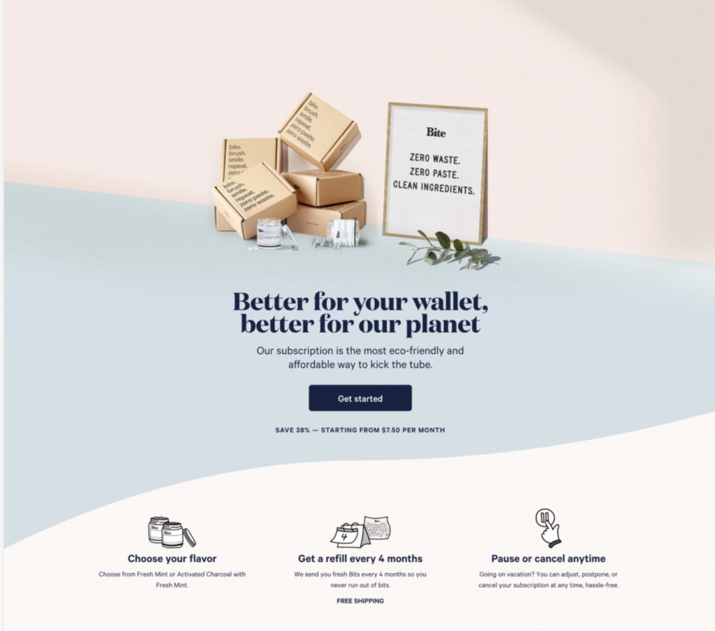
What works:
- Prioritized main CTA
- Images drive their mission and values as a brand
- Clear, concise copy (headline and benefits)
Try this e-commerce landing page template for a similar feel:
Pela Case
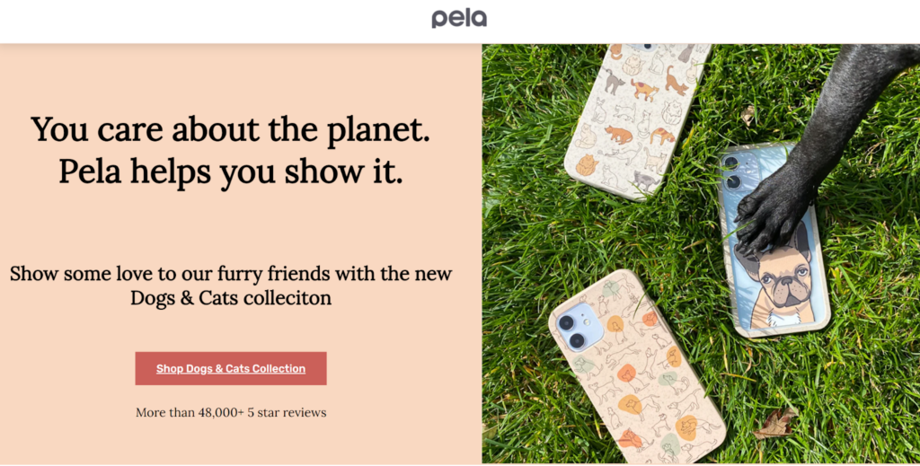
What works:
- Fun imagery to intrigue a specific audience
- Focused CTA
- Minimal copy
Try this e-commerce landing page template for a similar feel:
Slack
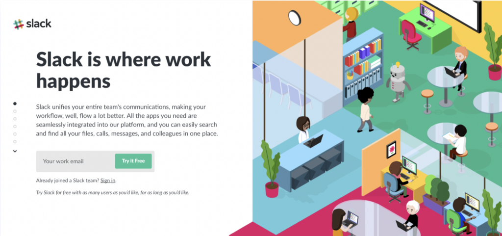
What works:
- Simple sign-up form
- Humorous imagery
- Concise headline that drives their mission
Try this e-commerce landing page template for a similar feel:
Larq
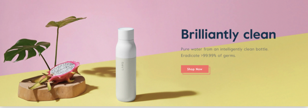
What works:
- Simplistic layout that matches the message
- Bold, crisp coloring
- Eye-catching visuals
Try this e-commerce landing page template for a similar feel:
Golde
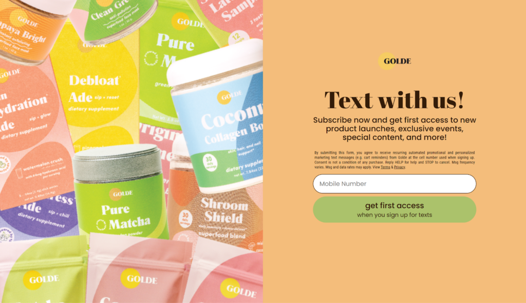
What works:
- Direct CTA telling visitors exactly what they’ll receive with sign-up
- Intriguing colors and imagery
- Simple sign-up form
Try this e-commerce landing page template for a similar feel:
Design your e-commerce landing page with BEE Pro
Digging these examples? Use them as inspiration as you start designing your e-commerce landing page with BEE Pro. Implement some of the design features like a clear CTA, bold headline and concise copy so your e-commerce landing pages reel in the purchases.If you’re not feeling the do-it-yourself route, let us do the legwork for you and start designing from one of our professional page templates for e-commerce.Last note, for freelancers and small businesses, if you’re in need of a custom domain for your e-commerce landing page, try BEE’s custom domain feature. Customize your published e-commerce landing page domain (Agency + Enterprise plans) for a more on-brand experience.
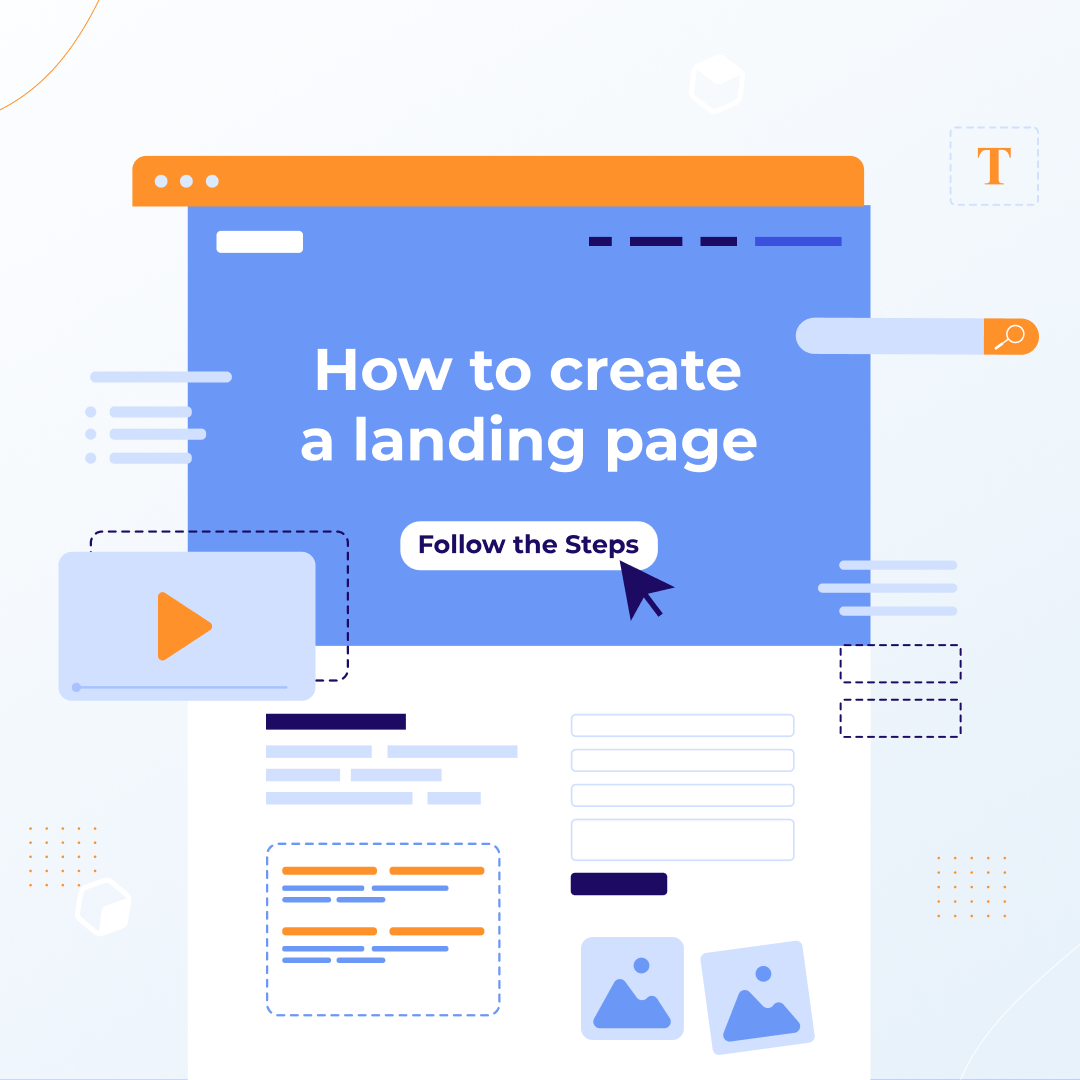
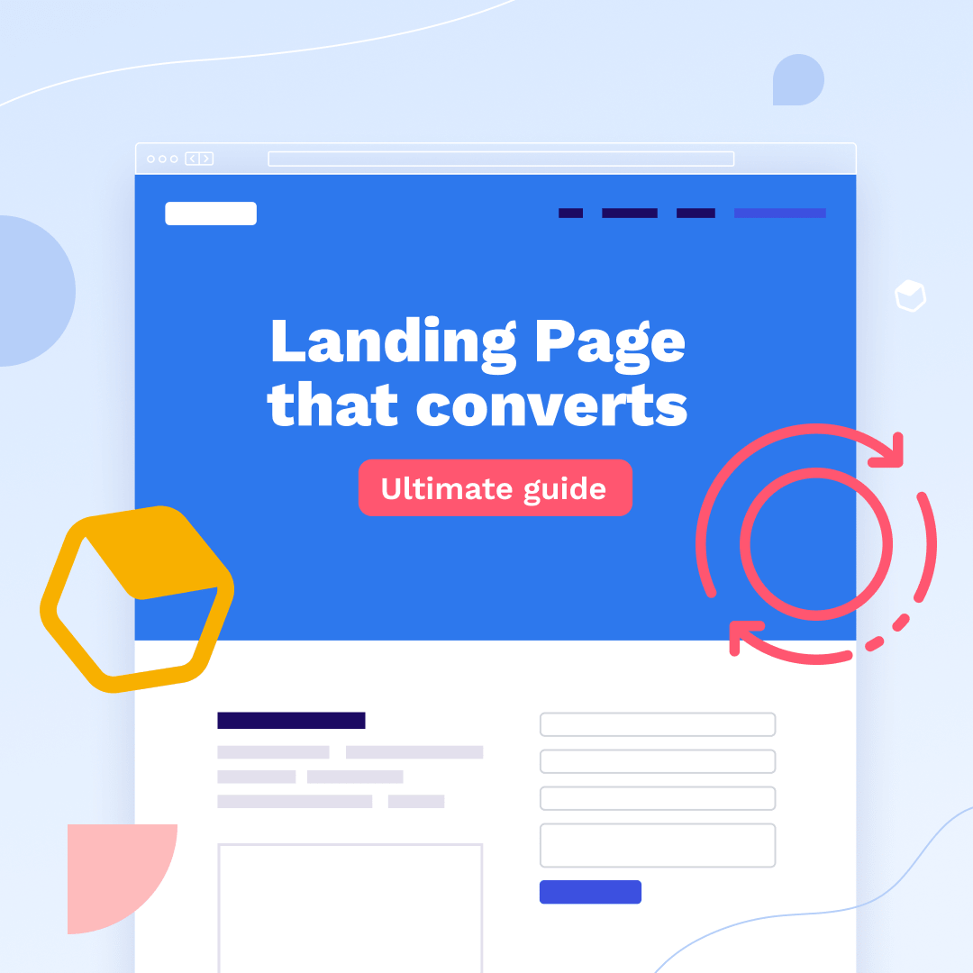
How to Create a Landing Page in 10 Easy Steps
Designing a landing page is a lot like putting a house up for sale. You stage the place, take eye-catching pictures, and list it in hopes of achieving one goal: Selling the house.In the same way, a well-designed landing page gets you to a focused goal: Getting your customer to click on the CTA. Just as you would stage your house for the big sale, you have to make sure your landing page is designed with elements that will entice readers and lead them to click.You don’t need expert-level design skills to achieve a high-converting landing page. Narrowing in on the quality of your content and landing page design elements is a sure way to attain those big results.Are you helping your target audience and meeting their needs? Are you intriguing your customer base to the point of conversion? Think about these questions as you follow along with this step-by-step guide to start designing landing pages that convert.
Know when to use a landing page
Before we go any further, let’s pinpoint if a landing page is the right asset for your goals. Identify what type of page you want to use before you begin designing. Do you need a website or a landing page to achieve your goals?Use a landing page when:
- You have one focused goal to achieve
- There are few distractions and one CTA (Call-to-action: The action you want your customers to take)
- You need to include sign up forms, lead initiating content, sale promotions
Use a website when:
- You want to explain multiple goals and provide in-depth details
- There are plenty of info regarding different goals and multiple CTAs
- You need to build brand awareness and teach customers about your product
Now that we confirmed we need a landing page, you’re ready to jump into the design steps.
How to build a landing page in 10 easy steps
Landing pages are supportive tools for your business. They work to achieve results like building your email list or driving purchases. Building a landing page requires you to identify the purpose of the page and then implement design elements that align with that purpose. Now let’s get into the nitty-gritty of the design process.
Decide on a campaign goal
By definition, landing pages have one focused goal. Before designing your landing page, determine what your goal will be. Is your landing page going to:
- Drive sales? Display a specific product where the CTA leads straight to the shopping cart.
- Boost conversions? Have a clear path to conversion that builds brand awareness.
- Generate Leads? Grow faster by offering a product demo, free downloadable resource or sign up form.
Once you’ve decided on your campaign-specific goal, choose the template layout that fully supports your goal.
Plan your landing page layout
Your layout is what guides subscribers to achieve the goal of your landing page. The perfect landing page will have a visual hierarchy and includes a headline, your offering, an explanation of the benefits, visuals, a CTA and lead-capture forms.The visual hierarchy of your landing page content will do some of the legwork for you. It creates a natural, easy-to-read pattern for subscribers, which clarifies what action you would like them to take. The F-pattern or Z-pattern layout is recommended for a smooth read.
Also, always remember to prioritize content above the fold. This means that the most important content will be visible instantly upon opening the landing page. Important information and your CTA need to be front and center before you dive into more details.This technique is like a first impression, it gives visitors a quick look at what you have to offer before they scroll, which helps increase conversions faster. It’s also a way to be respectful of a visitor's time.
Write your concise copy
The copy is the driving force of your landing page. It’s how you entice visitors with your offer and communicate the benefits of why your product or service is worthwhile. When writing copy make sure to:
- Develop a clear headline. State your offer and how it will benefit your visitors. Keep this short and concise.
- Bring it back to the customer. Simply stating all the highlights of your product/service doesn’t help your visitor. Share the benefits, details and how this is going to help visitors in the short and long term.
- Don’t get too technical. Cut the technical jargon and make it simple for visitors to understand what you have to offer.
Get straight to the point with your copy. Be clear about your explanation of why and how your offer will help customers and meet their needs.
Create your CTA
The CTA is the action you want visitors to take on your landing page. It’s the conversion-driving component and it should be crafted carefully. When designing your CTAs be sure to:
- Prioritize a main CTA. Having one CTA is best for your landing page, but if you are including more than one, make sure your main CTA is larger and above the fold for visitors to clearly see and be drawn to.
- Be descriptive. The copy you use inside your CTA will dictate if visitors care to click in or not. If you keep the copy vague, visitors will be less likely to click. Use specific language like, “Start your Free Trial” or “Add to Cart”.
The simpler the action, the more likely visitors will take that action. Concise copy and visible CTAs is the key to converting visitors.
Choose your images/visuals
Include images that your visitors will connect with on an emotional level. Customers should be able to relate, laugh or feel comforted by the imagery you use. For example, use pictures of dogs if your product/service is related to dogs, or with skin-care products use images of people using your product or close-ups of skin before and after using your product.It all depends on what your product or service is, but make sure to be mindful of the visuals you use for your landing pages. Images that create a more personable experience are what will get customers to buy.For your landing page use images that are personable, emotional and make sure they are optimized. They should also support the copy and other components of your landing page.
Plug in your design elements
Stick to the visual hierarchy when you start plugging in your content. This is the best way to limit distractions and ensure visitors will read your content. Use one of BEE’s landing page templates or start from scratch and drag and drop content blocks to make your own template.Be sure to match the landing page with the rest of the assets you create. Visitors and subscribers should be able to recognize your brand when reading your content.Last, be sure to optimize for mobile, and this is made easy with our Mobile Design Mode. This allows you to switch between desktop and mobile view while designing and it will ensure that your content renders on all devices.
Integrate with tracking tools
Integrate your landing page with Google Analytics and your CRM platform to analyze page performance. See what components are working and not working through this tracking and rework based on that info.It’s also helpful to set your custom domain (with a BEE Pro Agency or Enterprise plan). This is a sure way to raise brand awareness and customer credibility.
Double-check everything and then hit publish
Before publishing your page make sure to:
- Check the copy
- Solidify buttons and forms
- Confirm that you’re focused on one goal
Make sure every component of your landing page is working properly to avoid any issues once it’s published.
Reel in traffic
Now that your landing page is live, it’s time to boast about it. Share your page through:
- Email marketing
- Social media handles
- Social or pay-per-click (PPC) ads
These techniques are the best way to target different audiences and increase conversions at a faster rate.
Improve landing page with A/B tests and optimization
Keep an eye on your landing page. If certain components aren’t achieving their intended purpose then try implementing it in a different way. This could be through changing the copy, the CTA color or any other element that could use some tweaking.Test new elements and optimize everything to make sure the conversions continue to increase.
How to build a landing page: Expert Insights with our Design Community
Now that you have reviewed each step of the design process and know how to create a landing page, it’s time to run through some insider design tips. Two of BEE’s freelance designers, Betina Todorova and Navid Nosrati blessed us with some expert advice on how to truly make the most of your landing page designs. Let’s take note:
The essentials

Betina:
- Define your purpose/goal.
“The purpose of a landing page is to guide the user to achieve a specific goal, not just roam around your website. A landing page goal like signing people up for a webinar or getting them to subscribe to something. An important part of achieving this goal is to offer an incentive.”
- Structure your landing page (hero, body, CTA and footer).
“A hero section is where you have your headline/offering/value proposition,subheading and first CTA.In the body you have to build trust. You can put things like your USP (unique sellingpoints), social proof, reviews, customers you've worked with, etc. This is where you can also offer an incentive to help make up user's minds. For example if your goal is to sign up people for a webinar you can offer them a downloadable mini e-book.Then it's time for your finalCTA. This should be presented in a very clean and precise way so the user knows exactly what to do.”

Navid:
- Be purposeful about your layout.
“Having an asymmetrical balance on a page plays a main role. The purpose of a landing page is to create conversion and to do so the page needs to be designed in a way that leads the visitors to different sections of the page.”
- Understand the weight each element carries and craft accordingly.
“The hero section has to have a clear value proposition and explain to visitors what's in it for them—this needs to be very powerful. Then, a strong call to action. We must tell visitors exactly what they need to do, for example: Click Here, Start For Free, Sign Up Here.And the most important part of a page is the visuals. We want to always show the visitors an image, and that image needs to be very clear and hopefully explain to them what they’re going to get. Normally, I design the images in a way that matches the header of that section so if the visitors are just scrolling without reading by looking at the image they still understand what that section represents.”
The nitty-gritty details
Betina:
- Create a visual hierarchy.
“Hierarchy is important, as this will guide the user along the page. The design of a landing page should be clean, not cluttered with 2 or 3 fonts max.”
- Include an accent color.
“In your color palette you should have an accent color. Save this color for your CTA to draw attention. Many people make the mistake of using their accent color everywhere and this results in users leaving the page because they're not sure what to do. Also an accent color doesn't have to be bright/neon to draw attention. It just needs to have high contrast from the background color to stand out and not be the same as the copy text for example.”
Navid:
- Storytell with a Z-pattern technique.
“Look and feel is quite important. As a designer, my goal is to create a landing page to build trust and offer the visitors a great user experience. I most often use the Z-pattern technique to design my landing page, which is used for pages that follow the storytelling aspect.”
- Be intentional about each specific element.
“In my designs, I always include:Typography hierarchy: Headlines (no more than 6 words), sub-headers (compliments the header but does not repeat the wording and no more than 100 characters), and use bullet points (skim-friendly).Call-to-action: Exhibit value of CTA. For example, having a CTA like "Start Now For Free,” provides trust to visitors that they can start using or testing the product without paying.Visual: Images (not complex and evoke emotion), color palette (complementary colors, good contrast ratio and accessible to visually impaired visitors).Social proof: Builds immediate credibility and leverages the bandwagon effect (testimonials or reviews).”
The common mistakes to avoid
Betina:
- Too many CTAs, excess information, poor quality images.
“I think a few mistakes that are made are adding multiple CTAs, too much irrelevant information makes it difficult for the user to navigate the page. Also having a lot of menu items that lead to other pages and poor quality images that aren’t optimized.For example, check out Netflix’s site. Their sign up page doesn’t have any menu navigation. So you basically have nothing else to do other than to sign up.”
Navid:
- Inconsistent, broken or unstyled elements.
“Having inconsistent, broken or unstyled elements can be really hurtful to the landing page because visitors will see that and subconsciously doubt your brand.Another common mistake I often see is the designer of the page tries to show everything that they have to offer which can be overwhelming. The landing page is a very specific page with a very specific goal therefore it needs to be clear to the visitors and on point.”
Create landing pages with BEE Pro
Now that you’ve got the steps on how to make a landing page and collected some expert insight, you’re more than ready to design a professional landing page. Head over to BEE Pro to start from scratch and try the step-by-step guide, or quickly input your content into one of our beautifully designed page templates (some created by Betina and Navid).Also, be sure to set your custom domain with BEE Pro. An Agency or Enterprise Pro account allows you to personalize your published landing pages by using your customized domain for a more on-brand experience. Learn more about this here.
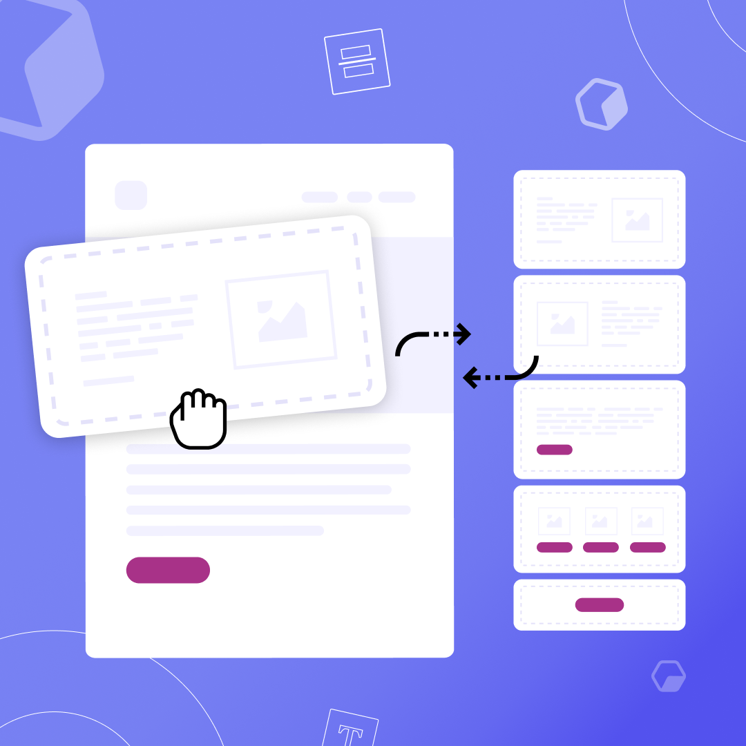
Modular design: How to boost productivity and create better emails
Originally published on April 8, 2016. Last updated Nov 2, 2021.
Email continues to reign as the most powerful communication channel for your marketing campaigns. With ROIs at nearly $42 for every dollar, reaching your audience through email is your best move right now.
But many marketers still shy away from email because they don’t seem as time-efficient as social media posts.
How can you scale your email marketing campaigns faster? The answer lies with a quick, reliable design system called modular design.
What is modular design?
In email, modular design is a system of creating content-filled building blocks to stack and arrange in your emails. Its flexibility gives you the freedom to customize your email template without changing your blocks. This is what makes modular designs so appealing. Creating modular emails accelerates and scales your entire email marketing campaign.
In fact, it’s like playing a game of Tetris. In the game, you try to match tiles within the playing field to eventually win the game. With modular email design, you stack content filled blocks within an email template to ultimately scale your email marketing campaigns.
In order to reach our desired outcome of scaling, we need to understand what our building blocks are and what purpose they serve:
- Template: A compilation of modules that are tactically placed to design an email campaign. Templates may change depending on the goal of each email. A newsletter email may look different than a feature launch email, and so on. Think of the template as your base of the email, or the playing field in Tetris.
- Module: The module is where the content lies. These blocks will contain HTML text, videos, CTAs, and other content. They will serve different purposes and be rearranged or stacked in specific ways depending on the purpose of the email being sent. With this in mind, plan to use one for your header, footer, primary content, social media links and other necessary content.
Utilizing modules will allow you to drag and drop content blocks to quickly form your desired template. This system will level-up your emails, lighten your workload and get you up to speed.
Out with the old: Traditional email design is outdated
Traditional email templates aren't commonly used anymore. Using these templates throws more work on your plate. With a traditional template you will need to add, delete and reposition elements in your emails which makes your entire design process error-prone and slow-paced.
In fact, their lack of brand consistency gives off an unprofessional appearance, and that messiness could lead your emails straight to spam. With 45% of all emails sent being considered spam, this outdated email design style is not worth the risk.
Even rendering for mobile becomes more of a concern with this design style. Adding, deleting and repositioning your content will toy with how your email renders on all devices. This will also require more testing each time you tweak your content. This is another extreme, risk seeing as 42.3% of people will delete an email if it’s not optimized for mobile.
Modular design will cut your design time in half by standardizing module components so you can rearrange and use them over and over again in your emails. Plus they will be perfectly optimized for mobile due to their regulated structure.
Benefits of modular design
A modular email design reigns over traditional design styles due to its simplicity, flexibility, and other fundamental benefits including:
Brand consistency
Keeping your image, logo, brand colors and other brand components consistent from email to email is difficult if you’re starting from scratch every time you create a new email. Modular design breezes past this complex rebuilding process by allowing you to set and save brand assets to reuse with each new email. Using consistent brand elements in your emails helps subscribers learn your brand. Keep your brand consistent with standardized email modules.
Reuse your modules and tweak text or images within them if needed. This will ensure consistency while also giving freedom and time to be more creative with your designs.
Personalization
Modular design provides the right mix of images and text in emails. This gives room for more personalization. Each module can include personalized copy to better connect with your audience. Also, 82% of marketers have reported an increase in open rates through email personalization, which means designing modular emails will undoubtedly increase your email open rates. Flexibly personalize your header, live text or send-off directly in your modules.
Easier design process
The modules you create are easily stackable. Think of them as Tetris blocks - you can drag and drop them into each template you create. This simplified designing gives you more time to focus on other elements that might need more attention.
You are essentially creating a design library filled with modules that you will reuse and place into templates. Modular design allows you to throw modules into your template without a worry on how they will render. It’s like an email puzzle where you have all your pieces set and you just need to think about where they fit together to achieve that responsive email.
Saves time
A traditional layout often requires an extensive email brief. As a result, these can take hours to create leaving no time to implement new, bold creative elements or time to run multiple A/B tests.
With modular design, you will flexibly arrange modules and quickly tweak blocks for each new email. Send emails out to your subscribers that are personalized and segmented with this time-efficient, standardized method. Modular email design is a consistent way to quickly scale your email marketing campaign.
Low cost
Traditional email templates need to be purchased since they are unique to each campaign. Meanwhile, the modular email templates provide flexibility to rearrange its components, so you only need to purchase one of those and apply it to every campaign. To avoid all costs, try a free template from the BEE template catalog.
Switch to a modular design for email
Creating modular email templates for future campaigns is a fast and flexible process. Get started here:
Brainstorm your module library
An easy way to start outlining your library would be to categorize your modules by primary, secondary, and tertiary content, depending on where they sit in your modular email template.
The modules will be filled with very specific content that you will reuse and recycle depending on each campaign you choose to send.
- Primary modules. Contain the table of contents and header.
- Secondary modules. A subscriber's main focus for clicks. Contain the headline, main text, main images, CTAs.
- Tertiary modules. Contain the social links, quotes, event announcements, emojis, surveys and other closing components.
Creating an organized library will streamline your email design process where you can select and stack modules to create the email you need.
Categorize by campaign
Take your outline a step further and plan where modules will fit in each upcoming email campaign. To begin, ask yourself a couple questions to better understand how you want your module library to be organized.
- How can I categorize these emails? Are they for my newsletter, a feature launch or a welcome series?
- How do I want to personalize modules for each campaign?
- What do subscribers love about my current emails and what sections need improvements?
Answering these questions will help you arrange your module library to simplify your design process. The ready-made modules will be ready to place into your template while changing a couple text blocks or images if needed to fit the desired campaign.
Implement a modular design strategy
Knowing which modules go where is key to creating the best email experience for your subscribers. Make the module design process more efficient by thinking about:
- Standardizing your brand specifics: logo, colors, images.
- Determining if it’s an image-heavy or text-heavy email
- Optimizing for mobile design
- Knowing your purpose for sending the email
- Understanding which sections will be personalized to subscribers
Speed up your modular template designing by standardizing some of these elements and ideas into your premade modules.
Create email modules
As we now know, producing a library of modules will fast-track your design process. It’s a design system that will pay off long term and allow you to really leverage your email campaigns. Follow your outline and fill your modules with content that suits your needs.
Test your modular designs
The ready-to-go module library you created will also give you more time to test your emails. When ready, initiate multiple A/B tests and gain feedback faster. Once you receive that feedback, you can tweak elements within modules and send it out again to decide on what works best for your subscribers.
Try out modular design in BEE Pro
Adopting a modular email design strategy is undoubtedly the most efficient way to create responsive emails. Test your designs on your audience and implement a core set of modules to reuse and rearrange for each email campaign you send.
Try it in BEE Pro. Our drag-and-drop editor gives you the creative flexibility to quickly design and save your modules. Create email templates from scratch or try a free template from our catalog. Save time and create stand-out modular email designs for your next campaign.
How To Design Landing Pages That Convert
Thoughtful content connects with your target audience and guides them to complete a specific action. Whether that action is to subscribe, purchase or review a product or service, a landing page serves as one of the best content forms to truly drive home conversions.At the core of a landing page is one defined intention. This intention or goal is more specific than only driving sales, it’s typically how you want to demonstrate value for each specific campaign: How can you show up for your customers and guide them towards a genuine solution to their problem? Once you narrow in on your goal, build a persuasive strategy and design the landing page to support that strategy: Why does your solution matter and how do you get customers to trust that it does?Understanding customer needs is the first step to creating an optimized landing page. Once you solidify that knowledge, you will be able to design and piece together your landing page elements that are geared towards customer personalities and interests.Let’s take this step-by-step so you can successfully craft a high-converting landing page.
What is a landing page?
A landing page is a standalone web page that serves one focused goal. In digital marketing, this is where your visitors end up or “land” after clicking on a link from your emails, social ads, or digital promotions. The best landing pages are campaign-specific and guide your visitors towards a CTA button.While normal web pages and your website showcase several different goals and allow visitors to explore,landing pages stay laser-focused on one goal: pushing visitors into the next step of the buying cycle. Depending on the stage they are on, this may be capturing leads, converting browsers into buyers or creating repeat buys.With a single CTA and the inability to explore the web page, the landing page is your best bet to increase conversion rates and lower costs of acquiring leads due its clear and direct mission.
What is the difference between a landing page and a website?
While the terminology seems similar, a landing page and a website have different makeups. Deciding on which to use will ultimately depend on your objective for creating the page.A landing page has one focused goal, and that is to convert visitors into customers. It will have the visitor fill out a sign up form, or simply click on a specific CTA. It partners a website but is used for a specific promotion, event or offering.However, a website is what finalizes the conversion. It gives visitors an opportunity to explore the offer in depth through other offerings and explanations. Here’s a quick breakdown of the differences:
Landing page vs. Website
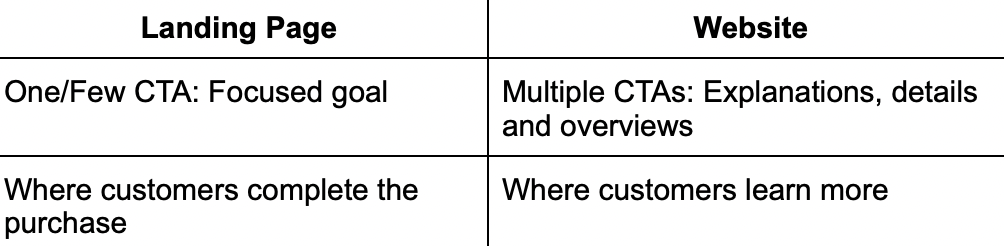
(Website)
(Landing Page)
Benefits of a high-converting landing page
Landing pages that convert are highly valuable for your business. They work to advance your visitors along in their buying journey. Some benefits of effective landing pages include:
- Driving conversion rates
- Providing actionable data tracking
- Building credibility
- Increasing search traffic
These are only a few of the reasons why you should develop landing pages for your campaigns. Keep reading to find out how to create a high-converting landing page.
What are the key components of a landing page?
Developing a high-converting landing page comes down to a clear formula. Honing in on your landing page development, design and follow up that will make or break the momentum of your landing page. Depending on the type of page you plan to design, your elements will vary from each form. Follow along with this list to develop a page that increases those conversions:
A solid CTA
- One/few CTAs
- Visibility - clear, it stands out
- Placement - above the fold
To-the-point copy
- Compelling/catchy header and descriptive subheaders - aligned with other copy
- Short, concise, informative and customer-centric
- Considerable offer that communicates value
- Emotional triggers
- Benefits and pain points - write content with your goal in mind
- Strong grammar and spelling
Optimized design
- Align the elements
- Use white space to your advantage - spread out your content, and make it easy for customers to find your CTA
- Add brand personality but don’t overload
- Zero distractions - simple, focused design
- Bullet point copy for a lighter design appearance
A single defined goal
- Understand the purpose and intention of your landing page - clear message and defined goals
- Customers come first - focus on the offer not who you are as a company. Speak and design for your target audience
Eye-catching imagery
- Engaging imagery - images/multimedia
- Videos
Reviews/Testimonials
- Customer feedback and support
- Credentials and promises
Unique value proposition
- What do you stand for?
- What makes your company, product or service different from the crowd?
What are best practices for a high-converting landing page?
Keep forms short
- Know what specific information you want from potential customers
- Showcase your data security badges so customers trust your brand
Promote on social media
- Take advantage of PPC ads
- Leverage your social media and post landing pages to those platforms
Automate
- Ease the day-to-day by automating your landing page shares from the get-go
A/B test
- A/B test your design components and personalized copy on each landing page you create
- Check your metrics - pay attention and measure to know what to change and how to improve for more conversions on your next landing page
Follow up
- Thank your customers
- Give access to your other marketing channels
- Follow up by letting customers know how to reach you
7 Types of Landing Pages that Convert
With one set intention, landing pages cut out all distractions and lead your customers step-by-step through the buying process. Each page you use throughout your sales funnel plays such a crucial role that works not only to drive the final sale, but to also genuinely help your customers face their challenges and find their solutions alongside them.Kath Pay, CEO at Holistic Email Marketing, explains that our drive should be to help customers not just sell to them. She says that, “Good marketing is helpful marketing. Customers are subscribed to you for a reason, so make their conversion as easy as possible. Don’t put barriers in front of them.”A 404 landing page is just as important as a lead capture page because they all direct customers towards content they need. Include each of these landing page types to effectively help your customers and remove any barriers from their buying experience.
Lead capture page
A lead-capture landing page is created to collect leads through a data capture form. This page encourages or incentivizes customers to fill out the form with their information to gain some sort of reward in return. It’s a win-win, your customer gets something they want and you get the conversion.When to use this page: Mid-sales funnel —Where your customers have learned about your product and are now evaluating if what you have to offer is a right fit for them.
Squeeze page
Similar to the lead-capture page, the squeeze landing page is another form-based page to collect data. They are used to gather email addresses from potential customers. A squeeze page needs to quickly get straight to the point with a bold headline, a clear CTA, an exit option and links to next steps if they decide to move forward.When to use this page: Top of sales funnel—Where you gather leads through bare minimum information (the email address) to create an email list.
(Easily delete content to simplify the landing page)
Splash page
A splash landing page is a simple version of a landing page where an announcement or special offer is provided. There’s no data collection, it's simply about giving potential customers information. The splash landing page should have a clean layout with a clear CTA, minimal copy and few images.When to use this page: Any time in your sales funnel—Where you provide customers with general information before they end up on your main website.
(Easily delete content to simplify the landing page)
Sales page
The sales page is a landing page where you convince your customers to make a purchase. These pages are often touchy with design because it’s best to thoroughly understand your customers before finalizing any of the copy or design elements. If you push too hard or not hard enough, you could lose the sale. Your page length will depend on the details of the product or service you’re providing. Whether it be a small push with quick bullet points of benefits or a page filled with extensive info, make sure your push is backed by your intentions and clearly represents your value proposition.When to use this page: Bottom of sales funnel—Where you push visitors to become customers and make that purchase. Convincing people to buy from you is difficult so design with clear intentions.
404 page
A 404 page is a safety landing page and pops up when the page customers landed on was not found. The error, “Page not found,” should be stated and then should offer a solution. That way, customers won’t simply exit your page, the solution will guide customers to an alternate form of assistance or page. Focus on keeping the mood light here by using funny copy, memes or other humorous content that your customer base will respond well to.When to use this page: Any time in your sales funnel (safety net)—Where you give customers the option to head to your website or other pages that will assist their needs. This shows that you care for their experience as a customer and want to help them in ways you’re able to.
(Customize design to fit 404 page standards)
Unsubscribe page
An unsubscribe page is a landing page where customers are able to opt-out of receiving your emails. It’s considerate to set this page up to show customers that you care about how you engage with them. Don’t feel discouraged by an unsubscribe page. Use this page as an opportunity to re-engage. Provide options to understand how frequently customers want to receive emails from you, or offer something of value like a tutorial on how to work with your product.When to use this page: Any time in your sales funnel (safety net)—Where you have the opportunity to gain insight and survey your customers. Try to understand the reason as to why they are leaving you and how you will be able to win them back and build trust.
(Customize design to fit unsubscribe page standards)
Thank you page
A thank you landing page is a great way to show appreciation of your visitors and customers. They are perfect for creating and nurturing your leads and should include a survey, customer feedback box or where you simply thank customers for making a purchase.When to use this page: Any time in your sales funnel—Where you thank your customers and then incentivize them to come back and purchase more or click further to learn more details.
(Customize design to fit thank you page standards)
Landing pages that convert: Expert insights with Emily Ryan
Now that you understand the importance of landing pages to support and drive conversions for your marketing campaigns, let’s open the conversation to an expert in the field.Emily Ryan, MailChimp PRO Partner and Digital Strategist, shared her thoughts on landing page best practices to thoughtfully drive conversion rates. Follow along with Emily to nail down your high-converting landing page for future campaigns:
Considerations before creating your landing page
Before you start designing your page, you need to understand what your main goal is for the page.
- Is it to get more subscribers or clicks on your product?
- Or offer a discount?
Nail down your goal and then start to work backwards on how to get to that goal.You always want to consider your Audience too.
- Who is your landing page for?
- What do they like and want?
If you understand your ideal customer then you can build a great page for them. Keep the tone natural and not too salesy. Write your headings/sub-headings as if you're writing to one person in your audience.
Best landing page design elements
A great landing page has a few important elements. Most importantly, it has to be easy to read and understand. Think 8th-grade reading level. You should have:
- A strong headline
- Simple body text/copy
- Great images
You also want your landing page to flow naturally and not feel like you're selling. The simpler, the better. A great headline with a beautiful image and a big button can do wonders!
Benefits of landing pages that convert
The benefits of a great landing page are that it increases conversions — whether that's more sales or more subscribers. A landing page is a simple and effective way to reach your goal without having to build an entire website. I often say that a landing page is like a one-page website. They take little time to create and can have massive ROI. They're also incredibly useful when you have a simple offer and a strong CTA. A single page lets you focus on one goal instead of many.
Key takeaways
Simple is always better. Make it super easy for people to understand your offer and then click on your button. Landing pages do not need to be long or have a lot of copy. A great image and strong headline can do the trick -- so don't overthink it. Stay clean and simple and remember to make that CTA button stand out!
Design landing pages that convert with BEE Pro
An effective landing page will ultimately do two things:
- Focus in on one focused goal
- Turn visitors into customers
When designing your landing page, think about how you want your customers to engage with your content. Follow along with the key design best practices and get creative in a way that’s going to intrigue your distinct customer base. BEE Pro offers a collection of professional landing page templates to customize to fit your specific brand needs.Adapt different elements to optimize landing page conversions, and be sure to take advantage of extensive features like Mobile Design Mode, co-editing and more. Try it out here.
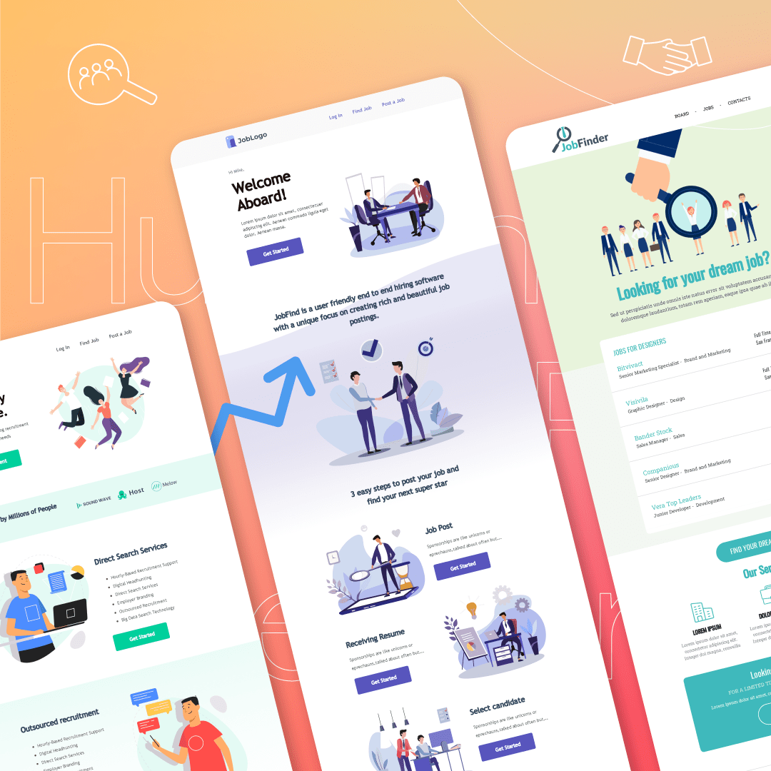
The Go-To Guide for Human Resources Newsletters

Your human resources newsletters have a pretty big job to tackle. They're responsible for delivering up-to-date company news and industry insights, announcing new hires and keeping employees engaged. All while staying short, sweet and to-the-point. That’s a tall order.Luckily, there are some pretty incredible internal communications tools to help you out.In this guide, we’ll cover everything you need to know about creating engaging human resource newsletters as well as the tools to help you do it. By the end, you’ll have a handful of new ideas and best practices to swear by.Let’s get to it.
What Is a Human Resources Newsletter?
Your human resources newsletter is a place to connect employees with the latest company news and internal updates. At the same time, it’s responsible for keeping employees connected and engaged. It should spotlight opportunities for staff to get involved within the company and build trust with colleagues—social committees, volunteer events, and everything in between.Your newsletter must also convey your company values and internal brand voice. This is done through your choice of words—conversational vs. formal—the images and graphics you use—memes vs. stock photos—as well as the information you include and exclude.
Human Resources Newsletters Best Practices
Internal newsletters from your HR team play a huge role in connecting employees across your company. They are even more prevalent now in our post-pandemic world.If your IT and Marketing teams have felt worlds apart beforehand, the pandemic introduced a whole new layer of physical distance. And it’s the job of your human resources newsletters to bridge this gap. To get your staff truly reading your newsletter, you’ll need to follow these best practices:
1. Ensure that your newsletter is easy to read
To get employees reading and connecting them to key company updates, you need to keep things clear and concise. Ditch the corporate jargon and keep sentences short—20 words or less is a good range.And don’t just make your newsletter a laundry list of new company protocols and policies. Add warmth and humor with personal anecdotes or jokes. All it takes is a quick google search of ‘funny’ or ‘heartwarming news stories of the day’ and you’ll have a selection of content to use as inspiration.
2. Use visuals
While it’s essential to get a lot of your information out in writing, some can be replaced with videos or even images. This includes how-to-guides, or announcements from your CEO. With a responsive HTML email template from BEE Pro, you can easily embed videos, GIFs and branded graphics into your human resources newsletters.If you’re a ContactMonkey customer, you can also leveragedesign service for Outlook. Their internal communications software enables businesses to create, send and track employee newsletters right from Outlook or Gmail. By streamlining employee communications, they empower internal communicators to continuously improve employee engagement.
3. Avoid information overload
You want to deliver the most up-to-date information to your employees without overwhelming them. The best way to find a balance between too many and too few emails is by checking your email analytics.See exactly when your employees are engaging with your HR newsletter the most and learn from the data.For example, if you send communications twice a week and employees mostly open them every Monday, it may be best to send your newsletter weekly. You’ll also learn the exact time when your employees are most likely to open your email and can schedule your send accordingly.
4. Include interactive elements
Reading often becomes boring when it’s too passive. You can make your internal company newsletter more engaging by asking questions and gathering employee feedback.Embed employee pulse surveysright into your human resources newsletters. These quick, simple surveys centre around a single focused question, which employees can answer using emojis, thumbs up/down and even anonymous comments.
The Top 12 Human Resources Newsletter Ideas
Even if you have years of experience in internal communications, it’s normal to feel like you’re fresh out of ideas sometimes.Below, we’ll break down 12 human resources newsletter ideas—the essentials and a few fun extras—as well as the tools to bring them to life.
1. Company updates and new products
This content should make up the core of your human resources newsletters. It could be a product launch, new influencer campaign or a bug fix on one of your customer interfaces. Big or small—it’s important that employees are fully in the loop so they can deliver the latest information to customers.Since this is the focus of your newsletter, you’ll want to keep this information at the top—so that it’s easily accessible for employees. But try to leave a surprise announcement, or exciting piece of news till the end of the newsletter so employees are incentivized to keep scrolling.Pro tip:List some of the update topics in your newsletter headline so employees interested in those insights are more likely to open.
2. Project updates from across your company
These are department-specific insights that will attract readers who are working on a project— such as a new marketing campaign or IT software—or whoever is directly impacted by it. This type of update also gives employees in other departments an in-depth look at what their colleagues are doing and prevents everyone working in silos.To roll out this update you’ll need to first send a request to different departments and have them email you any project updates and details. Remove any terminology that may not be accessible to others at your company and summarize the updates into key points.
3. New hire announcements
While it’s always been a challenge to be the new person in the office, the introduction of remote and hybrid work have made things even trickier. It’s challenging to build meaningful relationships without ever meeting your colleagues in person.New hire announcements play a huge role in connecting new employees with the rest of the team. In your new hire announcement, include the essentials like:
- Name
- Job title
- Personal hobby
- Experience level
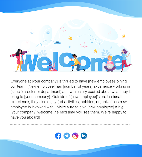
But also go beyond the basics and make the intro fun and conversational. With employee pulse surveys, your human resource professionals can embed the two truths and a lie in individual survey boxes and have readers respond with thumbs up for truth and thumbs down for lie.
4. Change management communications
When your company is going through change, it can be a time of uncertainty and confusion for employees. To keep your teams aligned and informed, your human resource newsletter is essential for sharing regular updates in the form of change management communications.It’s also important to ask for employee feedback during the change process and gauge concerns before they turn into full-blown problems. By embedding employee pulse surveys into your newsletter, you’ll be able to check in with your employees without overwhelming them with lengthy surveys during an already stressful time.
5. Revenue updates
Your revenue and its ups and downs, should be made transparent to employees. Although this update shouldn’t take up a huge chunk of your newsletter real estate, it does deserve some legroom.A good way to talk about revenue while avoiding information overload, is to leave it for your end-of-the-month human resources newsletter. Use short, simple bullets, to summarize how your company’s revenue is doing in comparison to the last quarter and add some infographics for detail.With a responsive internal newsletter template you can easily embed images, graphs and infographics to make your revenue update accessible for everyone—not just your finance department.
6. Company achievements
Don’t just let your newsletter become a space to break down the numbers and dish out targets. Celebrate your company achievements. Did your company surpass a quarterly sales target? Is a member of your team speaking at a major conference?It’s important to share your company accomplishments with your whole team. Learning about company successes helps build a sense of pride in the company. It also boosts employee morale and engagement by uniting employees in celebrating common goals.Your company achievement feature can include:
- Employee promotions: “Congrats to Anne for stepping into the role of Product Manager!”
- Associate of the month feature: “Check out our top performers for the month of August.”
- New product or feature announcements: “Have you taken advantage of the cool new features of our latest sales software?”
7. Policy changes
Are you implementing a new hybrid workplace? Is your company rolling out a new corporate social responsibility initiative? Inform your staff about company policy changes in your human resources newsletters.Make this information easily accessible and engaging—that means no copy-pasting lengthy policy documents from your legal department. Instead, summarize key points and provide a link to the full policy document or a video discussing it. Replace bulky attachments by embedding smart links right into your employee emails.
8. Event announcements
Sending out event invites and registrations separately from your human resource newsletter only risks that both get lost in your employees’ inbox. Instead, send everything together and drive a bigger audience for each.Have a designated feature called ‘events.’ In it, provide a bullet list of each event that’s coming up along with a registration button. With ContactMonkey’s event management feature, employees can register for events directly from your newsletter. That way, your HR team can easily keep track of registrations—straight from your analytics dashboard.
9. Industry news
Sharing industry news is a great way to give employees inspiration and creative ideas to use in their own work. Or, provide insights on what not to do.In your next human resources newsletters, include a feature called ‘In other news’ or ‘Around the world.’ Use it to spotlight success stories from other industry leaders, innovative ideas, or cautionary tales.
10. Your external blog posts
If your own employees aren’t reading and sharing your company content—why should your customers? Your blog content contains great material to include in your human resource newsletter and get employees reading and sharing.Remember: your employees are your brand ambassadors. Even if they’re already familiar with the content, they may have forgotten to share it on their social media or might be reminded of someone who’s interested in the topic covered. In sum, reposting your blogs to your employee newsletter is a must.
11. Info From Your Leadership Team
Your company leaders set the tone, style, and habits that shape your company culture. So it’s important that employees hear directly from your senior leadership team at least once a month.Your human resource newsletter is a great place for executives to pen a few words to the whole team. Create a feature in your company newsletter called “In their own words” and launch it at the end of each month. Ask your CEO to provide a monthly address on a topic of choice, or provide an overview of the month to come. This is a great way to get employees opening and reading to stay in touch with leadership updates.
12. Client Success Stories
How is your company helping its clients? What challenges are your customers still frequently facing? Not everyone in your company will have a chance to interact with customers on the daily. And yet, everyone’s work ultimately goes into improving the client experience.Use your newsletter to let everyone see where their efforts are going and hear from clients directly. Creating a ‘Client Testimonies’ or ‘Customer Success Stories’ feature is a simple way to boost team morale and show everyone how their work is making an impact.
Key Takeaways
Designing an engaging employee newsletter is no small feat. So trial and error should be expected. That being said, there are many ways to keep improving your newsletter and expanding your readership. The key is to gather continuous employee insights and learn from what worked and what didn’t. With a great email tool like BEE Pro and internal communications platform like ContactMonkey, you can make the job much easier.
The Best List of Marketing Statistics for 2021
Digital marketing is a dynamic playing field. It’s constantly evolving with new best practices to implement and technology to test.To stay ahead of your competitors, it’s crucial to keep up to date with the latest marketing statistics. For everything from email marketing to SEO, we’ve curated a fresh list of marketing trends to help your business stay up to speed. Use these statistics to better reach your customer base.

Content Marketing Statistics
Content is top priority for most marketers because it plays a crucial role in the success of entire digital marketing campaigns. These are the top trends when it comes to content marketing:
- A group of bloggers were surveyed in 2019 and it was found that 32% of respondents always checked the analytics of their blog posts (Statista, 2020)
- 56% of businesses have claimed that they want to increase their content creation spending (Content Marketing Institute, 2019)
- In 2020, 89% of content marketers used blog posts in their content creation strategy (Content Marketing Institute, 2020)
- About 70 million new posts and 77 million new comments are produced by WordPress users each month (WordPress, 2020)
- The “ability to measure and analyze their marketing impact” is ranked as a vital priority for improvement by 61% of marketers (Demand Generation Survey, 2018)
- About 51% of the businesses that invest in content marketing, publish content daily (The Manifest, 2018)
- Most popular content amongst companies: videos (72%), blog posts (69%), and research and original data (60%) (The Manifest, 2018)
- The top content marketing methods B2B marketers use to nurture their audience are email campaigns (87%) and educational content (77%) (Content Marketing Institute, 2019)
- About 63% of marketers use their content strategy to build loyalty with their existing clients (Content Marketing Institute, 2020)
- 300 B2C marketers were surveyed and it was found that 45% don’t tailor their content to a specific buyer’s persona or stage of the buyer’s journey (Conductor, 2018)

Email Marketing Statistics
Email marketing is one of the most effective channels for connecting with your audience and driving results. Take note of these email marketing statistics to see how your business could maximize their ROI and build sturdy customer relationships.
Subject line and open rate statistics
- 47% of email recipients open email solely based on the subject line (AWeber, 2019)
- Out of 1,000 email subject lines, only 6.9% incorporated emojis (AWeber, 2019)
- Average open rates soar above 80% for Welcome emails, making them the single most effective message you can send (GetResponse, 2021)
- The average open rate for email newsletter across all industries is 21.33% (Mailchimp, 2021)
Clickthrough rate statistics
- 2.6% is the average email clickthrough rate (CampaignMonitor, 2020)
- The highest click rate is 5.01% which is sent by hobbies entities (Mailchimp, 2019)
- Responsive email templates get higher click-through rates regardless of device (Mailchimp, 2020)
- Click-throughs increase to 28% when marketers use a CTA over just a text link (CampaignMonitor, 2019)
Mobile email marketing statistics
- If an email is not optimized for mobile, 42.3% of people will delete it (SaleCycle, 2021)
- Accounting for 29 percent of email opens iPhone email app is the most popular email client (Statista, 2018)
- 66% of all emails opened on mobile are read for more than eight seconds (Litmus, 2019)
- Mobile readers who open emails a second time from their computer are 65% more likely to click through (Campaign Monitor, 2019)
- About 1 in 5 email campaigns is not optimized for mobile devices (Hubspot, 2021)
Email spam statistics
- 69% of email recipients report email as spam just based on the subject line (Optinmonster, 2021)
- 47.3% of all emails in 2020 were spam (Statista, 2020)
Email personalization and segmentation statistics
- Segmented campaigns are noted to increase revenue by 760%, according to some marketers (Campaign Monitor, 2019)
- About 30% of marketers surveyed said they use audience segmentation tactics to improve email engagement (HubSpot, 2020)
Email engagement statistics
- 60% of email recipients said they are likely to engage with an interactive email (Dyspatch, 2020)
- Over 50% of email recipients hope to interact with content in their email (Dyspatch, 2020)
- iPhone Mail (34.2%) and Gmail (30.7%) are the two most popular ways to read email (Litmus, 2020)

Social Media Statistics
Social media marketing is a great opportunity to build your brand and drive website traffic. Use these statistics to learn how marketers are using social media to boost their business.
- Facebook Groups are currently used by 18% of marketers (HubSpot, 2020)
- In April 2020, social network via any kind of mobile phone was accessed by over 98% of Facebook's active user accounts worldwide (Statista, 2020)
- LinkedIn's number of users in the U.S. reached 160 million, in April of 2020, making it the country with the most users in the world (Statista, 2020)
- The social channel with the second-highest ROI among marketers is Instagram (HubSpot, 2020)
- By 2023, Instagram is projected to hit 120.3 million monthly active users in the U.S., which is up from 107.2 million users in 2019 (Statista, 2020)
- In 2021, 82 percent of the population in the United States had a social networking profile (Statista, 2021)
- The number of worldwide social media users reached 4.2 billion in January 2021 (Statista, 2021)
- Compared with one year ago, 61% of B2B marketers increased their use of social media for content marketing purposes (Content Marketing Institute, 2019)

SEO Statistics
SEO helps explain how your customers or prospects are finding out about your brand and purchasing your product. Optimizing your SEO strategies are the key to driving those conversion rates. Take a look at the statistics on how businesses are leveraging SEO.
- Google currently has 86.86% of the search engine market (Statista, 2021)
- According to 49% of marketers, organic search has the best ROI of any marketing channel (Search Engine Journal, 2018)
- The #1 result in Google gets about 32% of all clicks (Backlinko, 2019)
- Google organic search is responsible for 59.2% of the world’s web traffic (Sparktoro, 2018)
- About 25% of small business websites don’t have an H1 tag (Fresh Chalk, 2019)
- Over 5.5 billion searches are performed daily on Google (Ardor SEO, 2021)
- Nearly 91% of pages receive no traffic from Google (Ahrefs, 2020)
- 48% of consumers are using voice technology for general search queries (Search engine land, 2019)
- About 43% of voice-enabled device owners use their device to shop (Narvar, 2018)
- 27% of the online population worldwide is using voice search on mobile (Google, 2018)
- The first 5 organic results in the SERPs account for 67.6% of all clicks (Zero Limit Web, 2021)
- Over 29% of keywords with over 10K+ monthly searches consist of 3+ words (Ahrefs, 2021)
- The first 5 seconds of page load time have the highest impact on conversion rates (Portent, 2019)

Advertising Statistics
Advertising generates revenue through increasing the visibility of your brand. Use these statistics to find what advertising tactics will work best for your business.
- 44% of respondents say they use ad blockers because they don't want their online behavior to be tracked (Statista, 2020)
- 45% of people in the U.S. ages 15 to 25 say they use an adblocker (Statista, 2020)
- Ad Blocking costs advertisers billions of dollars and the losses are growing annually worldwide (Statista, 2019)
- $3.33 is the average cost-per-click (CPC) in the marketing industry and the most expensive marketing industry keyword CPC is $165 (Ahrefs and WordStream, 2020)
- Mobile advertising is expected to slow down to about 10.4% by the end of 2022 (Statista, 2021)
- By 2022, Mobile advertising spending is expected to surpass $240 billion dollars (Statista, 2021)

Video Marketing Statistics
Using video for your digital marketing efforts is a unique and effective way to gain more traction for your business. Keep up to speed with these statistics and implement video into your team's marketing efforts.
- Since 2016, the number of businesses using video in their marketing efforts has increased from 61% to 86% (Wyzowl, 2021)
- About 78% of video marketers said they believed video to be a crucial part of their marketing strategy in 2015, and now in 2021 that number has increased to 93% (Wyzowl, 2021)
- Marketers have reported great ROI that is consistently increasing from video. A third said they got a good ROI, in 2015. By 2021 that number increased to 87% (Wyzowl, 2021)
- 94% of marketers feel they increased understanding of their product or service using video (Wyzowl, 2021)

Lead Generation Statistics
Lead generation is the process of reeling in and converting people that are interested in your brand. These lead generation statistics will share how important it is to nurture this step of the customer journey and how marketers are doing that.
- On average 51% of companies are currently using Marketing automation. More than half of B2B companies (58%) plan to adopt the technology (EmailMonday, 2021)
- Research and Markets anticipated the global marketing automation market size to reach USD 8.42 billion by 2027 (Research and Markets, 2020)
- 90% of businesses are already using content marketing to generate inbound leads (Gist, 2019)
- 73% of organizations focus on lead quality over lead quantity (Demand Generation Survey, 2018)

Bonus Statistics
- For every $1 you spend on email marketing, you can expect an average return of $42 (DMA, 2019)
- 45% of internet users reported that they avoided opening emails from unknown email addresses (Statista, 2019)
- Over 306 billion emails are sent and received each day (Statista, 2021)
- This figure is projected to increase to over 376 billion daily emails in 2025 (Statista, 2020)
- In 2020, the number of global e-mail users amounted to four billion and is set to grow to 4.6 billion users in 2025 (Statista, 2020)
- 45% of small businesses with effective or very effective email copy have average open rates of 26% or higher (AWeber, 2020)
- 86% of small businesses send emails at least once per month (AWeber, 2020)
- Less than 7% of small businesses have more than 50k email subscribers (AWeber, 2020)
- Apple iPhone accounts for 37% of email opens (Litmus, 2021)
- Apple Mail accounts for 9% of email opens (Litmus, 2021)
- U.S adults spend an about 3 hours and 10 minutes per day on their smartphones (Emarketer, 2019)
- 4 out of 5 marketers said they’d rather stop using social media than email marketing (Litmus, 2020)
Keep up with the Latest Trends
Staying up to speed with the ever-changing marketing trends is crucial to the success of your business. Although the industry is constantly evolving and developing new methods, it is worthwhile to spend time studying up. Being in the know with how trends are moving will help you better connect with your target audience and allow you to drive more conversions.
Mail Privacy Protection is Here—And It Wrecked Your List-Pruning Strategy

Big, beefy open rates are a badge of honor in the email marketing biz. But open data has always been a tad unreliable—“noisy” is the word data nerds use to describe those fuzzy numbers—and thanks to the rollout of Apple Mail Privacy Protection (MPP) this week, open data will be noisier than ever before.The timing kinda sucks. Just as brand marketers are finalizing their plans for the 2021 holiday season, they have the added burdens of sorting out how to handle reporting with less exact data, how to achieve a more accurate read on engagement, and how to adapt strategies and tactics that are reliant on open pixels (RIP countdown timers!).One MPP-related conundrum in particular keeps popping up on my radar in email marketing communities: “How am I going to prune my email list of non-openers now that all Apple Mail users will register as opens? ?”But here’s the thing: Aggressive list pruning was never a great idea. And “what’s the workaround?” is the wrong question to ask.MPP presents an opportunity for us to look at our objectives through a fresh lens, challenge what we think we know, and conceive more effective solutions.
Boo, You’ve Been Lied To: List-Pruning Myths
The only brands who should be purging non-openers in 30 or 60 or 90 days are those who are using shady acquisition tactics. And there’s a name for that—it’s called spamming. And you’re not a spammer, right?If your subscriber acquisition strategy is on the up and up, then aggressive pruning is counter-productive. And you’re leaving money on the table if you’ve bought into these three list-pruning myths.
Myth 1: Increased Engagement
Everyone who holds fast to aggressive list-pruning practices likes to cite their open rate as evidence it’s effective and necessary. I’ve heard accounts of open rates doubling with deletion of the disengaged.And I’m unsurprised. Because math. And logic. Of course you’re going to produce a lift in open rates if you only send to folks who are showing high interest in your brand in that moment in time. But list pruning artificially inflates vanity metrics, and marketers conveniently ignore more important KPIs.So while list pruning can show a positive correlation to open rates, it’s often associated with declines in open volume. And click volume. And conversion volume.When you slash away at subscribers—with no changes to your campaign strategy—do you see a positive ripple effect all the way to your bottom line? Do you generate more revenue by sending fewer emails? Is it possible to produce more engagement by initiating fewer engagement opportunities?Spoiler: No.Because the problem isn’t your list. The problem is your strategy.
Myth 2: Deliverability Best Practice
Deliverability is absolutely a priority when it comes to email marketing. A campaign that’s banished to the spam box is certainly not going to convert. And one of the factors spam algorithms are evaluating to determine inbox-worthiness is subscriber engagement.If you have a deliverability crisis, it’s standard practice to suppress your less-engaged segments and rehab your reputation by sending to your most-engaged segments (along with ceasing any sort of sketchy activity that contributed to the problem). But ultimately, the goal is to get you back on your feet, sending to your entire list.It’s never been a deliverability best practice to simply trash a chunk of your list after a handful of campaigns go unopened.That’s not to say you shouldn’t ever delete subscribers. Long-term disengagement can be problematic, but heavy-handed pruning is usually overkill. And if your engagement is so low that it’s threatening your ability to inbox, the problem isn’t your list. The problem is your strategy.
Myth 3: Cost Savings
Email marketing platforms typically charge based on send volume and/or database size. So it’s true that deleting the disengaged can shave a few bucks off your ESP bill.But who’s responsible for replacing those subscribers? Who’s ensuring the list grows faster than it shrinks?It typically costs a fraction of a penny to send a marketing email. So even if you send every subscriber an email every single day, you may not spend more than a dollar per subscriber for an entire year.Do you know how much it costs your brand to acquire a subscriber? $3 $7? $12? $30? More?Retention is always cheaper than acquisition. And aggressive list pruning may not actually be saving you any money at all. There’s even a chance your brand is wasting budget on an endless loop of acquiring and deleting exactly the same subscribers, over and over.Because the problem isn’t your list. The problem is your strategy.
So how do you engage the disengaged?
MPP means it’s tougher than ever to even know who’s engaged, so our work is certainly cut out for us. But the secret to email engagement is unchanged: Send emails your subscribers actually want. Deliver engagement-worthy campaigns.How do you do that? Well, it’s not something that can be explained in a single blog post.But the perfect starting point is your re-engagement strategy. Rather than deleting the disengaged, target them. Grab the attention of your non-openers, non-clickers, and other folks who just aren’t advancing through your customer lifecycle.Re-engagement is one of my favorite email marketing topics, and it’s the theme of the next BEE webinar, Re-Imagine Re-Engagement. I’ll be presenting some of my top re-engagement tips and favorite campaign examples along with brilliant email strategists Adeola Sole and Natalie Jackson on October 4. And we’ll be sure to discuss the implications of MPP on re-engagement strategies as well. Register here so you can catch the session live or on demand.
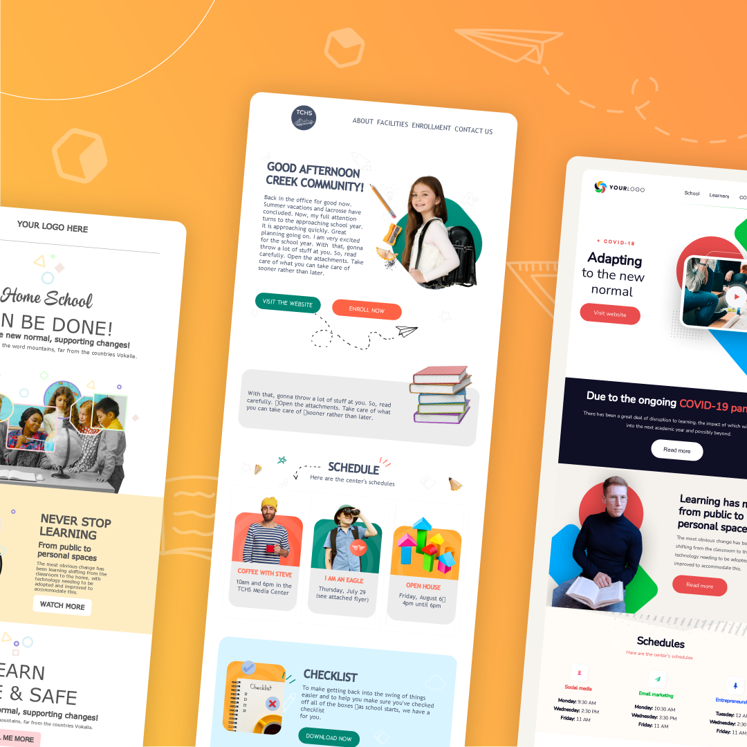
7 School Newsletter Templates to Use This Academic Year
Sending out weekly school newsletters sometimes feels like a meaningless task on your checklist. Are students reading these? Do parents even care to look at them?If you have these doubts, know that leveraging your school newsletter is an essential move that will make a great impact on your overall engagement with students and parents. Education-related emails currently have an average click through rate of 12%, which means students and parents are finding this form of communication useful.Create a digital school newsletter to stay accountable and keep in touch with students and parents. Start with a strategic approach. Brainstorm quality content like providing resources to assist students’ mental health, highlighting student achievements or including event information for your community to stay on top of all the important upcoming dates. Then, place your content into a template.Build stronger connections and establish clear communication with your community. Implement your strategy and use these school newsletter examples as inspiration.
How to optimize text-heavy school newsletters
Evaluating your current school newsletter design is the first crucial step towards creating a more engaging one. Is your newsletter easy to skim? Are students and parents able to consistently locate the specific information they need each week?If you’re responding no to these questions, then you’re sending an email that’s jam-packed with great content, but formatted incorrectly. Although the text-heavy email is a great approach when it’s templated, loading an email with a block of plain text will surely lose your readers’ attention.For example, The Creek High School (TCHS) sent out a long-winded email with plain text. While the content and information Steve provides is valuable, parents and students will likely stop reading and even delete the email because they can’t locate what they need quickly.
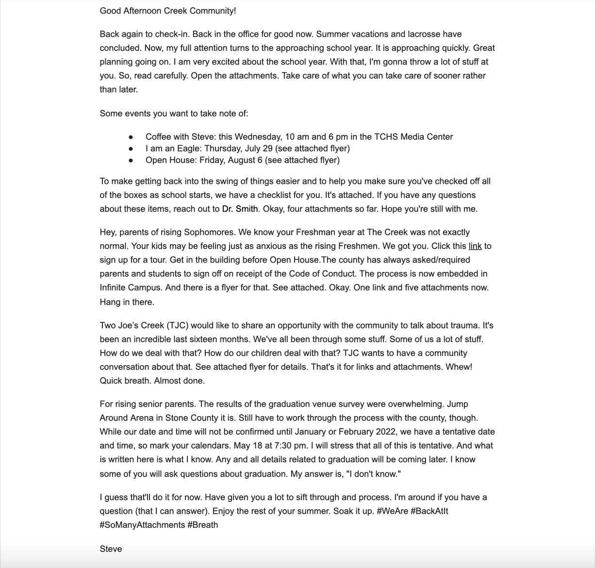
Text-heavy email example
Above all, students and parents want to hear from you and refer back to your newsletter for important information. But, if your school newsletter doesn’t have organized content blocks then it makes it a more time-consuming task for them.Transform your school newsletters with responsive email templates. In this example, BEE took the TCHS school newsletter and inputted that same content into a structured template.
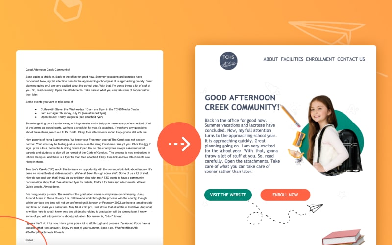
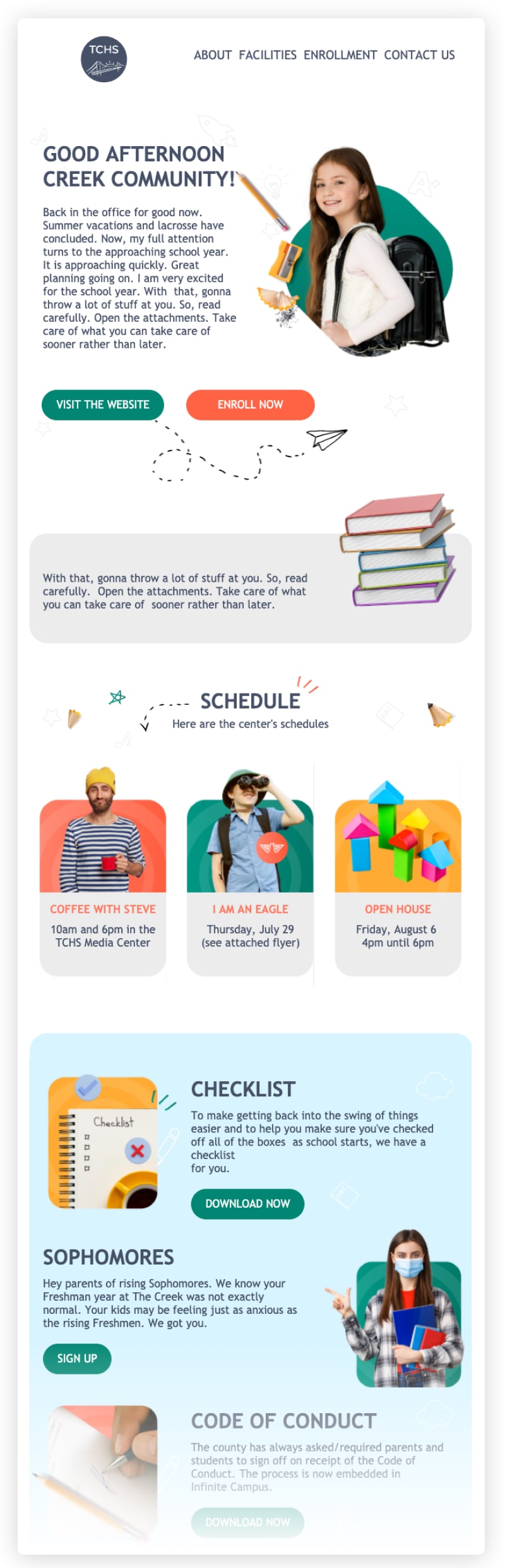
View the full template transformation here.
The content is organized in a careful manner. Students and parents will find their weekly agendas, links to event fliers and other important content with an easy skim.Therefore, putting your school newsletter content into templates and sticking to the same weekly send-off cadence is the best way to increase engagement with your community. After completing this step, consider these best practices as well to boost engagement even further:
- Craft intriguing subject lines (avoid spam trigger words)
- Don’t overload on CTAs
- Optimize for mobile
- Keep a clean email list
- Test content to accurately pinpoint your community’s needs
Craft the perfect school newsletter by implementing these best practices to increase open rates and overall engagement with your community. Now it’s your turn to take action.
7 school newsletter templates to use this season
School newsletters are a main source of essential information for students and parents. Their purpose is to foster connections between school and home. Creating an eye-catching newsletter that students and parents want to read doesn't have to be too complicated. Most importantly, settle on the content you need to provide your community with, and decide on how you want to showcase it. Forget about sending a hard copy newsletter and try one of these digital school newsletter templates for your weekly newsletter.
E-Learning Blog
Customize this e-learning blog template to serve as your weekly school newsletter. Provide students and parents with links to your educational blog that includes educational content or classroom updates. Then, personalize your headline with your school name and date, and include real in-class pictures for each blog post or content block. There is plenty of space to get creative and create a classic school newsletter with this template.
Book Lovers
Edit this book lovers template to fit your school newsletter’s agenda. Include pictures and quotes from students in the class to share progress updates with parents, showcase class readings and quotes from those books or simply run through a list of event descriptions to keep parents informed. In this school newsletter template, there is a simple grey background with non cluttered modules for an easy skimmable read.
Colorful Newsletter
Want to make sure parents and students are reading your newsletter? Use this colorful school newsletter template for your weekly recap. It’s a great design for K-5 classrooms, with areas to feature pictures of students in-action, share information about upcoming events and even provide a more detailed outlook of the week-to-week curriculum for parents to always stay in the know. Update the text and images to suit your classroom’s agenda.
School Agenda
Run through your weekly school activities with this unique school newsletter template. Include your school logo, classroom or student images and clear descriptions of your content in the organized text-modules. Moreover, this template provides an organized play-by-play of weekly classroom activities to keep parents and students in the loop. There’s even space to personalize the greeting to the student or parent you are sending the newsletter to.
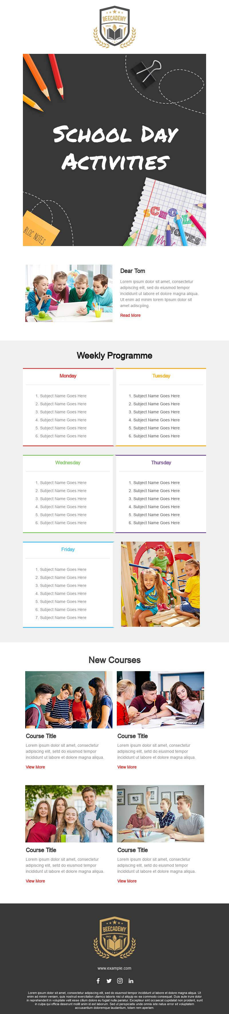
School Activities
This simplified design makes going over your classroom agenda incredibly easy. School district newsletters should adopt this design as well because it provides a clear event schedule for the community to keep up to date every week. With a bright yellow CTA and carefully sectioned columns, there’s no way parents or students will possibly miss a beat. This colorful email is perfect with the top portion designed to look like notebook paper, and the rest of the email looks like a blackboard and includes places to put student photos.
Student Spotlight
Share information about your background as a teacher for parents and students to get to know you in this school newsletter template. Or initiate a student spotlight or student of the week idea into your newsletter. So, whatever content you want to include, make sure to personalize it for parents and students as they will get excited about reading your newsletter if it’s directed towards them. This multipurpose template includes a clear, easy to spot CTA and appropriate white space between content so as to not overwhelm your readers. As a result, the entire email gives off an organized, professional appearance.
Back to School
This versatile school newsletter template is great for grades K-5 with its fun colors and characters scattered throughout the email. To start, introduce parents to the back to school learning app that students will be using throughout the year or map out different events or activities students will do each week in each detailed module. The bright colors and easy to read copy simplifies the newsletter for parents to make sure they are truly reading them.
Design your school newsletter with BEE Pro
Don’t hesitate on getting creative with these templates, use them in whichever way fits your content best. These school newsletter templates are versatile: keep the colors, module placements and location of CTAs and simply input and organize your content any way you want.Designing with BEE Pro will simplify your school newsletter design process. Quickly edit and input new information and updates into your chosen template to save you time each week. Also, take advantage of some of BEE Pro’s incredible features like co-editing, branding kits and mobile design mode. This will give you the ultimate design freedom and flexibility to create the best school newsletters.
Alumni Engagement: How to Create Newsletters Alumni Will Open
It’s no secret that alumni engagement is crucial to higher ed. Former students who feel connected with their alma mater attend more events, engage more with current students and donate more often. Alumni newsletters are a great way to add communication touch points throughout the year.With graduated students being scattered across demographics, email is one of the most effective ways to stay in touch with alum. Alumni newsletters open rates sit at about 25.8% compared to the 21.3% average across all industries. And with an average ROI of $42 for every $1 spent, email remains one of the most cost-effective marketing strategies for higher education institutions.Newsletters also provide versatility, allowing you to raise awareness about your next fundraising initiative, tell success stories, and keep former students informed about alumni association events.Check out some newsletter strategies and content ideas for inspiration to advance alumni engagement at your university.
8 Best Practices for Crafting Alumni Newsletters
Developing a clear content strategy is key to keeping alumni engaged. There aren’t any one-size-fits-all approaches to designing high-converting alumni newsletters for your university. But, there are key best practices that will help. Create better alumni newsletters using these 8 tips.
Establish your workflow
The first step in any strong content workflow is user research. Take time to build a relationship with your alumni before creating an alumni newsletter. Reach out to alumni through LinkedIn, other social media platforms or by attending alumni events. Use these interactions to guide the content, style and cadence of your newsletter.The second step is to establish a purpose for your newsletter. Ask yourself these questions before sending your email:
- What is the purpose of the message you’re sending?
- Why is this message important for alumni to know?
- How are you going to measure the success of this message?
Your third step is to create a visually-engaging newsletter. Create an alumni newsletter from scratch or choose from this collection to help you get started.Finally, test your content and reach out to alumni for feedback. Review open rates, click-through rates and conversions from each message. This will shed light on what’s serving your community best. Repeat this four step process until you find what’s most engaging to your alum.
Pinpoint your KPIs
Set your KPIs by looking at the objective behind your alumni newsletter. Rather than trying to maximize all metrics, measure outcomes by associating a specific KPI with the unique objective of each email.For example, if you are looking to raise awareness through your newsletter, open rates would be a solid indicator of that success. Meanwhile, if you’re aiming to simply attract more alum to an event, click-through rates are a better measurement. Establishing a KPI before sending your email will give you clarity on which elements to optimize.
Find your cadence
How many emails should you send to alumni each month? Reports indicate that the typical relationship-based organizations send an average of 16 emails per month. But when it comes to the higher education industry, universities are only sending about 7.4 emails each month.The problem is that creating extensive email marketing campaigns is expensive, time-consuming and demands the luxury of additional resources that many organizations don’t have.The number of emails sent each month depends on your budget and your team’s bandwidth. Using cost-effective tools like BEE Pro cuts down on the amount of time and effort it takes to craft an email.
Personalize your outreach
Segmenting your audience is the best way to personalize your alumni newsletter.Segment by breaking down your alumni group into various subsections to cater to each section’s specific needs. You can segment your email list based on geographic location, age, occupation, major and other fitting criteria to increase engagement.Useful data to gather includes:
- Where do your alumni live - what country, city and state?
- What year did they graduate?
- Which sports do they keep up with? What was their major?
Alumni will read newsletters that touch on their interests. For example, creating a campaign for younger crowds should contain more social media related links or podcasts while older alumni prefer more short and feature stories. Personalization builds that connection through care, concern and understanding of their interests.
Refresh your email list
If you find that you haven't heard back from many alumni regarding your newsletter, it’s possible that they aren’t receiving your email. The contact info you received from alumni years ago is likely to have changed. If you initiate a re-engagement campaign and still don’t hear back from them, it’s best practice to delete alumni that did not respond.Keep in mind that if you continue to send your alumni newsletter to those that are uninterested, you run the risk of hitting their spam boxes. This goes for all alumni on your list. Cleaning your email list will help you reach your active members and avoid spam.Continuously look for opportunities to retrieve this updated contact info from alumni through outreach on social media, virtual alumni webinars and in-person events. For example, start an alumni happy-hour event once a month or a virtual comedy show fundraiser and collect updated emails.
Optimize email design
Mobile optimization is a crucial part of your strategy to increase engagement with your alumni newsletter template. Alumni have different personal and professional lives which makes it difficult to determine the best way to reach everyone. Luckily, with tools like BEE Pro, you guarantee to reach them in the most optimized way on both desktop and mobile.
Display clear CTAs
Along with helpful links and resources, be sure to include one clear CTA. Reports show that emails with a single call-to-action increased clicks by 371%.When it comes to CTAs, these are best practices to increase click-through rates include:
- Use a CTA color that fits your brand while also allowing it to stand out amongst the rest of the newsletter content.
- Avoid too many distractions and use imagery to guide alumni towards the CTA. Alumni will be drawn to different sections of the newsletter based on their preferences, so one clear CTA is best.
Your CTA will provide feedback on whether your content resonated with alumni by measuring click-through rates. Their click means they’re interested, so be sure to refresh your content if click-through rates are low.
Provide value
Test and evaluate your newsletter content to determine what’s intriguing to alumni. What content are they gravitating towards? Gather the feedback you receive and reframe areas of the newsletter that aren't receiving any engagement or providing value.Alumni-centric content brings value to your newsletter and will show that your intentions are genuine. You will know alumni are finding the content valuable not only by metrics, but also through their email replies.
Content Ideas for your Alumni Newsletter
Fresh content and a perfect strategy are the key to a successful alumni newsletter. Your end goal should be to make your alumni feel valued and appreciated. Highlight your school’s success through acknowledging and thanking alumni for their support. Engage with your alumni through some of these thoughtful content ideas:
Newsletter introduction
The introduction of your alumni newsletter is the most important part of your newsletter. This is where you reel in your alumni with intriguing content. Some ideas for a great alumni newsletter intro include:
- School’s mission - Genuinely talk about your school’s ambitions, purpose and values. Discuss a vision that alumni will resonate with. For example, if you are a welcoming, inclusive school, make sure that alumni feel that.
- Stories alumni might find interesting - This should play off your mission statement. What were some values or purposes that you can draw a story out of? Are there exciting changes taking place at your school? Craft a story that emotionally engages alumni.
- Timely topic - Introduce alumni to relevant or useful information that encourages them to engage. This type of intro discusses any current exciting or moving stories.
- Message from administration - Alumni appreciate when higher ed officials take time to engage with them and their students. A personalized message providing insight, exciting news, or interesting facts would be a great start to your newsletter.
Alumni stories
Showcase your alumnus’ successes. Your newsletter should feature alumni success stories to capture where alumni are now and what they’ve accomplished after attending your school. Not only are these alumni stories inspiring and exciting to read, they are also expressing your care for their professional and personal successes. Conduct interviews to provide in-depth personal stories and implement some of these ideas:
- Alumni of the month - Feature a couple alumni each month with exciting facts or stories about where they are now. Talk about how they are still engaging with your school to excite other alumni to do the same.
- Awards - Share alumni wins. Capture pictures and express praise for alumni that have received accolades in their personal or professional lives.
- In the news - Be on the lookout for alumni that are featured in the local or national news. Oftentimes alumni in the news may mention their alma mater, which is important to acknowledge and be grateful for. Alumni are always looking for networking opportunities or a chance to boast about their alma mater.
- Networking - Sharing where alumni are now and what they have accomplished can help open doors for each other. Creating a connected community will encourage alumni to reach out to one another.
Catch up with classmates
Although professional networking is important, many alum (especially young graduates) feel connected to their school on a personal level. Help them keep in touch with their classmates by including more personal stories in the alumni newsletter. Use some of these ideas in your newsletter:
- Feature story - Conduct an in-depth interview with alumni that are willing to share where they are now, both personally and professionally. Reading stories about someone’s journey to finding happiness and success post graduation are intriguing and inspiring.
- Short stories - Similar to the feature stories, provide a shorter story covering a couple alumni that went down different paths. Choose a theme for these stories such as “travel stories” or “overcoming adversity”. Or even explore niche topics that your alumni community might care to learn and hear more about.
- 10 questions - A short and sweet version of short stories. Interview alumni with a quick 10 questions. Pull information and ask questions that stray from the typical topics alumni get asked: How do you spend your weekends? What podcasts do you find inspiring? Do research beforehand to find topics that resonate with that alum personally.
Alumni advice column
Current students and alumni love to take advantage of networking opportunities and chances to connect. But many alumni can’t make it to in-person events due to their busy schedules. This is where alumni advice in your newsletter comes in:
- Alumni advice column - Contact alumni to ask for a quote on certain topics that may be related to your school, their personal experiences, their professional experiences or niche fun facts that would be fun to include.
- Finding your path tips - Alumni, both young and old, travel on different paths. Some might make a career switch at an older age while others might make several switches throughout their career. This section is useful to interview and gain insight from alumni that have traveled down different roads.
- Training Sessions - Offering virtual or in-person training sessions from one alumni professional to the next is a great way to gain insight on things many may not know and would care to learn more about.
Faculty features
Express appreciation for those that work for your school. Alumni get excited to hear about the individuals that made their university experience so great. Many alumni pass through school without meeting many of these faculty members, so it’s great to share their impactful stories and how they contribute to your school’s mission. Implement these ideas into your newsletter:
- Inspiring faculty story - Interview faculty that have made a great impact on students. Many alumni will resonate and get excited about seeing these faculty members being recognized through a story.
- Recognition - Boast about your faculties wins in this section. What are they working on inside and outside of university that should be acknowledged?
- 10 questions (faculty edition) - Find the faculty members that are remembered by alumni for their quirks, supportive nature and other inside information that would be interesting to hear about. There are so many faculty members that have distinct personalities that will be remembered by alumni forever. Do some research and digging to find these extraordinary members.
Alumni engagement
Portraying that alumni are engaging with their school is a great way to reel more of them in. Create exciting events, offer fundraising opportunities and share the excitement through pictures. These ideas all lead to more personalized engagement, which is what is needed to provide true value through your alumni newsletter. Alumni want to see and feel like they are cared for post graduation, and these are great ways to express that. Try these alumni engagement ideas:
- Social snapshot - Include pictures of alumni on your social media platforms. This will encourage more alumni to get involved while also providing them with the opportunity to share pictures to reach and engage other alumni.
- Events - Share pictures from past alumni events to encourage alumni to get involved. Also take this space to talk about upcoming event info. Share quotes and fun excerpts from alumni that have attended and enjoyed specific events.
- Giving - Recognize donors, promote fundraising events and express certain incentives or recognitions received by alumni for giving back to your school.
Closing thoughts
Close out your newsletters on a personal note. Include a story, quote or thank you note from someone alumni are familiar with. Be sure to include these elements in your closer:
- Picture - Place a short bio picture of the individual signing the newsletter. This will put a face to the name and create more of a genuine connection with alumni.
- Name of sender - Include a real name in the send-off and not just a common one. “Alumni Association” is not as warm and personal as someone’s actual name.
- Signature - Provide a written signature on every newsletter. This is a more thoughtful approach. It shows you care for alumni and that you put genuine effort into your newsletter.
- Unsubscribe option - Ensure that subscribers can opt-out of your newsletter. Providing autonomy to your subscribers builds trust, stays in line with GDPR privacy terms and helps your newsletter avoid the spam filter. Respect their rights to security and provide them with the option to come or go as they please.
Now that you have an overview of newsletter best practices, it’s time to customize your approach. There are many opportunities to keep alumni engaged, find what works best for your community.
Design with BEE Pro
Create your engaging alumni newsletter in BEE Pro, the best, mobile-responsive drag and drop editor. We’re trusted and used by 15 of the top 50 universities from the US News & World Report, including Harvard, Northwestern, Vanderbilt, Cornell and USC. With hundreds of templates to choose from including an education template collection and features like brand kits, even the smallest departments can design an email in minutes.
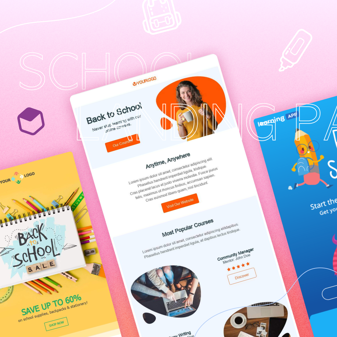
24 Ideas for School Newsletters
As summer winds down, prep time for the busy year ahead comes ever nearer. Before you know it, it’s time to start getting back into touch with teachers, parents, and students. Get a head start on the school season by developing an engaging school newsletter to connect with your community.Regular newsletters with high open rates indicate that your communications are being viewed. Newsletters also foster transparency and trust by ensuring that everyone receives the information they need. But with all of the competition for attention, your school newsletter runs the risk of being missed, or even worse, hitting the spam folder.Education-related emails sit at an average open rate of 34%. To meet or exceedthis benchmark, we recommend that you implement the following best practices, draw on inspiration from example templates and use these ideas to engage your community.
School newsletter best practices
Sending a school newsletter will benefit your community. You’re providing them with essential information, crucial updates, and exciting news to circle them into the conversations that are happening. How can you make sure that these important messages don’t get deleted? Start with best practices to captivate attention.
- Don’t overload with content. Less is more. Focus on the value of your content and narrow in on 2-3 main points to hit in each school newsletter. Overloading your emails with information is a sure way to end up in the archives. Many teachers, students, and parents appreciate a more concise email that brings value. Keep things simple and get straight to the point.
- Design for mobile. Optimizing your school newsletters for mobile is crucial since nearly 50% of email opens are coming from these devices. With parents, teachers, and students constantly on the move, desktop design has taken a backseat. Your community needs information fast and at your fingertips to stay up-to-date with changes and events.
- Personalize. Apply personalization strategies to your emails to increase engagement and hear more feedback on your school newsletters. Take advantage of personalizing the subject line by using a first name or nickname that your subscriber goes by. Also, assure that the content you are sending is relevant to your desired subscribers. If they don’t feel connected with the content you are providing them with, rethink your purpose to reframe the desired plan and outcome.
- Find the best time to send. Consider optimal times to send an email before choosing when to send an email. Your day, time, and frequency needs to cater to your subscribers and their schedules. Students read their emails at different times than teachers and teachers may read at different times than parents. It’s all relative to their schedule and interest in what your school newsletter has to offer. A great way to ensure that your school newsletter is reaching your subscribers at the best time is to ask your subscriber list. The goal is to provide value, so quality over quantity is the goal.
Ideas for teachers
As a teacher, enhancing your students’ knowledge and creating the best learning experience is a top priority. But you have an array of other responsibilities as well, like keeping parents informed about what their kids are learning by showcasing some of their work.If you’re planning on staying up to date with informing both students and parents, then using teacher newsletter templates is the best way to quickly initiate that line of communication. These examples will help you get started with brainstorming what to include in your school newsletter.
Newsletters for students:
- Field trip or class events: Share details on the upcoming events that your students will be able to look forward to.
- Get involved: List volunteer opportunities and other ways to get involved with the community.
- Important dates: Include a class schedule, syllabus or any crucial dates students need to remember and prepare for.
- Self-care: Share mental health-related info.
- Book recs: Include a list of book recommendations/book of the month.
- Meet the student section: Create a meet-the-student section where you ask a student a couple of questions that the class may not know about them and then feature them in the school newsletter.
Newsletters for parents:
- Meet the teacher: Students are back to school and it’s made parents curious as to who’s going to teach their child all year. Send a brief description along with fun facts about you so they can warm up to you before the school year begins.
- Supply wish list: As a teacher, you aren’t provided with many supplies or money for supplies to have a fully functioning classroom environment that would create the best experience for students. Include a list on your school newsletter to encourage parents or community members to donate supplies.
- Contact info: Send your info and ask for theirs in return to initiate a line of communication.
- Pictures: Parents love to see pictures of their kids, especially in school while they are away from them. Add pictures from school trips or in-class activities - they will love to see their kids in action
- Important dates: Keep parents informed of what their children are learning about and when.
Ideas for college departments and career centers
There are endless opportunities when it comes to college newsletters due to the diversity of the student population. Advance your newsletter by sharing valuable info that can apply to different sectors of the student body. We’ve got you covered on ideas for your college newsletter.
- Freshmen: Give freshmen the inside scoop on all the exciting things taking place on-campus; include tips on how to study and even an advice section from upperclassmen.
- Writing Center: Throw in top writing tips or advice for students to read and apply in their next essay, this is useful for undergraduates and graduate students. Include the hours of the writing center and how students can make an appointment as well.
- On-campus events: Talk about upcoming concerts, free giveaways, educational forums, fundraisers and other exciting events going around on campus.
- Clubs: Share details about new clubs on campus and how students can join.
- Athletics: Share the athlete of the week, team events/game schedules, and helpful material on collegiate athlete health and wellness. Even include pump-up quotes and tail-gate details to get more students involved in supporting college athletics.
- Alumni: Stay connected with alumni through a creative newsletter that excites them. Invite them to school events and even include a spotlight feature to share their story and successes they've achieved post-college to inspire other students and to build a bridge of communication between undergraduates and alum professionals.
- Career center: Share interviewing tips, job/internship opportunities, job/internship fairs, and insight from professionals to help guide students towards their dream career.
- Department-specific: From psychology to chemical engineering, different academic departments will reach their students in different ways. Include department-related club info to encourage students to join or share a schedule for career planning lunch-in sessions with industry professionals.
Ideas for school districts
Districts have plenty to manage when it comes to keeping a constantly flowing stream of internal and external communications with teachers, students, and parents. Preparing school newsletters to reach each desired audience is overwhelming due to the abundance of content. Check out these ideas to better your school newsletter communications.
- Staff meetings: Schedules and recaps of what was said, or information on new curriculum implementations can be included here.
- Tips: Provide insightful tips that teachers can use and take advantage of, for instance like organizational tips.
- Events: Organize and include info about school supply fundraisers or other initiatives to help equip teachers with the resources they need to be successful OR inform parents with details about the next back to school picnic or community events throughout the year.
- Faculty honor roll: Spotlight teachers or staff that have achieved success inside or outside of the classroom to further their connections with one another.
- Updates: Include info about new changes or happenings with the curriculum or other details that may affect teachers or students.
Key Takeaways
School newsletters throw a line of communication to teachers, parents, and students to build more of a human-to-human connection amongst such a large body of people. Evaluate your content to provide more value. This will increase your subscribers and that connection you are working towards.Include some of these newsletter ideas in your next email, and remember to:
- Design for mobile
- Keep content to a minimum for each email
- Personalize the information
- Find your email cadence (time, date, frequency)
Design with BEE Pro and apply some of these inspiring ideas to your next school newsletter to better support your community.
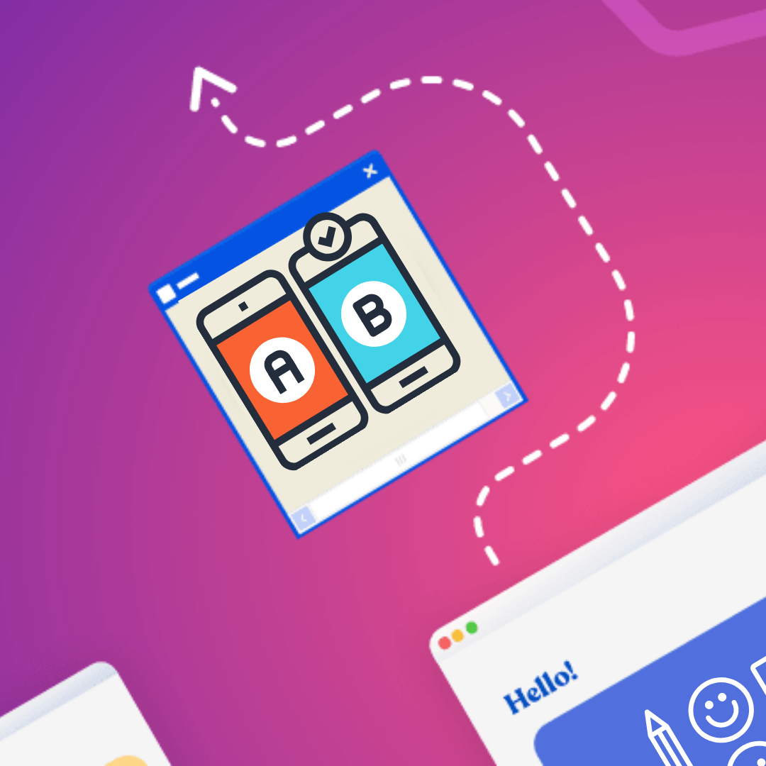
Designing for Conversions - Principles for Success
Visual design is all about making things pretty, right? Not quite. When it comes to digital content like emails and landing pages, design brings much more to the table than superficial aesthetics.Designing for conversions has the power to turbocharge KPIs like open rates, click through rates and, ultimately, revenue. In one A/B test conducted by Hubspot, just changing the CTA button color from green to red boosted conversions by 21%. Talk about low-effort, high reward.Of course, designing for conversions goes much deeper than choosing the right color. It’s an almost psychological practice that starts with deeply understanding your customer and ends with...well, it never really ends.
Principles for designing for conversions
At its core, strategic design is a dynamic process that builds on user research and response. There are no one-size-fits-all rules and no such thing as a perfectly optimized campaign. In other words, just because Hubspot’s audience prefers red CTA buttons over green, doesn’t mean yours will. And even if green wins out in one of your campaigns, that doesn’t mean it’ll work for every campaign moving forward.There are, however, best practices for optimizing design for conversion. Strategically design your emails from header to footer using these three principles.
Determine your purpose
Like most good things in life, designing a good email starts with defining a goal. “If you can’t answer the question, ‘Why am I sending this email?’, then don’t send it,” says email marketing consultant Jordie van Rijn.After all, it’s impossible to design for conversion if you aren’t exactly sure what it is you want to convert your audience to. Visual hierarchies, imagery and CTA buttons can only be determined after you decide on an end goal.Before you start creating something new, ask yourself what action you want your audience to take. Be careful about assuming that every email is about selling. The customer journey consists of many steps and sometimes the action that you need your customer to take is more nuanced than “buy now”.Reasons for sending an email (that aren’t selling):
- Nurture your audience
- Re-engage your email list
- Prevent churn
- Onboard customers
- Confirm transactions
Even if your primary goal is to sell, your email’s function is to get the customer to a landing page where they can learn more about your product or service. That may seem like a small shift, but it provides the clarity needed to streamline your design process.
Know your audience (and your competition)
It’s great to stand out in the inbox, but sending an email that feels too unfamiliar will result in confusion.Audiences convert when they understand what’s going on. For that reason, it’s vital to do your due diligence to find out what they already receive in their inbox. Is it mostly image-based or text-heavy? Minimalist or bold? Short and sweet or multiple scrolls?Knowing which design elements your audience is most familiar with allows you to pick and choose what to imitate and where you can differentiate.It’s also vital to know where and how your audience opens their emails, both in terms of mobile vs. desktop and which email service provider they’re likely to use.Responsive design guarantees that your email will render in most environments, but that doesn’t necessarily mean the email will be optimized across the board. It also doesn’t consider that consumers use different devices for different purposes.For example, while the majority of emails are likely to be open for the first time on mobile, consumers still prefer to make purchases on desktop or laptops. And if an email is read on mobile and then read for a second time on desktop, there’s a 65% higher likelihood of clicking through.What this means is different environments elicit different behaviors. So it’s vital to understand how your consumers are interacting with your emails. Since it’s likely that they’re using both desktop and mobile, use mobile design mode to optimize your design to look exactly like you intend it to on all devices.
Test design elements
Optimizing design relies on continuous feedback. But that doesn’t mean you should use a completely different design every time you send an email. In fact, consistent design will keep you out of the spam box. What you can (and should) do, is choose one design element to A/B test each time you send an email. Here are some ideas for design elements you can test:
- F vs Z pattern
- Heavier or less heavy image density
- Multi-column vs single-column sections
- Hyperlink color
- CTA button color
In addition to quantitative data (open rate, click through rate, etc), look at qualitative data to understand how your users react to emails. At least once per year, dig deeper by conducting user surveys or interviews with active subscribers.
Designing with BEE Pro
Good email design walks a tightrope between consistency and flexibility. Headers, footers and branding elements appear throughout all campaigns. But because different emails serve different purposes, it’s vital to adapt formats, fonts and other elements to optimize conversions.When emails and landing pages take days or weeks to create, going through design best practices like A/B testing or mobile design is tedious at best. Our team created BEE Pro with features like co-editing, branding kits and mobile design mode to give teams ultimate design freedom and the ability to optimize processes that get your email as close to perfect as possible. Check it out here.

Stay informed on all email trends
From the latest creative design strategies that inspire your next campaign to industry best practices and tech advancements, our newsletter is the go-to for all things creation.